Creating Micro Animations with CSS
 Ghost
Ghost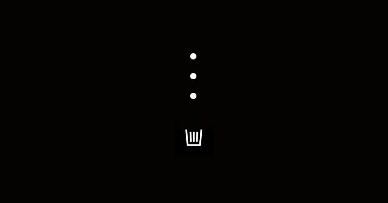
Follow me on Twitter @ js_tut for tutorial updates.
I'll start this tutorial with an example of what a micro animation is and then explain how I created my own. You're probably already familiar with Twitter's "heart" animation every time you press the like button:
(Check out my book CSS Visual Dictionary it explains CSS animations and all CSS properties in existence visually. It took me 3 months to create just the diagrams alone and you will help support more free tutorials.)
There are discounts on all coding book bundles for my Hashnode readers and currently you can preorder Python Grammar + other books.
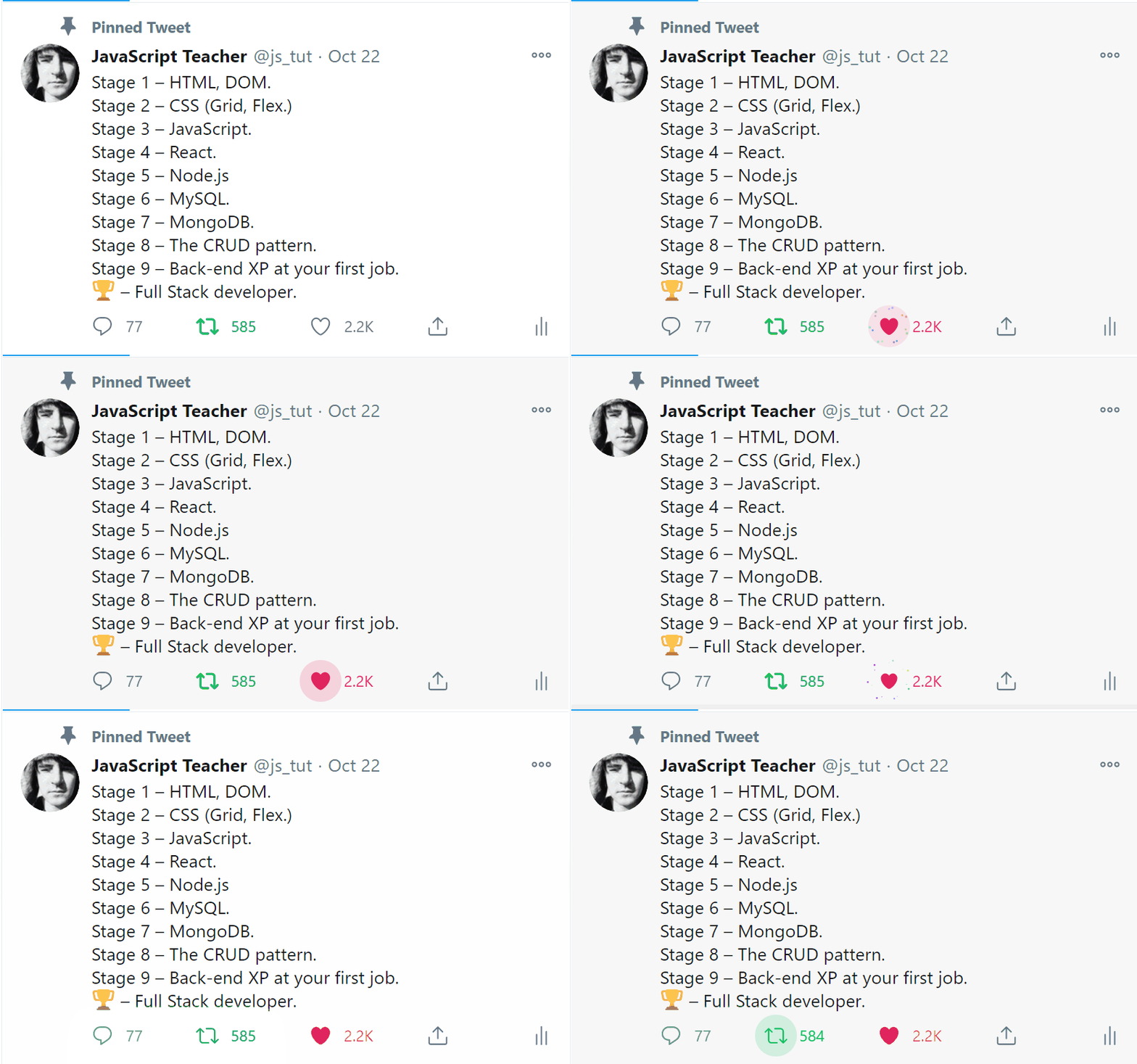
You can create a popup notification to let user know an action has occurred. But there is something about confirming an action with a micro animation.
I don't know if micro animations actually invoke real feelings of empathy. But upon my research I've discovered following properties of micro animations:
- 1. They can add personality to your app.
- 2. They are a technical challenge that requires writing custom code.
- 3. Can invoke a feeling of an event having occurred.
When I was working on Semicolon project I experimented with 3 micro animations:
- Airplane: for invoking "post message" dialog.
- Rocket: button for sending the message.
- Trash bin: animation for deleting posted messages.
Using frameworks or libraries is not the point of this tutorial. You can easily adapt the code from this tutorial to your favorite library. Some people still use vanilla on the front-end but it shouldn't be difficult to port this code to libraries like React. So I'll just show the basic principles I used when creating them.
Below I'll show animated examples together with the source code.
Airplane
The airplane button was inspired by Twitter's "start message" button. But instead of a feather pen icon I decided to animate an airplane:

Check out CSS Visual Dictionary and JavaScript Grammar.
I won't show entire CSS flex layout code. Only the important parts that make this animation work. I used CSS transition to move the airplane diagonally. The trick is the airplane background image actually has 2 planes on it:

The airplane background is a 190px x 190px image with 2 airplanes on it. You might want to use a transparent background to support different color themes. This image will be cropped inside main button container with id #container.
The HTML is straightforward. It consists of a container element and the plane:
<div id="container">
    <div id="airplane"></div>
</div>
Here's the CSS setup:
// Button container for #airplane element
#container {
  // Add rounded corners
  border-radius: 50%;
  background: black;
  // Crop the airplane image
  overflow: hidden;
}

#airplane {
  position: absolute;

  // Align the airplane with the center of the element
  top: -76px;
  left: -76px;
  width: 190px;
  height: 190px;
  background: url('airplanes.png') 8px 8px no-repeat;

  // This animation lasts half a second
  animation-duration: 0.5s;

  // Use single animation
  // normal is opposite of "reverse"
  // (you can use multiple values separated by comma)
  animation-direction: normal;
}

// Name the keyframe
@keyframes flown {
  from { top: -76px; left: -76px }
  to { top: -102px; left: -6px }
}
CSS animations are named using @keyframes directive. Name the animation (in this case "flown") and add a list of transitions to be played using from and to keywords.
The airplane image is offset by -76px pixels in both dimensions by default. This aligns the airplane with the center of the button.
When "flown" animation is applied, the airplane will smoothly transition diagonally. After that the animation is simply removed from the element and it "snaps" back to original position so it can be repeated again on next click.
@keyframes flown {
  0% { top: -76px; left: -76px }
  100% { top: -102px; left: -6px }
}
In first CSS code I use from and to rules to define starting and ending CSS for the animation. However, as shown above you could also use percentages.
To make more complex animations, you can use more states in between:
@keyframes example {
  0% {  }
  25% {  }
  50% {  }
  75% {  }
  100% { }
}
0% always means at the very start of the animation. 100% is what you want to happen on the last frame. Because animation-duration was set to 0.5s that means rules in 100% {} brackets will coincide with 0.5s on last frame.
0.5s is half a second or 500 milliseconds. CSS animations can be also specified using a value of 500ms. It's the same as 0.5s.
CSS animation engine will automatically interpolate between frames across the time interval specified in animation-duration property.
Add CSS into brackets and the animation will smoothly transform between all of the styles in the brackets. (In this example we don't need all that complexity and only two animation check points will be used.)
Later, by setting element.style.animationName property to "flown" will automatically trigger the CSS animation on given element.
The animation-direction: normal ensures animation is played forward. You can specify multiple values like normal, reverse to play multiple animations consequently in different directions. But we don't need that here.
Animating Micro Animation
Well, this isn't the only way to animate your micro animation UX. But it's the one that works for this simple example.
CSS elements with transition property will automatically animate CSS properties to new values when you apply another class to that element.
But similarly, when using CSS animation (like in this example) you can assign animation name to animationName property (or reset it to null to remove it):
// Helper utility for selecting elements (similar to jQuery syntax)
// Use $ and $$ instead of dinosauric document.querySelector function
let $ = selector => document.querySelector(selector);
let $$ = selector => document.querySelectorAll(selector);

// Somewhere in initialization step add this state:
let flying = false;

/* Your DOM just loaded */
window.addEventListener('DOMContentLoaded', event => {
    // Once DOM finished loading, add click event to the button:
    if ($("#container")) $("#container").addEventListener("click", E => {

        // If clicked more than once too fast,
        // don't trigger action again until animation completes
        if (!flying) {

            // Make sure animation can't be triggered again until it ends
            flying = false;

            // Trigger the animation
            $("#airplane").style.animationName = "flown";

            // Remove animation
            setTimeout(E => {

               // Remove animation from element
               $("#airplane").style.animationName = null;

               // Animation is completed, reset state
               flying = false;

            }, 800);
       }
    });
});
This could have been done with CSS transitions too. And to be honest that's probably a better option in this example. But that's just the way it was done.
You can use either way.
Rocket
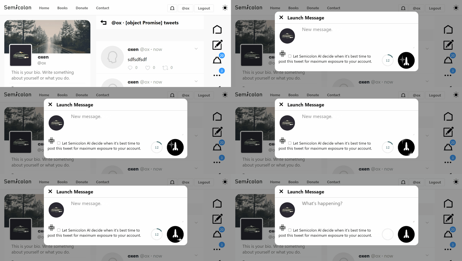
The rocket ship is for posting a message.
To me it feels a lot like "launching" a tweet. It makes your message more important because it feels like it's going to land on the Moon or Mars.
Check out CSS Visual Dictionary and JavaScript Grammar.
This micro animation uses exactly the same code as the airplane one. Except the CSS is a bit different. Airplane had to move in two dimensions. Here we only animate top property to move the rocket ship upward.
Secondary animation to move stars for creating a "flying rocket" effect was done simply by animating position of a star pattern image in opposite direction using the same techniques.
Here is the starfield background image.
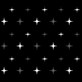
This image has a slightly lower z-index than the rocket. And just like the rocket it is cropped within the main container. The overlay:hidden; property will crop around the curve of the rounded corners.
The image can be definitely improved – maybe in the future – but I was pleased with the effect so far. In my opinion it accomplishes the purpose of making user "feel" like something is happening or has happened.
And that's the 🗝️ to micro animations.
Trash Bin
Finally, probably my favorite micro animation so far.
I use it when a message is deleted to indicate Mongo.deleteOne method has successfully completed the delete action on the back-end.
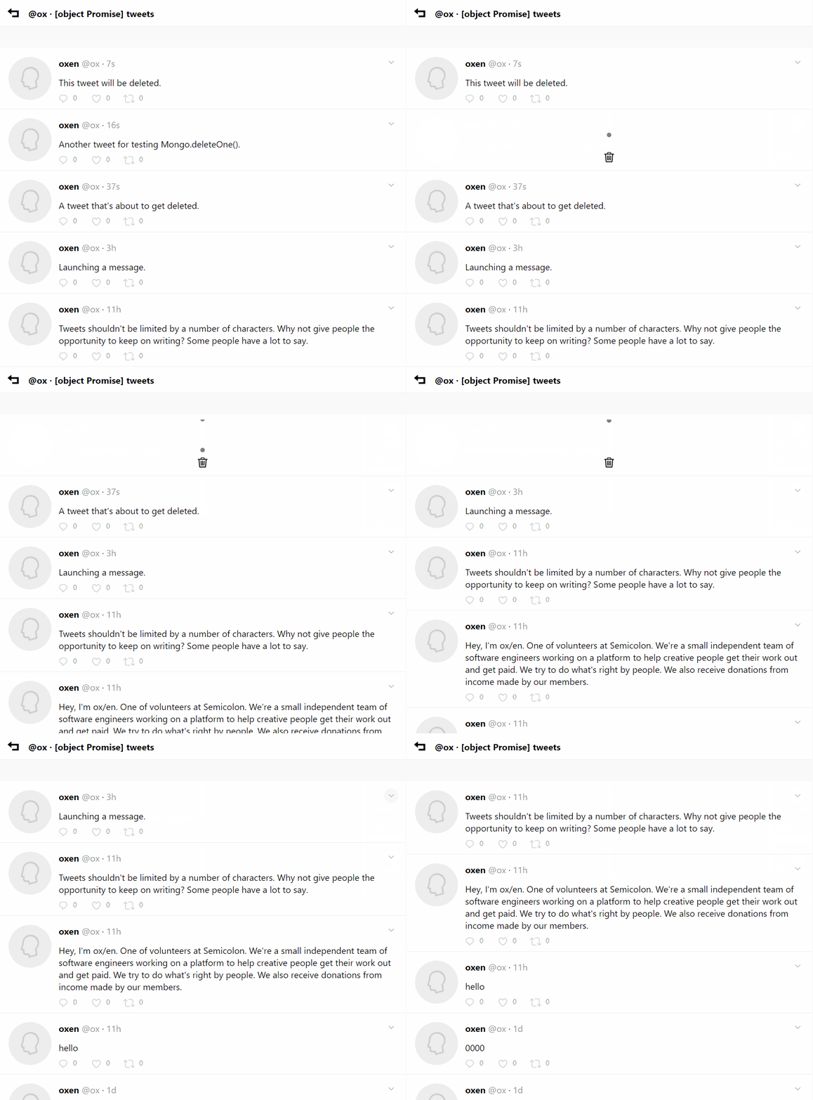
How was it created? I'll start with my CSS setup:
.trash-dot {
  position: absolute;
  display: block;
  top: -10px;
  left: 15px;
  width: 10px;
  height: 10px;
  background: gray;
  border-radius: 50%;
  transition: 0.6s;
}

.trash-dot.fall {
  top: 100px;
}
This time I used CSS transitions. Just to demonstrate another popular way of making micro animations for your UX!
Every time a "tweet" is deleted, the tweet container element's innerHTML is used to replace its content to a trash bin with 3 trash particles.
There is a back-end part to this. But it won't be shown here. Just the front-end:
// The fetch call to the Express/Mongo database
Tweet.delete = (token, userid, tweetid) => {

  // Get tweet's element by userid and tweetid
  const element = $(`#tweet_${userid}_${tweetid}`);

  // Calculate tweet's dimensions
  const width = element.offsetWidth;
  const height = element.offsetHeight;

  // Apply width and height to element's style
  // to keep its original dimensions after innerHTML
  // clears out the element's contents
  element.style.width = `${width}px`;
  element.style.height = `${height}px`;
  element.className = 'tweet f v h r rel tweet-sep-bottom';

  // Replace the tweet's HTML contents with trash icon
  element.innerHTML = `<div class = "f v h c" id = "trash_${tweetid}">
    <div style = "position: relative; display: block; width: 40px; height: 75px; overflow: hidden;">
      <div class = "t1 trash-dot"></div>
      <div class = "t2 trash-dot"></div>
      <div class = "t3 trash-dot"></div>
    </div>
    <div style = "position: relative; width: 40px; height: 40px; background:url(https://semicolon.dev/static/trash1.png) no-repeat">
      <div style = "position: absolute; top: 0px; left: 0; width: 40px; height: 40px; background:url(https://semicolon.dev/static/trash2.png) no-repeat"></div>
    </div>
  </div>`;

  // Add ".fall" class to trigger transition for each trash particle:
  setTimeout(x => {
    console.log(1);
    $(`#trash_${tweetid} div div.t1`).className = 't1 trash-dot fall';
  }, 0);

  setTimeout(x => {
    console.log(2);
    $(`#trash_${tweetid} div div.t2`).className = 't2 trash-dot fall';
  }, 200);

  setTimeout(x => {
    console.log(3);
    $(`#trash_${tweetid} div div.t3`).className = 't3 trash-dot fall';
  }, 400);

  // Remove the element containing the "tweet" from DOM
  setTimeout(x => {
    element.style.display = 'none';
  }, 800);

  fetch(`https://${Site.www}semicolon.dev/api/tweet/delete`, make(payload)).then((response) => response.json().then(json => {
    console.log(json);
    if (json.success) {
      console.log(`Tweet was deleted.`);
    } else {
      console.log(`Tweet cannot be deleted.`);
    }
  }));
}
Keep in mind this is just a vanilla JavaScript example. No frameworks. It's not even the best way to do it. And the animation will play regardless of whether Mongo call succeeds (although in 99% of cases it will anyway.)
I would recommend against using setTimeout for animations. Moving this code to just CSS would be the right thing to do.

My Coding Book
Check out my book CSS Visual Dictionary it explains CSS animations and all CSS properties in existence visually. It took me 3 months to create just the diagrams alone and you will help support more free tutorials.
Conclusion
You don't always have to use frameworks or libraries. This is true especially if you're just learning and practicing. But it shouldn't be hard to replicate these micro animations in React or Vue, especially if you're already familiar with them.
Hope you enjoyed this tutorial, I had fun making it!
#Octopack is my coding book bundle.
Hey readers! At the end of each tutorial I advertise my coding book bundle. I don't know if it's going to work as I don't really do marketing well. But I decided to follow this protocol just to see what happens.
The pack includes CSS Dictionary, JavaScript Grammar, Python Grammar and few others. Just see if you might need any of the books based on where you are on your coding journey! Most of my books are for beginners-intermediate XP.
I don't know who is reading my tutorials but I put together this coding book bundle that contains some of the best books I've written over the years. Check it out 🙂 I reduced price to some regions like India, Nigeria, Cairo and few others. Prices are just so different here in the U.S. and all over the world.
You can get Octopack by following my My Coding Books link.


Subscribe to my newsletter
Read articles from Ghost directly inside your inbox. Subscribe to the newsletter, and don't miss out.
Written by
