Create Custom Bottom Sheets in Ionic using CSS Grid and Angular Animations
 William Juan
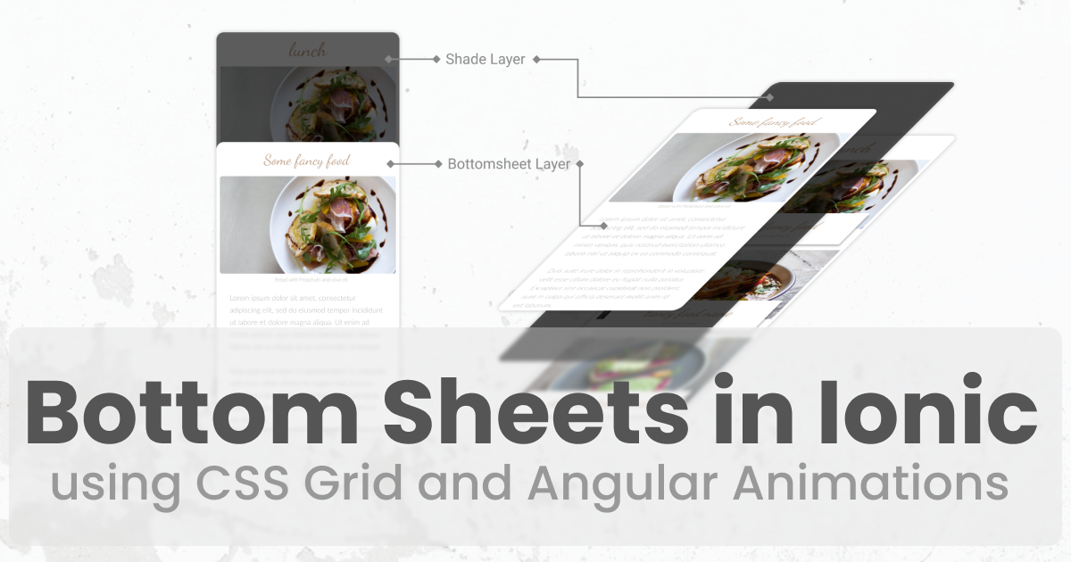
Ionic has a lot of prebuilt components such as ion-modal and ion-action-sheet to layer components on top of the main view. In this post, I will show you another way you could stack your views using CSS Grid and some Angular Animations to create a custom bottom sheet.
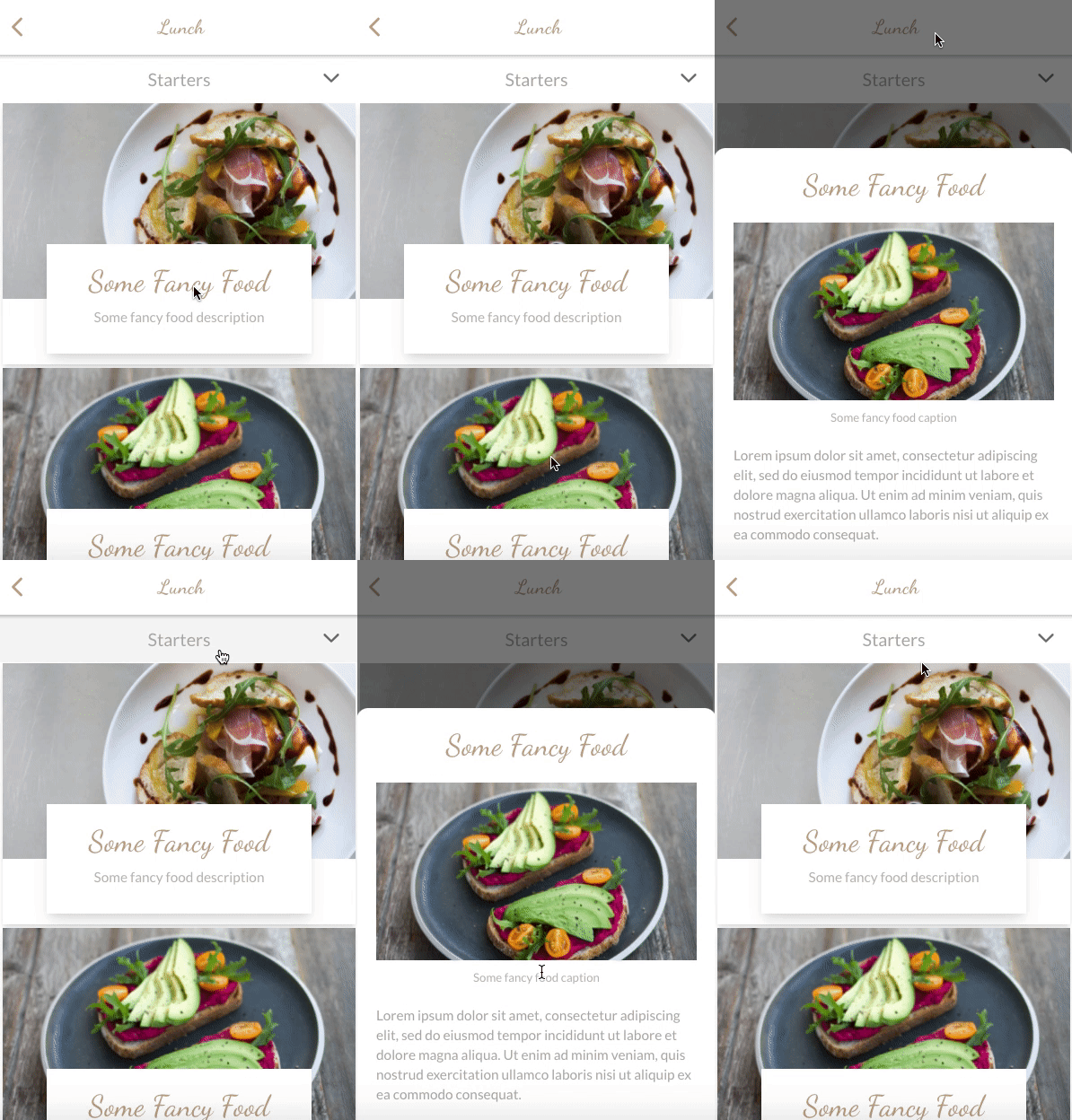
See it in action 👇

I showcased this technique in one of the episodes on my Restaurant Speed Code Series on Youtube. You can check out the episode below 👇
For those that prefer going through the source code, check out the repo here
File and Folder Structure
To keep the post more focused, I will skip going over the setup process and jump straight to the areas of the code where this is implemented. These are the list of files from the project (Github repo) that we will be using through the tutorial. Feel free to clone the repo and follow along 🤓
src/app/
|- core
    |- animations
        |- fade.animation.ts
        |- slide.animation.ts
    |- services
        |- layers.service.ts
|- shared
    |- components
        |- layers
            |- food-details-bottomsheet
                |- food-details-bottomsheet.ts | html
|- app.component.ts
|- app.component.html
High-level Concept
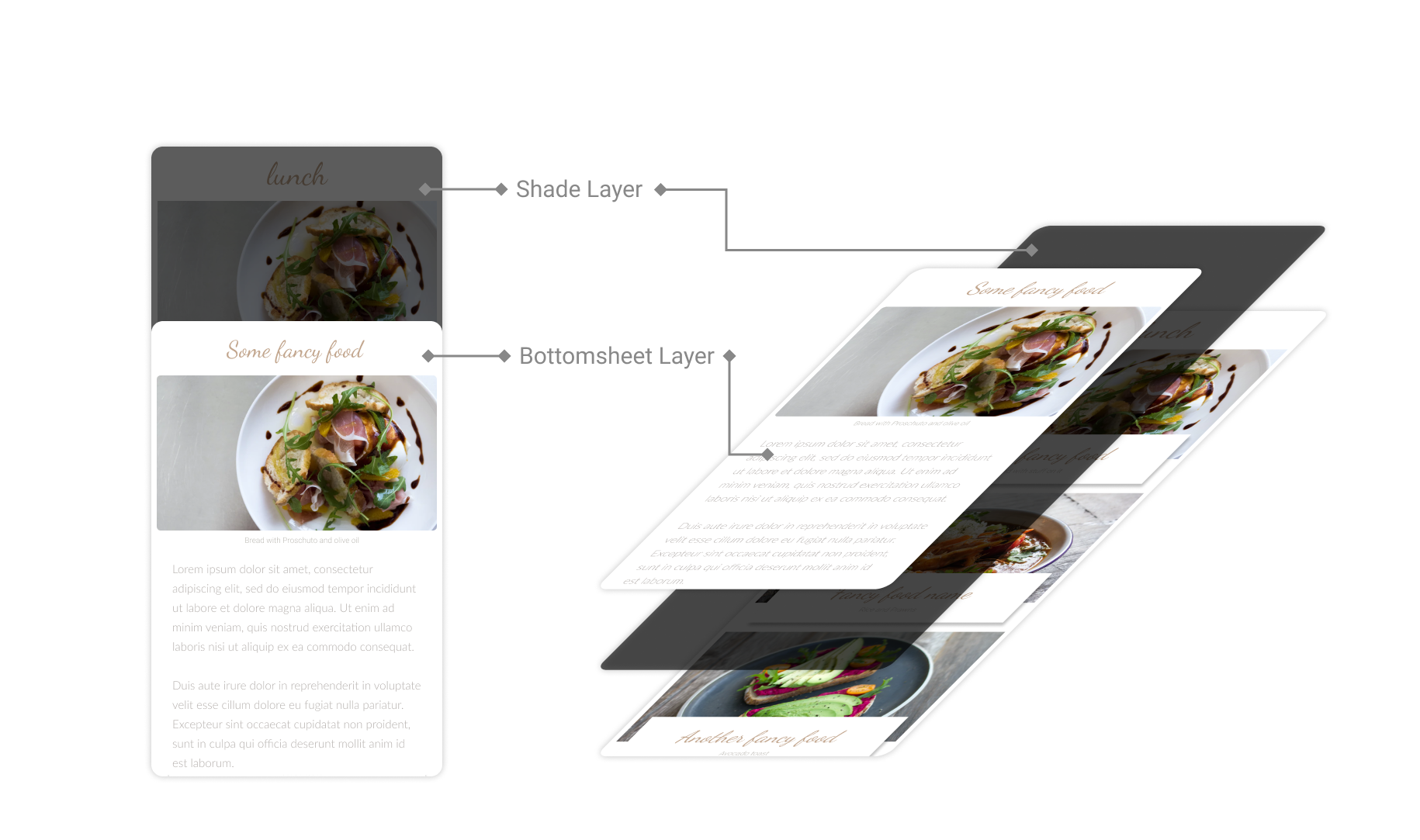
If you look closely at the example at the beginning of the tutorial, you'll see that 2 layers are added to the view when the bottom sheet is opened. I will refer to these as the shade layer (the semi-transparent layer that dims the background) and the bottom sheet layer (the actual bottom sheet that gets animated from the bottom).
Here is what the views look like if you look at it from a 3d perspective where the layers are stacked in increasing z-indexes as you move towards the top.
Setting up the main view
There are a few different ways to get this stacking behavior. For this particular use case, I used a CSS grid (via Tailwind CSS). CSS grids, by default, stack the elements on the z-axis if you place them in the same row/column which makes it convenient for creating layers like our shade and bottom sheet layers.
Open up app.component.html and wrap everything inside ion-app with a div with display: grid 👇
<!-- src/app/app.component.html -->

<ion-app>
  <div class="grid grid-rows-1 grid-cols-1">
    <div>
      <ion-router-outlet></ion-router-outlet>
    </div>

    <!-- layers -->
    <div class="z-40">
      <!-- this will be where your layers go -->
    </div>
  </div>
</ion-app>
We will come back and update this after creating the bottom sheet component.
Bottomsheet Component
Let's create a simple bottom sheet component. Since we will be displaying information about food, we'll name it FoodDetailsBottomsheetComponent. Let's also add some hardcoded values that we can use to render in our template.
// src/app/shared/components/layers/food-details-bottomsheet/food-details-bottomsheet.component.ts

import { Component } from "@angular/core";

@Component({
  selector: "app-food-details-bottomsheet",
  templateUrl: "food-details-bottomsheet.component.html",
})
export class FoodDetailsBottomsheetComponent {
  food = {
    name: "Some Fancy Food",
    image: "assets/images/food-avocado.png",
    caption: "Some fancy food caption",
    description: `
    Lorem ipsum dolor sit amet, consectetur adipiscing elit,
    sed do eiusmod tempor incididunt ut labore et dolore magna aliqua. Ut enim ad minim veniam,
    quis nostrud exercitation ullamco laboris nisi ut aliquip ex ea commodo consequat.`,
  };

  close(): void {}
}
The template contains three parts - container, shade and a bottomsheet
- container - a
divthat spans the full width and height of its parents that will contain the shade and bottom sheet layers. This container will be another CSS grid to be able to stack the shade and bottom sheet layers on top of each other - shade - a single
divthat spans the full width and height of the container to dim the background - bottom sheet - another
divthat will contain the contents of the bottom sheet. Thisdivhas theself-endclass (translates toalign-self: flex-end;in CSS) which aligns it to the bottom of the parent container.
<!-- src/app/shared/components/layers/food-details-bottomsheet/food-details-bottomsheet.component.html -->

<!-- container -->
<div class="h-screen grid grid-rows-1 grid-cols-1">
  <!-- shade -->
  <div
    class="row-start-1 row-span-1 col-start-1 col-span-1 bg-black bg-opacity-50"
    (click)="close()"
  ></div>

  <!-- bottomsheet -->
  <div
    class="row-start-1 row-span-1 col-start-1 col-span-1 z-10 self-end p-5 bg-white rounded-t-xl"
  >
    <p class="text-center text-3xl text-brand-accent font-cursive">
      {{ food?.name }}
    </p>

    <!-- add min height here to prevent view adjusting mid animation when the image loads -->
    <div style="min-height: 190px">
      <ion-img class="mt-5" [src]="food?.image"></ion-img>
    </div>
    <p class="text-center text-xs text-brand-gray-light">{{ food?.caption }}</p>

    <p class="mt-5 font-sans text-sm text-brand-gray-medium">
      {{ food?.description }}
    </p>
  </div>
</div>
Add it to App Component
Now that we have the bottom sheet built out, let's head back to the app.component.html and add the component's selector to the template.
<!-- src/app/app.component.html -->

<ion-app>
  <div class="grid grid-rows-1 grid-cols-1">
    <div>
      <ion-router-outlet></ion-router-outlet>
    </div>

    <!-- layers -->
    <div class="z-40">
      <!--✨ NEW: bottomsheet added here 👇 -->
      <app-food-details-bottomsheet></app-food-details-bottomsheet>
    </div>
  </div>
</ion-app>
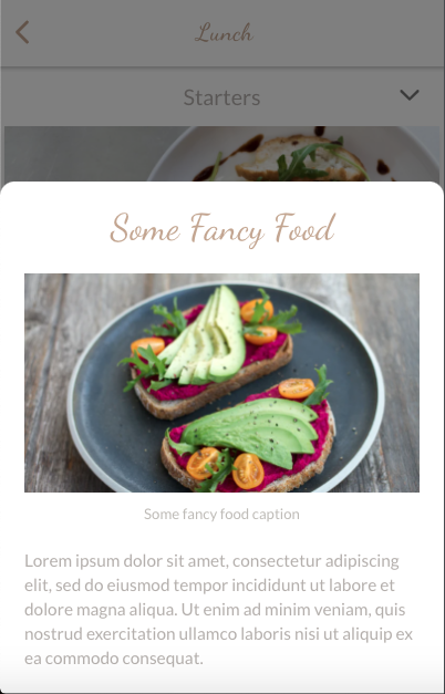
If you run the app, you will see the main view of the app covered by the shade and bottom sheet layers (and we don't have any way to dismiss it right now 🤦)
Open and Close via Layers Service
There are also a lot of different ways you can control the opening and closing of the bottom sheet. You could use a state management system like ngrx or ngxs, rxjs's Subject or BehaviorSubject, or even regular variables and function calls. For simplicity, I will be using rxjs's BehaviorSubject to control the opening and close of the bottom sheet.
To do this, we will create a layers.service.ts which will have an openFoodDetailsBottomsheet and a closeFoodDetailsBottomsheet function that we can call from anywhere within the app to open or close the bottom sheet. These functions will then update the layersSource$ BehaviorSubject which can then be used by the bottom sheet to listen for new changes and react accordingly.
// src/app/core/services/layers.service.ts

import { Injectable } from "@angular/core";
import { BehaviorSubject, Observable } from "rxjs";

@Injectable({
  providedIn: "root",
})
export class LayersService {
  private layersSource$ = new BehaviorSubject<Layers>(initialLayers);

  layers$(): Observable<Layers> {
    return this.layersSource$.asObservable();
  }

  openFoodDetailsBottomsheet(): void {
    this.layersSource$.next({
      ...this.getLayersCurrentValue(),
      foodDetailsBottomsheet: true,
    });
  }

  closeFoodDetailsBottomsheet(): void {
    this.layersSource$.next({
      ...this.getLayersCurrentValue(),
      foodDetailsBottomsheet: false,
    });
  }

  private getLayersCurrentValue(): Layers {
    return this.layersSource$.getValue();
  }
}

export interface Layers {
  foodDetailsBottomsheet: boolean;
}

export const initialLayers: Layers = {
  foodDetailsBottomsheet: false,
};
Add Open on Food Card Click
Open src/app/features/lunch/lunch.page.html and add a click event to the div container of app-food-card 👇
<!-- src/app/features/lunc/lunch.page.html -->
...
<ion-content [fullscreen]="true">
  <div class="grid grid-rows-1 grid-cols-1">
    <div
      class="row-start-1 row-span-1 col-start-1 col-span-1 bg-white p-1 mt-12"
      @staggerFade
    >
      <ng-container *ngFor="let food of foodOptions">
        <!--✨ NEW: click event added here 👇 -->
        <div (click)="openFoodDetailsBottomsheet()">
          <app-food-card [food]="food"></app-food-card>
        </div>
      </ng-container>
    </div>
    <div
      class="fixed w-full row-start-1 row-span-1 col-start-1 col-span-1 z-40"
    >
      <app-options-drawer></app-options-drawer>
    </div>
  </div>
</ion-content>
Open src/app/features/lunch/lunch.page.ts and inject the layers service we created in the previous section. We will then need to call layer service's openFoodDetailsBottomsheet in our click event listener 👇
// src/app/features/lunc/lunch.page.ts

import { Component } from '@angular/core';
import {
  LayersService,
  NavigationService,
  staggerFadeAnimation,
} from '@app/core';
import { IFoodCard } from '@app/shared';

@Component({
  selector: 'app-lunch',
  templateUrl: 'lunch.page.html',
  styleUrls: ['lunch.page.scss'],
  animations: [staggerFadeAnimation],
})
export class LunchPage {

  ...

  constructor(
    private navigationService: NavigationService,
    // ✨ NEW: layers service injected here 👇
    private layersService: LayersService
  ) {}

  back(): void {
    this.navigationService.back();
  }

    // ✨ NEW: click event listener added here 👇
  openFoodDetailsBottomsheet(): void {
    this.layersService.openFoodDetailsBottomsheet();
  }
}
Add Close on Shade Layer Click
Similarly, we will need to add click event listeners and wire them up to close the bottom sheet when we click on the shade layer.
<!-- src/app/shared/components/layers/food-details-bottomsheet/food-details-bottomsheet.component.html -->
<div class="h-screen grid grid-rows-1 grid-cols-1">
  <!--✨ NEW: click event added here 👇 -->
  <div
    class="row-start-1 row-span-1 col-start-1 col-span-1 bg-black bg-opacity-50"
    (click)="close()"
  ></div>

  ...
</div>
// src/app/shared/components/layers/food-details-bottomsheet/food-details-bottomsheet.component.ts

import { Component } from "@angular/core";
import { LayersService } from "@app/core";

@Component({
  selector: "app-food-details-bottomsheet",
  templateUrl: "food-details-bottomsheet.component.html",
})
export class FoodDetailsBottomsheetComponent {
  // ✨ NEW: layers service injected here 👇
  constructor(private layersService: LayersService) {}

  // ✨ NEW: close bottomsheed 👇
  close(): void {
    this.layersService.closeFoodDetailsBottomsheet();
  }
}
Open and Close Event Listeners
Now that we have the open and close triggers, all that is left is to listen to these events and display and hide the bottom sheet accordingly. We will add an isOpen$ observable that maps the layers service's layers$ observable to listen to only changes in the foodDetailsBottomsheet property.
// src/app/shared/components/layers/food-details-bottomsheet/food-details-bottomsheet.component.ts

import { Component } from '@angular/core';
import { map, distinctUntilChanged } from 'rxjs/operators';
import { LayersService } from '@app/core';

@Component({
  selector: 'app-food-details-bottomsheet',
  templateUrl: 'food-details-bottomsheet.component.html',
})
export class FoodDetailsBottomsheetComponent {
    // ✨ NEW: isOpen listener 👇
    isOpen$ = this.layersService.layers$().pipe(
        map((layers) => layers.foodDetailsBottomsheet),
        distinctUntilChanged()
    );

    ...
}
We can then bind the isOpen$ variable to our template using an async pipe and conditionally display our component's outermost container using an *ngIf
<!-- src/app/shared/components/layers/food-details-bottomsheet/food-details-bottomsheet.component.html -->

<!-- ✨ NEW: *ngIf -->
<div *ngIf="isOpen$ | async" class="h-screen grid grid-rows-1 grid-cols-1">
  <!-- shade -->
  <div
    class="row-start-1 row-span-1 col-start-1 col-span-1 bg-black bg-opacity-50"
    (click)="close()"
  ></div>
  ...
</div>

Add Animations
We will be adding two different sets of animations for displaying and hiding the bottom sheet. A fade in and fade out for the shade layer, and a slide up and slide down for the bottom sheet.
Since these animations get triggered as elements get added and removed from the DOM, we can utilize Angular Animation's :enter and :leave transitions.
For more information on Angular Animations and how it works, you can check out their official docs or a reference I created with live examples 🤓
Fade Animation
// src/app/core/animations/fade.animation.ts

import { trigger, transition, style, animate } from "@angular/animations";

export const fadeAnimation = trigger("fade", [
  transition(":enter", [
    style({ opacity: 0 }),
    animate("300ms", style({ opacity: 1 })),
  ]),
  transition(":leave", [animate("300ms", style({ opacity: 0 }))]),
]);
Slide Animation
// src/app/core/animations/slide.animation.ts

import { trigger, transition, style, animate } from "@angular/animations";

export const slideUpAnimation = trigger("slideUp", [
  transition(":enter", [
    style({ transform: "translate(0,500px)" }),
    animate(
      "350ms cubic-bezier(0.17, 0.89, 0.24, 1.11)",
      style({ transform: "translate(0,0)" })
    ),
  ]),
  transition(":leave", [
    animate("300ms ease-in-out", style({ transform: "translate(0,500px)" })),
  ]),
]);
Wire up our Bottomsheet Component
To use the animations we created in the previous sections, we will need to import the animation in our component and add it to the animations array in our Component decorator.
// src/app/shared/components/layers/food-details-bottomsheet/food-details-bottomsheet.component.ts

import { fadeAnimation, LayersService, slideUpAnimation } from '@app/core';

@Component({
  selector: 'app-food-details-bottomsheet',
  templateUrl: 'food-details-bottomsheet.component.html',
  // ✨ NEW: animations array 👇
  animations: [
    fadeAnimation,
    slideUpAnimation,
  ],
})
export class FoodDetailsBottomsheetComponent {
    ...
}
We can then add the animations using their trigger names prefixed with the @ symbol to our UI elements.
<!-- src/app/shared/components/layers/food-details-bottomsheet/food-details-bottomsheet.component.html -->
<div *ngIf="isOpen$ | async" class="h-screen grid grid-rows-1 grid-cols-1">
  <!-- shade -->
  <!-- ✨ NEW: @fade 👇-->
  <div
    @fade
    class="row-start-1 row-span-1 col-start-1 col-span-1 bg-black bg-opacity-50"
    (click)="close()"
  ></div>

  <!-- bottomsheet -->
  <!-- ✨ NEW: @slideUp 👇-->
  <div
    @slideUp
    class="row-start-1 row-span-1 col-start-1 col-span-1 z-10 self-end p-5 bg-white rounded-t-xl"
  >
    ...
  </div>
</div>
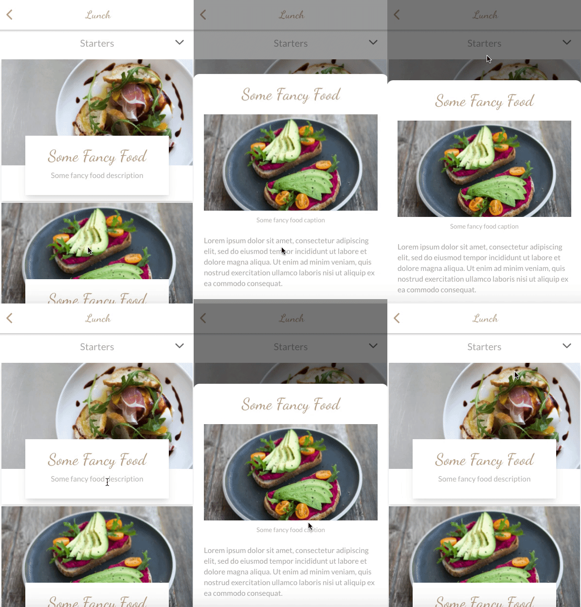
Awesome! Let's try opening and closing the bottom sheet. It's animating! But wait, it's only animating when it is being opened, not when it's getting closed. This is expected behavior since the *ngIf is applied to the parent of the elements with the animation directives. In other words, when the parent is added to the DOM, the children will be added as well, which triggers the enter animation. However, when the parent is removed from the DOM, it doesn't know about the children having an animation that needs to be executed before removing them from the DOM, hence causing those animations to get skipped.
We can fix this by adding an animation directive on the parent that queries the children and executes animateChild. This causes the parent to wait until the children are done executing their animation before removing them from the DOM
<!-- src/app/shared/components/layers/food-details-bottomsheet/food-details-bottomsheet.component.html -->

<!-- ✨ NEW: @container 👇-->
<div
  *ngIf="isOpen$ | async"
  @container
  class="h-screen grid grid-rows-1 grid-cols-1"
>
  ...
</div>
// src/app/shared/components/layers/food-details-bottomsheet/food-details-bottomsheet.component.ts

import {
  animate,
  animateChild,
  query,
  style,
  transition,
  trigger,
} from '@angular/animations';

@Component({
  selector: 'app-food-details-bottomsheet',
  templateUrl: 'food-details-bottomsheet.component.html',
  animations: [
    fadeAnimation,
    slideUpAnimation,
    // ✨ NEW: container 👇
    trigger('container', [
      transition(':enter, :leave', [
        query('@*', animateChild(), { optional: true }),
      ]),
    ]),
  ],
})
Conclusion
This brings us to the end of the tutorial. I hope you enjoyed that. If you are interested in more content like this or have any questions let me know in the comments or tweet me at @williamjuan27
Subscribe to my newsletter
Read articles from William Juan directly inside your inbox. Subscribe to the newsletter, and don't miss out.
Written by

William Juan
William Juan
I am a Frontend Developer working primarily in the web and hybrid mobile spaces. The majority of my work has revolved around the Angular ecosystem, including working with other Angular-related frameworks such as NativeScript and Ionic. My passion lies in converting a design into code and achieving a close to pixel-perfect end-product.