Flip Card Effect using CSS
 Gladson Dsouza
When browsing websites you might have come across this effect. This will not only help us save space on the site but also makes the site look better.
This is useful when you want to initially display some information on the card and display more information when you hover over the card.
Here is an example of the effect.
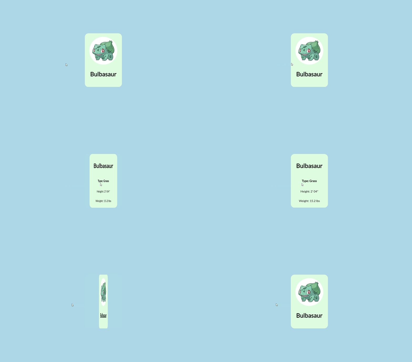
Let's start with the HTML markup.
  <div class="card">
    <div class="card_side front">
     Content in the front side
    </div>
    <div class="card_side back">
     Content in the back side
    </div>
  </div>
We have a parent div that contains 2 child div for the front and back parts of the card. The child div contains the content for the front part and back parts respectively.
Now let's start with the CSS part.
.card {
  position:relative;
  width:250px;
  height:350px;
}
Here we set the width and height of the card and also the position is set to relative so that the child div front side and back side can be set absolute to stack one above the other.
.card_side {
  position:absolute;
  width:100%;
  height:100%;
}

.front {
  background-color:#fcba03;
}
.back {
  background-color:#fc6f03;
}
Here I have set the width and height of both the front and back part to the width and height of the parent div and assigned 2 separate background colors to visualize easily. The position is set to absolute to stack one above the other. This can be checked using the dev tools.
The current output will look something like this.
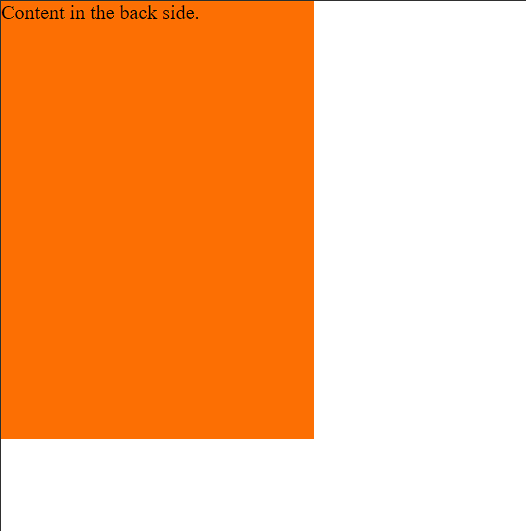
Next, we will rotate the content on the back side, here we will rotate the content along the Y-axis but it can be changed depending on the end result you want to achieve.
.back{
  background-color:#fc6f03;
  transform:rotateY(180deg);
}
Now the text will be rotated but still visible.
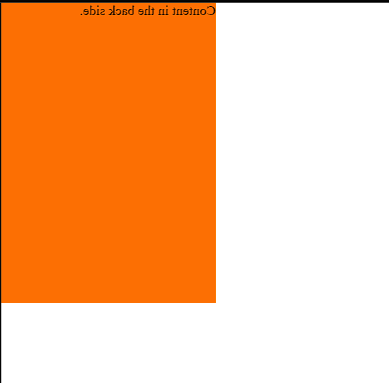
We don't want the back content to be visible right away so we use the backface-visibility to set the content rotated content to hidden. This property will make the content visible only when the back face is turned towards the user.
Read more about the backface-visibility here.
.card_side {
  position:absolute;
  width:100%;
  height:100%;
  backface-visibility:hidden;
}
Now the output will look like this,i.e. only the content on the front side will be visible.
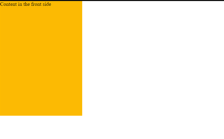
Now the final part, rotate the front side to 180deg and back side back to 0 when we hover over the card. And finally, add a transition on the card sides to make it look like a flip.
.card_side{
  position:absolute;
  width:100%;
  height:100%;
  backface-visibility:hidden;
  transition:all 1s ease;
}

.card:hover .front{
  transform:rotateY(180deg)
}
.card:hover .back{
  transform:rotateY(0deg)
}
Our end result will look like this.
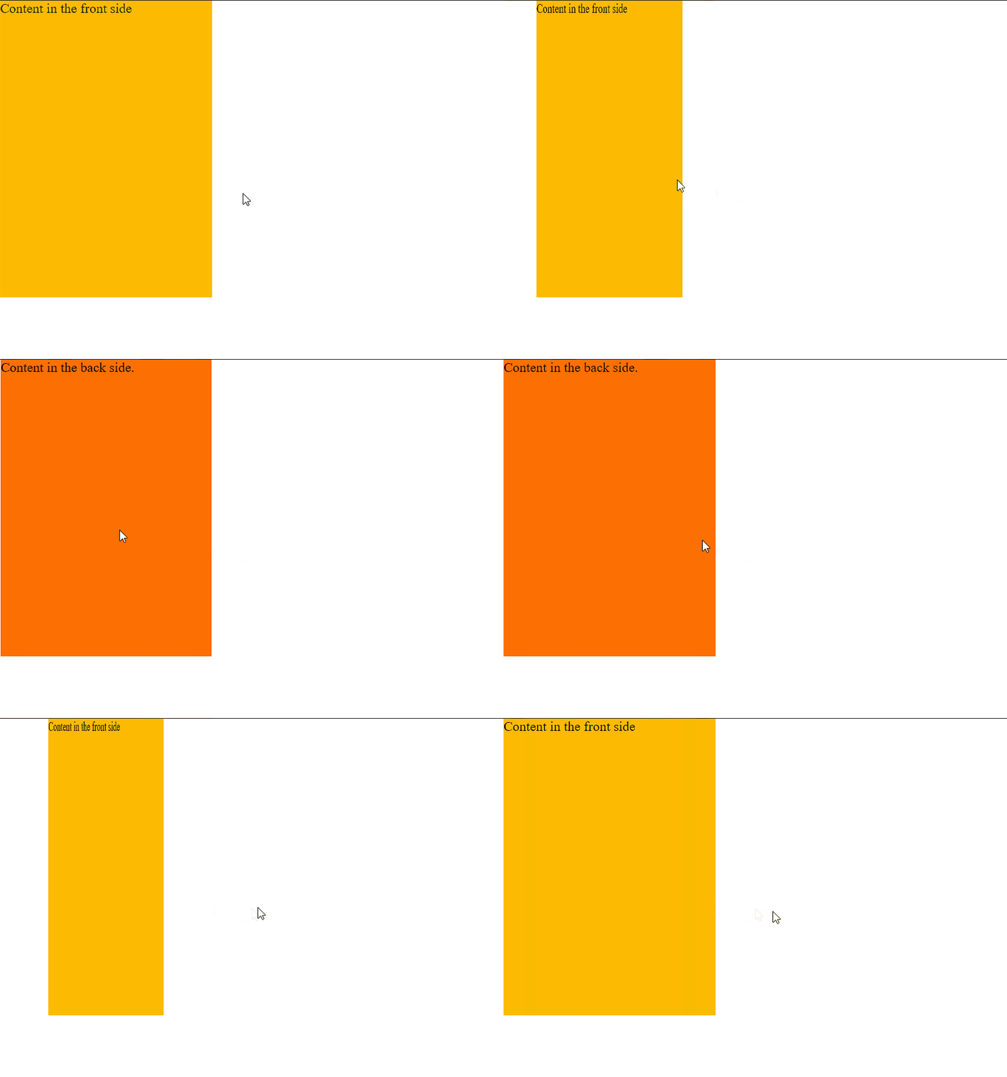
Here is a demo of Card Flip that I created.
This is the 2d version of the card flip, 3d effect also can be done just by adding few lines of code. To achieve 3D effect transform-style: preserve-3d and perspective property are required.
Here is a demo of 3D effect with the same content.
Hope you have learned something new after reading this article.
Thank you for reading.
Subscribe to my newsletter
Read articles from Gladson Dsouza directly inside your inbox. Subscribe to the newsletter, and don't miss out.
Written by
