Building A Web Story Using AMP
 Velda Kiara

I really love dogs, in particular, the Siberian Husky. I do not own one yet but it's on my bucket list. I was on Instagram getting lost in the numerous pictures and Insta stories of dogs instead of being a responsible adult and doing adult things like getting my tasks done. Moping about the lost time was not helping and instead of going back to my tasks, I decided to start a new one. I figured now that I had already used time on them, I might as well learn how to actually build them. I came across AMP(Accelerated Mobile Pages) which reminded me of a session we had with Ben Morss when I used to lead She Code Africa Nairobi. I had always planned to do something with AMP but I never got to it. This was going to be what I build with AMP.
Let's get to it.
How to build a Web story using AMP
I will be using Glitch and this boilerplate to create an HTML file and a CSS file.
The code of the boilerplate is initially like this:
<!doctype html>
<html ⚡>
  <head>
    <meta charset="utf-8">
    <meta name="viewport" content="width=device-width">
    <meta name="description" content="This is the AMP Boilerplate.">
    <link rel="preload" as="script" href="https://cdn.ampproject.org/v0.js">
    <script async src="https://cdn.ampproject.org/v0.js"></script>
    <!-- Import other AMP Extensions here -->
    <style amp-custom>
    /* Add your styles here */
    </style>
    <style amp-boilerplate>body{-webkit-animation:-amp-start 8s steps(1,end) 0s 1 normal both;-moz-animation:-amp-start 8s steps(1,end) 0s 1 normal both;-ms-animation:-amp-start 8s steps(1,end) 0s 1 normal both;animation:-amp-start 8s steps(1,end) 0s 1 normal both}@-webkit-keyframes -amp-start{from{visibility:hidden}to{visibility:visible}}@-moz-keyframes -amp-start{from{visibility:hidden}to{visibility:visible}}@-ms-keyframes -amp-start{from{visibility:hidden}to{visibility:visible}}@-o-keyframes -amp-start{from{visibility:hidden}to{visibility:visible}}@keyframes -amp-start{from{visibility:hidden}to{visibility:visible}}</style><noscript><style amp-boilerplate>body{-webkit-animation:none;-moz-animation:none;-ms-animation:none;animation:none}</style></noscript>

    <link rel="canonical" href=".">
    <title></title>
  </head>
  <body>
    <h1>Hello World</h1>
  </body>
</html>
The AMP story contains the AMP-story page that has layers inside. Layers in the AMP story page include the images and various text you intend to use.
The <amp-story> is the complete web story responsible for creating the shell of the interface of the story.
AMP story is a component in which we will add the script to the code. Think of the AMP story as a noticeboard that allows people to display messages on it, like posters and memos.
Add the following code in your <head> tag.
<head>
<script async custom-element="amp-story"src="https://cdn.ampproject.org/v0/amp-story-1.0.js"></script>
</head>
The validity of an <amp-story> is dependent on the standalone component.
In this case, to make our story valid we need to add the standalone attribute.
In your code, add the <amp-story> component below the <body> and specify the standalone attribute.
<body>
  <amp-story standalone>
  </amp-story>
</body>
Metadata
Metadata is data about data. We will provide the following information:
- title
- publisher
- source of the image.
<amp-story standalone
    title="Love Dogs"
    publisher=" By Velda Kiara"
    poster-portrait-src="https://cdn.glitch.me/9d268a31-4635-4f43-a3a6-ff72fc021e86%2F3.png?v=1634683890582">
</amp-story>
Creating a Cover Page
We will use the <amp-story-page> to create the cover page. The <amp-story-page> will contain the particular pages of the images you want to have.
Insert the following code after the standalone code.
<amp-story-page id="cover-image">
   </amp-story-page>
Stories are valid when they have at least one layer. Our story so far does not have any, making it invalid.
Layers are significant because they create the visual effects as the story slides one after the other. The story utilizes the stack data structure where the first layer will be at the bottom and the second one will be at the top.
Our page will use two layers. The first image will act like our background and the second layer will contain the title and the text.
Creating The First Layer
The layer will have an image that covers the entire page.
Create the layer by adding the <amp-story-grid-layer> element as a child of <amp-story-page>. To make the image fill the screen, specify the template="fill" attribute in the <amp-story-grid-layer> tag. To add an image Inside the layer, add an <amp-img>. Make sure it's responsive by adding the layout attribute to <layout="responsive"> with the image dimensions being 720 x 1280 px.
After adding the layer, your code should look like this:
<amp-story-grid-layer template="fill">
            <amp-img src = "https://cdn.glitch.me/9d268a31-4635-4f43-a3a6-ff72fc021e86%2F3.png?v=1634683890582"
                width="720" height="1280"
                layout="responsive"
                alt="me">
            </amp-img>
                </amp-story-grid-layer>
For styling, update your CSS file with this:
amp-story {
        font-family: 'Oswald',sans-serif;
        color: #fff;
      }
amp-story-page {
        background-color: #000;
      }
The first layer based on my images looks like this:

Creating The Second Layer
For this layer we want the heading and sub-heading to be at the top, where the elements follow one after the other. To do this we will specify the template attribute<template = vertical>.
<amp-story-grid-layer template="vertical">
              <h1>Siberian Husky </h1>
              <p>By Velda Kiara</p>
  </amp-story-grid-layer>
Add more styles to your styles page to style the header and paragraph.
h1 {
        font-weight: bold;
        font-size: 2.875em;
        font-weight: normal;
        line-height: 1.174;
      }
p {
  font-weight: normal;
  font-size: 1.3em;
  line-height: 1.5em;
  color: #fff;
}
The story should now look like this:

Now that you have added the first image repeat the process to add the images that you want. You can do this with as many images as you want.
Adding A Video
We have been adding images but you can also get creative and add video files to your story.
In the first layer, we will still use the <amp-story-grid-layer template="fill"> to cover the page. Being a video file we will add <amp-video > . Add the script on the <head> to ensure the video appears.
<script async custom-element="amp-video"
        src="https://cdn.ampproject.org/v0/amp-video-0.1.js"></script>
We will also specify the poster image that we will use since it is a requirement for the story to be valid.
                width="720" height="1280"
                poster="https://cdn.glitch.me/9d268a31-4635-4f43-a3a6-ff72fc021e86%2Fvideo_2021_11_14_07_22_11.mp4?v=1636968569678"
                layout="responsive">
We will also set the video to play automatically and on loop to ensure the video plays on loop the moment you get to the page. We want the video to be responsive too. Hence, we will set the dimensions and the layout to be responsive.
<amp-video autoplay loop
                width="720" height="1280"
                poster="https://cdn.glitch.me/9d268a31-4635-4f43-a3a6-ff72fc021e86%2Fvideo_2021_11_14_07_22_11.mp4?v=1636968569678"
                layout="responsive">
We will now add the source of the video file, after specifying the video tag.
<source src="https://cdn.glitch.me/9d268a31-4635-4f43-a3a6-ff72fc021e86%2Fvideo_2021_11_14_07_22_11.mp4?v=1636968569678" type="video/mp4">
For the second layer, we will still add the attribute<template = vertical> for the text to be at the top.
<amp-story-grid-layer template="vertical">
          <h1>Siberian Husky</h1>
        </amp-story-grid-layer>
In the third layer, specify the attribute<template = vertical> to class = "bottom" and style it with the following CSS to ensure it stays at the bottom.
amp-story-grid-layer.bottom {
  align-content:end;
}
The code for the video file looks like this:
<!--  video file -->

    <amp-story-page id="image-8">
        <amp-story-grid-layer template="fill">
          <amp-video autoplay loop
                width="720" height="1280"
                poster="https://cdn.glitch.me/9d268a31-4635-4f43-a3a6-ff72fc021e86%2Fvideo_2021_11_14_07_22_11.mp4?v=1636968569678"
                layout="responsive">
              <source src="https://cdn.glitch.me/9d268a31-4635-4f43-a3a6-ff72fc021e86%2Fvideo_2021_11_14_07_22_11.mp4?v=1636968569678" type="video/mp4">
          </amp-video>
        </amp-story-grid-layer>
        <amp-story-grid-layer template="vertical">
          <h1>Siberian Husky</h1>
        </amp-story-grid-layer>
        <amp-story-grid-layer template="vertical" class="bottom">
          <p>Huskies are curious and playful.</p>
        </amp-story-grid-layer>
      </amp-story-page>
Animating Our Last Page
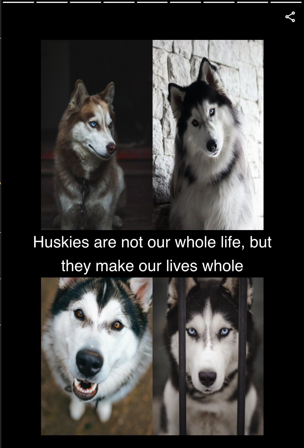
Let's create the last page to contain a collage of Huskies and a text in the middle.
To create a collage will use <amp-story-grid-layer>
Add this to your code.
<amp-story-page id="image-9">
                  <amp-story-grid-layer template="vertical" class="noedge">
                        <div class="wrapper">
                          <amp-img src="https://cdn.glitch.me/9d268a31-4635-4f43-a3a6-ff72fc021e86%2Fsb7.jpg?v=1635197308069"
                          width="720" height="1280"
                        layout="responsive"
                        alt="...">
                            </amp-img>
                        <amp-img src="https://cdn.glitch.me/9d268a31-4635-4f43-a3a6-ff72fc021e86%2Fsb2.jpg?v=1635197312007"
                            width="720" height="1280"
                            layout="responsive"
                            alt="...">
                        </amp-img>
                    <amp-img src="https://cdn.glitch.me/9d268a31-4635-4f43-a3a6-ff72fc021e86%2Fsb5.jpg?v=1635197316881"
                        width="720" height="1280"
                        layout="responsive"
                        alt="...">
                    </amp-img>
                    <amp-img src="https://cdn.glitch.me/9d268a31-4635-4f43-a3a6-ff72fc021e86%2Fsb1.jpg?v=1635197310919"
                        width="720" height="1280"
                        layout="responsive"
                        alt="...">
                    </amp-img>
              </div>
                </amp-story-grid-layer>
              <amp-story-grid-layer template="vertical" class="center-text">
                  <p class="banner-text">Huskies are not our whole life, but they make our lives whole</p>
              </amp-story-grid-layer>
           </amp-story-page>
Update your CSS with the following code:
amp-story-grid-layer.bottom {
  align-content:end;
}
amp-story-grid-layer.noedge {
  padding: 70px;
}
amp-story-grid-layer.center-text {
  align-content: center;
}
.wrapper {
  display: grid;
  grid-template-columns: 50% 50%;
  grid-template-rows: 50% 50%;
}
.banner-text {
  text-align: center;
  background-color: #000;
  line-height: 1.5em;
}
The last page now looks like this, though it is static for now.
To animate you need to specify by using (animate-in) followed by a preset. The presets of animations can be found here
For example, to animate the cover page you add the following code:
 <amp-story-page id="cover-image">
          <amp-story-grid-layer template="fill">
            <amp-img src = "https://cdn.glitch.me/9d268a31-4635-4f43-a3a6-ff72fc021e86%2F3.png?v=1634683890582"
                width="720" height="1280"
                layout="responsive"
                alt="me">
            </amp-img>
                </amp-story-grid-layer>
            <amp-story-grid-layer template="vertical">
              <h1 animate-in= "rotate-in-left">Siberian Husky</h1> <!--  the animate-in has been added -->
              <p animate-in= "rotate-in-right">By Velda Kiara</p> <!--  the animate-in has been added -->
            </amp-story-grid-layer>
     </amp-story-page>
Delay of the animation.
As you animate using the presets they have different durations which you can customize. On the last page of your story, we have a collage of four images. You can add the animate in to the text and the images as well as the animate-in-delay. The animate-in-delay will allow you to see the effects of the image in terms of the time they appear.
You can add the following code:
 <amp-story-page id="image-9">
                  <amp-story-grid-layer template="vertical" class="noedge">
                        <div class="wrapper">
                          <amp-img src="https://cdn.glitch.me/9d268a31-4635-4f43-a3a6-ff72fc021e86%2Fsb7.jpg?v=1635197308069"
                          width="720" height="1280"
                        layout="responsive"
                        alt="..."
                        animate-in="fade-in"
                        animate-in-delay="0.4s"> <!--  the animate-in  and animate-in-delay has been added -->
                            </amp-img>
                        <amp-img src="https://cdn.glitch.me/9d268a31-4635-4f43-a3a6-ff72fc021e86%2Fsb2.jpg?v=1635197312007"
                            width="720" height="1280"
                            layout="responsive"
                            alt="..."
                            animate-in="fade-in"
                            animate-in-delay="0.6s"> <!--  the animate-in  and animate-in-delay has been added -->

                        </amp-img>
                    <amp-img src="https://cdn.glitch.me/9d268a31-4635-4f43-a3a6-ff72fc021e86%2Fsb5.jpg?v=1635197316881"
                        width="720" height="1280"
                        layout="responsive"
                        alt="..."
                        animate-in="fade-in"
                        animate-in-delay="0.8s"><!--  the animate-in  and animate-in-delay has been added -->

                    </amp-img>
                    <amp-img src="https://cdn.glitch.me/9d268a31-4635-4f43-a3a6-ff72fc021e86%2Fsb1.jpg?v=1635197310919"
                        width="720" height="1280"
                        layout="responsive"
                        alt="..."
                        animate-in="fade-in"
                        animate-in-delay="1s"><!--  the animate-in  and animate-in-delay has been added -->

                    </amp-img>
              </div>
                </amp-story-grid-layer>
              <amp-story-grid-layer template="vertical" class="center-text">
                  <p class="banner-text" animate-in="twirl-in"  animate-in-delay="0.1s">Huskies are not our whole life, but they make our lives whole</p> <!--  the animate-in  and animate-in-delay has been added -->

              </amp-story-grid-layer>
           </amp-story-page>
To know different ways you can animate check this out
You can find the complete codebase here and the live site here
To learn more on AMP check out their site
Disclaimer: The images of the huskies used for this project do not belong to me. I found them on unsplash
Whenever you get lost in stories remember that you can always build one. I hope knowing that you can build one puts a smile on your face.
Subscribe to my newsletter
Read articles from Velda Kiara directly inside your inbox. Subscribe to the newsletter, and don't miss out.
Written by

Velda Kiara
Velda Kiara
Velda is a software engineer and Technical Writer who loves creating art by building software applications.