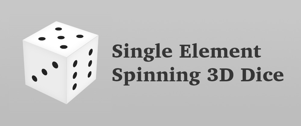
Single element dice with CSS
 Alvaro Montoro
Creating a 3D-looking dice with CSS is not especially difficult. It will most likely be the first demo you'll build when practicing 3D CSS because it is a simple cube with different things on each side.
So it's common to see a dice where the HTML looks like this:
<div class="dice">
  <div class="side side-1"></div>
  <div class="side side-2"></div>
  <div class="side side-3"></div>
  <div class="side side-4"></div>
  <div class="side side-5"></div>
  <div class="side side-6"></div>
</div>
Where every side is translated and/or rotated to form the cube. Then the content is set accordingly (remember that the opposite sides of a dice will always add to 7.) This could be a basic cube's CSS:
.dice {
  animation: rotate 10s linear infinite;
  width: 30vmin;
  height: 30vmin;
  background: #ccc;
  transform: rotate3d(1, 1, 0, 60deg);
  transform-style: preserve-3d;
}

.side {
  background: #f003;
  position: absolute;
  width: 100%;
  height: 100%;
}

.side-1 { transform: rotateX(000deg) translateZ(15vmin); }
.side-2 { transform: rotateY(270deg) translateZ(15vmin); }
.side-3 { transform: rotateX(270deg) translateZ(15vmin); }
.side-4 { transform: rotateX(090deg) translateZ(15vmin); }
.side-5 { transform: rotateY(090deg) translateZ(15vmin); }
.side-6 { transform: rotateX(180deg) translateZ(15vmin); }
Here you can see a demo of this cube (after adding some content and colors):
Drawing that is "easy"... and discussing this with Temani Afif and InHuOfficial on Twitter, we talked about the possibility of making it more of a challenge by drawing a 3D dice but using a single element. Could it be done? How?
In theory, creating a 3D dice with a single element would be possible because, at most, three sides are visible at any given time, and there are three elements that we could use: the element in itself and the ::before and ::after pseudo-elements associated to it. So I started coding, and this is what I ended up with:
How it was done
This solution uses a single element and looks three-dimensional, but as you may have noticed, not all sides are visible! As the rotation happens only over one axis, one of the sides will always be visible (and its opposite side will always be hidden, so we don't need to draw it.) That considerably facilitates the work: the visible side will always be the element in itself. Then we only need to worry about animating the pseudo-elements.
But there's more than that. In total, there are four animations:
- A general animation rotating the dice. This is an animation applied to the element in itself, so it spins over the Z-axis.
- Two different animations for the pseudo-elements. Making the pseudos "jump" from one side to the other and changing their content (from 1 to 6, and from 3 to 4).
- An additional animation for the pseudo-elements, so their color changes as they rotate. That way, one side will be brighter than the other and get darker as it turns, simulating a light.
The problem
This solution is "cheating." It only spins on one axis, and that makes it simpler. But things get tricky if we make the dice animate on more than one axis (so all the sides are visible.) Then, it will require the pseudo-elements to "jump"... and the element in itself, too. And that's when trouble begins: changing the component's location will mess up with the animations and positions of the pseudo-elements.
I haven't been able to complete that part yet. Maybe it's because I had a complex animation, or perhaps because I didn't try hard enough, but I always hit a point where I'd like to use different transform origins for the transforms, which is not allowed in CSS.
Another "cheating" option would be to rotate over different axis but not at the same. That way, all the dice sides will be visible, but it is no more than an extension of this trick version.
Still, I think it should be feasible to create the dice with a single element while rotating over more than one axis at once. So I probably need to change my approach to the problem. We'll see how it goes.
Article originally published on November 29, 2021
Subscribe to my newsletter
Read articles from Alvaro Montoro directly inside your inbox. Subscribe to the newsletter, and don't miss out.
Written by
