DDD App: a Neat Tool for Remembering German Nouns
 CY
CY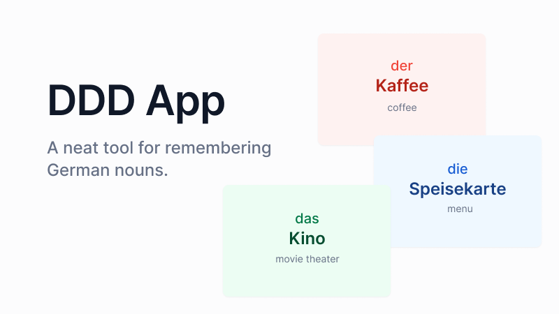
I'm totally late and missed this Hackathon, but I've spent the last three weeks working on this project and I'd love to share it with everyone (for learning purposes).🤞🏻😬
The Problem
In the language world, all German nouns have gender. There are three genders of them, a noun is either masculine, feminine or neuter. And they don't follow the "nature rules", such as how the word "chair" is masculine, not neuter? Because of these genders, each noun has a distinct article, one of the "die/das/der"; in English, there's only one "the". This is why it is more difficult for people to remember nouns when learning German. If you like me who struggle with remembering the genders, I introduce you to the DDD App.
Introducing DDD App
DDD is a flashcard-like application. There are a lot of nouns for people to learn and remember, and there are review sessions to see if they remember them. However, it is more than just a flashcard app.
Color-coded
We use three colors to represent the three genders:
- Red denotes masculine;
- Blue denotes feminine;
- Green denotes neuter;
Color serves as a visual indicator; it does not require much brainwork, but it can still have an impact on the subconscious. With this method when I was thinking of a noun, the specific article did not always come to mind, but the color did.
Spaced Repetition System Algorithm
Many flashcard-ish applications or learning platforms use the Spaced Repetition System technique, but some of them, such as the Anki App, require users to make extra efforts to manually determine whether or not they know a word. (Besides the extra efforts, I sometimes fool myself to choose that I've remembered it. 🤦🏻♀️)
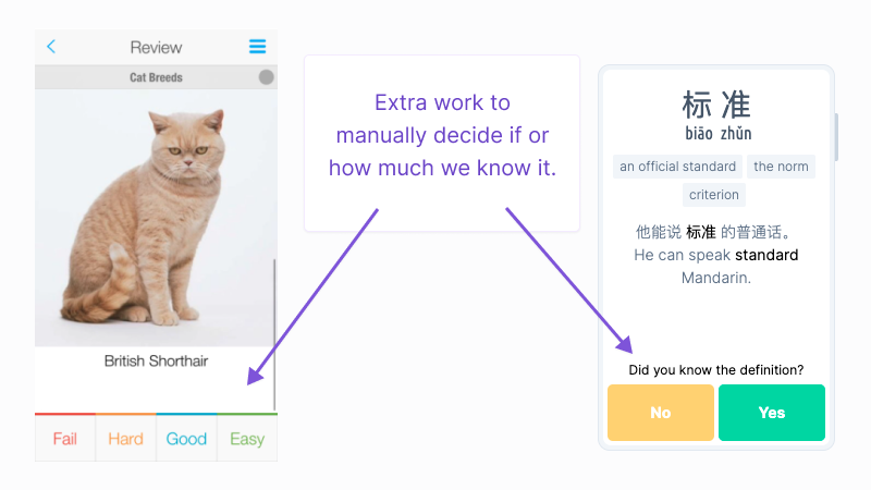
In DDD, our SRS algorithm takes care of this, our app remembers how well a user knows a word.DDD decides when to review some of the words based on whether the user selected the correct answer in his/her previous review sessions.
The following are the six stages of reviewing:
- Stage 0: unlock immediately after learning the word;
- Stage 1: unlock one day after learning the word;
- Stage 2: unlock four days after the first review;
- Stage 3: unlock two weeks after the second review;
- Stage 4: unlock two months after the third review;
- Stage 5: user has remembered the word.
(I've learned these "spaced stages" from Execute Program.)
In case you're wondering, "DDD" is an abbreviation for the German articles "die," "der," and "das." 😄
App Walkthrough
To Learn
After logging into the app, the user can go to the dashboard by clicking the link in the navigation bar. The user can select a set of words to learn from the dashboard (for the time being, there is only one set).
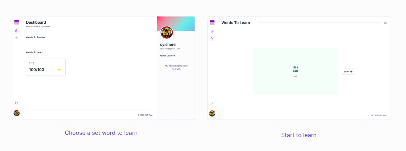
By "learn," we mean that the user reads through the word cards by clicking the "Next" button. A learning session can be terminated at any time. The user's newly learned words would then appear in the "review cards."
To Review
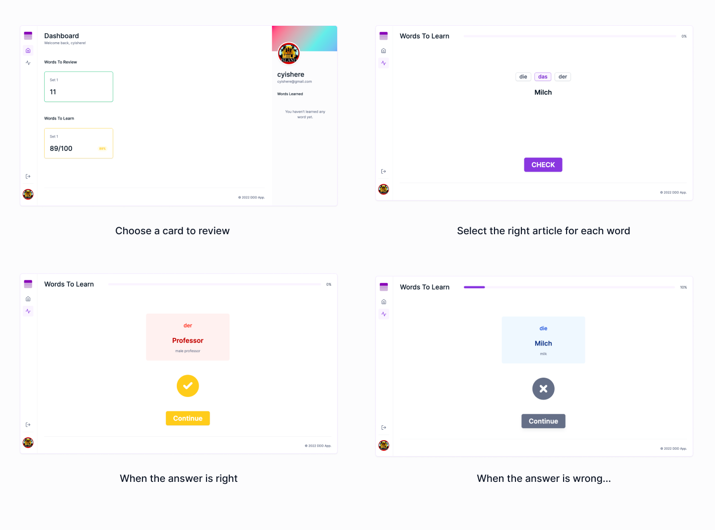
The review cards will appear after the user has learned a few words. To select a review session, click the review card. (If nothing shows up, please refresh the page. Sorry about this.😬) During the review session, the user must choose an article for each word. There are various UI states that indicate whether the user's answer is correct. Our algorithm will use the correct or incorrect result to determine when to review it again.
Technologies and Tools Used
- Design: Figma + Untitled UI
- Backend: Hasura
- Frontend: Next.js + Apollo Client
- Tools: TypeScript, GraphQL Codegen
Building DDD App
Planing
I found out about this hashnode+hasura hackathon on March 13, which means I only have less than three weeks to make this app. I have a clear vision of the functionality parts, but putting them into action requires more work. I decided to begin with design.
Designing
The screens of this app mostly are word cards, which are simple but also have aesthetic requirements. I'm not good at UI design, so I used Untitled UI as the boilerplate and designed the screens in Figma.
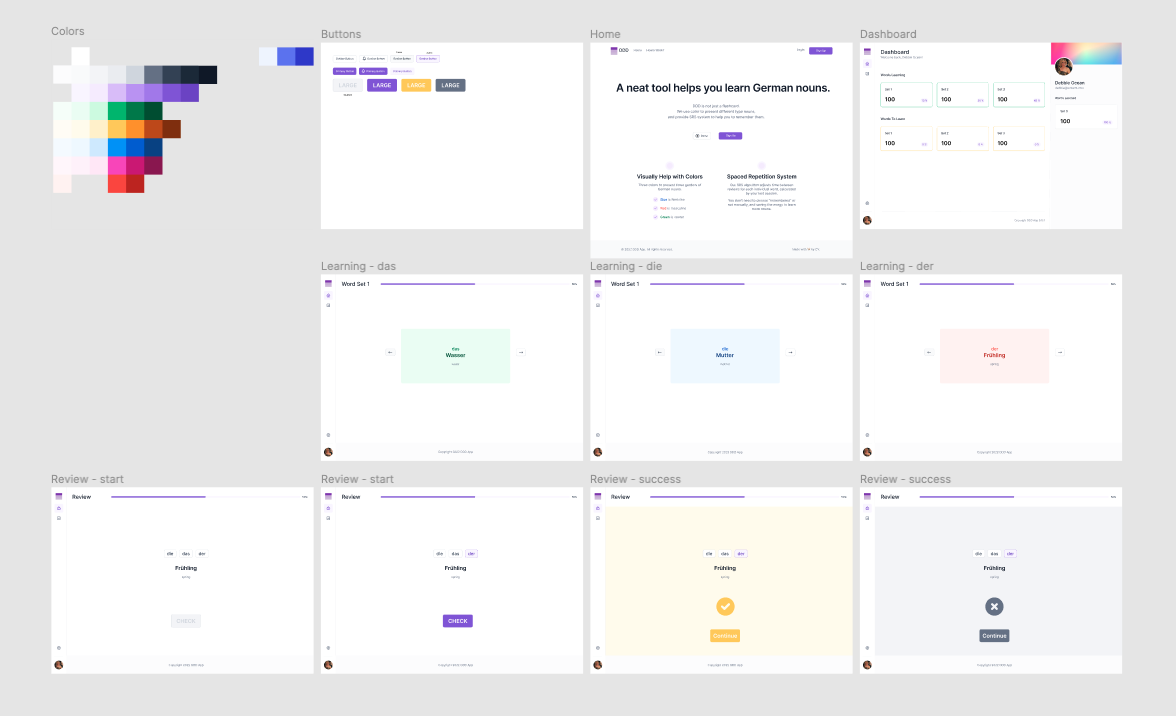
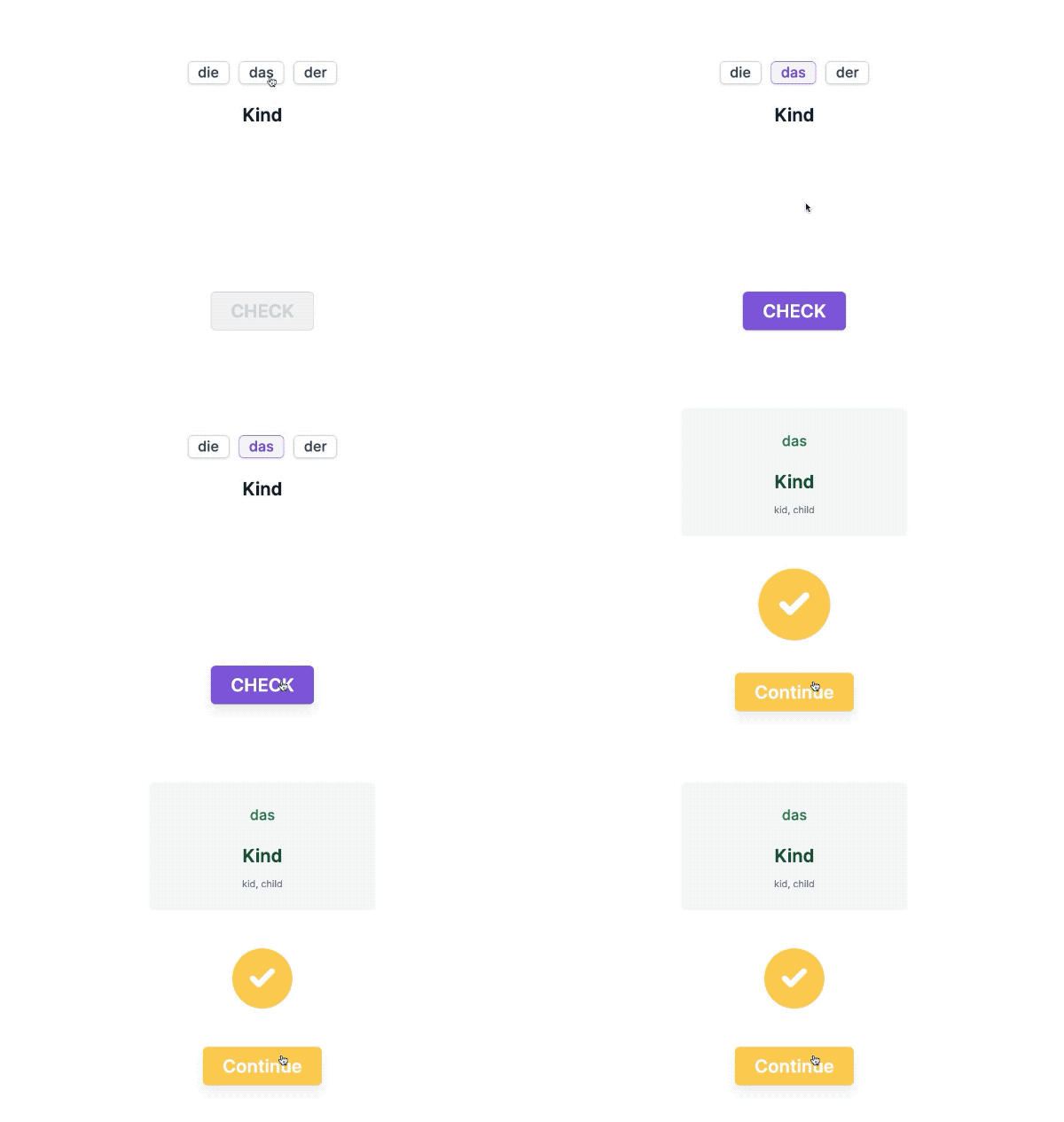
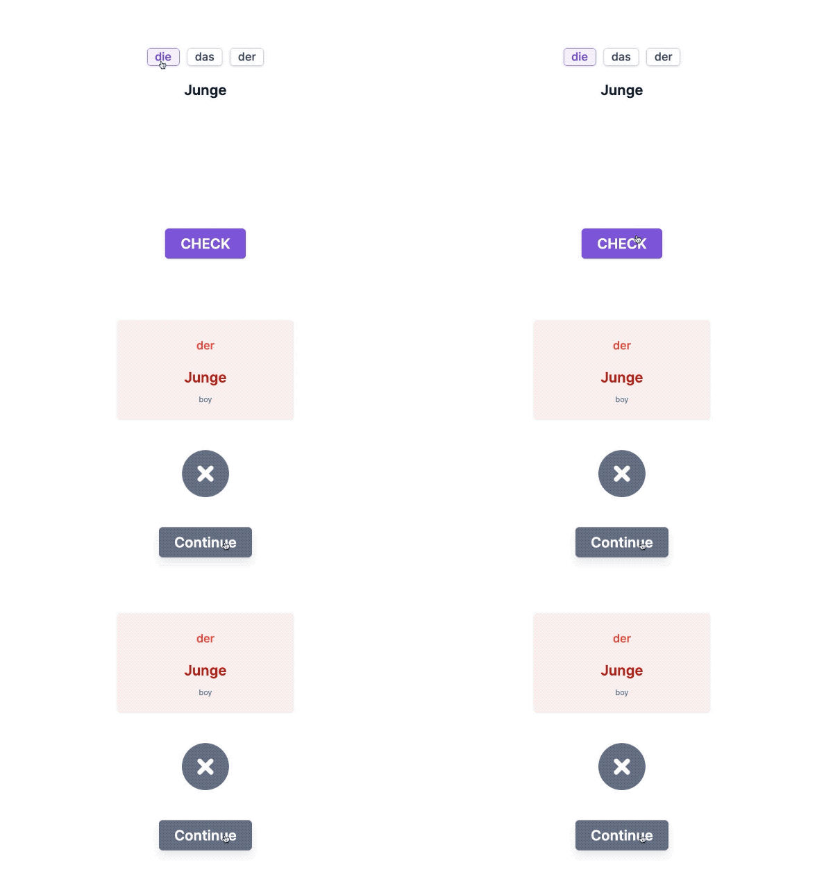
The challenging part in designing is that we are used to using red-ish colors to represent "error" or "danger" and using green-ish colors to represent "success", but the main feature of the DDD app is to use "red" and "green" to represent the nouns' genders. This makes displaying the UI states of "success" and "error" become more difficult.
The decision of using RGB to denote the genders is because these three colors are very common and have their own "tone". The last thing I want is that users need to expend extra energy besides remembering the nouns, and memorizing special colors IS extra energy.
As a result, I chose yellow to represent "success" and gray for the "error" state. Yellow is bright and joyful and has a "success" vibe. Gray is dull and its dark hue is ideal for "failure". Also with a bit of animation.
Building
The easy part is creating the screens with Next.js and styled-components. The most difficult parts are learning how to use Hasura, implementing Auth0 with Hasura and Next.js, wiring up the API to the front-end, and calculating the three types of cards: to-learn-card (how many words remain to learn), to-review-card (how many words are available for review), and learned-card (how many words already learned/remembered).
This is the first time I use Hasura. Before this, my only experience with SQL databases was following along with Prisma's tutorials. So in the beginning, I used Prisma to sketch out my visions to get a better sense of the database, then implement it in Hasura.
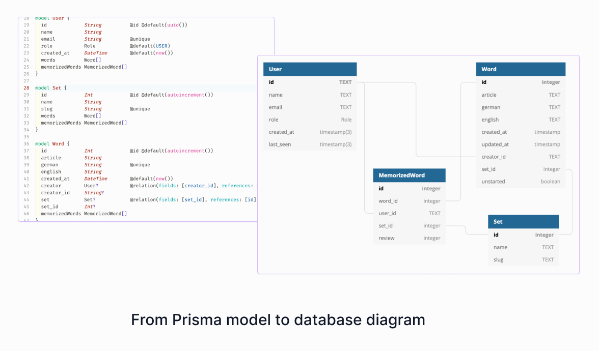
After modeling the database, I spent a week figuring out how to integrate Hasura, Auth0, Next.js, and Apollo Client. Then came the real challenge: querying and mutating with the API.
Deploying
I use Vercel for deploying the DDD app. Vercel is no doubt the best choice for a Next.js app.
Challenges I Faced
Since starting to learn React in March 2020, this is the first app I've created from scratch and without any tutorial references, the first time to use Hasura, and the first time to use Next.js with GraphQL.
I started this journey with full joy and ambition, but now I'm beginning to doubt myself. Whether I made the right decision about the UX flow -- is that helpful to users to know how many words to learn, review, etc? Whether I designed the right database model? Would it be better with those calculations if the database was different?
Anyone who reads my code will notice that there are queries nested within queries that contain calculations and comparisons. Do I truly benefit from the brilliant GraphQL?
What's Next
First of all, fix a bug which is by finding a better way to update the ready-to-review cards. For now, the ready-to-review cards only query from API(database) when the user first time opens the dashboard page. That feature needs to be updated after a user has learned any number of new words. Because of the queries-nested-within-queries issue, I'm not sure how to update it is better: updating the cache or using a subscription to monitor.
And some other todos:
- Improve accessibility with responsive design;
- Add more words; (obviously)
- Add sound effects for the "success" and "fail" states;
- Benefit from Hasura's permission feature.
Useful Links
That's All Folks
This is all about DDD App (for now). If you've read this article and tested my app, please give me some advice. Thank you very much. You can find me on:
Or leave comments here.
Subscribe to my newsletter
Read articles from CY directly inside your inbox. Subscribe to the newsletter, and don't miss out.
Written by

CY
CY
🖖🏻 Hello, my name is Chen Yang, CY for short. I am a self-taught front-end developer who also makes full-stack stuff.