React Portal
 Sukanya Sen
What are REACT portals?
React portals provide a way to render children into a DOM node that exists outside the DOM hierarchy of the parent component. Think of it as Doctor Strange teleporting people through his sling rings 😀
Now, what does it actually mean?
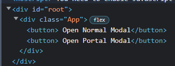
If you check the console of a react app, you can see -

By default React app component is mounted on the "root" div, so, every single react DOM element falls under this root div element. With react portal, an element gets the ability to break out of this DOM tree.

Syntax of React Portal
ReactDOM.createPortal(child, container)
The first argument (child) is any component we want to render, such as an element, string, or fragment. The second argument (container) is a DOM element. We will see an example of how to use it below.
The Importance of Using Portals
Portals can be used for
- Modal dialogs
- Tooltips
- Loaders
Let us understand this with the help of an example.
Below is the code for a sample custom Modal.
const NormalModal = ({ message, open, onClose }) => {
  if (!open) return null;
  return (
    <article className="modal-content">
      <h4>{message}</h4>
      <button className="button" onClick={onClose}>
        Cancel
      </button>
    </article>
  );
};
export default NormalModal;
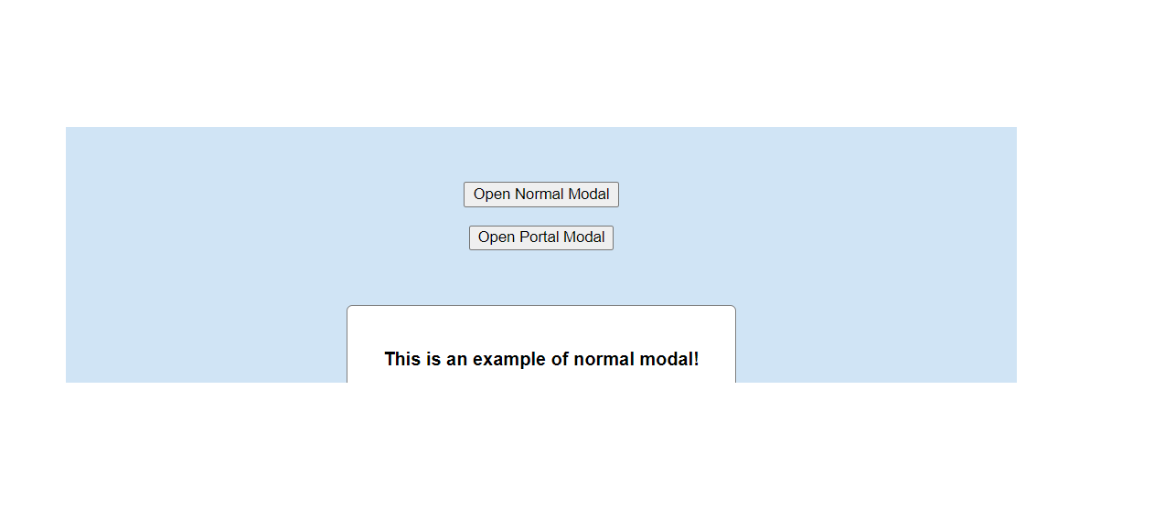
Now if I open the modal, it will render inside its parent, which is okay for small apps. But sometimes the modal is nested so deep that there is a possibility that the modal will be cropped and not be shown properly in the application. A typical use case for portals is when a parent component has an overflow: hidden or z-index style, but you need the child to visually “break out” of its container.

How to Use a Portal?
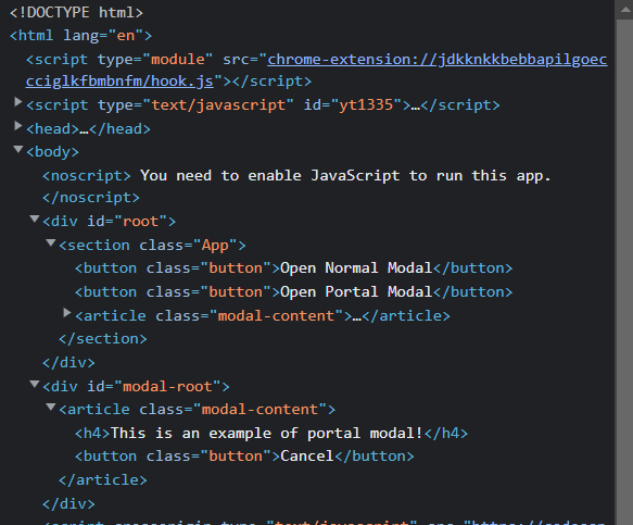
Add a div - 'modal-root' div adjacent to the 'root' div in
index.htmlTweak the code of the normal modal above to change it into a portal modal, add createPortal, its first parameter will be the child i.e. custom modal and the parent will be the modal-root div which was added in the index.html.
import { createPortal } from "react-dom";
const PortalModal = ({ message, open, onClose }) => {
  if (!open) return null;
  return createPortal(
    <article className="modal-content">
      <h4>{message}</h4>
      <button className="button" onClick={onClose}>
        Cancel
      </button>
    </article>,
    document.getElementById("modal-root")
  );
};
export default PortalModal;
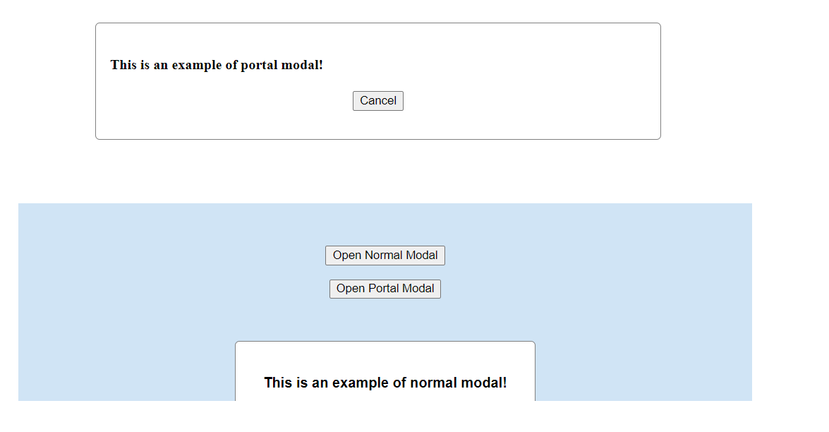
Now if we open the portal modal.


 Congratulations! Your custom modal is ready now!
Since this modal is rendered outside of the root hierarchy, its dimensions would not be inherited or altered by the parent components.
- You can find this example here - Codesandbox, where you can play around.
- Can read more about it here - React docs
Conclusion
- Portal only affects the DOM structure.
- React has control over Portal nodes and their lifecycle.
- Event Bubbling and using context, redux will work as usual.
- When using Portals, you need to define an HTML DOM element as the Portal component’s mount point. Here we used 'modal-root' div for this.
Thanks for reading, hope you enjoyed it!! 🙂
Subscribe to my newsletter
Read articles from Sukanya Sen directly inside your inbox. Subscribe to the newsletter, and don't miss out.
Written by

Sukanya Sen
Sukanya Sen
Aspiring Full-stack MERN developer :)