JSWorld Conference 2022 Summary - 1 June 2022 - Part III
 Mohsen Vaziri
Welcome! Glad to see you in the third part of my JSWorld Conference 2022 summary series, in which I share a summary of all the talks in four parts with you.
You can read the first part here, and the second part here, where I summarized the first seven talks:
- First Talk: Colini talks about the state of Deno in 2022, compares Deno with Node.js, and gives us a taste of working with Deno.
- Second Talk: Negar talks about how browsers render CSS, and then introduces us to CSS Houdini, which is a set of low-level APIs that exposes parts of the CSS engine.
- Third Talk: Dexter goes over his “perfect” stack, using graphQL, SvelteKit, Docker, and Github.
- Fourth Talk: Gift begins with how servers have been managed in the past, continues with how it got better over time with serverless, and what can we expect with Cloudflare Edge services.
- Fifth Talk: Stacy talks about creating a personal brand (blog), using Angular, TypeScript, and static web apps in Azure, and eating the elephant one bite at a time.
- Sixth Talk: Sendil’s talk is about performance and why it matters. He gives some great tips to improve the performance of your app.
- Seventh Talk: Natalia talks about a new provisioning experience in Azure Developer CLI which goes Public preview at end of June.
After this part, you can read the last part here, where I summarize the rest of the talks.
(Recurring) Introduction
After two and a half years, JSWorld and Vue Amsterdam Conference were back in Theater Amsterdam between 1 and 3 June, and I had the chance to attend this conference for the first time. I learned many things, met many wonderful people, spoke with great developers, and had a great time. On the first day the JSWorld Conference was held, and on the second and third days, the Vue Amsterdam.
The conference was full of information with great speakers, each of whom taught me something valuable. They all wanted to share their knowledge and information with other developers. So I thought it would be great if I could continue to share it and help others use it.
At first, I tried to share a few notes or slides, but I felt it was not good enough, at least not as good as what the speaker shared with me. so I decided to re-watch each speech, dive deeper into them, search, take notes and combine them with their slides and even their exact words in their speech and then share it with you so that what I share with you is at least at the same level as what I learned from them
Since I’m trying to include all the important points, I have to split each day into three, four, or maybe five parts to prevent the article from getting too long.**
A very important point
Everything you read during these few articles is the result of the effort and time of the speaker itself, and I have only tried to learn them so that I can turn them into these articles. Even many of the sentences written in these articles are exactly what they said or what they wrote in Slides. This means if you learn something new, it is because of their efforts. (So if you see some misinformation blame them, not me, right? xD)
Last but not least, I don’t dig into every technical detail or live codings in some of the speeches. But if you are interested and need more information, let me know and I’ll try to write a more detailed article separately. Also, don’t forget to check out their Twitter/Linkedin.
Here you can find the program of the conference:
Table of Content
- Micro-Frontends, Three years After: Max Gallo - Principal engineer at DAZN
- It’s easy to create a good-looking product, but what about a useful one?: Eleftheria Batsou - Community manager at Hashnode
- The evolution of javascript: Jemima Abu - Frontend developer at WeMakeWebsites
TL;DR
- Eighth Talk: Max shares lessons he learned after dealing for 4 years with Micro-Frontend at DAZN.
- Ninth Talk: Eleftheria talks about UX and UI from the perspective of both users and developers and why you should care as a developer.
- Tenth Talk: Jemima takes a look at the humble beginnings of JS and how it exploded into the chimaera of frameworks and libraries that we have today
Micro-Frontends, Three years After
Max Gallo - Principal engineer at DAZN
In 2019 he was on stage with Luca Mezzalira to introduce the DAZN approach to Micro-frontends.
In this talk, he talked about what they have learned in the last 4 years dealing with micro frontends every single day at scale at DAZN
Once upon a time
DAZN is a Live Sports Streaming Company, that allows users to watch their favorite football teams from over 200 countries.
In the first years, their Engineering department was growing exponentially (4 developers In 2017 and 500 now) and they had to optimize for scale and growth.
To sustain the team's growth plans, they decided to split their monolith into Micro-frontends. The core concept is the single responsibility of a codebase works well if you have a single team or a couple of teams, but when you start to have 10 or 15 teams it starts to get messy and you need to organize it.
They introduced their specific plan called DAZN Micro-frontends Manifesto.
They modeled their micro-frontends around the Business Subdomain (like main content page, landing pages, contact us, customer support, etc.) and each of those subdomains was a micro-frontend — a completely independent implementation of a subdomain, owned by separate teams.
For example, the entire catalog view is owned by team A and the entire landing page view is owned by team B.
But there were still some problems. Because this industry always evolves and changes, so the written code has an expiration date and it must reflect the business interest.
Domain boundaries evolution
Although It's not easy to define Domain Boundaries, but as we covered briefly, they have arrived to define those business subdomains and the boundaries.
But the thing is business priorities changes over time and our code should reflect that. So they had to revisit their split of the main boundaries, and they tried to shrink and make those domain boundaries smaller or larger. But still, some vertical Micro-frontends were too big for a single team and Cross-teams coordination was needed.
So there were 3 4 teams talking and planning with each other even outside of their team normal daily, and those are signs that we have to think: there are teams which are organizing by themselves, its fantastic, but as a company you have to think twice, is that happened because we wanted to or because the actual teams are fighting back a certain architecture.
The thing is business subdomains are not immutable, so they got back to the drawing board and tried to redefine their boundaries. They tried to split a certain boundary (micro-frontend) into two or merge two boundaries into one. That was helpful because the runtime approach didn’t change, there’s always one team in every view, but at some point, they hit a roadblock.
In some cases, a Subdomain did contain a complex subsystem that was not considered a Micro-frontend. Like Catalog micro-frontend which holds the player. In Such a subdomain there was not a team working on it, but a department! So they couldn’t just split it because there were so many things related to each other.
To address this problem, they had to consider vertical and horizontal split micro-frontends. Here is the difference:
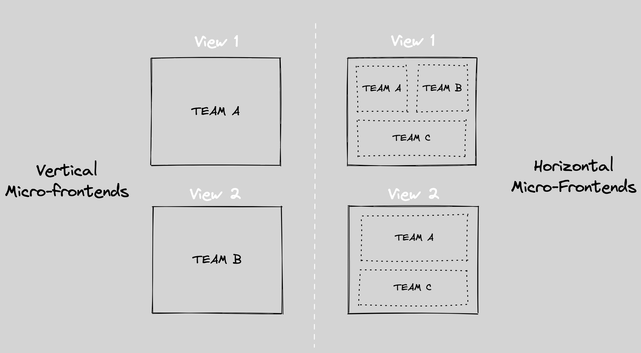
In the concept of Horizontal, you have multiple teams supporting the same view, which need to coordinate with each other about the layout or certain shared libraries.
They took a Deep Dive into Horizontal Micro-frontends to implement these theories and decided to keep the vertical micro-frontend teams as an encapsulation ( host ), and put another team as horizontal micro-frontend working on the complex subsystem, In this case, the player.
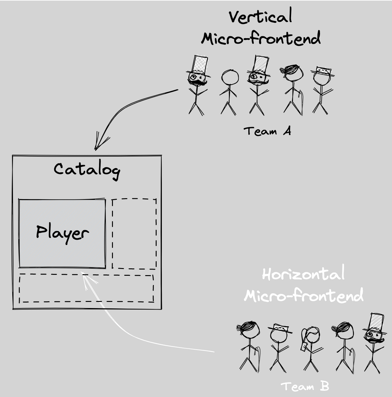
With this new architecture, Breaking Changes releases (major in semver) are blocked by the host, and Other releases (Minor & patch) are owned by the team.
Beyond Team Autonomy
While re-defining the boundaries, they went even further talking about Team Autonomy.
They wanted to push their team autonomy so much, that they were at risk to create silos. Silos in a team are when your team doesn’t communicate enough with teams outside of their teams.
They wanted to keep the team as autonomous as possible but keep the company as organized as possible.
Shared knowledge across Teams
To do that, first of all, they did several frontend guilds once a month or every two months to allow people to talk with each other outside of their team and maybe talk about a library or tech that a team uses.
It’s important for generic rules which work across teams to spot if two or three teams are reinventing the wheel in so many places if it’s so complicated.
Favor Local decisions but have a plan for global decisions
The next one is about decisions. They wanted to favor Local decisions as much as possible but they needed to plan for global decisions.
We work in a complex environment that needs to be prepared for global decisions.
They used Request for comments (aka RFC) and Decision Records (aka ADR) to keep track and to purpose changes. It’s just a wait to express what you want to change and to ask for feedback.
While this is a good practice within a team, if you go across teams they became so important in order to spread the knowledge or to onboard a new joiner.
Enable Discovery beyond teams
You may talk a lot within your team, but outside of your team how are you finding out which new micro-frontends your team added recently? So to solve this problem, they used Backstage (a tool from Spotify). It helps with having an entry point to ease the discovery when you want to have autonomous teams which are aware of what is happening outside of their teams.
Sharing code
Last time on the stage they pointed out that:
We are duplicating by design, not by accident. We are doing that because we favor autonomy from the team at the coast of visual inconsistencies.
Now four years after, they have not shared a single visual component across all the Micro-frontends, yet.
Why yet? Because these things were modeled after DAZN four years ago and they were optimizing for autonomy. That may not be true anymore, because they are changing priorities again and the code and architecture need to follow that.
Right now there are some Shared components, like Payments as a critical component or analytics because of risks of duplication.
Takeaways
- Your business subdomains are not immutable, and so is your code and architecture.
- Share as a solution to achieve a goal, not as a goal. Do not measure the number of shared components for the sake of sharing components, do that because you think it’s valuable and helps you to solve a problem.
- It's always about people
It’s easy to create a good-looking product, but what about a useful one?
Eleftheria Batsou - Community manager at Hashnode
In this talk, she talks about UX and UI from the perspective of both users and developers and why you should care as a developer.
We should start with UX, then go to design and then go to coding. Whereas most of us are just coding coding coding!
UX vs UI
The users perspective
From the perspective of the user, UI is what a user interacts with in a product, what taps or clicks on, and the whole experience is localized externally in a device. Whereas on the other hand, UX is more about how a user interacts with a product and how he/she feels as a result of the interaction which is localized in the user’s physical body.
The Designer’s perspective
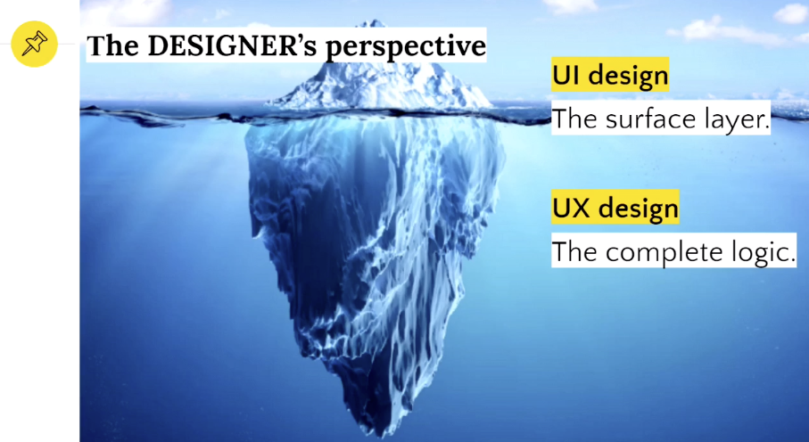
From the designer’s perspective, UI is shat you can see and interact with and UX is what you can see, along with what you can't see, and that which holds everything together.
What is UX, Really?
Us is all about ease and satisfaction and it can be both subjective and objective.
Subjective
- Does the user connect emotionally with the app by cracking a smile?
- Are the icons and illustrations understandable and aesthetically pleasing to the eye?
- Is the user pleasantly surprised by the animated interaction as a feedback mechanism?
Objective
- Does the user accomplish their actions?
- is the speed of response from the app satisfactory?
- is a swiping gesture or a tap more convenient for the mobile user?
Bad VS Good user experience
Would you prefer a ride-sharing app that doesn’t indicate where your driver is located while you’re waiting, doesn’t allow you to make multiple stops when you’re with friends, and doesn’t allow you to save your favorite destinations for quick access or would you prefer another app that is personalized to your riding habits, allows you to get a ride with two taps on your phone, shows you the location of your ride on real-time map and allows multiple stops so you can ride with friends?
Let’s also take a moment and think about our product. Because of our experiences, we assume everything with our app is fine and the user can find something that we want easily. But give your product to a real user, and make them test your product. Will they be able to do the same thing as you do quickly and easily?
Why is UX important?
UX is important because at its core is about putting people before technology. Focus always on creating positive experiences for users, and It will be a win-win scenario for the users and the business.
What does a UX designer do?
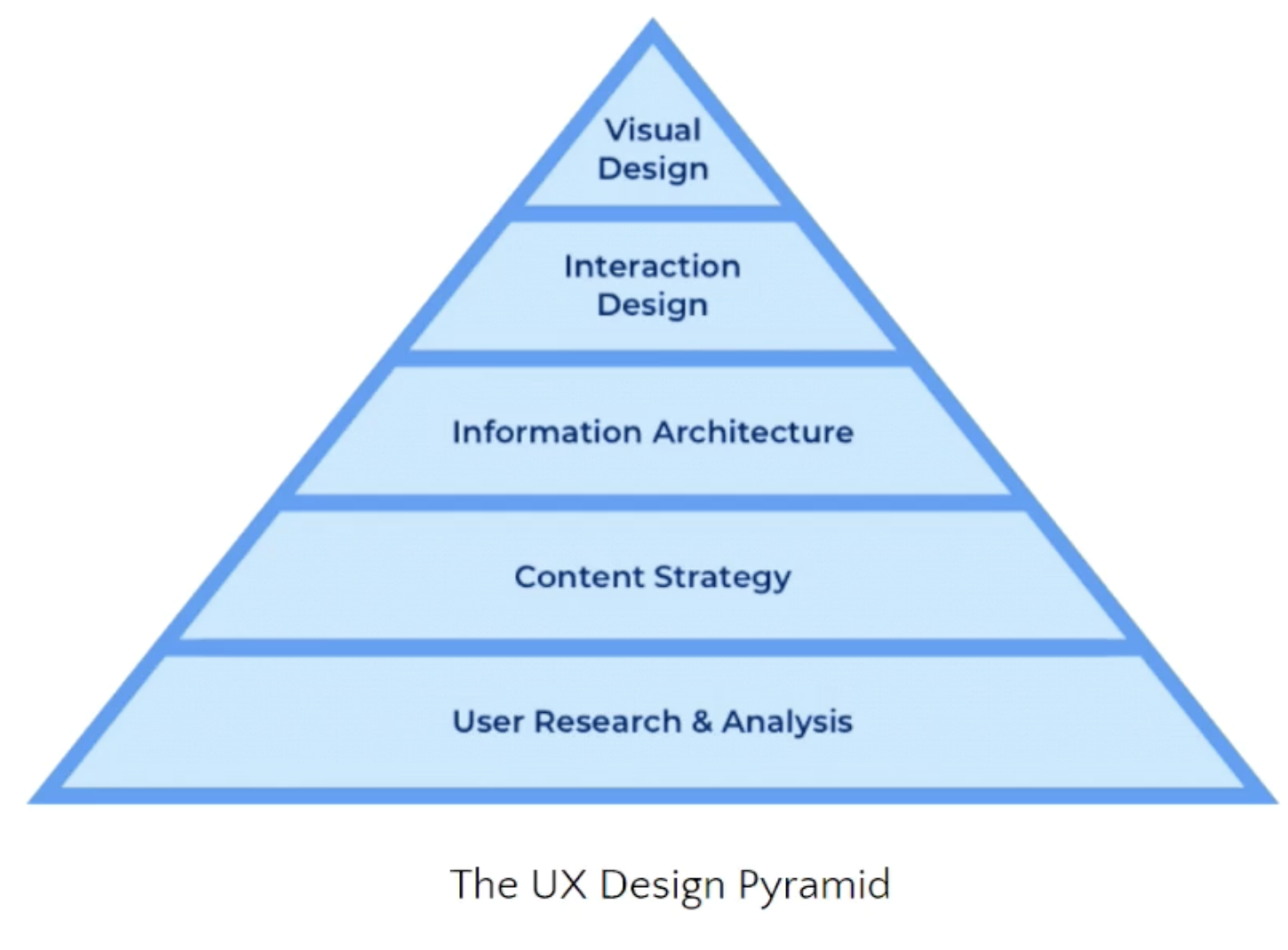
User research & analysis
In this layer, the UX designer will have to do things such as user interviews, user behavior studies, and focus group surveys and when it is done, he/she will have to create user personas, user stories, empathy maps, and customer journeys.
Content strategy
Things such as writing product copy and microcopy, selecting the right wording and tone for the target users and writing email messaging, and designing emails.
Information Architecture
This is very important because it connects all the work we did with the work that our designers are going to do and the way the data is organized and presented, which heavily influences how the product is consumed and used. It’s the lifeblood of digital systems and products. Some of the things in this level are
- Card sorting → for defining taxonomies and simplifying navigation
- Sitemaps → to view relational information structures
- Wireframes → to layout information on a screen
- User flows → to cover multi-step information processes
Interaction design
Here the focus is on user interfaces that are easy to navigate, micro-interactions that enhance feedback, screen states for relaying system status, and interactive prototypes for user testing.
Visual design
Last but not least is about design principles to combine colors effectively, use typography with sophistication, and design icons to speed up recognition.
What is UI, Really?
It’s not just how it looks. A user interface is a dynamic system that facilitates communication between a user and a machine (backend/database), through the flow (input/output) of information, which ultimately lets the users achieve their desired outcome (interaction).
It can be for example an audible! like, google Nest, or textual UI-like terminals.
What does a UI designer do?
As a UI designer, on one hand, we have Interaction Design which is about focusing on the surface details, like buttons, colors, and typography, and giving the finishing touches to the whole product experience, but it’s not only that. The Designer has to know visual design skills such as Typography, color, theory, iconography, illustration, visual hierarchy, alignment, layout, spacing, readability, and contras.
All these elements work in conjunction to define a particular UI’s look and feel.
On the other hand, we have the Visual design, which focuses on possible variations of a screen and how it will respond to the user's input, and a designer has to apply design patterns effectively, create component libraries and establish complete design systems.
If you want to dive deeper into it, here is a great resource: The design of everyday things by Don Norman, Apple’s engineer in the 1980s.
About heuristics

A heuristic evaluation is a method of inspecting and evaluating the usability of a website, or product. There are several inspection methods for heuristics evaluation, like heuristic analysis, cognitive walkthrough, and user testing. The end goal is similar, but the efficiency and validity are not.
| Cognitive walkthrough | User testing | Heuristic analysis | |
| Who | New user | End-user | System expert |
| What | Performs specific user tasks in line with user goals. | Uses the digital product in realistic circumstances | Compares usability to predefined heuristics |
| Why | To determine if the sequential processes to get from point A (user task) to point B (user goal) work in the correct order they were designed to. | To understand how representative users will complete typical tasks in real-life • situations. | To see if the digital product can be used in a way that is most compatible for users and aligns with recognized usability principles |
The 10 usability heuristics by Jakob Nielsen
Visibility of system status
People love to keep things under control, and only then they can feel secure. Some of the examples:
- Time, wifi signal, and battery life status
- Loading state that shows the system is loading a new content
- Empty state in basket
Match between the system and the real world
People presume how the system could work based on their experience with other similar systems. They use 90% using other apps and products so they just have up to 10% of their time for your app. So don’t try to make it very different because your users are going to get confused. For example, we have skeuomorphism design, which is a term most often used in graphical user interface design to describe interface objects that mimic their real-world counterparts in how they appear and/or how the user can interact with them. A well-known example is the recycle bin icon used for discarding files.
User control and freedom
Every system should have a clearly marked “emergency exit” mechanism, which can be an undo button, restore functionality, etc. Whether we want it or not, even if we think we designed the perfect system, our users will make mistakes. They will miss clicking something or they will be in a hurry.
Consistency and standards
A comprehensible system should never confuse users by using different words, visuals, or actions for the same concepts.
Error prevention
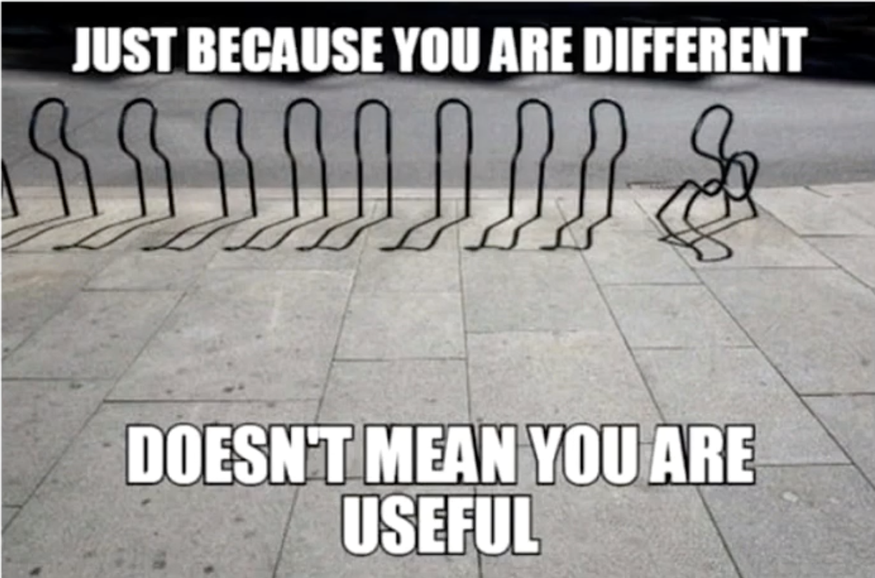
There are two kinds of errors created by interaction with a user interface
Slips, which are the errors that our users are going to do and we already discussed the solution. We should have an emergency exit.
The second one is mistakes. Here the problem is on us and not on our users and it means that we didn’t think of something clear and that’s why our users doing mistakes.
Recognition rather than recall
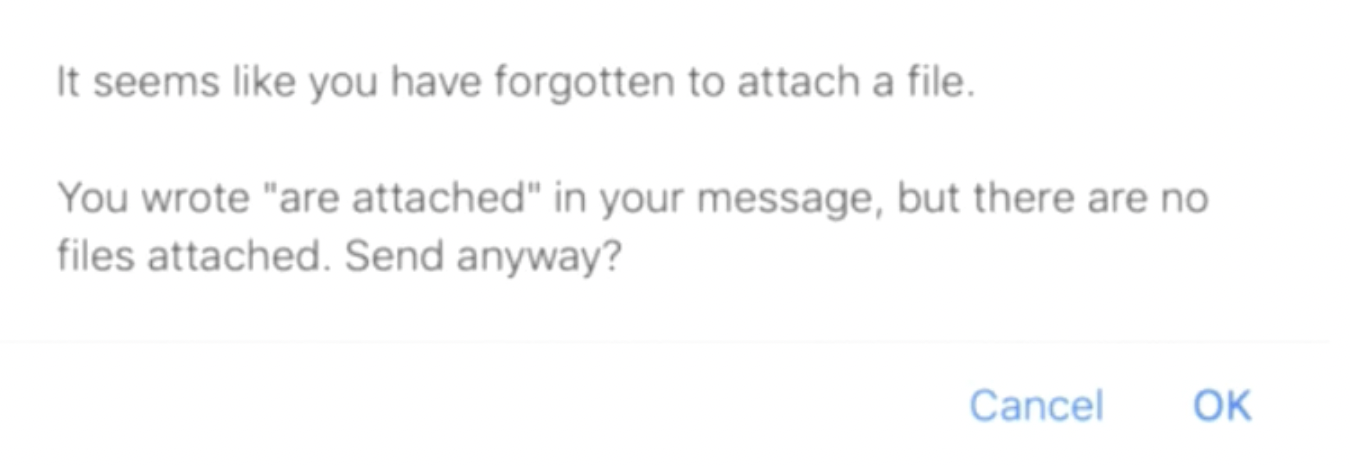
There are two types of memory retrieval: recognition and recall.
Never let the user recall. Always give a hint about how they should use a product or search or type something. Everything should come naturally to them.
Flexibility and efficiency of use
Every user is unique; each has its own different needs and skills. Try to always have something for everyone, either a power user who knows your product and expects some shortcuts, a new user who is slower and needs hints and help, or someone in between.
Aesthetic and minimal design
Minimalism helps users to quickly access important information and come to the result quickly. If you are not sure about what you are doing, just go for the simple version.
Antoine de saint-Exupery:
Perfection is achieved, not when there is nothing more to add, but when there is nothing left to take away.
Help Users Recognize, Diagnose, and recover from errors
Whether we want it or not, users always tend to get themselves into situations that they need to find a way out of.

Help and documentation
Documentation should be well structured, written in a human language, and minimalist.
The Do’s and Dont’s
- Don’t assume you know what users want. Ask real users, or your colleagues but in other teams so that they are not familiar with your product. Don’t just wait for them to use your product and give feedback, but observe them. Look at them and find out how they feel while using your product.
- Don’t follow the hippo (Highest paid person’s opinion) in the room
- Do make the time and effort for user research
- Don’t just create a list of methods to check off
- Don’t prototype too soon even if you plan to test it
- Do focus on what people do, rather than what they say
- If you can only do one thing, do conduct user testing
- Don’t overlook existing insight from customer care representatives
- Do collaborate
- Do find someone qualified to do your research or become one yourself
The designer’s mindset
| The good.. | The bad… |
| Listens to everyone from decision-makers, team members & stakeholders | Judges and suggests solutions all the time |
| Questions the status quo. | Follows the rule of “We’ve always done it this way”. |
| Digs deep to find out real problems and needs | Tries to fix symptoms only. |
| Takes time to ask about what is missing. | Follows his assumptions. |
| Is always uncertain about his understanding and designs. | Is always certain about his work. |
| Loves to be wrong | Loves to be always right. |
| Seeks feedback | seeks praise |
| Leads | Follows |
The evolution of javascript
Jemima Abu - Frontend developer at WeMakeWebsites
In the beginning, there was the web and the web was a simple place. Then came along JavaScript and all that changed. In this talk, she took a look at the humble beginnings of JS and how it exploded into the chimaera of frameworks and libraries that we have today, leading to the vast complexity of web development as a whole.
Episode I - JavaScript: a brief history
In the beginning, there was the world wide web, created by Tim Berners Lee in 1989 and it was a simple place for people. It was like a giant shared folder on which everyone could access the same information.
But sometimes it wasn’t a simple place because we had some websites that looked like fever dreams!
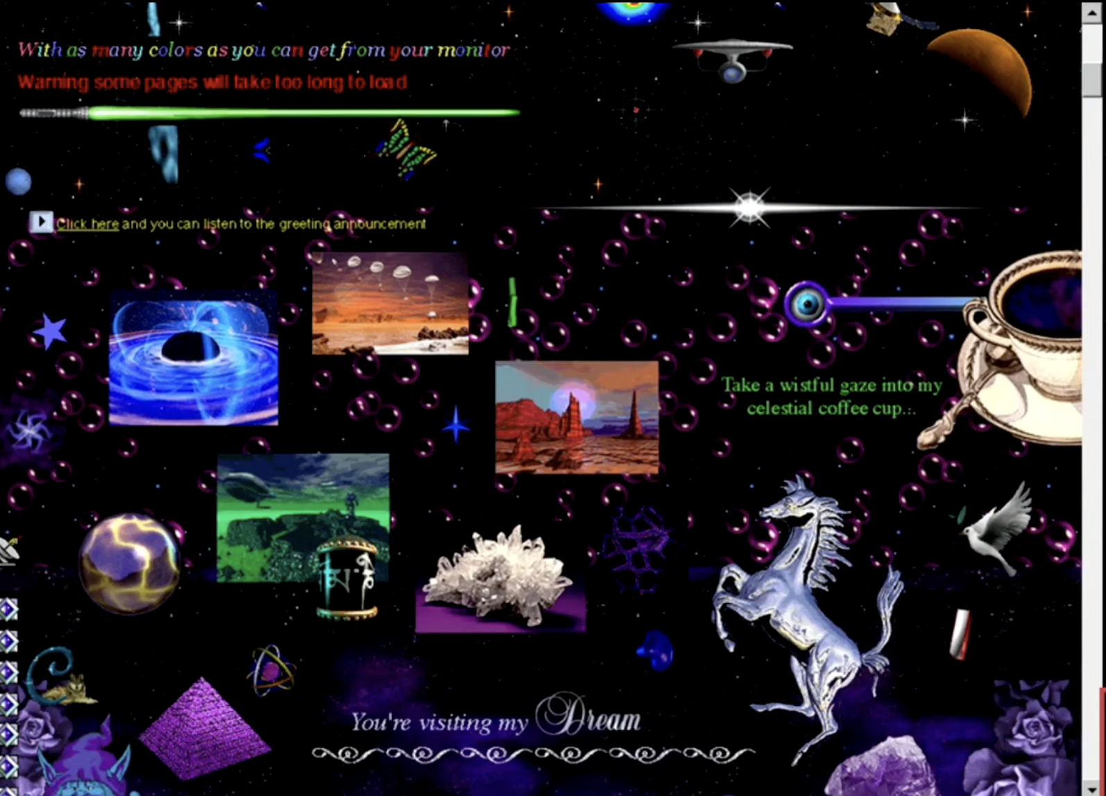
Before Javascript, all websites were static. You could just share text and images. The Problem was for example for a simple login form, if you wanted to validate that form, you had to collect the user email, send it to your server, validate it, and send a response or potential error back to the client. And back then there was even no 3g and the connection was slow. So it could take for example 1 minute to go to the server and one minute to return the error.
Then there was a company called Netscape navigator, they wanted a way to not bother their server with all these less important things like validating user inputs to check if an input was empty or not. they wanted a client-side validation.
That's why javascript was invented in 1995 in 10 days by Brendan Eich.
Brendan Eich:
Javascript is a programming language for web desigenrs and programmers to use embedded directly in the web page not something that was like coming along at the time called java which was a more of a professionals language where you would write real code with type declarations and you’d have to write the code in a way that compiled. I was wrting something that could be used by people who didn’t know what a compiler was they were just going to load it. it was basic.
The many names of JavaScript
When Brendan was working on it was called Mocha, before it was released to Netscape navigator 2.0 was changed to LiveScript, and they called it JavaScript right before it went to development.
So you may ask is JavaScript related to Java? Nope! JavaScript is related to Java the same way carpets are related to a car. They just have similar letters.
The name JavaScript was a marketing ploy to capitalize on the popularity of Java.
Episode II - JavaScript: The rise of the language
When Netscape Navigator released and invented javascript in 1995, that same year Microsoft released Internet explorer and they took javascript and reverse-engineered it and they had their own client-side language called J-Script. They were the same language with the same purposes just with different syntax.
The problem was that J-Script doesn’t run on Netscape Navigator and JavaScript doesn’t run on explorer.
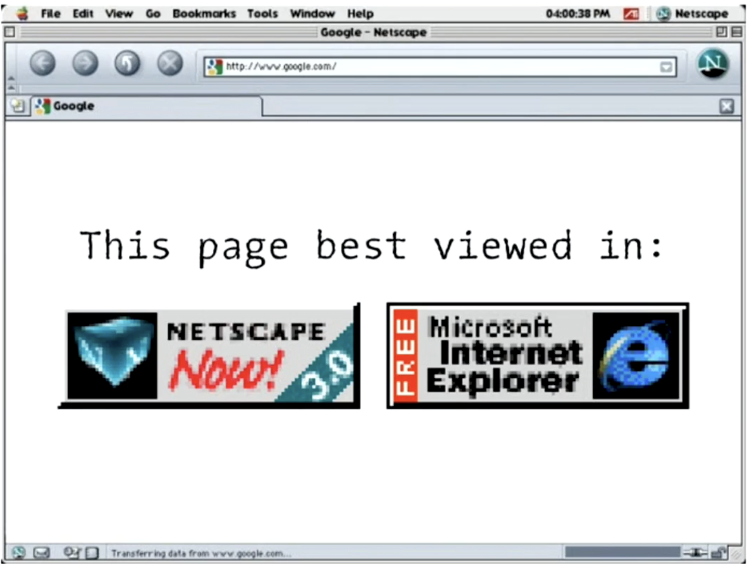
So Netscape reached out to the European computer manufacture association (ECMA) and suggested creating a standardized form of this language. That's how the ECMA script came about.
They were working on ECMA 1, 2, and 3 but with ECMA 4 they decided to make javascript a cool language and put classes modules. But Microsoft didn’t like it because they believed that it sounds like doing too much, So ES4 was never released
But then in ES5, we had other browsers. At this point, Netscape had been acquired by AOL which was the creator of Mozilla Firefox, and Google released chrome with the V8 engine which was the fastest javascript compiler. ES5 was working across all of these browsers apart from Internet explorer.
Internet explorer was popular at first because it was free and came out of the box with windows. But it lost its popularity because it just was not adapting to the times.
The original state of JavaScript
It was the first client-side scripting language and was used by the major browsers and was standardized.
Popularity of javascript
It became popular because it was easy to use. You didn’t need to learn anything about VM, compiler, etc. and as long as you have a browser you can get started.
It not only allowed user interaction with websites but also had so many expansive possibilities.
Eric Elliot, Medium:
Software ate the world, The web ate software, and javascript ate the web.
Today 97.6% of all live websites use javascript and it’s also the most popular language on Github with 2.3M opened pull requests, the second place is python with 1M!
It is a point where websites just won’t work without javascript.
Episode III - JavaScript: Attack of the frameworks
Web 1.0 was the static websites era, we just had simple text and color and images. But Javascript was about the advent of web 2.0, now we have creative websites like social media and blogs.
As JavaScript’s popularity grew, so did the need for improvement. And that’s how frameworks came about, for example, Angular, React, Vue, Swelte, jQuery, and Node.
Timeline of JavaScript frameworks
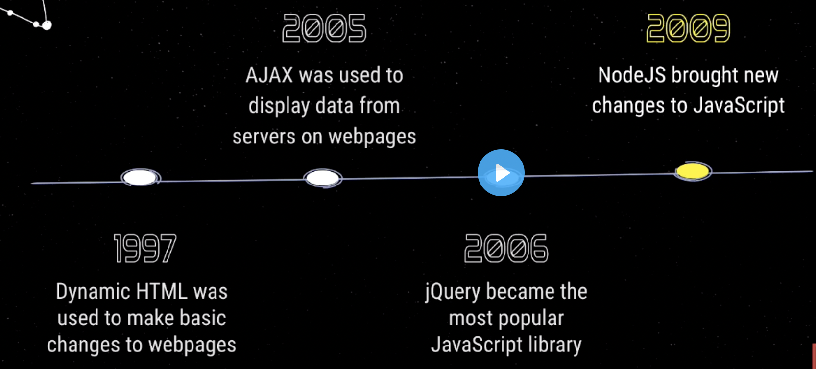
- 1997 - Using dynamic HTML to make basic changes to webpages: Things like client-side validation or getting user interaction on the page. but we were still dealing with static pages. so even if you did send something to the server, the server responds with a new HTML page for you to display.
- 2005 - Using AJAX to display data from servers on webpages: Ajax is what let you communicate with the server directly instead of getting a new page, you get the data from the server, and then you can just display that data on the page without reloading the page. Now JavaScript was less of a client-side form validation language and people started to take it more seriously.
- 2006 - jQuery became the most popular JavaScript library: jQuery made it a lot easier to write javascript which was already an easy language to use. It was a lot more cross-browser compatible because of its own form of standardization.
- 2009 - NodeJS brought new changes to JavaScript: Node.js cemented javascript as a powerhouse of a programming language.
Episode IV - JavaScript: Revenge of the modules
In 2009 npm was created as an open-source package manager for NodeJS.
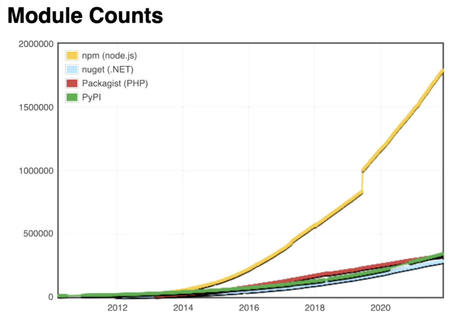
The reason for this difference is that npm is a lot more relaxed than a lot of the other package managers. It allows anybody to upload anything whenever they’d like.
It’s like a fancy social media. you can put all your trash on it and nobody tells you anything.
In 2016, one programmer broke the internet by deleting a tiny piece of code! Azer Koçuluhad had a package on npm called left-pad with 11 lines of code, which added a character before a string.
const leftPad = require('left-pad')

leftPad('foo', 5)
// => "  foo"

leftPad('foobar', 6)
// => "foobar"

leftPad(1, 2, '0')
// => "01"

leftPad(17, 5, 0)
// => "00017"
People used this package as a dependency on their own packages.
One of the open-source JavaScript packages Koçulu had written was kik, which helped programmers set up templates for their projects. it shared a name with Kik messaging app based in Ontario, Canada.
Koçulu received an email from Bob Stratton, a patent and trademark agent who does contract work for Kik and they asked Azer to change the name of the package, which he did not agree to.
Then npm sided with Kik and tried to force Azer to do that, but he decided to take everything down. He removed all his packages on npm (~270 packages) and this tiny left-pad package was one of them!
It made a huge problem for packages using left-pad, and packages using that packages as dependency and so on until even React!
That's why npm introduced a new rule: You can not delete a package, you can only depreciate it.
Episode V - JavaScript: What’s next?
Jeff Atwood:
Any application that can be written in JavaScript, will eventually be written in JavaScript.
When JavaScript has first invented nobody planned for it to be this Giant language, now we have things such as Desktop applications like Electron, machine learning applications that use Tensorflow, the internet of things, and cryptocurrencies, and it's exciting to see what else we can do with it.
End of Part III
I hope you enjoyed this part and it can be as valuable to you as it was to me.
You can read the first part here, and the second part here or continue reading the last part, where I summarize the rest of the talks which are about:
- Eleventh Talk: Gert Talks about upcoming Storybook 6.4, 6.5, and 7.0.
- Twelfth Talk: Wim’s talk is about the problems or difficulties that must be overcome to allow our app to move freely to the phones of our end users and give ourselves the necessities to keep this app running.
- Last Talk: Samuel’s talk is mostly about experience. What is the best developer experience? Are the answers in SDKs, Relations, Love, or Thunder?
Subscribe to my newsletter
Read articles from Mohsen Vaziri directly inside your inbox. Subscribe to the newsletter, and don't miss out.
Written by

Mohsen Vaziri
Mohsen Vaziri
A fast learner and self-motivated Full-stack Web Developer with more Frontend experience, who really enjoys designing and building products with a strong focus on clean architecture with superior attention to detail, and who is able to work alongside other talented IT professionals in creating websites and web apps to the very highest standards. I'm continually evaluating and upgrading my skills to stay at the cutting edge of Web Development. I could consider myself a natural problem solver and solution maker, who has proven himself by successfully completing projects for companies and clients.