Let's understand CSS background-clip Property
 Diksha Jain
CSS background-clip property cuts the background to fit inside a box.
Syntax:
element{
    background-clip:  value;
}
background-clip : border-box
This is the default value of the background-clip. Its sets the background up to the border of the element.
background-clip : padding-box
This sets the background inside the border, which means cutting the background to fit into the padding box.
background-clip : content-box
It sets the background up to the content only.
background-clip : text
It is used with the prefix Webkit. It cuts the background image according to the text element.
let's understand all these by coding.
First of all, we will create four div elements and give some styling to them.
HTML
<!DOCTYPE html>
<html lang="en">
<head>
    <title>background-clip</title>
</head>
<body>
    <div class="box1">This is Box 1</div>
    <div class="box2">This is Box 2</div>
    <div class="box3">This is Box 3</div>
    <div class="box4">This is Box 4</div>
</body>
</html>
CSS
div{
    display: inline-block;
    font-size: 50px;
    padding: 10px;
    margin: 20px;
    color: black;
    font-weight: 900;
    border: 10px dotted black;
    background: linear-gradient(45deg,red,blue);
}
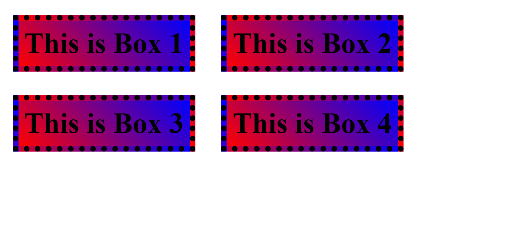
This is how our page should look like:

So far so good, nothing special.
Now, let's use the background-clip property for all four divisions.
We will add the below code to the CSS file.
.box1{
   background-clip: border-box;
}
.box2{
    background-clip: padding-box;
}
.box3{
    background-clip: content-box;
}
.box4{
    background-clip: text;
    -webkit-background-clip: text;
    color: transparent;
}
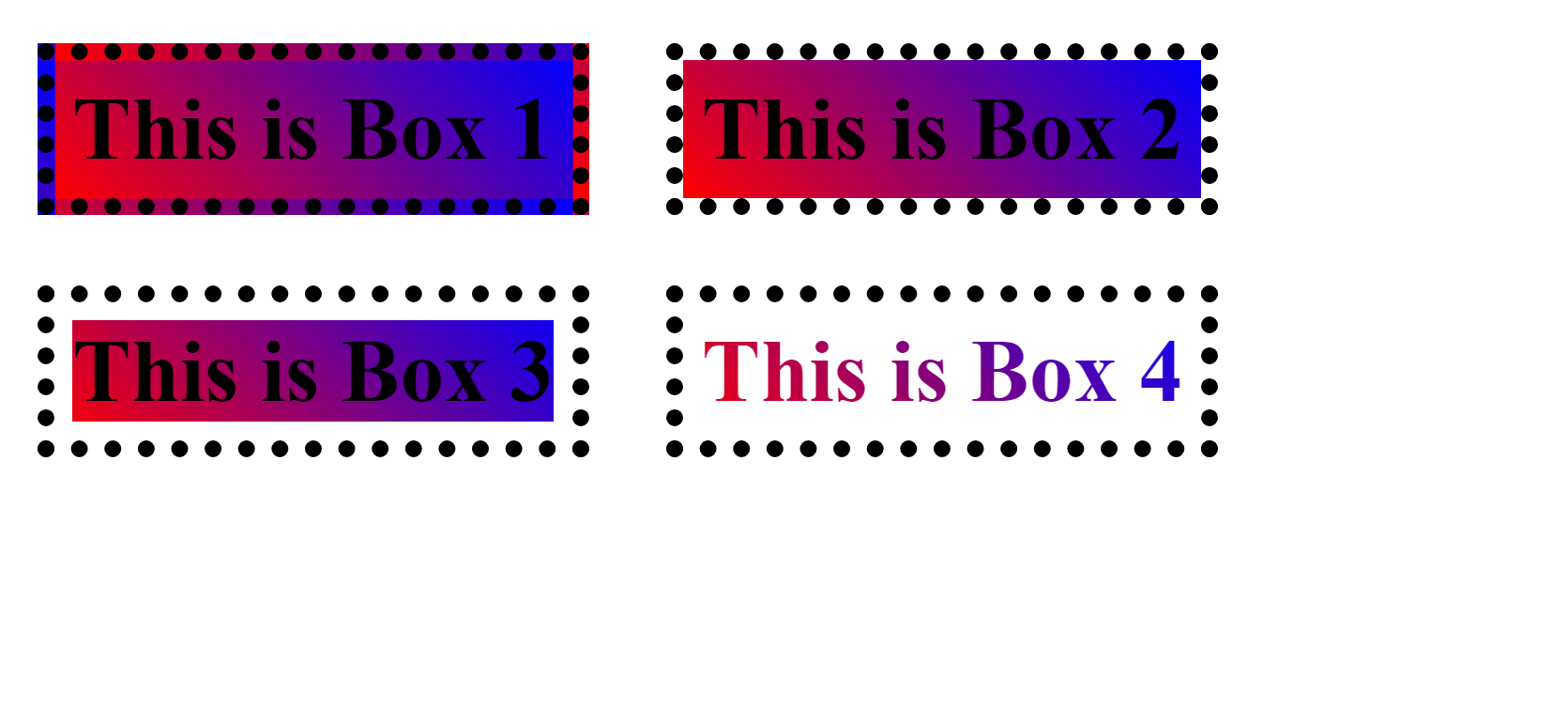
output:

Okay, now let me explain this code.
In the .box1 element, we have set the background-clip border-box, And in the output, there is no difference for the box-1, as the border-box sets its background up to the border, which is already there by default.
In the .box2 element, we have set the background-clip padding-box, And in the output, it is not taking the border of the box into consideration. which means setting the background up to a padding box.
Similarly, In the .box3, we have set background-clip content-box, And in the output, you can see the background is spread only up to the content box. There is a white space in the padding box.
But What about background-clip : text ? Text color changed?🤔
let's understand it.
To understand it, we have to comment out the color which is set to transparent in the .box4 element.
.box4{
    background-clip: text;
    -webkit-background-clip: text;
    /* color: transparent; */
}

So, we can see that the text has its original color(black). What actually happened is that this property has clipped the background in the text field only, because we have mentioned text here.
But only writing background-clip : text ; will not work here as it's not fully compatible. we have to write one more line with the prefix webkit -webkit-background-clip: text;
Okay, now you understood, why we can't see the background? as it is hidden behind the text. Therefore, In order to see the background we have to set the value of color transparent.
Now, you can remove the comment and see the result.
Thanks for reading the article till the end.
I hope, this blog helped you.
Subscribe to my newsletter
Read articles from Diksha Jain directly inside your inbox. Subscribe to the newsletter, and don't miss out.
Written by

Diksha Jain
Diksha Jain
Transforming designs into code and problems into solutions. 🚀🌈