5 Common Android Issues and How To Fix Them
 Arnab Roy Chowdhury
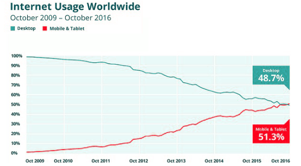
In October 2016, the internet usage share of mobile devices has surpassed the usage share of desktop.

Page Loading Time
Page loading time matters a lot in the user experience of an Android web application. Often it has been observed that a page gets loaded quickly in desktop but takes up a lot of time in mobile. An end user usually waits for a few minutes to get the page loaded and once it does not, he switches to another web application providing the same features. Let’s see how to deal with this issue and prevent a user from leaving your app.
While executing performance testing for your application, test how the application performs under low network coverage. While unit testing, applications are usually tested over Wifi network, but mobile network plays an important role in how your page performs. Optimize your code for faster page load
Check the size of the images used in the page. Avoid using Ultra HD or 4k images. They are perfect for desktop but in mobile they can only reduce the page loading time. If your web app is meant to be operated at multiple platforms, use separate images for large and small screen.
Check out Subresource Integrity- Subresource Integrity is a new security feature that enables browsers to verify that files are delivered without unexpected manipulation.
Internal Page Navigation
Often, mobile web applications are seen to contain multiple menu items in the navigation bar which are difficult to click because of their small size. The same issue happens not only with menu items but with date selection feature and buttons as well. This problem can be very easily dealt with.
While designing the template, it should be kept in mind that navigation in desktop can be done very easily with the use of cursor. But in a touchscreen mobile, instead of a pointer, finger is used which is about a centimetre thick. Size of buttons and links should be optimized to make them easily clickable.
Minimalistic content is the latest trend in user experience design. Home page of an application should be kept simple and instead of a navigation menu clustered with multiple items, use of a hamburger menu which expands on touch makes it easier for the user to navigate through the contents.
Did you know tabindex global attribute- This optional attribute specifies the focusability of the element and in what order (if any) it should become focused when navigated through with the keyboard (“tabbing” through the document).
Responsiveness and Cross Browser Issues
Unlike iOS, Android can be installed free by both developers as well as manufacturers of mobile devices. More than hundreds of Android devices are available in the market, each with different size as well as Android versions and browsers. A page may get displayed properly in one device but may contain horizontal scrollbar or other responsive issues in another. Apart from this, an application may run properly in one browser while cause breakage in another. Since responsiveness of a web application is an important factor in the digital world, let’s see how to deal with it.
Study the market analytics and prepare a list of devices with different resolutions and android versions on which the application is meant to be accessed. Test using emulator plug-ins and make sure that your application is working perfectly in all the targeted devices.
In case of breakage for any specific device resolution, CSS media query will do the trick.
Test your application in both portrait as well as landscape mode and write separate media query for both of them while performing android browser testing.
You can now test on safari browsers, Opera, UC browser, Samsung Internet etc. Lambdatest offers the perfect solution to test your application across different browsers.
Hey, check out Video element- The video element lets you easily play video in a webpage, without requiring a plug-in. This page provides examples of the most common control and properties used for the video element.
Doorslams in Application
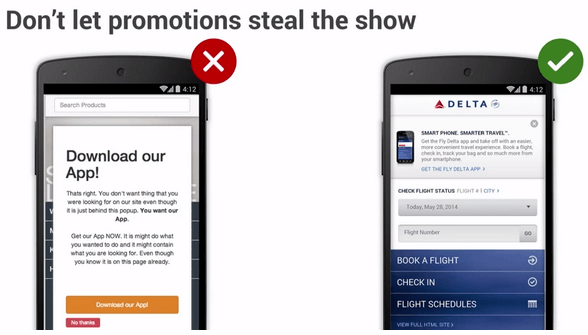
Often, while navigating across a web application, an ad pops up for the native mobile app, blocking the user further access to the website without downloading the app. Website owners usually use this strategy to increase their app download but, in most cases, users may switch to another website instead of
Clicking the confirm button
Go to Google Play Store
Download the App
Wait for installation
Once everything is done, navigate through the webpage.
Ads or unnecessary pop ups reduce a site’s ranking. If you want to promote your application, there are subtle ways to do it.
Well designed banners at the top or bottom of the page that does not block the content may grab the user’s attention to go ahead and download it.
Smart banners provide a better way for handling promotion and advertisement without hampering user experience.

Long Application Flow
Many web applications require users to fill their details or other information in a form. These forms may sometimes get lengthy and tiring for users to scroll constantly and fill out the details. The process is tiring, especially for surveys and job application sites.
This problem should be dealt at the beginning of the design phase.
Linearity in design is a latest UX trend. Users should be allowed to fill the details step by step without filling all of them at once. Uber or Cleartax have already implemented this in their cab booking or tax filing applications
Pop-up suggestions, nudges and other animations that guides the while performing these actions make the overall user experience less boring and more exciting.
The problems mentioned above are simple but matters a lot to your application’s ranking. While developing or testing the app, apart from testing for these issues, a better choice is to experience the application through the point of view of an end user. As a result, many common issues which are often overlooked during testing will be uncovered and you will be able to optimize your site for better performance in any android device. Now test with free APK emulator online!!!
Subscribe to my newsletter
Read articles from Arnab Roy Chowdhury directly inside your inbox. Subscribe to the newsletter, and don't miss out.
Written by
