Maven Airline Analysis
 Data Analytics
Background
It's the fourth week of the Side Hustle bootcamp, my team and I can't tell how insightful this past four weeks has been. I must say my team and I did a lot of researches and brain racking to the end that we meet up with the task for the week in the process improving our analytical skills. This week's task is simply to carry out an analysis of any Airline in or outside our country Nigeria. This analysis is to find out how passengers relate with the Airline and their views of the airline services.
Data Collection
The team scraped data from the Maven Analytics website. We simply decided to jump on the Maven Analytics June challenge though the challenge is over.
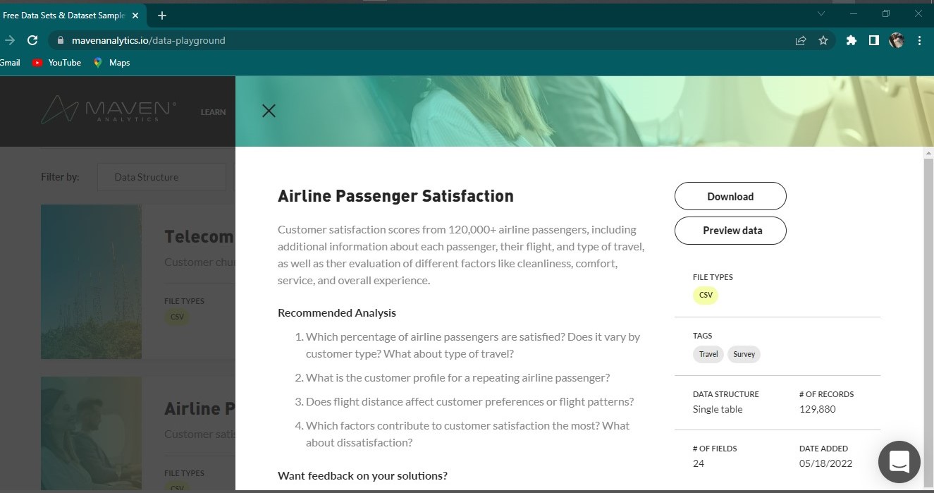
Data Preparation
The following are the steps we followed to prepare our data for further analysis:
- we used the Get Data function on the Power BI desktop to connect to the data which opened up the Navigator where we preview the data.
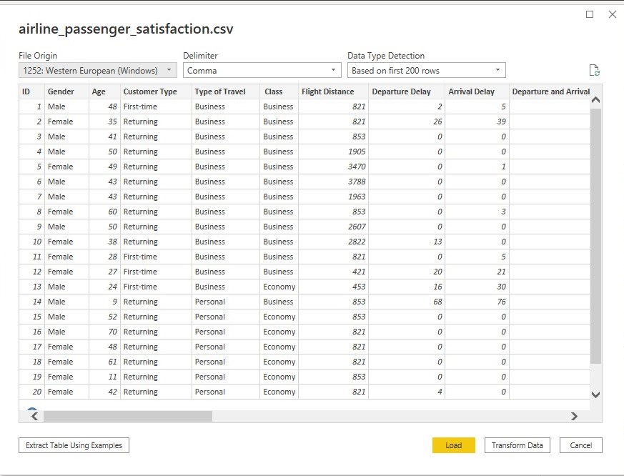
we clicked the Transform Data so as to carry out some analysis in the Power Query Editor and ensure our data is ready for analysis.
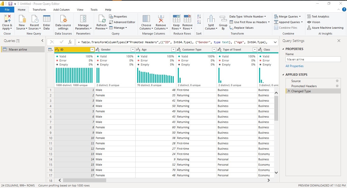
- we renamed the dataset to Maven Airline
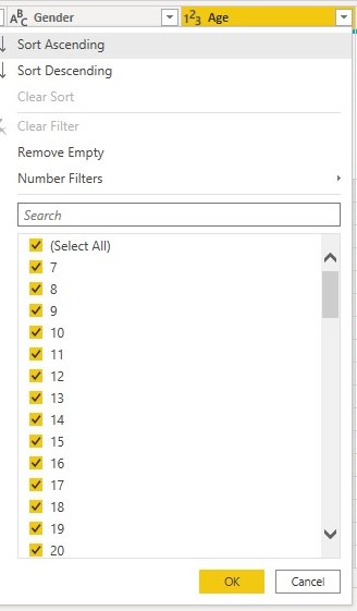
- while previewing the data in Power Query Editor we realized the age ranged from 7-85yrs this led us to create an Age group which we were able to do this using the Conditional Formatting function on the Power Query Editor. Visuals below:

To navigate to Conditional Formatting we clicked on the Add Column button on the Home Tab in Power Query Editor which opened an interface where we selected Conditional Formatting.
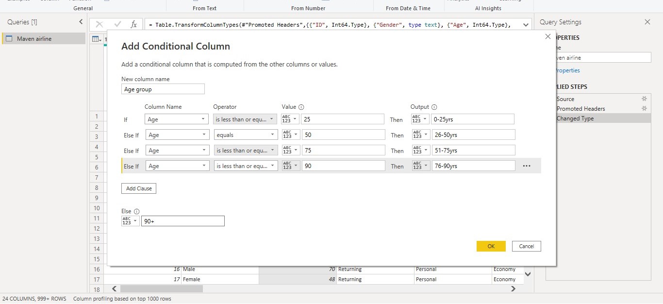
in the Conditional Formatting page we stated the condition we will like to work with as shown in the visual above. The age group we worked with include "0-25yrs", "26-50yrs"... as seen in the visual above.
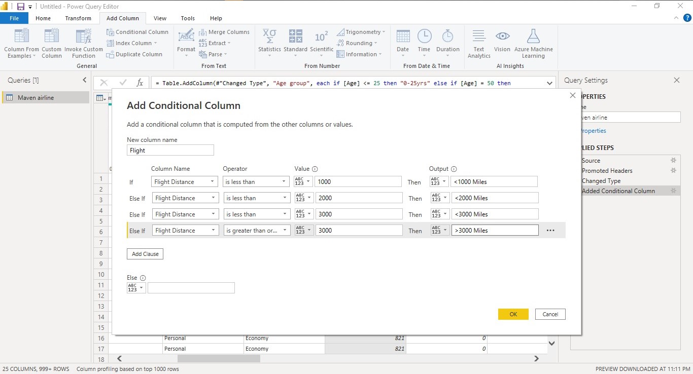
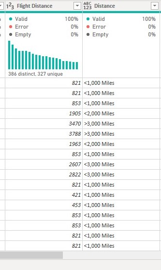
- we also grouped the Flight Distance using the Conditional Formatting function. We grouped this into "<1,000 Miles", "<2,000 Miles"... as seen in the visual below:
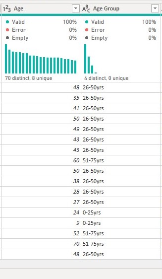
- we previewed the grouping in Power query Editor to ensure there are no errors in the formatting.
- After these we loaded the data into Power BI for further analysis and visualization using the Close & Apply button on the Home Tab of Power Query Editor.
Data Analysis
On Power BI we went ahead to create some measures using DAX (Data Analysis Expressions) functions like Calculate, DistinctCountNoblanks etc.
Some of the analysis we carried out include:
- we used the DistinctCountNoblanks function to find out the total number of customers recorded.

We used DistinctCountNoblanks because we'd like the function to return the number of customers without adding the blanks so as to have a unique data to work with.
- after this we used the Calculate function to calculate the number of customers that are satisfied with the airline services.

We used the Calculate function because it helps to filter out the column we want to total by adding some arguments (Filter). The value we need here is the Number of customers satisfied with the Airline services.
- we also used the Calculate function to calculate the number of customers that are Neutral or not Satisfied with the airline's services.

The Calculate function helps to return the value of a column based on the Filter used. The Calculate function can be used with several other DAX functions like Count, Average etc.
- we then calculated the total of each variables (the rating columns).

we did this to determine which of the variables has high values and which has lower values. The variables were rated on a range of 1-5. 1 is the lowest while 5 is the highest which implies that 1 is least satisfactory and 5 is satisfactory. We summed the variables to determine the level of satisfaction as shown by the passengers. The variable with high sum value shows it is satisfactory while the variable with low sum value shows it is not satisfactory.
Data Visualization
Now that we've made our data ready for visualization we visualized the variables using the charts thought appropriate.
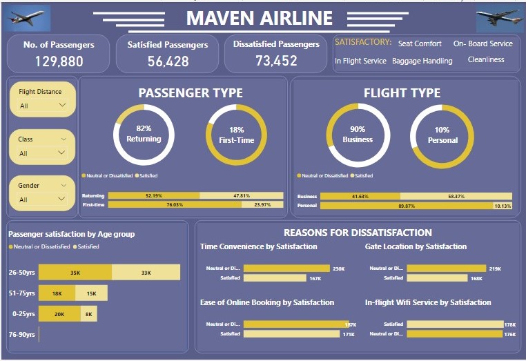
- we used Card to visualize the No. of Passengers, Satisfied Passengers and Dissatisfied Passengers

This Visual can be further filtered by the filters available on the dashboard.
- we then visualized Passenger Type (Returning / First-time passengers).
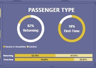
The Donut chart shows of the total no of passengers 82% (106,100) are Returning passengers while 18% (23,780) are First-time passengers.
The 100% stacked column chart shows the percentage of the passenger type based on how they rate the Airline (Satisfactory or Neutral/Dissatisfied):
Of the Returning passengers, 52.19% (55,372) are Neutral or Dissatisfied with the Airline while 47.81% (50,728) are Satisfied with the Airline.
Of the First-time passengers, 76.03% (18,080) are Neutral or Dissatisfied with the Airline while 23.97% (5,700) are Satisfied with the Airline.
after this we visualized by Flight Type (Business / Personal).
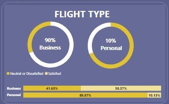
The Donut chart shows of the total no of passengers 90% (89,693) are on the flight for business purposes while 10% (40,187) are on the flight for personal purposes.
The 100% stacked column chart shows the percentage of the flight type based on how they rate the Airline (Satisfactory or Neutral/Dissatisfied):
Of the Business type, 41.63% (37,337) are Neutral or Dissatisfied with the Airline while 58.37% (52,356) are Satisfied with the Airline.
Of the Personal type, 89.87% (36,115) are Neutral or Dissatisfied with the Airline while 10.13% (4,072) are Satisfied with the Airline.
we also visualized the Satisfactory rate of the passengers based on their age range.
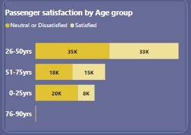
The Stacked Bar chart above shows:
in age group 0-25yrs, 20,168 of them are Neutral or Dissatisfied with the Airline while 8,005 are Satisfied with the Airline.
in age group 26-50, 35,275 of them are Neutral or Dissatisfied with the Airline while 32,830 are Satisfied with the Airline.
in age group 51-75, 17,722 of them are Neutral or Dissatisfied with the Airline while 15, 483 are Satisfied with the Airline.
in age group 76-90, they are a total of 287 and all 287 are Neutral or Dissatisfied with the Airline.
we also visualized the variables (services) with lowest satisfactory rating to show how dissatisfied or satisfied the passengers are with the Airline services.
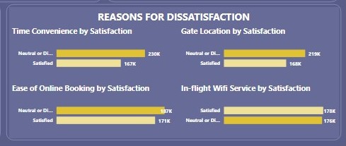
The Stacked column charts above show how satisfied the customers are with services like; Arrival and Departure time convenience, Gate Location, Ease of Online Booking and In flight Wi-Fi service.
- the services that are considered satisfactory by the passengers were listed in a text box.

Theses tiles were put together on the Canvass to make the dashboard as seen below.

Recommendations
The First time and Personal passengers are the most dissatisfied with the Airline Service, listed below are some recommendations to help encourage the first-time Passengers to use the Airline more:
The In-Flight Wi-Fi should be worked on to attend to the concern of the passengers to help them have a smooth nd interesting travel.
the Online booking procedures should be made easier by making the user interface more friendly to the users or adding more instructions to help the booking process.
The time of Arrival and Departure should be looked into so it will be convenient for the passengers.
You can interact with the dashboard Here
In case you missed our last three publications you can check them out here Week 1, Week 2 and Week 3.
Corrections are contributions are welcomed.
Thank you.
Subscribe to my newsletter
Read articles from Data Analytics directly inside your inbox. Subscribe to the newsletter, and don't miss out.
Written by

Data Analytics
Data Analytics
Data Analytics team 12 is a sub section of Data Analytics in the ongoing Bootcamp organised by Side Hustle. Data analytics Team12 is a group 10 rookie DAs whose aim is to make sense of data and provide insightful recommendations to help better the interest of another.