Storyboard vs. programmatically for iOS app UI design
 Irem Karaoglu
Table of contents
With the UIKit framework, there are two options available for creating the UI for iOS apps: Storyboard and programmatically. Both methods offer several advantages.
When I first started learning to create user interfaces for iOS, I wasn’t sure how to decide between using Storyboard and coding the UI programmatically. However, after much research and hands-on development experience, I’m ready to share what I’ve learned and also offer some insights and opinions.
In this article, we’ll compare the pros and cons of creating UI for iOS with Storyboard vs. programmatically. We’ll demonstrate coding the same UI using both methods, and we’ll also discuss which method is preferable for certain circumstances.
Let’s dive in!
Designing iOS UI with Storyboard
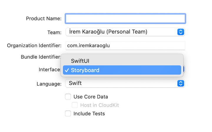
Storyboard allows us to add UI elements to the screen by simply dragging and dropping. To create a project in UIKit with Storyboard, we select Storyboard in the Xcode project Interface dropdown:
Using the Interface Builder, we add UI elements to the screen, as shown in the below video. We click on the + button, select an object, and then drag and drop it to the desired location on the screen.
Creating a sample UI with Storyboard
Let’s create a sample project called Koala-Storyboard. As shown in the below video, we’ll add a koala image and the text “Koala” in the Interface Builder:
Storyboard enables us to add objects to a UI in just seconds. We simply place the object in the desired location and it’s done. However, it’s important to understand that this method does not automatically result in a responsive design.
When we create a UI on a sample iOS device canvas and then build the app on a different device, the end result may have a slightly different appearance.
Here’s an example that illustrates this issue:
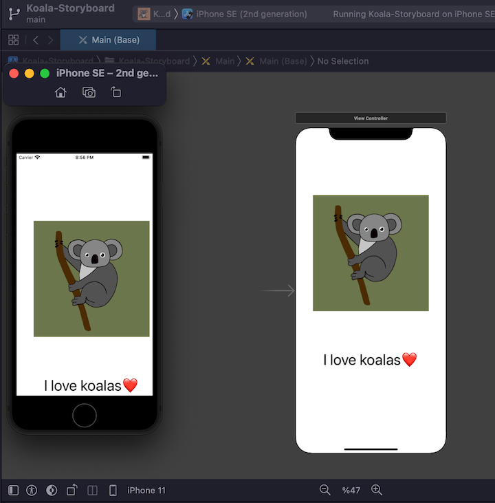
This UI was created on an iPhone 11 canvas (right image) but looks different when run on iPhone SE, 2nd generation (left image).
In order to create a UI that looks the same on all devices, we must add relationship constraints for the different UI elements and use the Interface Builder’s Auto Layout feature. Auto Layout automatically adjusts a UI’s layout to account for device screen size, as well as external changes like a user rotating a device or resizing a window.
First, we’ll add some constraints to have the same UI for different devices. We’ll resize the image and position it to the center of the screen:
Next, we’ll position the “I love koalas” text 64px below the image:
This process enables us to build the same UI for different devices such as iPhone 11, iPhone 8, and iPhone 13 Pro Max. Each device displays the image centered on the screen with text 64px below the image:
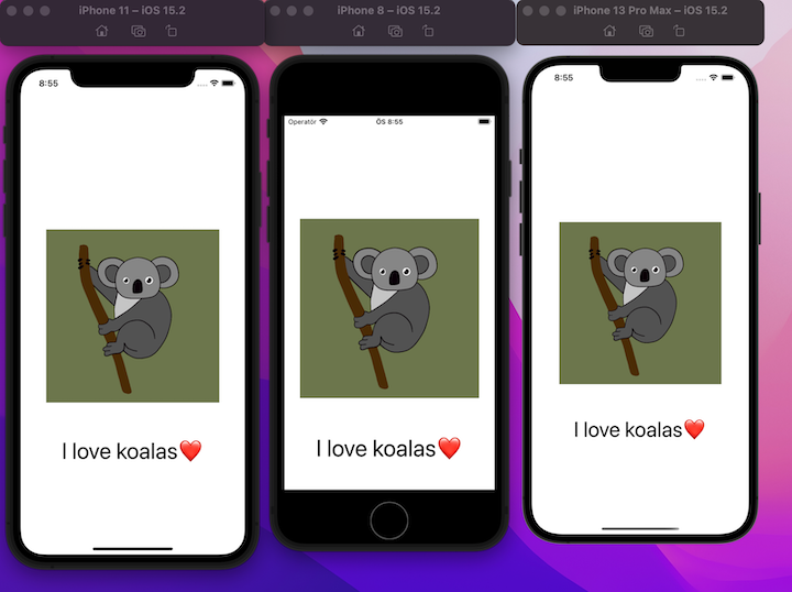
App UI built in Storyboard, using the Interface Builder’s Auto Layout feature.
Although Storyboard does not automatically generate a responsive design, it can be a very useful method for prototyping. To create a demo or prototype, we simply select the appropriate device canvas.
Merging conflicts in Storyboard
Merge conflicts are probably the most significant downside to Storyboard. Merge conflicts can occur easily, and because Storyboard is actually an XML file, it can be difficult to debug and resolve the conflict.
Let’s review a Storyboard merge conflict scenario:
Assume we have two developers: Developer A and Developer B. Both are working on a particular screen. Each developer has their own branches that are created from the main branch.
During development, the following sequence of events occurs:
- Developer A moves the
imageView(in this case, the koala image) up by a certain number of pixels - Developer B adds a button and moves the
imageViewdown by a certain number of pixels - Developer B’s branch is merged to the main branch
After these events, Developer A’s branch is behind the main branch, and their branch’s codebase is outdated. Developer A tries to merge their branch with the main branch, but there is a merge conflict:
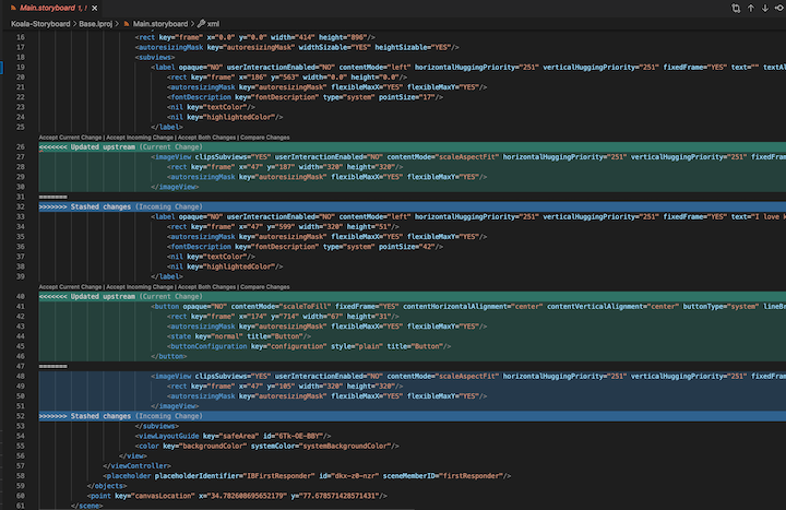
Merge conflict shown in VS Code.
We can see the conflict in the VS Code. The updated stream (shown in green) represents Developer B’s changes. The stashed changes (shown in blue) represent Developer A’s changes.
There are three options for attempting to resolve the conflict:
- Accept the most recent changes (Developer A’s changes) and lose the updated stream (Developer B’s changes)
- Accept the updated stream (Developer B’s changes) only
- Accept all changed lines, without losing a single change
Accepting every change (option 3) may initially seem like the best option, but first, let’s take a closer look at the code.
One developer moved the imageView up, and the other moved it down. The file now consists of two imageViews (on lines 26 and 48). Since both imageViews have the same ID, we’re seeing an error when we open Xcode:
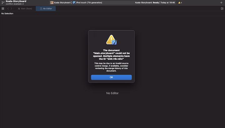
Merge conflict error in Xcode.
Merge conflicts are not uncommon in development, and they happen fairly frequently in Xcode. Xcode adds some references and IDs to the XML file. So, as a UI becomes more elaborate, the XML file becomes more complex. Even just two developers working on the same UIKit Storyboard project can face a merge conflict that will take some time and attention to resolve.
Pros and cons of using Storyboard to design UI for iOS
Here’s a summary of Storyboard’s pros and cons:
PROS
Easy option for adding UI elements to the screen (drag and drop)
Easy option for prototype creation (static UI)
Provides a visual representation of all screens on Xcode
CONS
Difficult code review (XML file)
Requires constraints for auto layout (responsiveness)
Hard to resolve merge conflicts (XML file)
Difficult for more than one developer to work on the same screen
Code is not searchable
Performance (app load time) can be impacted if Storyboard is not well organized
Does not support animations (any animations must be added programmatically)
Difficult to see the properties of UI elements
Designing iOS UI programmatically
Building UI programmatically means creating the user interface in code (Swift, to be exact), rather than using the Interface Builder.
To create a project in UIKit programmatically, we create a new Xcode project and initially select Storyboard as we did before. Xcode creates a storyboard by default and makes it the initial screen. We go to Project Navigator and remove any references to Storyboard. We also make some configuration changes to Info.plist and AppDelegate.swift to remove the Storyboard dependency. For a tutorial of these configuration changes, follow along with this video.
To build UI programmatically, we first create an instance of a UI element. Then, we code the position of the instance on the screen.
Creating a sample UI programmatically
Let’s create a sample user interface programmatically that will match the Koala-Storyboard.
We’ll use the following Swift code snippet:
let koalaView = UIImageView()
koalaView.image = UIImage(named: "koala")
koalaView.translatesAutoresizingMaskIntoConstraints = false
view.addSubview(koalaView)

NSLayoutConstraint.activate(\[
  koalaView.centerYAnchor.constraint(equalTo: view.centerYAnchor),
  koalaView.centerXAnchor.constraint(equalTo: view.centerXAnchor),
  koalaView.widthAnchor.constraint(equalToConstant: 320),
  koalaView.heightAnchor.constraint(equalToConstant: 320)
\])
First, we create an UIImageView called koalaView. We give it an image attribute, UIImage, and a file name, koala. We add this subview to the parent view.
Then, we use the NSLayoutConstraint class to position the UI element. We center the UI element in the screen by specifying that its centerYAnchor and centerXAnchor values should equal the parent’s (in this case, the screen’s) centerYAnchor and centerXAnchor values. Just as we did with Storyboard’s Interface Builder, we specify the image’s width and height to be 320px.
let koalaText = UILabel()
koalaText.text = "I love koalas ❤️"
koalaText.font = UIFont.systemFont(ofSize: 42)
koalaText.translatesAutoresizingMaskIntoConstraints = false
view.addSubview(koalaText)

NSLayoutConstraint.activate(\[
      koalaText.centerXAnchor.constraint(equalTo: view.centerXAnchor),
      koalaText.topAnchor.constraint(equalTo: koalaView.bottomAnchor, constant: 64)
\])
We create a UILabel() for the “I love koalas” text and specify a UIFont size to match that used in the Storyboard example. Next, we use the centerXAnchor.constraint to center-align the text horizontally (along the x-axis). We use the topAnchor.constraint to position the test 64px below the image’s bottomAnchor.
Here’s an example of the UI created programmatically:
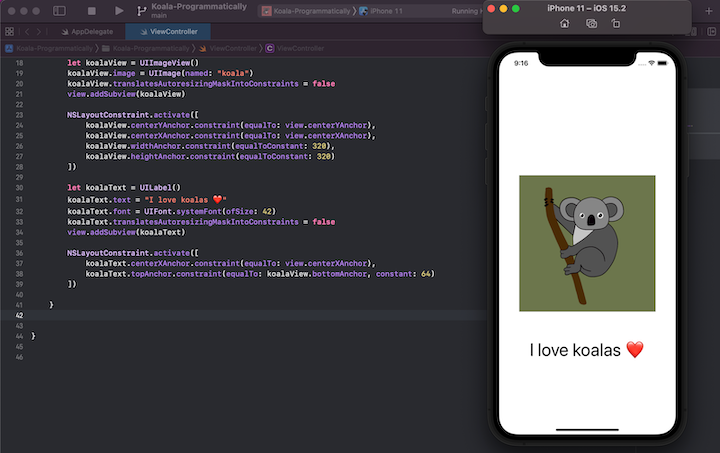
Demo of the app UI built programmatically.
N.B., Apple provides theNSLayoutConstraint class for constraining the relationship between UI elements; however, some third-party libraries provide the same functionality with greater ease. One of the most popular libraries is SnapKit. To learn more about SnapKit, check out its repository on GitHub.
Pros and cons of creating UI programmatically for iOS
Here’s a summary of the pros and cons of building UI programmatically:
PROS
All UI and screen control is in one place
Code may be searched and reused
Easy code refactoring for experienced developers since the developer is in control of the UI elements
Easier to resolve merge conflicts
Easy to see the properties of UI elements
Supports adding animations
CONS
Most developers find it more time consuming to write code vs. drag and drop
No visual representation of screens until the code is run
Potentially complex refactoring, in cases of old code or code that was written by another developer
Requires constraints for auto layout (responsiveness)
Conclusion
in this article, we evaluated the pros and cons of using Storyboard to create an iOS app user interface vs. building it programmatically. We showed that each method can be advantageous, depending on the scenario. Here are the repositories for the Storyboard example and the programmatically example used in this article.
I recommend getting comfortable using Storyboard as well as designing programmatically so that you can decide which method to use on a project-by-project basis.
If you have an urge to create a static UI and are a solo developer, Storyboard is probably the best option. Storyboard is quick, and without other developers working on the project, you won’t face merge conflicts.
I hope you enjoyed this article. If you have any feedback or would like to share knowledge on this topic, feel free to reach out to me in the comments below or directly at hi@iremkaraoglu.com.
The post Storyboard vs. programmatically for iOS app UI design appeared first on LogRocket Blog.
Subscribe to my newsletter
Read articles from Irem Karaoglu directly inside your inbox. Subscribe to the newsletter, and don't miss out.
Written by

Irem Karaoglu
Irem Karaoglu
iOS Developer at Hepsiburada