A UX starter pack - part II
 Soundarya Rangarajan
In my previous article, I introduced some interesting color principles. In this one, you'll get a peek into a different set of terms and user experience essentials.
Response time
Response time refers to the total amount of time it takes for the software to respond to a user request. Naturally, we wouldn't like to keep the user waiting, so a general rule of thumb is to minimize response time (I was surprised to find just how soon users lose patience!) This mostly involves optimizations at your backend. UX design too, however, plays a crucial part in how end users perceive delay, with certain aspects such as UI animations (transitioning from one screen to another, for example), progress indicators and more.
So- the backend optimizations plus a good interface should be enough, right? After all, faster is better?
Not necessarily.
While it is true, in general, that faster response is better for keeping the user engaged, there are certain cases where medium-paced visual cues can be helpful. Yes, this can mean deliberately setting some latency or including descriptive animations on your frontend. A great example can be found in the game Angry Birds, as explained well in this article. The flight of the birds is deliberately slowed down to let the user register the path followed, allowing them to perform better in subsequent attempts.
Response time is thus much more complex than "faster is better", and can effectively be used to
- Aid in the user's learning process, and error correction
- Signify work in progress, giving an opportunity for users to acknowledge and appreciate the behind-the-scenes work
- Standardize response times. Your server response speed may vary, so an effective method is to pad it on the frontend. In fact, it's interesting to note that user research has proven consistency to be more important than speed.
Acknowledgements, confirmation and interactivity
We now know the importance of response time, but it's important to couple it with acknowledgements and confirmations.
Confirmation clarifies action details with the user. It double-checks user intent, and this can be crucial while performing important actions. Remember the alert dialog that pops up when we want to delete a picture? It's good to be double-sure before performing certain actions, especially those that can't easily be undone.
Acknowledgement is super important, yet often overlooked- even big tech is guilty of this. The most frustrating bit for the user is not knowing whether an action has been successfully performed or not.
The below UI flow (before and after a user taps the button), for example, does not do a good job of indicating an action performed- the change is hard to catch at first sight.

Observe this second one, however, and you can immediately see how it's far better than the former.

Context and short-term memory
Ever found yourself on a screen where you feel you're missing some crucial bit of information, such as what previous choice led you here, for example? Turns out this is an important aspect of UX: context. Good design always lets the user feel comfortable and in control of any process flow within the app.
So, how do you convey context to the user? Here are a few examples
- Breadcrumbs: for large apps or websites, with multiple pages, this directory-path-like element can be very helpful.

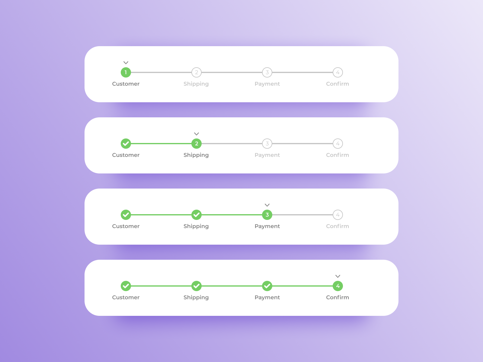
- Progress Steps: It's most likely that you've seen these progress bars on signup or checkout pages. It provides a very crisp overview of the process to the user, and that can prove invaluable.
 Design from https://dribbble.com/shots/7434415-Daily-UI-086-Progress-Bar
And voilà, we have now equipped ourselves with elementary UX concepts. The research I did for this article (part-II, especially) proved very educative, bringing to light many user behaviours and design concepts I had no idea about; I hope it was just as insightful for you!
Subscribe to my newsletter
Read articles from Soundarya Rangarajan directly inside your inbox. Subscribe to the newsletter, and don't miss out.
Written by

Soundarya Rangarajan
Soundarya Rangarajan
I'm a comp sci student and developer. I love thinking up unique solutions and designing them as much as I love coding them up! And of course, you guessed it- I enjoy writing :)