Setting up your own design system with React + Typescript
 Ishan jirety
Hello people, In this article, we will look into building your own design system with minimum setup.
Most of you must have heard about CSS in JS, there are different libraries that allow you to write and compile styles that are written in javaScript. One of them is styled-components now this library is sufficient to design the whole interface and build the components.
But who likes to set up different files for different styled-components. So here styled-system comes into the picture this library is built on top of styled components it allows you to style the components by just passing props, isn't this cool ✨
Let's deep dive into styled-system
A styled system is a library that basically allows you to pass props and style the component accordingly, this becomes a very lenient process in which different developers can style components according to their convenience which can lead to inconsistencies in the design. So generally, I follow the design scheme given by a UI designer to configure my own rules.
Now the question arises how can we restrict the developer from using random units and yet give them designing flexibility, so here comes the power of typeScript but before setting up the design system let's configure the project.
To set up the whole project you need three things
React appwithtypescripttemplateStyled-ComponentsStyled-System
Setting up a react-app with a typescript template
npx create-react-app my-app --template typescript
OR
yarn create-react-app my-app --template typescript
After setting the whole project and cleaning up the unnecessary files this is how my project looks like
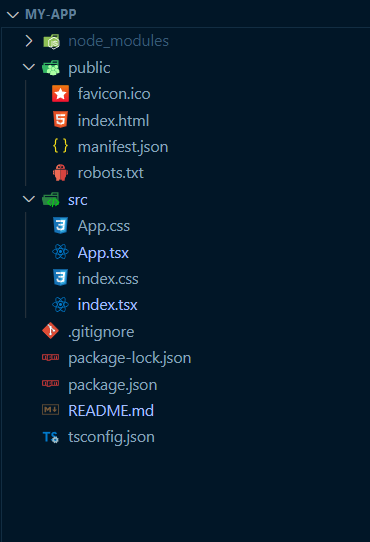
Now let's start by adding styled-components and styled-system
npm install styled-components styled-system
OR
yarn add styled-components styled-system
As we are using typescript we have to install all the types for these packages and we would save these types as a developer dependency.
npm i --save-dev @types/styled-system @types/styled-components
OR
yarn add -D @types/styled-system @types/styled-components
So since we have installed all the dependencies let's start setting up our design system 🔥
In react I generally prefer creating a separate components folder
So make a folder named components and add a utility folder inside it, that will look something like this
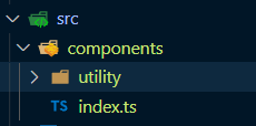
I have added index.ts for bulk export you can avoid adding it
So in our day to day development we generally use few HTML elements like div, span, a, img & button, p etc.
Let's set up a div component initially
inside components/utility I have created an element named Box
src/components/utility/box.ts
import styled from 'styled-components'

import {
    layout,
    space,
    border,
    position,
    color,
    flexbox,
    grid,
    typography,
    shadow
} from 'styled-system'

const Box = styled.div`
    ${layout}
    ${space}
    ${border}
    ${position}
    ${color}
    ${flexbox}
    ${grid}
    ${typography}
    ${shadow}
`

export default Box
I have imported all the required props from styled system so these props will insure that this box is styled according to the specified properties now this component will accept all the layout properties like Display ,Width, Height etc you can read more about it from the official styled-sytem documentation.
Similarly, you can create multiple components as per your need
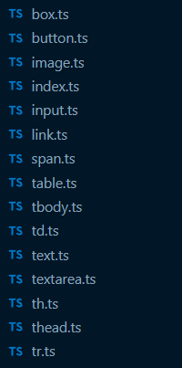
Once the whole setup is done you can start using the components like this

but no! this setup is still not ready and we are going to add some finishing touches.
Since we are using typescript the compiler won't allow us to pass props, hence we have to create prop definitions
To create prop definitions we will add a folder with name @types in src/components
inside which you can add all the prop definitions, you can refer to this box.d.ts
and now pass the prop types in this manner here <BoxTypes> refers to the type we just created
import styled from 'styled-components'

import {
    layout,
    space,
    border,
    position,
    color,
    flexbox,
    grid,
    typography,
    shadow
} from 'styled-system'

const Box = styled.div<BoxTypes>`
    ${layout}
    ${space}
    ${border}
    ${position}
    ${color}
    ${flexbox}
    ${grid}
    ${typography}
    ${shadow}
    transition:0.2s ease-in-out;
    box-sizing: border-box;
`

export default Box
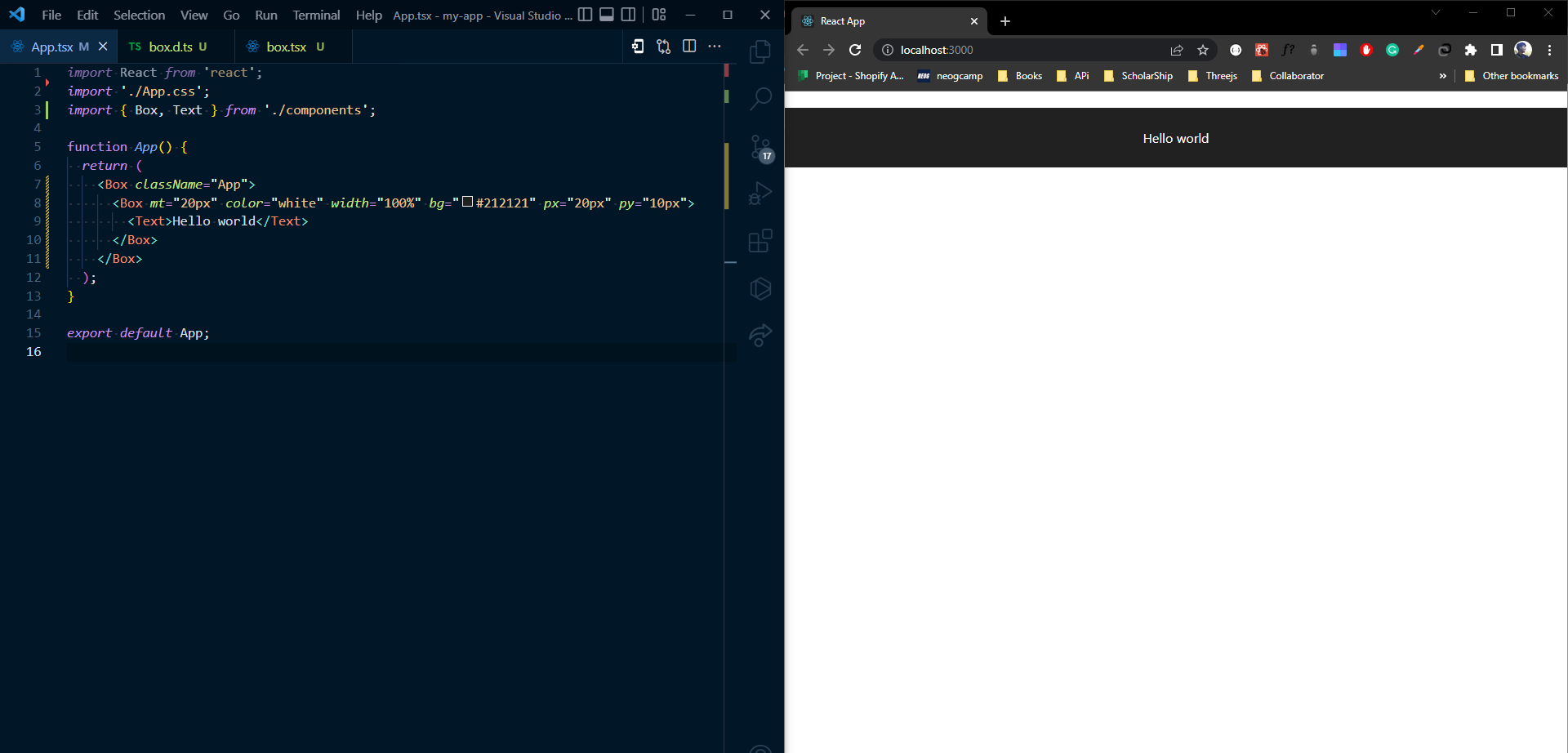
Now we can style our components in whatever manner we like but since we are using typescript then why not use its power in the right direction I have created a set of rules with a 4px grid system this will restrict developers from adding random values and will maintain design consistency
In order to add that create a folder named @types in src/ and add a file name design.rules.d.ts
after adding this, now you can replace 'box.d.ts' with box.d.ts
type BoxTypes = {
    childern?: React.ReactNode | JSX.Element | null;

    // Disabled
    disabled?: boolean;

    // Margins
    ml?: FourPixelGridSystem;
    mt?: FourPixelGridSystem;
    mr?: FourPixelGridSystem;
    mb?: FourPixelGridSystem;
    my?: FourPixelGridSystem;
    mx?: FourPixelGridSystem;

    // Padding
    p?: FourPixelGridSystem;
    pt?: FourPixelGridSystem;
    pb?: FourPixelGridSystem;
    pl?: FourPixelGridSystem;
    pr?: FourPixelGridSystem;
    py?: FourPixelGridSystem;
    px?: FourPixelGridSystem;
    .
    .
    .
    .
}
which will look like this. and now we are done with the setup after this adding random values will result in errors also you will get the suggestions for the different props. cool right! you can also customize these rules as per your need
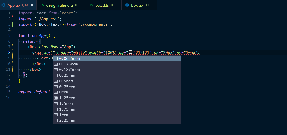
import React from 'react';
import './App.css';
import { Box, Text } from './components';

function App() {
  return (
    <Box className="App">
      {/* <Box mt="20px" color="white" width="100%" bg="#212121" px="20px">
        <Text>Hello world</Text>
      </Box> */}
      <Box mt="0.75rem" color="white" width="100%" bg="#212121" px="1.25rem" py="0.75rem">
        <Text>Hello world</Text>
      </Box>
    </Box>
  );
}

export default App;
I have created a starter you can clone it from here https://github.com/ishanjirety/design-system-starter.git
Subscribe to my newsletter
Read articles from Ishan jirety directly inside your inbox. Subscribe to the newsletter, and don't miss out.
Written by

Ishan jirety
Ishan jirety
Hi, I am Ishan a web developer who likes to build beautiful and clean UI.