Statistics Concepts in Data-Science
 Aman Singanamala
Importing Libraries and Read Data
import pandas as pd
import numpy as np
import matplotlib.pyplot as plt
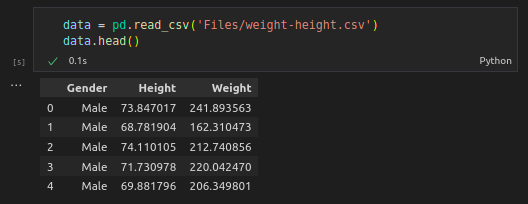
Read the Data and get the first rows of the DataFrame
data = pd.read_csv(‘files/weight-height.csv’)
Output
Count
The count is descriptive statistics and counts observations.
The count is the most used in statistics and has high importance to evaluate findings.
Example: Making conclusion on childhood weights and the study only had 12 childing (observations). Is that trustworthy?
The count says something about the quality of the study.
Count groups to see the significance of the results.
data.groupby(‘Gender’).count()
Output

Mean
- Return the mean of the values over the requested axis.
data.groupby(‘Gender’).mean()
Output

Standard Deviation
Standard deviation is a measure of how dispersed (spread) the data is in relation to the mean.
A low standard deviation means data is close to the mean.
A high standard deviation means data is spread out.
data.groupby(‘Gender’).std()
Output

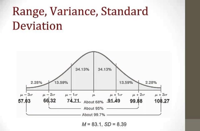
- In the above diagram, we can observe if we take 3 samples of males(multiple times), 2 of them are likely to be within one standard deviation of the mean.
Describe
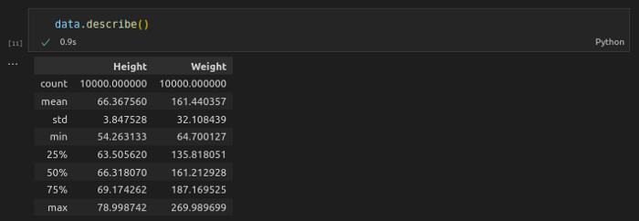
- Descriptive statistics include those that summarize the central tendency, dispersion, and shape of a dataset’s distribution, excluding NaN values.
data.describe()
Output
Correlation
Correlation can be said to measure the linear relationship between two variables measured.
A non-linear relationship could cancel out positive and negative correlations which might end up with zero(no relationship between variables).
Measure the relationship between two variables and ranges from -1 to 1


data.corr()

Correlation Matrix
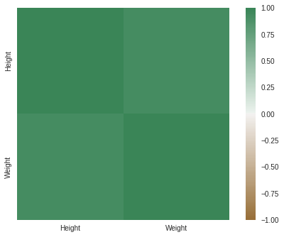
- A correlation matrix is simply a table showing the correlation coefficients between variables.

data.groupby('Gender').corr()

- Using a heat map could be more helpful.
import seaborn as sns
axis_corr = sns.heatmap(
correlation,
vmin=-1, vmax=1, center=0,
cmap=sns.diverging_palette(50, 500, n=500),
square=True)
Scatter Plots
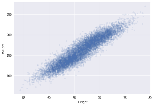
- SCATTER PLOT is a great tool for identifying correlation.
data.plot.scatter(x=’Height’, y=’Weight’, alpha=.1)
Box Plots
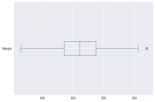
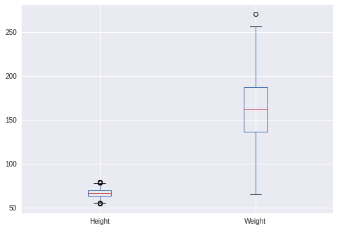
- Box plots are a great way to visualize descriptive statistics.
- Notice that Q1: 25%, Q2: 50%, and Q3: 75%.
- Box plots also help us to identify the Outliers.
- Make a box-and-whisker plot from DataFrame columns, optionally grouped by - some other columns.

data[‘Weight’].plot.box(vert=False)
data[‘Height’].plot.box(vert=False)
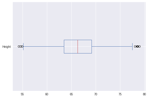
- We can observe a few outliers in the above BoxPlots.(Outliers should be removed for a proper model to be built.)
data.boxplot(column=[‘Height’, ‘Weight’])
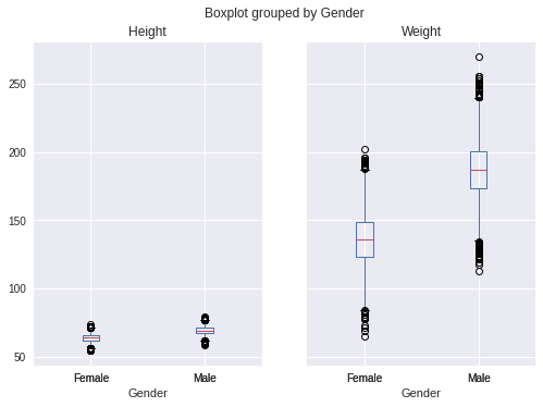
- BoxPlot grouped by gender
data.boxplot(column=[‘Height’, ‘Weight’], by=’Gender’)
Why Statistics?
-
Statistics presents information in an easy way.
Gives you an understanding of the data you are working on.
In this blog, we will work on a dataset to understand a few concepts of Statistics.
The dataset is a list of Genders, Heights, and Weights.
Subscribe to my newsletter
Read articles from Aman Singanamala directly inside your inbox. Subscribe to the newsletter, and don't miss out.
Written by