💎 What is flexBox? 💎
 Abhishek Patil
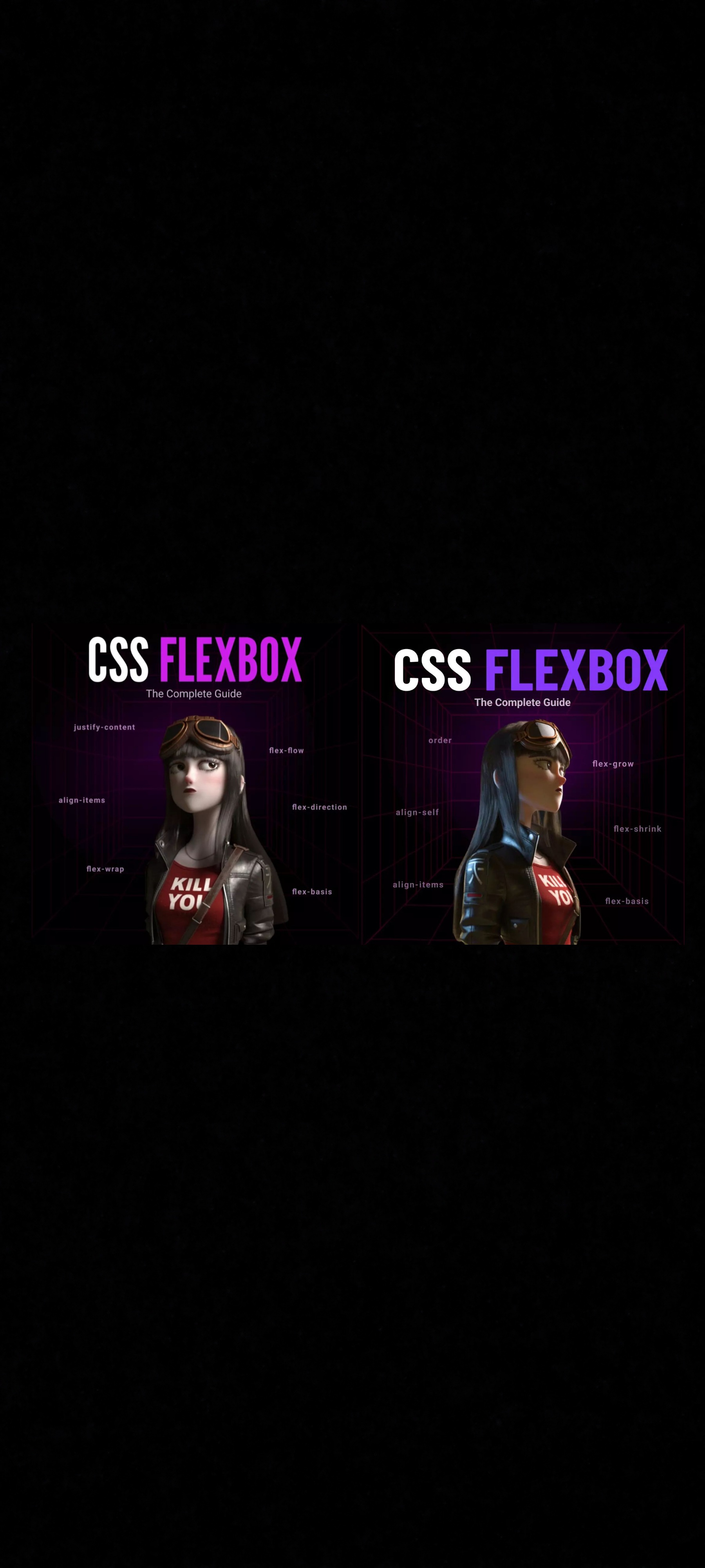
Flexbox is a one-dimensional layout system that we can use to create a row or a column axis layout.
👉🏻Properties of flexbox:-
PART - I
🔥1. flex-direction:-
row(default)row-reversecolumncolumn-reverse
🔥2. flex-wrap:-
nowrap(default)wrapwrap-reverse
🔥3. flex-flow :-
This is a shorthand for the flex-direction and flex-wrap properties
🔥4. justify-content:-
flex-start(default)flex-endstartendleftrightcenterspace-betweenspace-aroundspace-evenly
🔥5. align-items:-
flex-start / start / self-startflex-end / end / self-endcenterbaseline
FELXBOX
To use flexbox we will use the display property.
Let's first see the OUTPUT without flex.
HTML ->
<body>
    <div class="box"><img src="./logo.svg" alt="Lco Logo" /></div>
    <div class="box"><img src="./logo.svg" alt="Lco Logo" /></div>
    <div class="box"><img src="./logo.svg" alt="Lco Logo" /></div>
    <div class="box"><img src="./logo.svg" alt="Lco Logo" /></div>
</body>
CSS ->
.box {
  width: 120px;
  height: 120px;
  background-color: #0d1117;
  margin: 15px;
  display: grid;
  place-items: center;
}
OUTPUT ->

Now let's use display: flex; property on the parent container
body {
  display: flex;
}

✅ flex-direction:
HTML ->
  <body>
    <div class="box">1</div>
    <div class="box">2</div>
    <div class="box">3</div>
    <div class="box">4</div>
  </body>
CSS ->
body {
  display: flex;
  flex-direction: row | column | row-reverse | column-reverse;
}
➡️ flex-direction: row;

⬅️ flex-direction: row-reverse;

⬇️ flex-direction: column;

⤴️ flex-direction: column-reverse;

✅ felx-wrap:
🎁flex-wrap: wrap;
body {
  display: flex;
  flex-wrap: wrap;
}

.box:nth-child(2) {
  width: 300px;
}
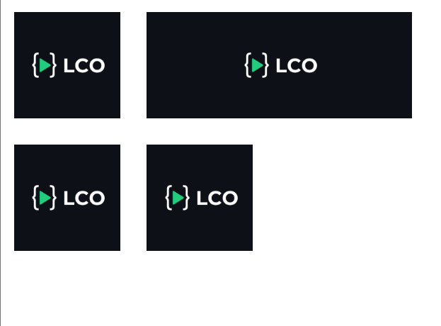
🎁 flex-wrap: nowrap;

🎁 flex-wrap: wrap-reverse;

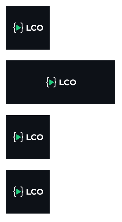
✅ flex-flow:
This is a shorthand for the flex-direction and flex-wrap properties together.
body {
  display: flex;
  flex-flow: column wrap;
}
✅ justify-content:
body {
  display: flex;
  justify-content: flex-start | flex-end | center | space-between | space-around | space-evenly;
}
🚀 justify-content: flex-start;

🚀 justify-content: flex-end;

🚀 justify-content: center;

🚀 justify-content: space-between;

🚀 justify-content: space-around;

🚀 justify-content: space-evenly;

✅ align-items:
.container {
  width: 600px;
  height: 260px;
  margin: 2rem;
  border: 2px solid black;
  display: flex;
  align-items: stretch | flex-start | flex-end | center | baseline;
}
📢 align-items: flex-start;

📢 align-items: flex-end;
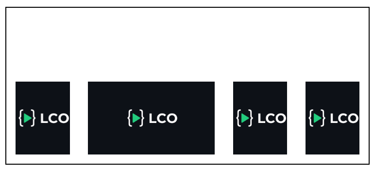
📢 align-items: center;
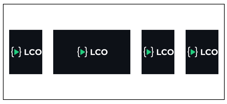
📢 align-items: stretch;
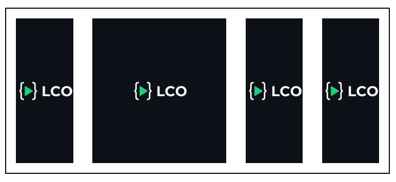
📢 align-items: baseline;
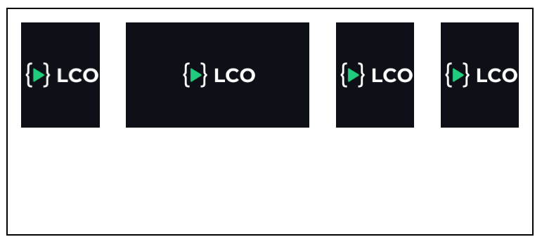
- PART - II
🔥1. ORDER:
🔥2. FLEX-GROW:
🔥3. FLEX-SHRINK:
🔥4. FLEX-BASIS:
🔥5. ALIGN-SELF:
✅ ORDER PROPERTY
Output without applying order property ::

.box:nth-child(1) {order: 3;}
.box:nth-child(2) {order: 4;}
.box:nth-child(3) {order: 1;}
.box:nth-child(4) {order: 5;}
.box:nth-child(5) {order: 2;}
Output after applying order property ::

✅ FLEX-GROW
Output without applying felx-grow property ::

.box:nth-child(1){flex-grow: 1;}
.box:nth-child(2){flex-grow: 1;}
.box:nth-child(3){flex-grow: 2;}
.box:nth-child(4){flex-grow: 1;}
.box:nth-child(5){flex-grow: 1;}
Output after applying flex-grow property ::

✅ FLEX-SHRINK
Output without applying felx-shrink property ::

.box:nth-child(1) {
  flex-grow: 1;
  flex-shrink: 1;
}
.box:nth-child(2) {
  flex-grow: 1;
  flex-shrink: 1;
}
.box:nth-child(3) {
  flex-grow: 1;
  flex-shrink: 2;
}
.box:nth-child(4) {
  flex-grow: 1;
  flex-shrink: 1;
}
.box:nth-child(5) {
  flex-grow: 1;
  flex-shrink: 1;
}
Output after applying flex-shrink property ::

✅ FLEX-BASIS
Output without applying felx-basis property ::

.box:nth-child(1) {
  flex-grow: 1;
  flex-shrink: 1;
}
.box:nth-child(2) {
  flex-grow: 1;
  flex-shrink: 1;
}
.box:nth-child(3) {
  flex-grow: 1;
  flex-shrink: 2;
}
.box:nth-child(4) {
  flex-grow: 1;
  flex-shrink: 1;
}
.box:nth-child(5) {
  flex-grow: 1;
  flex-shrink: 1;
}
Output after applying flex-basis property ::

✅ ALIGN-SELF
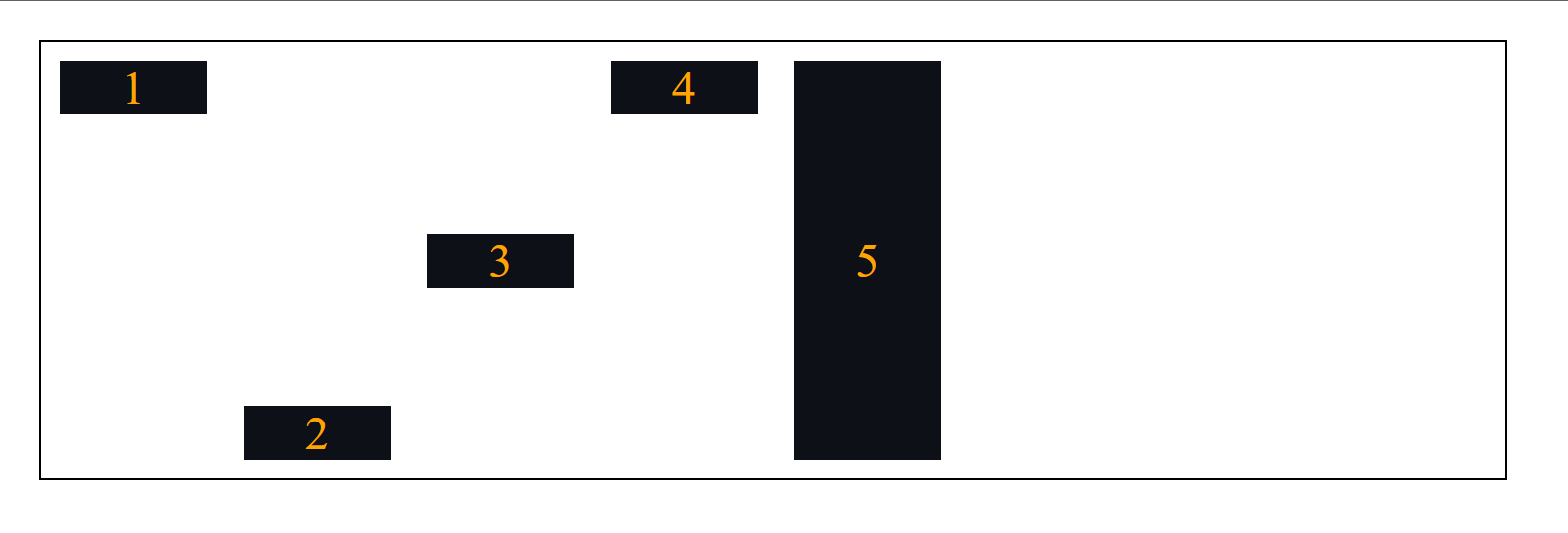
Using the align-self property we can place an individual item inside the parent container.
.box:nth-child(1) { align-self: flex-start; }
.box:nth-child(2) { align-self: flex-end; }
.box:nth-child(3) { align-self: center; }
.box:nth-child(4) { align-self: baseline; }
.box:nth-child(5) { align-self: stretch; }
Do you find it helpful? 🤗
Let me know in the comments. 🙋♂️
CSS Grid Comming Soon 🔜
Follow me on Instagram -> Abhishek Patil
Subscribe to my newsletter
Read articles from Abhishek Patil directly inside your inbox. Subscribe to the newsletter, and don't miss out.
Written by

Abhishek Patil
Abhishek Patil
Hey! I'm Abhishek Patil, a tech lover who's always excited about checking out new stuff. I'm all about diving into the latest gadgets and software, and I'm eager to grow within the tech community.