Breaking Down Box-Shadow(Beginners).
 Jewel Jeff-Onyegbule
Box-Shadow
As I began my CSS journey one of the CSS properties that really gave a hard time was Box-shadow. Let me not bore you with my depressing and confusing story. I know, it isn't always easy, sometimes we just need a little push, a little explanation to get through with our challenges.
Well I'm here to break down how to use the property Box-shadow, to the level that a lay man would understand.
What is Box-Shadow?
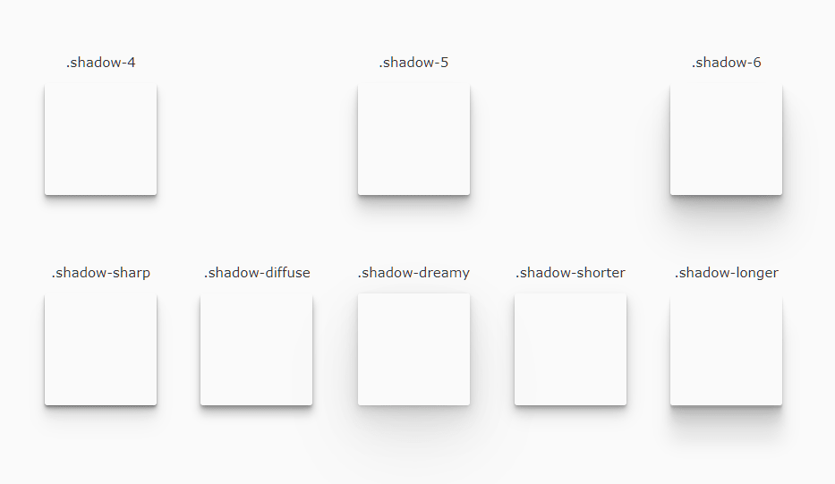
Box-Shadow is a CSS property adds shadow effects around an element's frame. Just as seen in the image below.

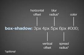
A box shadow is described by X and Y offsets relative to the element, blur and spread radius, and color.
Box-shadow Syntax
[box-shadow: none| h-offset v-offset blur spread color |inset| initial| inherit; ]
Values and Description
none - Default value. No shadow is displayed.
h-offset - Required. The horizontal offset of the shadow. A positive value puts the shadow on the right side of the box, a negative value puts the shadow on the left side of the box.
v-offset - Required. The vertical offset of the shadow. A positive value puts the shadow below the box, a negative value puts the shadow above the box.
blur - Optional. The blur radius. The higher the number, the more blurred the shadow will be.
spread - Optional. The spread radius. A positive value increases the size of the shadow, a negative value decreases the size of the shadow.
color - Optional. The color of the shadow. The default value is the text color. Look at CSS Color Values for a complete list of possible color values. Note: In Safari (on PC) the color parameter is required. If you do not specify the color, the shadow is not displayed at all.
insert - Optional. Changes the shadow from an outer shadow (outset) to an inner shadow.
initial - Sets this property to its default value.Read on initial.
inherit - Inherits this property from its parent element.Read about inherit.
EXAMPLES:
Define the spread radius of the shadow:
#example1 {
box-shadow: 10px 10px 8px #888888;
}
Define multiple shadow:
#example1 {
box-shadow: 5px 5px blue, 10px 10px red, 15px 15px green;
}
Add the inset keyword
#example1 {
box-shadow: 5px 10px inset;
}
Try all the examples out and play with the values.
Reference:
Conclusion
I hope this article helped you some way. For more articles comment the topics you would like me to breakdown. Thank you.
Subscribe to my newsletter
Read articles from Jewel Jeff-Onyegbule directly inside your inbox. Subscribe to the newsletter, and don't miss out.
Written by

