An Internship at Warp Speed
 Varun Jindal
I joined Warp on May 16th 2022, and 12 weeks later, I feel like I’ve leveled up as an engineer.
About Me
Last fall, I had to make a big decision. I was taking spring semester off and I wanted to do something special with the 8 months I had before me. I wanted to ensure three things:
- My technical skills grow to at least 3x what they were before
- I understand what it means to find product-market fit
- I explore something I’ve wanted to for a long time (see more here)
I joined Warp to accomplish goal 1, but I found that I made significant headway on goal 2 as well.
Why I Joined Warp
I found out about Warp through the Neo portfolio. They connected me with Zach Lloyd, Warp’s CEO & founder. I instantly realized that he’s a little different than most founders — he’s very forthright in his communication; no fluff; no bouncing around the point. I soon found out that he had written all of his learnings on a website called the ZBook. The team is similarly thoughtful and experienced so I knew I would have lots of people to learn from.
Secondly, when I first started coding, I was honestly scared of the terminal. I saw it as a deep, dark cave of despair and hidden information. A company trying to remedy that is a company I wanted to work for.
I saw it as a deep, dark cave of despair and hidden information.
And lastly, I found the business case quite interesting. Warp is creating a paradigm shift — no business has historically paid for a terminal because it has always been free. But, that’s also why it’s stayed largely the same for the past 20 years. Large businesses are only ever built with a corresponding large switch in behavior.
My Experience at Warp
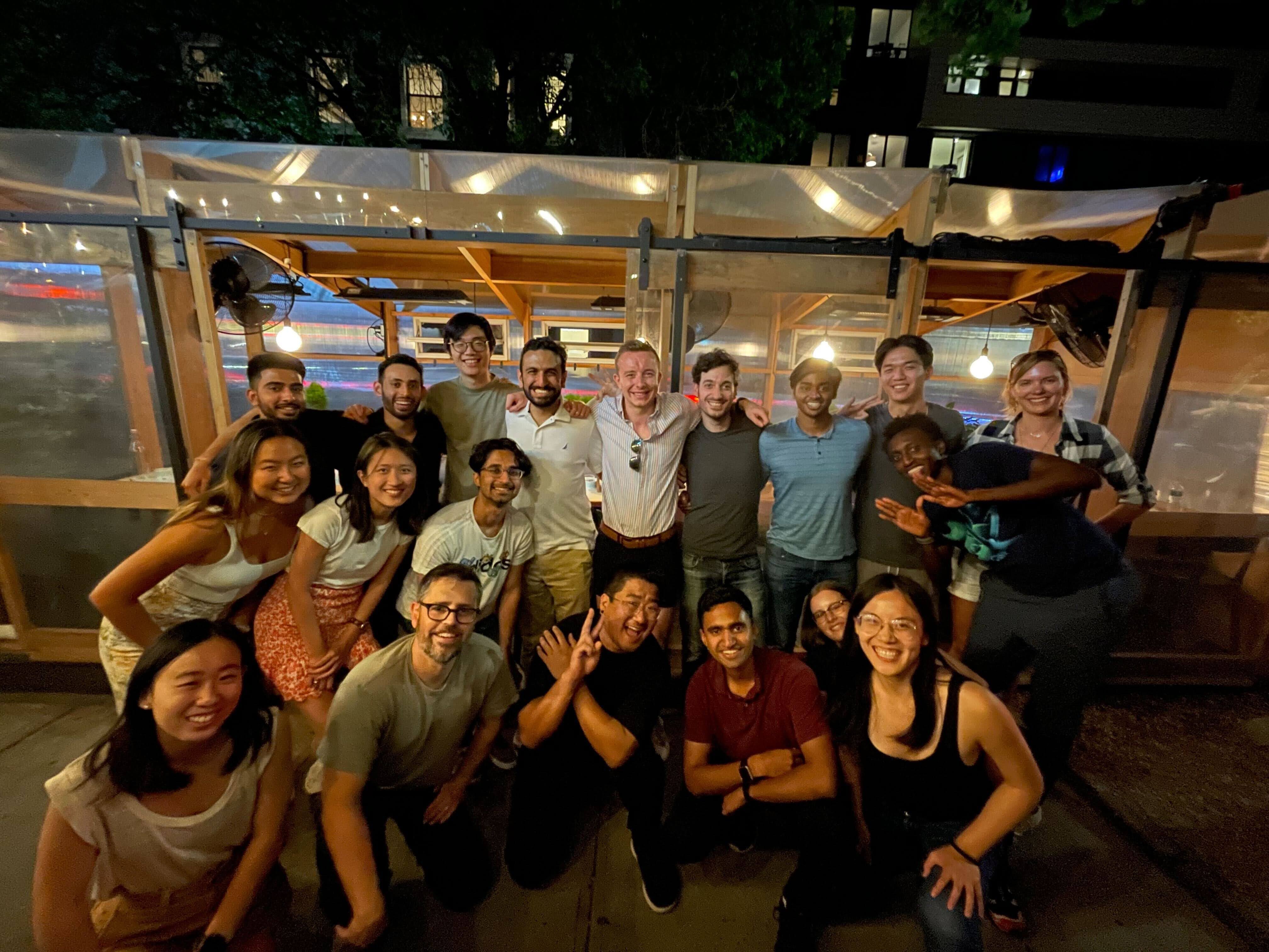
I’ve had the chance to do a lot during my internship – here’s a list of some things I did outside of engineering and product:
- I’ve spoken directly with investors like Dylan Field at our Board of Directors meeting.
- I’ve been involved in helping refine our recruiting process.
- I was a part of a company retreat and presented a design project in-person to the entire team.
- Hosted our company-wide weekly meeting with the other interns.
- Went to a Rust Language meetup in NYC.
- Did an escape room with the whole company.
I had the complete authority to start any initiative, write to anyone in the company, propose any feature, and take down prod whenever I wanted. (luckily the last one never happened)
And when it comes to engineering and product I led the entire end-to-end process of a couple of features. The most technically interesting feature I launched was called Launch Configurations.
Launch Configurations
This is a feature which lets a user save a configuration of windows, tabs, and panes so that they can easily open it later. See the docs here.
This feature was particularly interesting because of three main reasons:
- There was quite a bit of product ambiguity that had to be managed.
- It required a refactor of one of our core features: the command palette.
- I tried using the newly created refactor in a way in which it wasn’t meant to be used.
Product Process of Launch Configurations
There were two main aspects to launch configurations:
- Launching an existing configuration
- Saving a new launch configuration based on the current state
When developing this feature, there were a few main concerns that we had to consider for each of these flows:
- Discoverability: Warp has a lot of features, how will a user find out about launch configurations?
- User Education: at every point during each flow, does the user know the next step and how to use the feature?
- Switching Cost: since this is a feature that exists in other terminals, we must be wary of reimagining it too much.
To address some of the above concerns, we decided to reuse the concept that Warp users are already familiar with – our command palette — and turn it into a more generic module. We wanted to use the palette mechanism for both viewing existing launch configs, and saving a new one.
Parallel to this project, another palette was being created: the session navigation palette. This feature would allow users to quickly find existing tabs and navigate to them seamlessly. The product process became complex because these two concepts were slightly related. A large decision that had to be made was whether the two palettes semantically belonged together (and be viewed as a single palette) or should be separated.
Our first iteration assumed that both navigation and launch configurations should be viewed together (at this point, the launch configurations feature was known as “session templates.”):
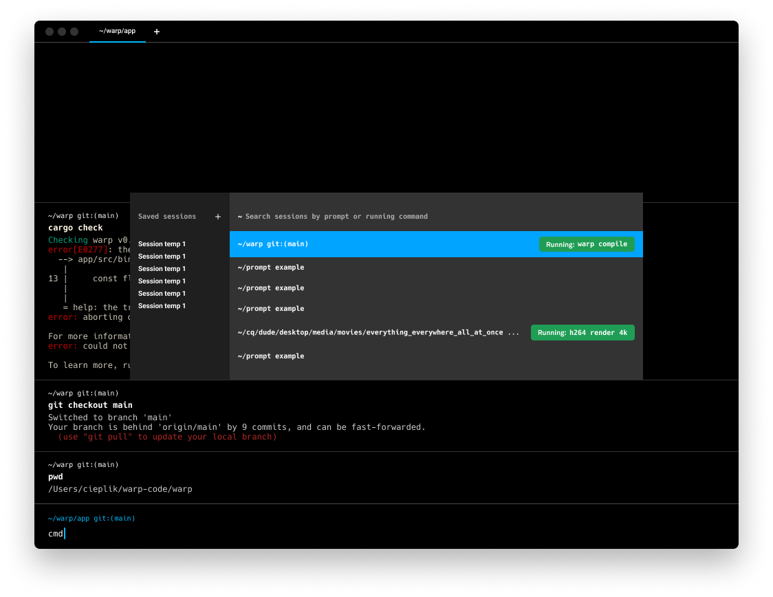 The left side of the palette allows the user the ability to open saved launch configurations and the right side allows the user to search the currently open sessions.
But as we jammed on the designs, we began to drift away from them being fully coupled. Our next iteration separated them into two palettes connected through a button.
 On the left you can see the session navigation palette which has a plus-button leading to another palette (featured on the right) from where a user can search through saved launch configurations.
It still didn't feel right. So, inspired by the Chrome search for tabs feature, we created our next iteration. This iteration combined the navigation and launch configuration palettes into a top-right corner palette.
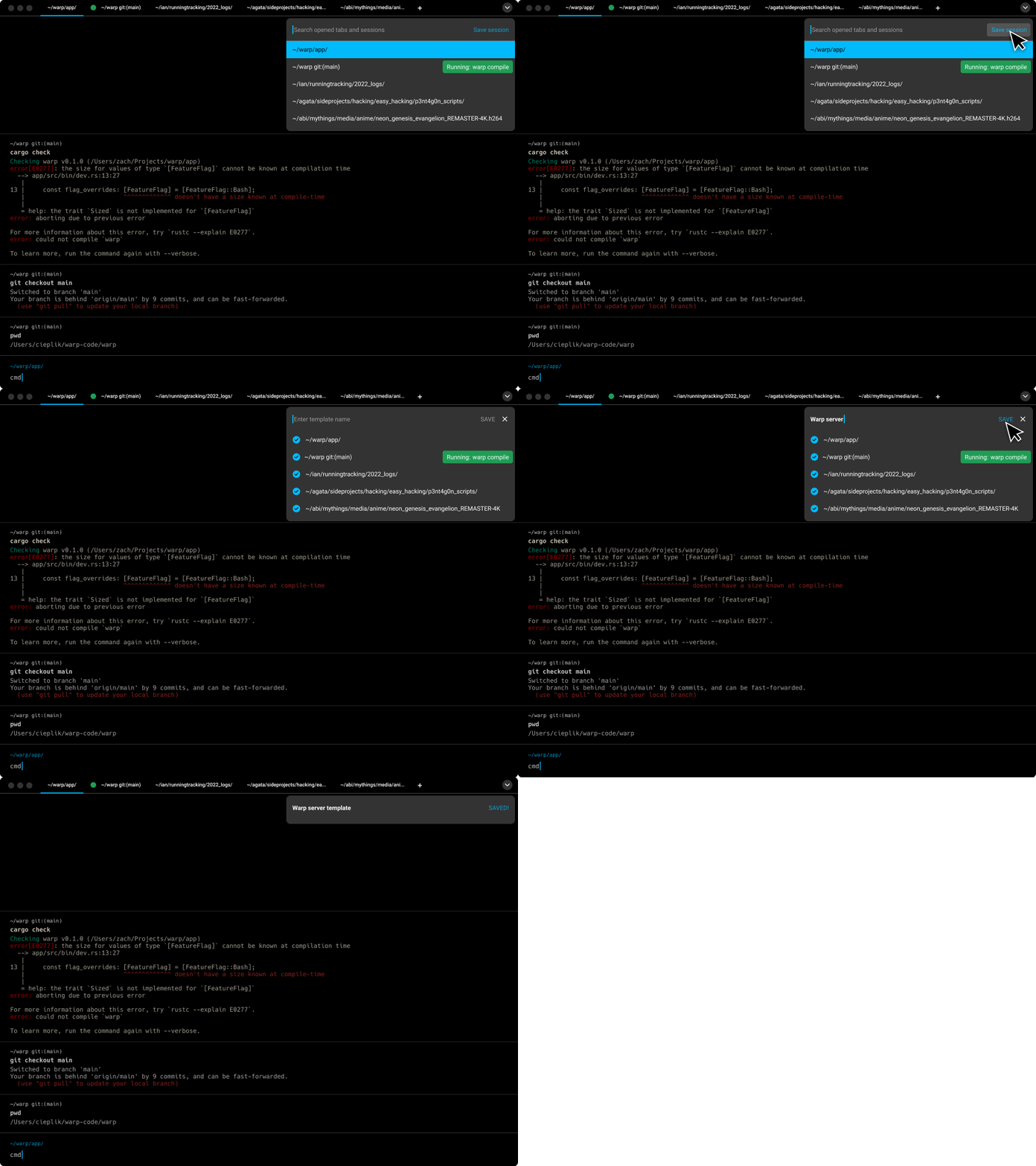
However, we decided not to pursue this design further, and went back to the original palette style. We also decided to fully separate navigating sessions from launch configurations, and implement “prefix logic”, allowing users to switch palettes easily with a prefix typed into the command palette.

After all this, we still had to figure out one last complicating factor: how should the saving flow relate? Since we know that the palettes can switch easily, we quickly (and perhaps prematurely) decided to also incorporate a palette for this flow.
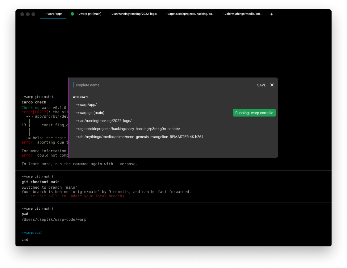
However, even though this palette looks similar to the other palettes, its functionality is entirely different. It was confusing because what’s usually the search bar has turned into an input bar for naming a file.
So we eventually landed on a much simpler flow with a modal.
Technical Aspects of Launch Configurations
The command palette is a core part of Warp. It allows the user to execute any command from one location. The concept of a palette is powerful, and in the future there’s potential for many different palettes (similar to VSCode’s quick open feature). We wanted to enable this potential by creating a generalizable palette. My friend and fellow intern Abhishek Pandya led this charge.
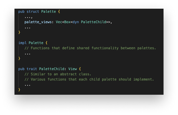
This was an interesting task because in a typical OOP language, you would imagine making a base class from which these palettes could simply inherit. However, Rust doesn’t have the concept of inheritance. Rather, Rust has something called traits. These end up being quite similar to abstract classes. I was forced to use "composition over inheritance" by design of the Rust language!
Rust doesn’t have the concept of inheritance, rather it has traits.
We decided on a pattern where a Palette has a vector of objects implementing PaletteChild. Based on user input, these objects can easily switch between each other. The Palette implementation is created as its own standalone class while the objects each implement the PaletteChild trait. The part that’s interesting is that we had shared rendering functionality in the Palette implementation, not in the PaletteChild trait (since there’s no inheritance in the usual form).
After all of the refactoring was finished, I began using the palette class to implement both the launching and the saving flows. Because the saving flow used the palette in a way that it wasn’t really designed for, I encountered all sorts of caveats, exceptions and problems with this implementation.
Good UX typically lends itself to simpler code.
What I realized however, is that a good UX typically lends itself to simpler code. The palette was not the right decision for the saving flow and the code seemed to know it before I did.
In early August, I wrapped up the feature and launch configurations are now live for all users! Check out the docs for more information about what you can do and how to use this feature.
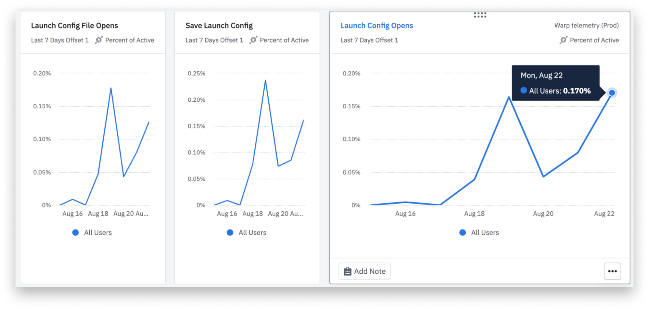 Launch Configurations are being used by nearly 0.2% of all unique daily active users.
Learnings
Over my time at Warp, I’ve compiled a list of learnings. Three of them were particularly interesting.
Over parallelization creates a risk of nothing getting shipped
I always thought that one should attempt to parallelize things as much as possible. Logically, if you can parallelize tasks between multiple people, projects will finish faster. However, I now understand there are a few exceptions:
- Ease of Management
- Context Switching Cost
- Feeling of Progress Among the Team
The more projects there are, the more management time you’ll need. Coordinating and keeping the right priorities aligned is a higher time cost than one might expect and it increases for each project you add to someone’s radar.
Additionally, if things are over parallelized, the feeling of progress diminishes because while as a whole you are going quickly, each project goes quite slowly.
There is still certainly a balance to be struck somewhere in between.
Attracting experienced engineers to the team is far different from attracting junior engineers
I’ve always believed that the most attractive companies to join are the “grind-iest” companies, the ones where everyone works a lot because that means the company must be growing extremely quickly. This idea also proliferates in many of the environments I’m in (i.e. college).
However, I’ve realized that very experienced engineers are not as attracted to this idea. They have gotten to a point where the hours they spend engineering are extremely efficient, so their 8 hours would equal someone else’s 24. And to stay at this efficiency level, work-life balance is important.
Logically, it makes more sense for a company to have more experienced engineers than junior engineers, especially in the early stages of a company. You can move quicker and with more direction, and when younger engineers join, you are primed to give them incredible mentorship.
I’ve found that work at Warp is extremely focused and efficient, but there’s a strong work-life balance. The experience of the team reflects this.
At any point in time, everyone should know where the single source of truth of your project is
This became particularly apparent when I left for a week and a half during the middle of my internship. Before leaving I posted a massive message in Slack about what needed to be done, what priorities were, and what the state of my project was so people could continue where I left off. However, that’s not ideal. It should always be clear to everyone involved where the outstanding tasks are enumerated and what the state is.
I had things tracked in Linear, through my PRs on Github, in Slack, and also in a Google Doc. The bus factor became low because only I knew what was updated and what was not. Once tasks are centralized, handing projects off becomes simple.
What's Next
I’ve been really enjoying building for developers. It’s unlike anything I’ve done before. It’s as if we have a full external product team. If you look through the github issues page, you’ll find Figma mockups created by users, nearly full PRDs described in issues, and sometimes our users will even build for us. Developers also tend to have a good idea of how difficult a feature is to build, so expectations are usually quite aligned with ours.
Building for developers feels like we have a full external product team.
I’ll be going back to school for a semester. But, I know that I want to continue building for developers.
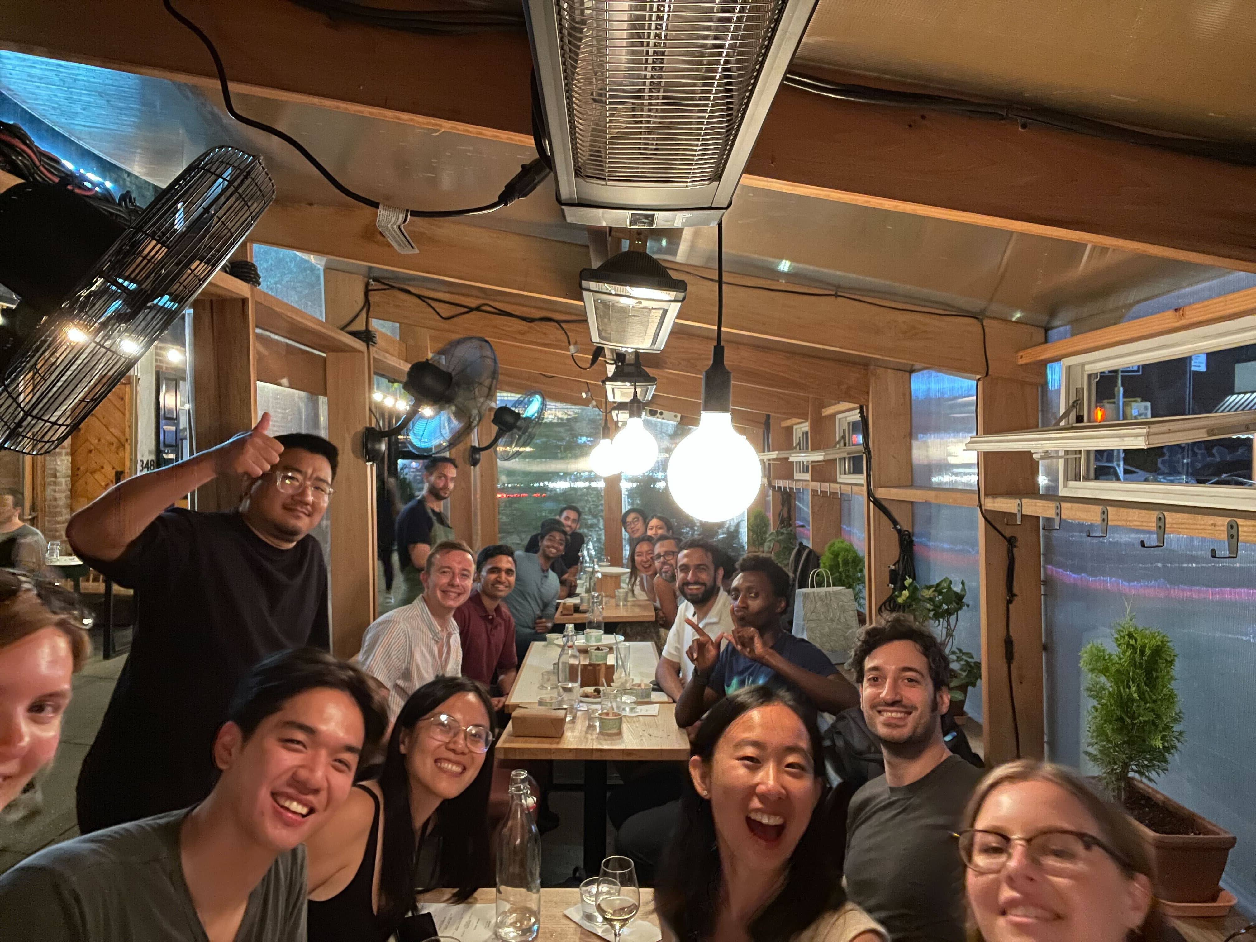
If you want to learn more about Warp, check out the website. They are also hiring — check out their open roles.
Here’s a small photo gallery of my experience.
Gallery of Other Features I Built
Find Bar Regex Toggle
VSCode New Session Shortcut Integration
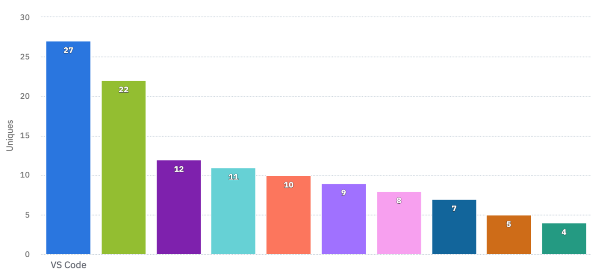 Our top churn reason before I launched this feature was a lack of VS Code integration.
Reorder Tab Keyboard Shortcut
Users are now able to reorder tabs with a simple keyboard shortcut. This was a highly requested feature.
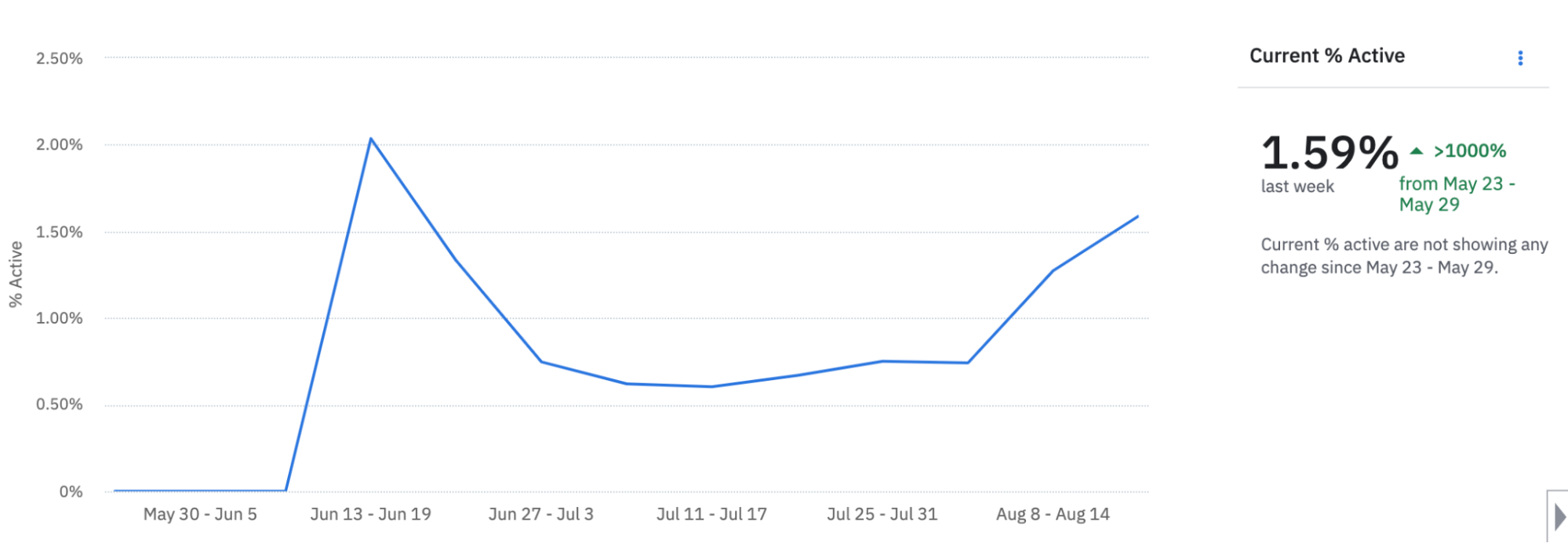 This feature is used by nearly 1.6% of unique weekly active users.
Subscribe to my newsletter
Read articles from Varun Jindal directly inside your inbox. Subscribe to the newsletter, and don't miss out.
Written by
