Calendar component using ViewComponent and Hotwire
 Andrew Foster
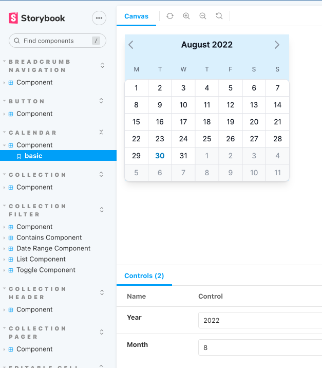
TailwindUI has a nice looking calendar component I can use for this task. Here is what it will look like:

And here is the component in action being used to set a value for a date input:
Let's start by getting the rendering of the component done first, using a ViewComponent of course.
app/components/calendar/component.html.erb
<%= turbo_frame_tag "#{id}", loading: :lazy do %>
  <div <%= 'hidden' if hidden %>
       id="<%= "#{id}_calendar" %>"
       class="absolute w-80 z-10 bg-sky-100 shadow-lg"
       data-controller="calendar--component"
       data-calendar--component-input-id-value="<%= input_id %>"
  >
    <div class="mt-2 text-center lg:col-start-8 lg:col-end-13 lg:row-start-1 xl:col-start-9">
      <div class="flex items-center text-gray-900">
        <a
          id="<%= "#{id}_calendar--previous_month_button" %>"
          href="<%= previous_calendar_url %>"
          class="-m-1.5 flex flex-none items-center justify-center p-1.5 text-gray-400 hover:text-gray-500"
          data-turbo-frame="_self"
        >
          <span class="sr-only">Previous month</span>
          <%= icon(name: :chevron_left, colour: :gray) %>
        </a>
        <div id="<%= "#{id}_calendar--current_year_month" %>" class="flex-auto font-semibold"><%= Date::MONTHNAMES[month] %> <%= year %></div>
        <a
          id="<%= "#{id}_calendar--next_month_button" %>"
          href="<%= next_calendar_url %>"
          class="-m-1.5 flex flex-none items-center justify-center p-1.5 text-gray-400 hover:text-gray-500"
        >
          <span class="sr-only">Next month</span>
          <%= icon(name: :chevron_right, colour: :gray) %>
        </a>
      </div>
      <div class="mt-6 grid grid-cols-7 text-xs leading-6 text-gray-500">
        <div>M</div>
        <div>T</div>
        <div>W</div>
        <div>T</div>
        <div>F</div>
        <div>S</div>
        <div>S</div>
      </div>
      <div class="isolate mt-2 grid grid-cols-7 gap-px rounded-lg bg-gray-200 text-sm shadow ring-1 ring-gray-200">
         <% six_week_date_range.each_with_index do |date, index| %>
          <button
            id="<%= "#{id}_calendar--button_#{date.strftime('%F')}" %>"
            type="button"
            class="<%= button_style(cell_date: date, index: index) %>"
            data-action="click->calendar--component#selectDate"
          >
            <time
              id="<%= "#{id}_calendar--time_#{date.strftime('%F')}" %>"
              datetime="<%= date.strftime('%F') %>"
              class="<%= day_style(cell_date: date) %>"
            >
              <%= date.day %>
            </time>
          </button>
        <% end %>
      </div>
    </div>
  </div>
<% end %>
The HTML renders a 7 x 6 grid for the days and a heading with controls for moving to the previous and next months. All of this is inserted into a Turbo Frame tag with the id of the calendar in question. I'll come back to how this is important a bit later, but first here is the component class:
app/components/calendar/component.rb
module Calendar
  class Component < ViewComponent::Base
    include Turbo::FramesHelper
    include IconsHelper

    # @return [String] a unique identifier for setting the id on HTML elements in the component
    attr_reader :id
    # @return [Integer] the year to display
    attr_reader :year
    # @return [Integer] the month to display
    attr_reader :month
    # @return [String] the HTML id of the input connected to this calendar
    attr_reader :input_id
    # @return [Date] a string that has been parsed to a date representing the selected date in the attached input
    attr_reader :selected_date
    # @return [Boolean] true if the calendar is hidden, false otherwise
    attr_reader :hidden
    # @return [Date] the first day of the month and year for the calendar
    attr_reader :calendar_date
    # @return [Date] the current date in the current Time.zone
    attr_reader :today

    def initialize(id:, year:, month:, input_id:, selected_date: nil, hidden: true)
      super
      @id = id
      @year = Integer((year.presence || Time.zone.now.year.to_s), 10)
      @month = Integer((month.presence || Time.zone.now.month.to_s), 10)
      @input_id = input_id
      @selected_date = Date.parse(selected_date) if selected_date.present?
      @hidden = hidden
      @calendar_date = Date.new(@year, @month, 1)
      @today = Time.zone.now.to_date
    end

    # @return [String] the URL to retrieve the calendar for the previous month
    def previous_calendar_url
      "/calendar?id=#{id}&input_id=#{input_id}&year=#{previous_month_date.year}&month=#{previous_month_date.month}"
    end

    # @return [String] the URL to retrieve the calendar for the next month
    def next_calendar_url
      "/calendar?id=#{id}&input_id=#{input_id}&year=#{next_month_date.year}&month=#{next_month_date.month}"
    end

    # @return [Date] the first day of the previous calendar month
    def previous_month_date
      calendar_date - 1.month
    end

    # @return [Date] the first day of the next calendar month
    def next_month_date
      calendar_date + 1.month
    end

    # @return [Range] a six week date range starting from the first_day_of_range to last_day_of_range
    def six_week_date_range
      (first_day_of_range..last_day_of_range)
    end

    # @return [Date] the date for the beginning of the week containing the calendar_date
    def first_day_of_range
      calendar_date.beginning_of_week
    end

    # @return [Date] the date 41 days after the first day of the range (this makes 42 days in total)
    def last_day_of_range
      first_day_of_range + 41.days
    end

    private

    def button_style(cell_date:, index:)
      [
        button_style_default,
        button_text_colour(cell_date: cell_date),
        ('font-semibold' if cell_date == today || cell_date == selected_date),
        (cell_date.month == calendar_date.month ? 'bg-white' : 'bg-gray-50'),
        corner_style(index: index)
      ].compact.join(' ')
    end

    def button_text_colour(cell_date:)
      return 'text-white' if cell_date == selected_date
      return 'text-sky-600' if cell_date == today
      return 'text-gray-900' if cell_date.month == calendar_date.month

      'text-gray-400'
    end

    def button_style_default
      'py-1.5 hover:bg-gray-100 focus:z-10'
    end

    def corner_style(index:)
      case index
      when 0
        'rounded-tl-lg'
      when 6
        'rounded-tr-lg'
      when 35
        'rounded-bl-lg'
      when 41
        'rounded-br-lg'
      else
        ''
      end
    end

    def day_style(cell_date:)
      [day_style_default, selected_date_style(cell_date: cell_date)].compact.join(' ')
    end

    def day_style_default
      'mx-auto flex h-5 w-5 items-center justify-center rounded-full'
    end

    def selected_date_style(cell_date:)
      return 'bg-gray-900' if cell_date == selected_date
    end
  end
end
This component class has a reasonable amount going on in it. There are two methods for generating a URL to load a calendar for the previous and next months. And there are methods for working out the exact date ranges so that the calendar fits 42 days (7 days x 6 weeks) nicely into the table.
All the private methods are related to determining the correct CSS styles to apply based on the day within the calendar, taking into consideration the current date, which date has been selected (if any) and whether the day falls into the next or previous month.
There is also a Stimulus controller that takes care of two things; toggling whether the calendar component is visible; and setting the value of a date input based on what date the user clicked on:
app/components/calendar/component_controller.ts
import {ActionEvent, Controller} from "@hotwired/stimulus"
import cash from "cash-dom";

export default class extends Controller {
    static values = {
        inputId: String
    }

    declare readonly inputIdValue: string;

    toggle(event: ActionEvent) {
        event.preventDefault()
        const calendar: HTMLElement = cash(`#${event.params.toggleCalendarId}`)[0] as HTMLElement
        calendar.toggleAttribute('hidden')
    }

    selectDate(event: ActionEvent) {
        const targetEl: HTMLElement = event.target as HTMLElement
        const buttonEl: HTMLButtonElement = targetEl.closest('button') as HTMLButtonElement
        const timeEl: HTMLTimeElement = buttonEl.querySelector('time') as HTMLTimeElement
        const date: string | null = timeEl.getAttribute('datetime')
        const inputEl: HTMLInputElement | null = document.querySelector(`#${this.inputIdValue}`)

        if (inputEl && date) {
            inputEl.value = date
            inputEl.dispatchEvent(new Event('select'))
        }
    }
}
So I mentioned before there was a URL for rendering the previous and next months on the calendar, so I'll need a route for that:
config/routes.rb
  # Calendar
  get '/calendar' => 'calendar#index'
And also a controller that will respond to that route:
app/controllers/calendar_controller.rb
class CalendarController < ApplicationController
  include TurboFrameVariants

  # @param [Integer] id the unique identifier for the calendar container
  # @param [Integer] year the calendar year to display
  # @param [Integer] month the calendar month to display
  # @param [String] input_id the HTML id of the input that should receive calendar selection updates
  # @param [String] selected_date the date that is currently selected in YYYY-MM-DD format
  # @param [Boolean] hidden true to add the hidden attribute to the calendar container
  # @example Calendar for Year 2022, Month July
  #    /calendar?id=created_at_from&input_id=q_created_at_gteq&year=2022&month=7
  def index; end
end
This calendar does very little, it is only listening for an index action and if it receives that via a turbo frame this is what it will respond with:
app/views/calendar/index.html+turbo_frame.erb
<%= render Calendar::Component.new(
    id: params[:id],
    year: params[:year],
    month: params[:month],
    input_id: params[:input_id],
    selected_date: params[:selected_date],
    hidden: ActiveModel::Type::Boolean.new.cast(params[:hidden])) %>
In the erb the component being rendered using the parameters being passed in on the URL. Here is an example of how that looks in practice:
<%= turbo_frame_tag "#{attribute}_from", src: "/calendar?id=created_at_from&input_id=q_created_at_gteq&year=2022&month=12", loading: :lazy %>
This turbo frame has a src referring to the calendar endpoint and it is asking for a calendar for the year 2022 and month 12. When the controller returns this to the browser Turbo will replace the existing calendar content with the new content, without the need for any full page reloading. Every time the user clicks on the arrows for previous or next the same thing will occur, fetching a new calendar component with that year and month and replacing the content on the page.
Subscribe to my newsletter
Read articles from Andrew Foster directly inside your inbox. Subscribe to the newsletter, and don't miss out.
Written by

Andrew Foster
Andrew Foster
I am a web developer who has been in the industry since 1995. My current tech stack preference is Ruby on Rails with JavaScript. Originally from Australia but now living in Scotland.