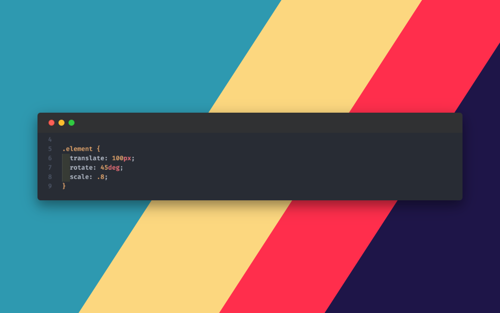
Welcome New properties of CSS -> translate - scale - rotate
 Ahmed Ibrahim
Yeah 🎉💥🤩, Exactly like you saw new properties used to move, scale, and rotate the element without needing (( Transform )).
let's begin with why you should consider that update.
Simply, because it looks cool 😍. No, I'm kidding 😅.
Let's see how using the new properties will improve our coding experience, and more flexible, and solve problems.
1. Ease of use ✅:
transform: translate(50px, 200px);
will be
translate: 100px 200px;
2. Prevent overwriting different CSS transform properties while applying different classes to the same element 🥳.
.element {
  /* default CSS */
}

.element.shrink {
  transform: scale(.8);
}

.element.move {
  transform: translate(100px);
}
As you see the element will move only (translate) and ignore the scaling because adding different transform properties like above will cause overwriting and apply the last one only.
We can solve this problem using CSS variables and will discuss it in the below section.
3. No need to use CSS variables while applying different classes that include other transform properties for the same element according to changes in state 😎.
Let's clarify that with an example.
Normally, if you want to add different transform properties according to change the element state we use CSS variables as shown below:
.element {
  /* default CSS */

  transform:
    scale(var(--scale, 1))
    translate(var(--translate, 0))
    rotate(var(--rotate, 0));
}

.element.shrink {
  --scale: .8;
}

.element.move {
  --translate: 100px;
}

.element:hover {
  animation: rotate 1s infinite alternate;
}

@keyframes rotate {
  5% {
    --rotate: 0;
  }
  100% {
    --rotate: 120deg;
  }
}
But 🤔 wait for a second! Did you see what was the problem with the above code?
Exactly 👏🏻, the problem will happen during hovering the element the animation will be very unpleasant because we can not animate CSS variables.
So, how the new properties will help in the above problem? let's find out.
.element {
  /* default CSS */

  /* Remove the transform code from the element itself */
}

.element.shrink {
  scale: .8;
}

.element.move {
  translate: 100px;
}

.element:hover {
  animation: rotate 1s infinite alternate;
}

@keyframes rotate {
  5% {
    rotate: 0;
  }
  100% {
    rotate: 120deg;
  }
}
Have you seen the experience while using the new properties?
- Less code written.
- Ignore the overwriting behavior.
- Everything will work as expected.
- Applying different properties to the same class easily without focusing on writing according to special syntax like the distance between every property.
Ex.
transform: translateX(10px) rotate(10deg) translateY(5px);
Now let's speak about how to use all of these properties.
Translate:
/* Keyword values */
translate: none;

/* Single values */
translate: 100px;
translate: 50%;

/* Two values same like 2D */
translate: 100px 200px;
translate: 50% 105px;

/* Three values  same like 3D*/
translate: 50% 105px 5rem;

/* Global values */
translate: inherit;
translate: initial;
translate: revert;
translate: revert-layer;
translate: unset;
Scale:
/* Keyword values */
scale: none;

/* Single values */
/* values of more than 1 or 100% make the element grow */
scale: 2;
/* values of less than 1 or 100% make the element shrink */
scale: 50%;

/* Two values */
scale: 2 0.5;

/* Three values */
scale: 200% 50% 200%;

/* Global values */
scale: inherit;
scale: initial;
scale: revert;
scale: revert-layer;
scale: unset;
Rotate:
/* Keyword values */
rotate: none;

/* Angle value */
rotate: 90deg;
rotate: 0.25turn;
rotate: 1.57rad;

/* x, y, or z axis name plus angle */
rotate: x 90deg;
rotate: y 0.25turn;
rotate: z 1.57rad;

/* Vector plus angle value (same like 3d -> x y z + deg) 1 means active and 0 means inactive */
rotate: 1 1 1 90deg;

/* Global values */
rotate: inherit;
rotate: initial;
rotate: revert;
rotate: revert-layer;
rotate: unset;
Finally:
❌ These features are not applied to Skew till now.
🌐 Because it's still fairly new but it got supported very fast you can check the below links for more information about them and support across different browsers.
Thanks 🌸🌸🌸
Subscribe to my newsletter
Read articles from Ahmed Ibrahim directly inside your inbox. Subscribe to the newsletter, and don't miss out.
Written by

Ahmed Ibrahim
Ahmed Ibrahim
(( Enjoy Coding & Deep thinking )) I’m a father of two beautiful girls 👧👧 & Enthusiastic frontend developer eager to succeed through hard work, attention to detail, and excellent organizational and communication skills, while keeping motivated to learn, grow and excel in web development. Before front-end development, I shifted my career from sales and marketing to programming which helped me a lot by growing my skills like communication and being target oriented and taught me how to understand clients' needs.