How to Pass className to Styled-Components in React
 Khadija Gwarzo
In this article, we discuss how to use className with styled-components. Styled-components is a CSS in JS library, which allows you to write CSS styles in ES6 template literals. If you are not familiar with styled-components, you can learn the basics here.
I am a fan of styled components majorly because:
- I don't have to worry about style leaking
- Dynamic styling based on props passed to components
- and the best part of it all is I don't have to maintain multiple CSS files
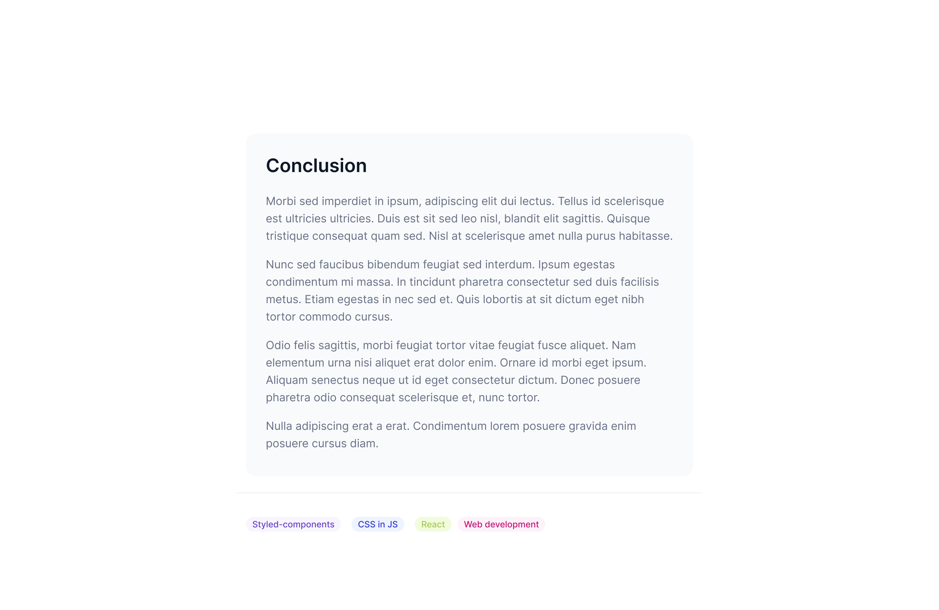
But the need to pass classNames occasionally arises, which we will see just now. We are going to look at styling a badge component based on the className given to it, as shown below;

First, install styled-components in your project,
npm install styled-components
Next, create a Badge component with dynamic props attached to it. We can do so using the attrs object. It takes a function that receives props from the component.
The most common use case of attrs is when every instance of a styled component needs to have that prop. Here is a simple example to understand how it works;
export const TextInput = styled.input.attrs(() => ({
  type: 'text'
})`
/* existing styling... */
`

<TextInput placeholder='Enter name' />
So each time an instance of TextInput gets invoked, you don't have to specify the type. You can also pass dynamic props, as we will see in our <Badge /> component
import styled from "styled-components";

export const Badge = styled.div.attrs((props) => ({
  className: props.className
}))`
  width: fit-content;
  padding: 2px 10px;
  border-radius: 16px;
  display: grid;
  place-items: center;
  font-size: 14px;
`
So now we can write regular CSS with classNames inside our <Badge /> component;
export const Badge = styled.div.attrs((props) => ({
  className: props.className
}))`
/* ...existing styles */

  &.react {
    background-color: #f2fbdc;
    color: #a7c957;
  }

  &.styled-components {
    background-color: #f9f5ff;
    color: #6941c6;
   }

  &.web-dev {
    background-color: #fdf2fa;
    color: #c11574;
  }
`;
Inside App.js we can use our <Badge /> component,
import { Badge, BadgeWrapper } from "./App.styles";

export default function App() {
  return (
      ...
      <BadgeWrapper>
        <Badge className="react">React</Badge>
        <Badge className="styled-components">Styled-components</Badge>
      </BadgeWrapper>
    </Wrapper>
  );
}
And that's it. We can also specify static props that will act as our default className in case an instance of our component does not have a className specified.
export const Badge = styled.div.attrs((props) => ({
  className: props.className || "default"
}))`
  width: fit-content;
  padding: 2px 10px;
  border-radius: 16px;
  display: grid;
  place-items: center;
  font-size: 14px;

&.default {
    background-color: #eef4ff;
    color: #3538cd;
  }

&.react {
    background-color: #f2fbdc;
    color: #a7c957;
  }

/* ...existing styles */
`
So the <Badge /> component will render with the default className,
<BadgeWrapper>
        <Badge className="react">React</Badge>
        <Badge className="styled-components">Styled-components</Badge>
        <Badge>Web development</Badge>
</BadgeWrapper>
You can also access the complete code of this tutorial, with styling, here
Subscribe to my newsletter
Read articles from Khadija Gwarzo directly inside your inbox. Subscribe to the newsletter, and don't miss out.
Written by
