CSS Animations : Level Genin
 Vaibhav Tripathi
We all have seen those fancy looking websites with cool animations and smooth transitions effects. Animations increase the user retentivity and help to attract more traffic to the websites. Therefore, using animations in development projects has become a necessity.
After reading this blog, I am sure you would be able to implement really cool animations to your websites. So lets begin!
Lets build the intuition first by understanding three basic properties before jumping to the coding part :
- Animation Duration.
- Animation Iteration.
- State of the selector.
1. Animation Duration:
Animation duration basically refers to the time period under which a particular animation executes. For eg:
-> Suppose we have a div with some height and width and a background color white and we want to change the background color to red while we hover our cursor on to it.
-> Now by default the :hover pseudo class will immediately change its color to red. But the condition is, we want to do it slow within some defined time span.
-> Here the defined time span refers to the animation duration.
Note : It must be overwhelming for a newbie to grasp concepts but things will gradually make sense as we progress in the blog.
2. Animation Iteration:
Animation iteration refers to the frequency in which an animation executes. Suppose, we have an animation with duration of 2 secs and it executes for 10 secs. So, in total this animation will execute for 5 times. Here, the 10 secs refers to animation iteration in CSS.
3. State of Selector:
In CSS most of the times animations are applied on the state of a particular selector. Here state is nothing but the properties a CSS selector carries. Lets take the previous example to understand it:
-> We have a div with some height and width and a background color white, we have the same animation with an animation duration of 3 secs. What is animation-duration? Read the first heading.
-> Now for the first half, between 0 sec to 1 sec we want color to be changed to red.
-> For the second half, between 1 sec to 2 sec we want color to be changed from red to green.
-> At last , between 2 sec to 3 sec we want color to be changed from green to blue.
Here the background-color of the div is changing during animation, and this background-color here refer to the state of the selector which changes time to time.
Note: There are a lot more properties for animations but for the time being understand the above three for building the basic intuition.
The intuition part for understanding the animation is done. Now lets jump to the coding part.
How to implement animations
The animations in CSS are implement via keyframes. Keyframes are used to define the sequence of the animation. Lets take a deep dive into CSS animations and understand it via same example:
Task : We have a div with some height and width and a background color white, we want to change its color from white to red during 0 to 1sec, red to blue in next 1 sec and then blue to green next second.
Follow the following steps:
1. Set up your markup:
Make a div and assign it a class
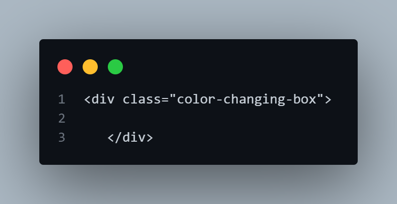
2. Do the basic styling on the container:
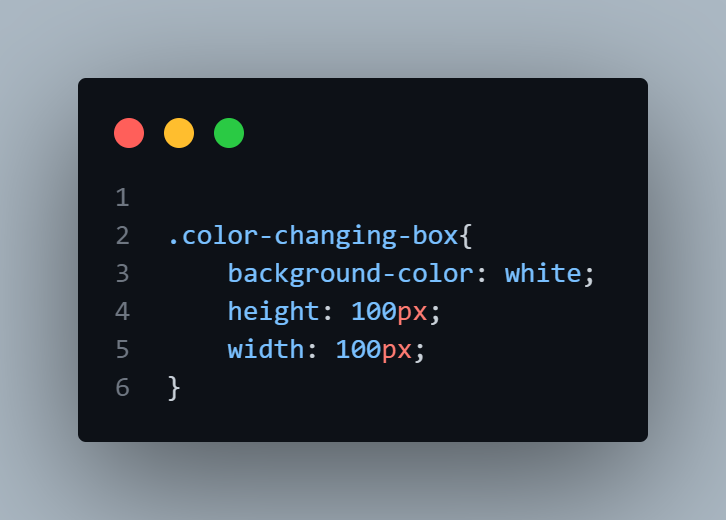
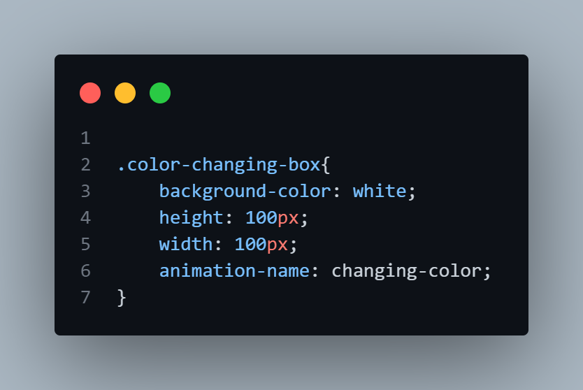
3.Specify animation name:
Animation name is used as a reference of the selector in the keyframe.
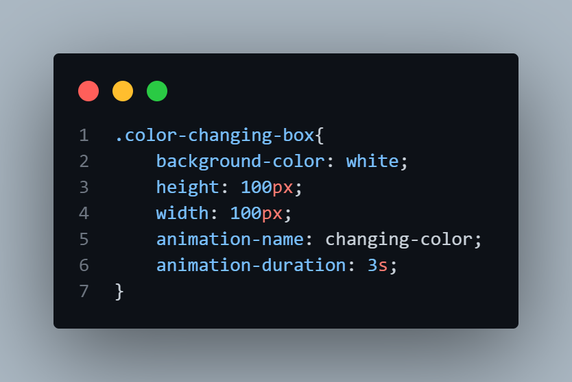
4. Specify animation duration:
This basically refers to the time period during which animation takes place, already explained above.
5. Add keyframes:
The way we write keyframes is, first we write '@keyframe' followed by the name of the animation.
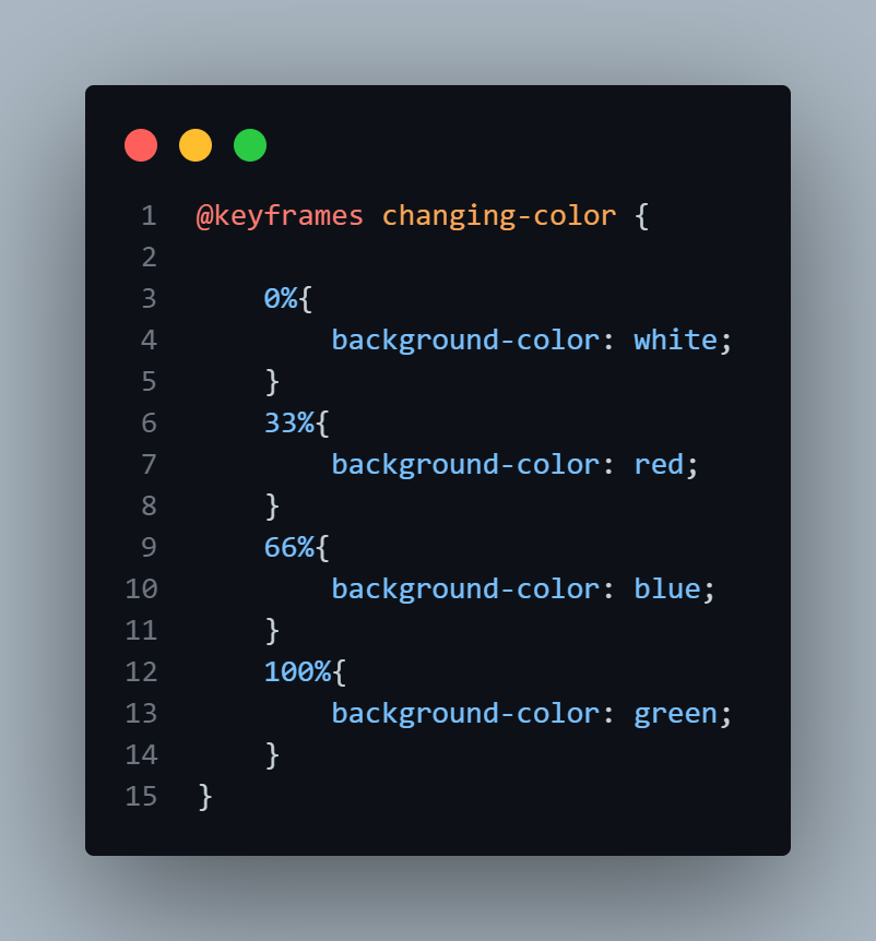
The different percentages refer to the animation progression and the content inside the block refers to the state of the selector at different stages of animation.
6. Add iteration-count:
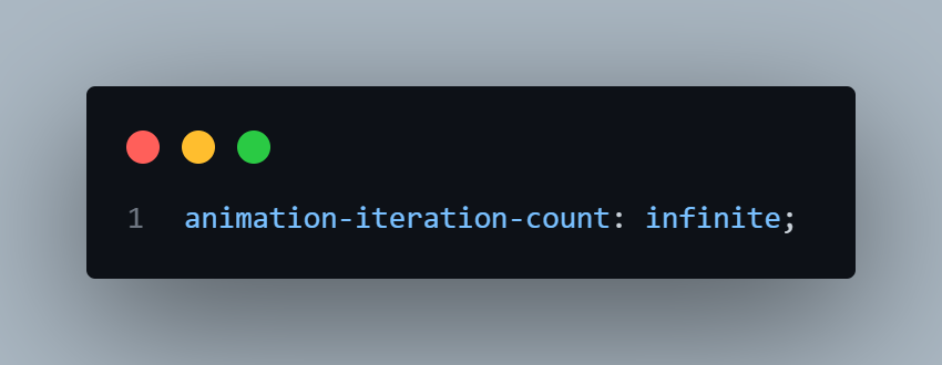
Here, animation-iteration count refers to the amount of time an animation with some animation duration is going to be executed. For the time being I've set it to infinite which means this animation is going to repeat for infinite times.
That's it your are done. From now on you will be able to use animations in your project. Go on and try animating with different properties.
Congrats!! if you made it this far. Make sure to give yourself a pat on the back !!
Sources used : Traversy media lectures, MDN blogs.
Subscribe to my newsletter
Read articles from Vaibhav Tripathi directly inside your inbox. Subscribe to the newsletter, and don't miss out.
Written by

Vaibhav Tripathi
Vaibhav Tripathi
Hi there , I am Vaibhav and I am a frontend developer. Make sure to drop a 👋 on my socials !