The proper way to stack card items in CSS
 Somnath Paul
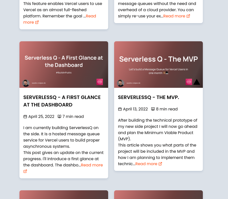
Here is the story, So I was building my portfolio website and I wanted to create some blogs post cards to show case my recent articles. But while I built the cards and fetched the articles, I found out that the brief about the articles were of different lengths and thus let to cards of different heights. It was creating an extra gap between rows. Like this 👇
❌Using Flexbox or Grid

Well, you can make an argument why not use align-items: stretch;? Well, I don't want empty space in the cards either.
So let me get to the main part! Why not customize each item with flexbox or grid here? Well, you can when each item sizes are known and the number of items is static, but in my case, each card had different length and the height of the card was only found after the API call is made.
So, I googled a lot but most Stack overflow post ended up with 'You cannot do that with vanilla CSS'. But after a lot of digging, I found out about multi-Column layout and that was a big pain relief 😮💨.
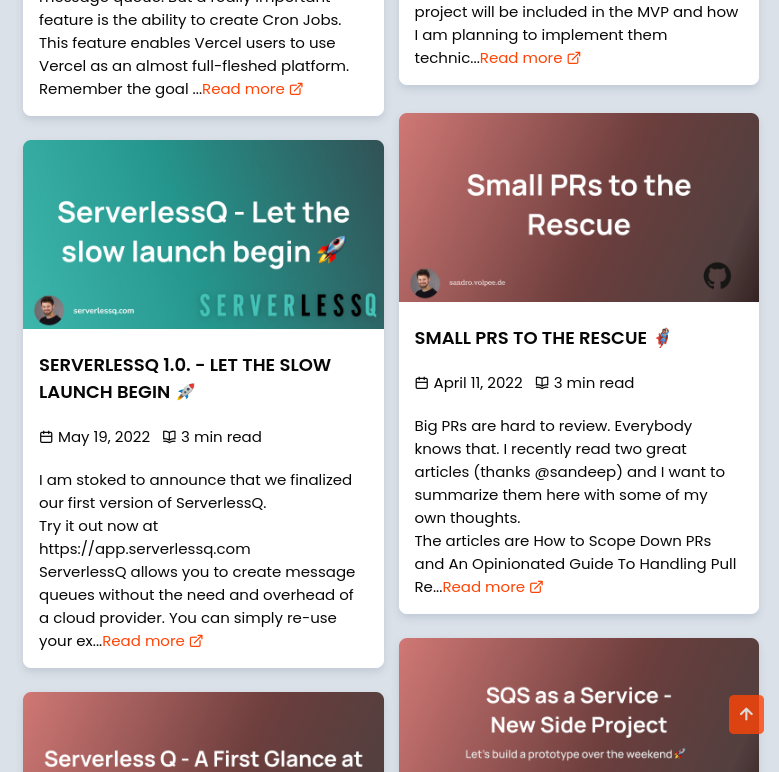
Now look how the cards are stacked 👇
✔️Using Multi Column layout

.blog_container{
  column-count: 2;
}
Now look at the gap between the cards. This single line of code saved me from so much headache. Learn more about CSS columns 👉 here.
If you have a better solution, feel free to comment below!
Subscribe to my newsletter
Read articles from Somnath Paul directly inside your inbox. Subscribe to the newsletter, and don't miss out.
Written by

Somnath Paul
Somnath Paul
I am a developer from Kolkata, Interested in all thing's tech!