Principles of UI/UX
 Hanson
Table of contents

When it comes to UI/UX design, there are principles that form the base of your design. Interacting with UI/UX principles is very tantamount in becoming a good designer and even web developer. Design has power so use your power for good. Design is all around us. We interact with designs everyday from our mobile phones to billboards to our TV screens, name them!
What makes a good design? Aesthetically, designs can be a piece of wall arts hanging in your bedroom or in the art gallery. You can call it art - it draws your attention and some times retains it.
But looks are not everything, or are they? Design is thinking made visual. Designs serves a function and purpose. Design communicates. Design affects the way we feel. Design can change our opinions.
-CONTRAST "The designs pops!", says the client. While that sounds random, what the client means is that the contrast is just perfect thereby not rendering the design monotonous. Contrast describes how different elements are in a design, particularly adjacent elements. The various elements stand out because of those differences. Contrast affects everything from how a user feels when they interact with a design, to how they use the design whether they can fully see and understand it. Contrast Impacts user experience on an emotional and usability level.
Using the PEPSI drink as a case study. You can see that purple isn’t popping the design but the original design pops the can and even makes it look so enticing.

-BALANCE Each design element-topography, colors, images, shapes, patterns etc. carries a visual weight. Some images, shapes, patterns etc. carries a virtual weight. Some images are heavier to the eyes while some are not. The arrangements of these elements laid out on a page should give a feel of balance. Elements are arranged either symmetrically, asymmetrically, or radially in relation to the overall design.
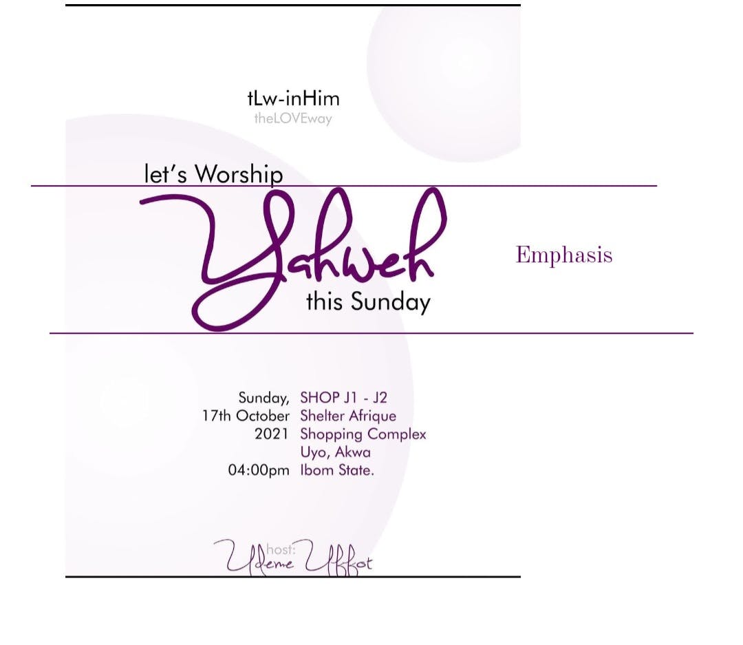
-EMPHASIS Emphasis gives the distinctive features. Emphasis deals with the part of design that is meant to stand out. Emphasis conveys important design information.

-PROPORTION Proportion is one of the most easiest design principles to understand. Easily, it is the size of elements in relation to one another. Proportions helps you approach your designs in sections instead of as a whole. Proportion is achieved when all elements of your design and well-sized and thoughtfully placed. Proportion pin points what is important in a design and what is not.
-HIERARCHY Hierarchy directly relates to how well content can be processed by people using a website. Hierarchy is the importance of elements within a design, making the most important elements appear as the most important. In visual hierarchy, the interface helps the user process details in order of relevance.
-REPETITION Repetition is a great way to reinforce an idea. Repetition unifies a design that brings together a lot of different elements. Don't reinvent the wheel. Reinventing hurts engagement and instead of differentiating, scares off the audience.

-MOVEMENT AND RHYTHM Movement is how the eye moves throughout the composition, capturing each detail and attention from one aspect to another. Rhythm is how often something repeats, and the intensity of its contrast creates rhythm. Maintain consistency of the user flow throughout the journey.
-PATTERN Patterns are the repetition of multiple designs, and elements working together. Examples are the wallpaper patterns that virtually everyone is familiar with. In designs, patterns are set standards for how certain elements are designed.

-WHITE SPACE White space is the part of the design that has no design elements. White space give the design room to breathe. Psychologically, humans appreciate white spaces more. White spaces creates serenity. Don’t be afraid of white space. White space helps create focus and balance.

-VARIETY Designs becomes dull without variety. Design uses variety for visual interest. Variety are through colors, topography, images shapes and virtual every other design element. Variety reinforces other elements of design to create more interesting and pleasing outcomes that improves the user's experience.

-UNITY Unity shows how well a design elements work together. Designs that are not united throws the user off balance. For example, magazine page with different fonts. Unity ensures concepts are communicated in a clear manner. Designs with good unity depicts high quality and authority.

-DESIGN PSYCHOLOGY We must design for the way people behave, not how we want them to behave. Design psychology aids you to understand how your user thinks and respond to design elements which enables you to make effective decisions about architecture and aesthetics.
-INCLUSIVE DESIGN People ignore designs that ignore people. Inclusive design is a framework that respects and enables human differences by involving and learning from the diverse range of people the design will serve. Inclusive design provides the best user experience.
Conclusively, Even more exciting, a design doesn't need to follow all these principles to be good. A design can be spontaneous. Make your designs findable, discoverable, understandable, efficient, and informative. Make it simple but significant. Significant by eliminating the unnecessary so that the necessary may speak. Simple sells, simple is useable and simple scales.
Thanks for reading!
Subscribe to my newsletter
Read articles from Hanson directly inside your inbox. Subscribe to the newsletter, and don't miss out.
Written by

Hanson
Hanson
Last project - Currency Strength Meter using .Net core 5.0