CSS Flexbox
 Krishnanand Roy
What is Flexbox
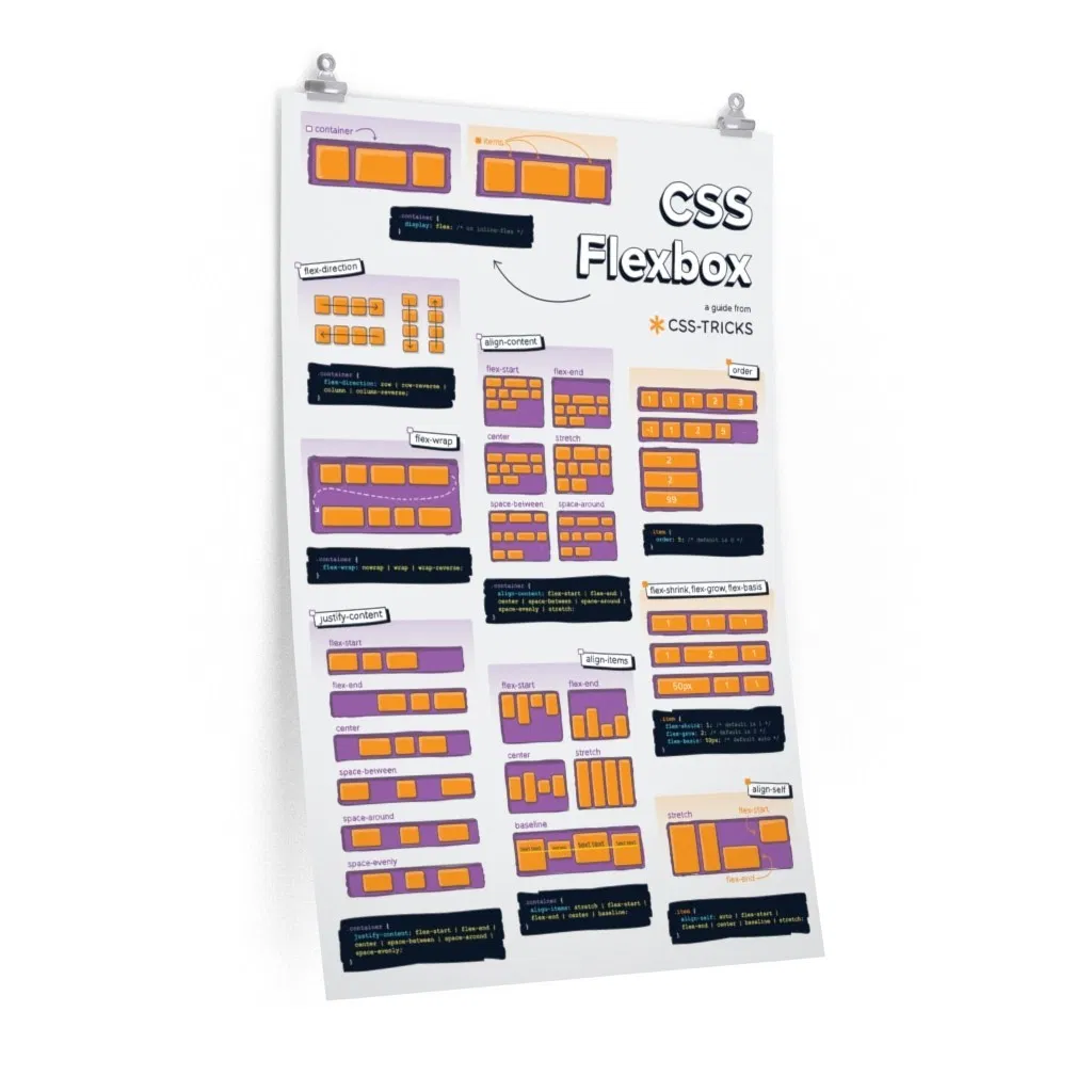
Flexbox Layout provide a more efficient way to lay out, align and distribute space among items in a container, even when their size is unknown and/or dynamic.
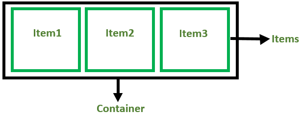
There are 2 main components of the Flexbox:
- Flex Container( parent ) -> which contains various divisions(items) is called a flex container.
- Flex items( child ) -> The items inside the container are flex items.
Flexbox deals with layout in one dimension at a time — either as a row or as a column.
Flexbox Axes
While working with Flexbox, we deal with 2 axes
- Main Axis
- Cross Axis
Main Axis
Main axis is defined by flex-direction, which has four possible values:
- row( left to right )
- row-reverse( right to left )
- column( top to bottom )
- column-reverse(bottom to top )
When you choose row or row-reverse, then your main axis will run along the row in the inline direction.

When you choose column or column-reverse then your main axis will run from top to bottom

Cross-axis
The cross axis runs perpendicular to the main axis, so when your flex-direction (main axis) is set to row or row-reverse the cross axis runs down the columns.
When your main axis is column or column-reverse then the cross axis runs along the rows.
Flexbox Properties
Properties for Parent( Container )
Display flex
Display flex is the property of flex container to use flexbox.
When we add display: flex, we are really defining display: block flex. The outer display type of our flex container is block; it acts like a block level element in normal flow. The inner display type is flex, so items directly inside our container will participate in flex layout.
syntax :-
.container {
  display: flex;
}
Example without Display flex :-
<style>
        .container{
           border: 2px solid red;
        }
        .items{
            border: 2px solid yellow;
            height: 60px;
            width: 60px;
            background-color: blueviolet;
            color: white;
            text-align: center;
    </style>
</head>
<body>
    div class="container">
        <div class="items">Flex-Child</div>
        <div class="items">Flex-Child</div>
        <div class="items">Flex-Child</div>
    </div>
</body>
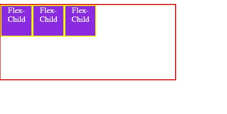
Output without flex

Example With Display flex Property : -
<style>
        .container{
        display: flex;
            height: 150px;
            width: 350px;
           border: 2px solid red;
        }
        .items{
            border: 2px solid yellow;
            height: 60px;
            width: 60px;
            background-color: blueviolet;
            color: white;
            text-align: center;
    </style>
</head>
<body>
    div class="container">
        <div class="items">Flex-Child</div>
        <div class="items">Flex-Child</div>
        <div class="items">Flex-Child</div>
    </div>
</body>
Output with Display flex :-
flex-direction
Flex Direction property is given to flex container to change direction of flex items. By default, flex direction value is row.
There are total 4 value are for flex-direction :-
- row
- row-reverse
- column
- column-reverse
Syntax:-
.container {
  flex-direction: row | row-reverse | column | column-reverse;
}
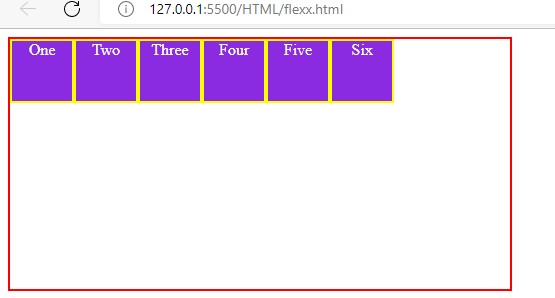
1. row
The row value of flex items( child ) arrange the flex items horizontally( means from left to right ).
Example : -
<style>
        .container{
            display: flex;
           flex-direction: row;
            height: 250px;
            width: 500px;
            border: 2px solid red;

        }
        .items{
            border: 2px solid yellow;
            height: 60px;
            width: 60px;
            background-color: blueviolet;
            color: white;
            text-align: center;
        }
    </style>
</head>
<body>
    <div class="container">
        <div class="items">One</div>
        <div class="items" id="two">Two</div>
        <div class="items" id="three">Three</div>
        <div class="items">Four</div>
        <div class="items">Five</div>
        <div class="items">Six</div>
    </div>
</body>
Output:-
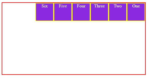
2. row-reverse
The row-reverse value arrange the flex items horizontally ( but from right to left )
Example:-
.container{
            display: flex;
           flex-direction: row-reverse;
            height: 250px;
            width: 500px;
            border: 2px solid red;

        }
Output:-
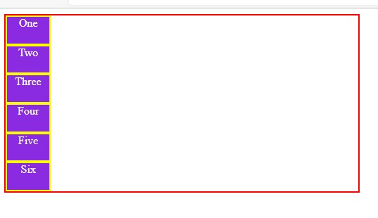
3. column
The column value arrange the flex items vertically ( from top to bottom ).
Example:-
.container{
            display: flex;
           flex-direction: column;
            height: 250px;
            width: 500px;
            border: 2px solid red;

        }
Output:- *
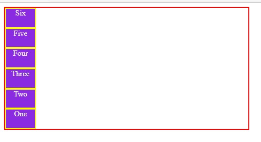
4. column-reverse
The column-reverse value arrange the flex items vertically ( but from bottom to top ).
Example:-
.container{
            display: flex;
           flex-direction: column-reverse;
            height: 250px;
            width: 500px;
            border: 2px solid red;

        }
Output:-
justify-content
justify-content property is used to justify content in main axis. This can adjust items to left, center, right or add space in between. default value for justify-content is flex-start.
There are total 6 value for justify-content : -
- flex-start
- flex-end
- center
- space-between
- space-evenly
- space-around
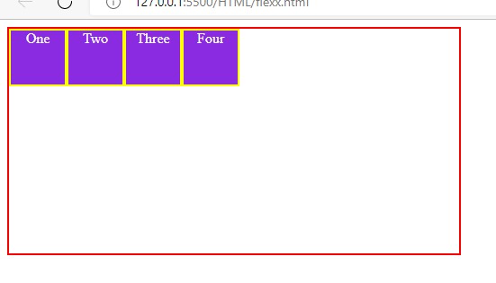
1. flex-start
The flex-start value aligns the flex items at the beginning of the container.
Example :-
<style>
        .container{
            display: flex;
            justify-content: flex-start;
            height: 250px;
            width: 500px;
            border: 2px solid red;

        }
        .items{
            border: 2px solid yellow;
            height: 60px;
            width: 60px;
            background-color: blueviolet;
            color: white;
            text-align: center;
        }
    </style>
</head>
<body>
    <div class="container">
        <div class="items">One</div>
        <div class="items" id="two">Two</div>
        <div class="items" id="three">Three</div>
        <div class="items">Four</div>
    </div>
</body>
Output : -
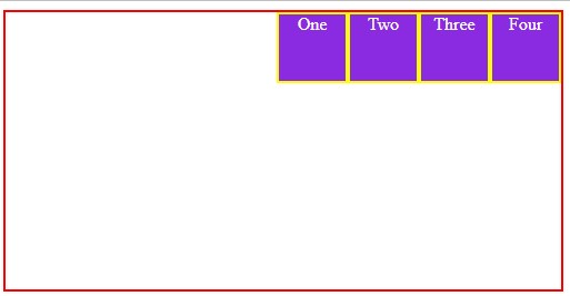
2. flex-end
The flex-end value aligns the flex items at the end of the container.
Example : -
.container{
            display: flex;
            justify-content: flex-end;
            height: 250px;
            width: 500px;
            border: 2px solid red;

        }
Output :-
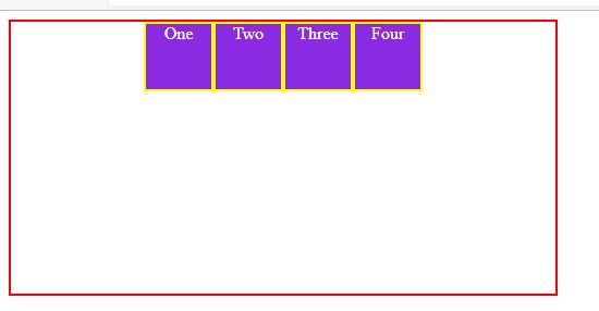
3. Center
The center value aligns the flex items at the center of the container.
Example: -
.container{
            display: flex;
            justify-content: center;
            height: 250px;
            width: 500px;
            border: 2px solid red;

        }
Output : -
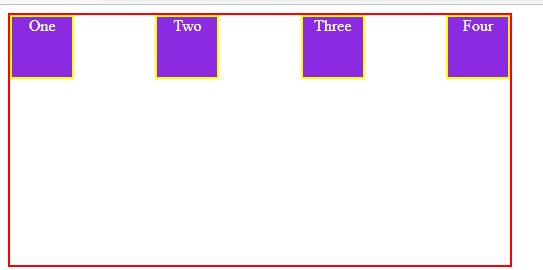
4. space-between
The space-between value displays the flex items with space between the lines.
Example :-
.container{
            display: flex;
            justify-content: space-between;
            height: 250px;
            width: 500px;
            border: 2px solid red;

        }
Output:-
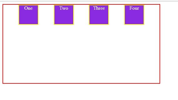
5. space-evenly
Example:-
.container{
            display: flex;
            justify-content: space-evenly;
            height: 250px;
            width: 500px;
            border: 2px solid red;

        }
Output:-
6. space-around
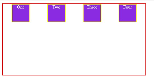
The space-around value displays the flex items with space before, between, and after the lines.
Example:-
.container{
            display: flex;
            justify-content: space-around;
            height: 250px;
            width: 500px;
            border: 2px solid red;

        }
Output:-
align-items
Align-items determines how the items as a whole are aligned within the container. it define the behavior of child( items ) means they are laid out across horizontal axis. default value for align-items is stretch.
There are total 5 value for align-items:-
- stretch
- flex-start
- flex-end
- center
- baseline
1.stretch
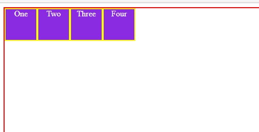
The stretch value stretches the flex items to fill the container.
Example: -
.container{
            display: flex;
           align-items: stretch;
            height: 250px;
            width: 500px;
            border: 2px solid red;

        }
Output:-
2. flex-start
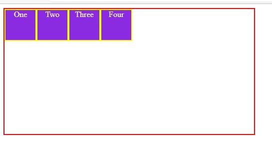
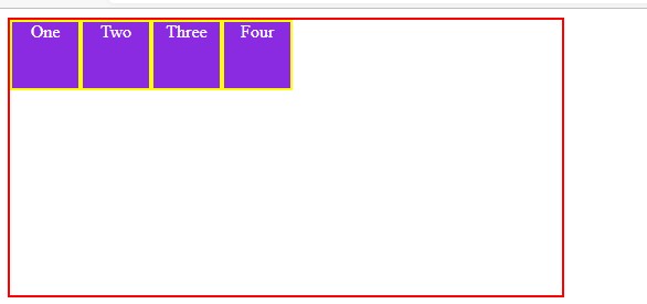
The flex-start value aligns the flex items at the top of the container.
Example:-
.container{
            display: flex;
           align-items: flex-start ;
            height: 250px;
            width: 500px;
            border: 2px solid red;

        }
Output:-
3. flex-end
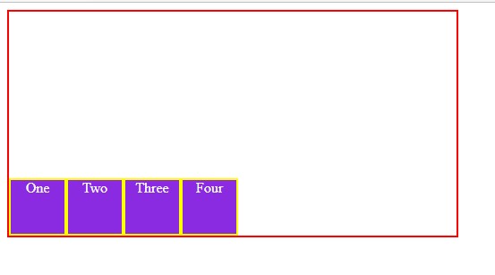
The flex-end value aligns the flex items at the bottom of the container.
Example: -
.container{
            display: flex;
           align-items: flex-end ;
            height: 250px;
            width: 500px;
            border: 2px solid red;

        }
Output:-
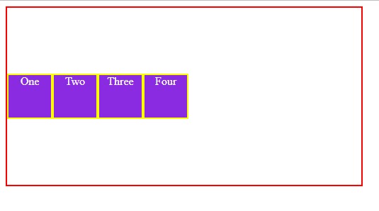
4. center
The center value aligns the flex items in the middle of the container.
Example: -
.container{
            display: flex;
           align-items: center ;
            height: 250px;
            width: 500px;
            border: 2px solid red;

        }
Output:-
5. baseline
The baseline value aligns the flex items such as their baselines aligns
Example: -
.container{
            display: flex;
           align-items: center ;
            height: 250px;
            width: 500px;
            border: 2px solid red;

        }
Output: -
flex-wrap
The flex-wrap property specifies how the flexbox items should wrap or not. default value for flex-wrap is nowrap.
There are total 3 value for flex-wrap.
- nowrap
- wrap
- wrap-reverse ( multiple line but in reverse from bottom to top )
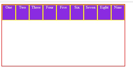
1. nowrap
It specifies that the flex items will not wrap. it is the default value for items( child ) which is present in container
Example:-
<style>
        .container{
            display: flex;
            flex-wrap: nowrap;
            height: 250px;
            width: 500px;
            border: 2px solid red;

        }
        .items{
            border: 2px solid yellow;
            height: 60px;
            width: 60px;
            background-color: blueviolet;
            color: white;
            text-align: center;
        }
    </style>
</head>
<body>
    <div class="container">
        <div class="items">One</div>
        <div class="items" id="two">Two</div>
        <div class="items" id="three">Three</div>
        <div class="items">Four</div>
        <div class="items">Five</div>
        <div class="items">Six</div>
        <div class="items">Seven</div>
        <div class="items">Eight</div>
        <div class="items">Nine</div>
    </div>
</body>
Output:-
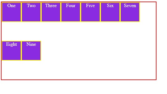
2. wrap
It wrap the elements in next line.
Example:-
.container{
            display: flex;
            flex-wrap: wrap;
            height: 250px;
            width: 500px;
            border: 2px solid red;

        }
Output:-
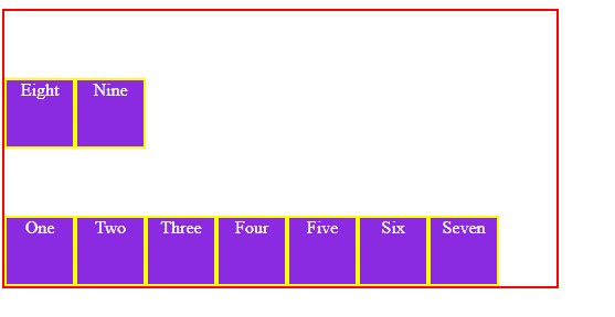
3. wrap-reverse
It Wrap items in multiple line but in reverse manner ( from bottom to top )
Example:-
.container{
            display: flex;
            flex-wrap: wrap-reverse;
            height: 250px;
            width: 500px;
            border: 2px solid red;

        }
Output:-
flex-flow
This is a shorthand property for the flex-direction and flex-wrap properties. default vlue for flex-flow is row nowrap.
Example:-
.container {
  flex-flow: column wrap;
}
Gap
It provide space between flex items. It applies that spacing only between items not on the outer edges.
There are total 3 value for Gap
- gap
- row-gap
- col-gap
Syntax:-
.container {
display: flex;
 gap: 10px;
  gap: 10px 20px; /* row-gap column gap */
  row-gap: 10px;
  column-gap: 20px;
}
Properties for the Children( flex items )
Order
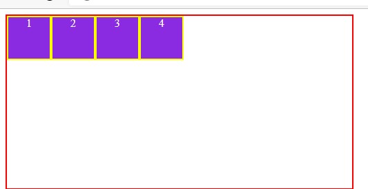
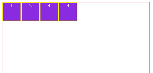
Order property of flex item is used to define the order in which they appear in parent container.
The default order value for container item is 0.
value of order is always a number.
Example:-
Without order property :-
<style>
        .container{
            display: flex;
            row-gap: 20px;
            height: 250px;
            width: 500px;
            border: 2px solid red;

        }
        .items{
            border: 2px solid yellow;
            height: 60px;
            width: 60px;
            background-color: blueviolet;
            color: white;
            text-align: center;
       }
    </style>
</head>
<body>
    <div class="container">
        <div class="items">1</div>
        <div class="items" id="two">2</div>
        <div class="items" id="three">3</div>
        <div class="items">4</div>

    </div>
With Order property:-
<style>
        .container{
            display: flex;
            row-gap: 20px;
            height: 250px;
            width: 500px;
            border: 2px solid red;

        }
        .items{
            border: 2px solid yellow;
            height: 60px;
            width: 60px;
            background-color: blueviolet;
            color: white;
            text-align: center;
        }
        #three{
            order: 4;
        }
    </style>
</head>
<body>
    <div class="container">
        <div class="items">1</div>
        <div class="items" id="two">2</div>
        <div class="items" id="three">3</div>
        <div class="items">4</div>

    </div>
flex-grow
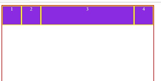
Flex-grow property of flex item defines how the items of container will grow. The default value for all flex items is 0.
Flex-grow 0 means width of flex item as per content only.
Flex-grow 1 means width of flex item will be distributed equally to all items.
If one of the children has a value of 2, that child would take up twice as much of the space either one of the others (or it will try, at least).
Syntax:-
.item {
  flex-grow: 4; /* default 0 */
}
Example :-
<style>
        .container{
            display: flex;
            height: 250px;
            width: 500px;
            border: 2px solid red;
        }
        .items{
            border: 2px solid yellow;
            height: 60px;
            width: 60px;
            background-color: blueviolet;
            color: white;
            text-align: center;
        }
        #three{
            flex-grow: 3;
        }
    </style>
</head>
<body>
    <div class="container">
        <div class="items">1</div>
        <div class="items" id="two">2</div>
        <div class="items" id="three">3</div>
        <div class="items">4</div>

    </div>
</body>
Output:-
align-self
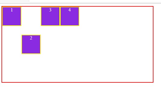
align-self is the property of flex items. It is used to align an individual flex item on y-axis.
Syntax: -
.item {
  align-self: auto | flex-start | flex-end | center | baseline | stretch;
}
Example :-
Subscribe to my newsletter
Read articles from Krishnanand Roy directly inside your inbox. Subscribe to the newsletter, and don't miss out.
Written by
