Flex & its Properties in CSS
 Deepak Sankhyan
Introduction
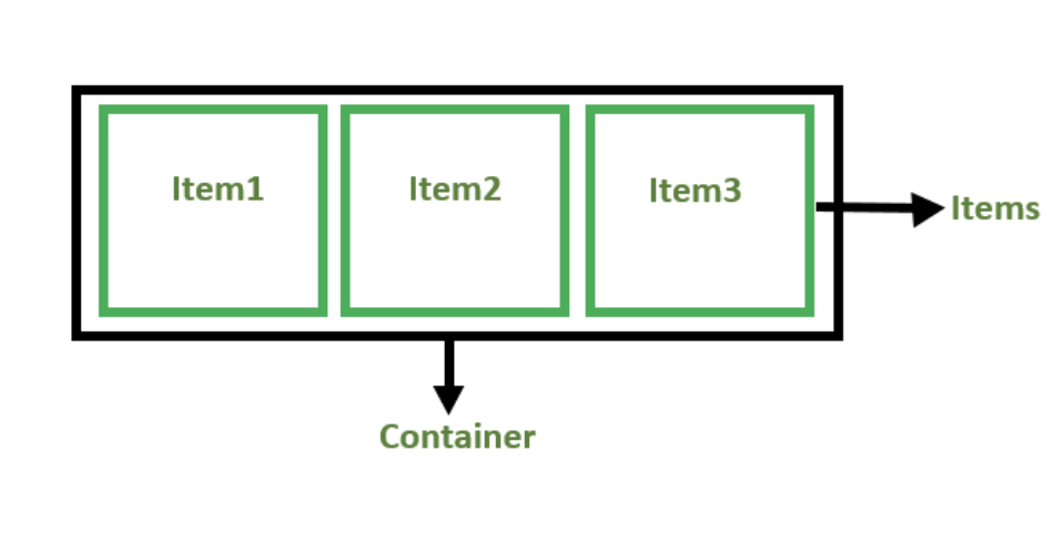
The Flex is the module to provide the layout, align and distribute the space among the items in the container ,even when their size is unknown or we can say the contents are in dynamic in nature.
The main idea of flex layout is that it gives the ability to container that how it alter its width, height to best fill the space. A flex container expands items to fill available free space and shrinks them to prevent the overflow.
Properties of Flex-
There are various properties of flex-box, which are as given below -
Float Property-
As the name suggest its very simple property which is used to float the element in the box towards left or right .
Clear Property-
This is used to clear the float . It. specifies what element can float beside a given element.
Introduction to FlexBox-
The flex-box or flexible box model in CSS is a one-dimensional layout model that has flexible and efficient layouts with distributed spaces among items to control their alignment structure ie., it is a layout model that provides an easy and clean way to arrange items within a container. Flex-box can be useful for creating small-scales layouts & is responsive and mobile-friendly.
Features of FlexBox are-
trangement of the items -Proper spacing] -Order and sequence of the items -Bootstrap 4 is built on top of the flex layout.
The main aim of flex-box is providing a better way to align and distribute the space among the items in a container.
How to initialise the Flexbox-
The way to initialise the flexbox is given below -
.container{
    display: flex;
}

Flex-direction property-
It defines the direction towards which items are laid can be row(which is default), row-reverse, Column, Column-reverse.
Some Flex properties for flex containers-
The following are the properties. for the flex containers are as follows -
Flex-wrap: it can be used to wrap the items as needed. sub properties will be -
- wrap
- nowrap
- wrap-reverse
Justify-Content: It defines the alignment along the main axis.
Align-items: It defines the alignment along cross-axis.
Align-Content- It Align the flex container's line when there is extra spaces in the cross axis .
Some Flex properties for flex items-
The following are the flex-properties which are applied directly on the flex items-
Order: The keyword Order is used to control the order in which the items appear in the flex container.
Align-Self: It allows the default alignment to be overridden for an individual flex items.
3.Flex-Grow: Flex-grow will define the ability for a flex item to grow .
4.Flex-Shrink: Flex shrink will specify the that how much a flex item will shrinks relative to the rest of the flex items.
Subscribe to my newsletter
Read articles from Deepak Sankhyan directly inside your inbox. Subscribe to the newsletter, and don't miss out.
Written by
