CSS FLEXBOX(Flexible Box)
 pankaj thakur

What is FlexBox?
"FlexBox" the term here defining its self as a box which is expandable,flexible which can be modified or altered easily. In context of Css ,FlexBox is one dimensional layout(either row or column wise) which helps us in space distribution and aliging of the flexbox items. Flexbox contains some propeties which we apply to the flex container o( parent element) and to the flex items(child -items) inside the flex-container.
The flex items in the flex conatiner are laid out either row or column wise so it depends on the flex-box directions. Our flex flex-container contianer main axis and cross axis, the item are laid out on main axis it can be either horizontal or vertical depending on the flex direction.The cross is perpendicula to the main axis .
Why FlexBox ??? Earlier css layouts were handled using floats and positoning but it was not easy to control the spacing and the alignments of the items , e.g centering an item inside container. Flexbox brings its properties that makes our layout taks easier. So lets learn about flexbox properties.
Properties for the flex-container(parent container)
1.display:
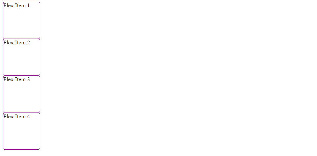
In order to make our flex-container we need to set the display property to either flex or inline-flex.When we set the display to flex, all the direct children becomes flex items. All the flex-items will behave in the following way. i) their display will be in a row because the flex-direction property is set to row by defalult. ii) the items will start from the start edge of the main axis. Example
Without Display :Flex:
Style:
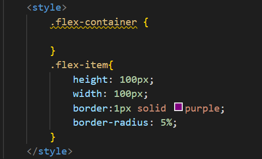
Html:

Webpage:
With Display:Flex Style:
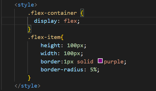
Webpage:

2. flex-direction:
The flex-direction property allowsl us to change the direction of our flex items according to the values given. As the directioin changes our main-axis and cross axis also changes with it.If the our flex-direction is set to column then the main-axis will be vertically and cross-axis will set horizontally.
i)flex-direction: column
Html + style:
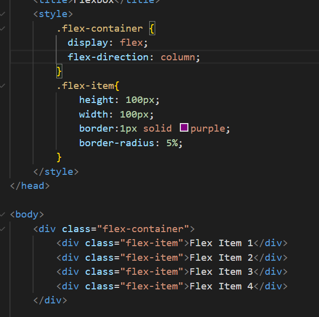
Webpage:
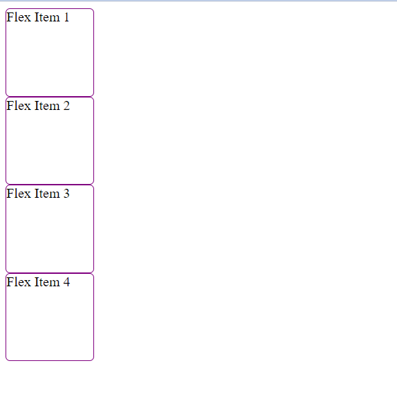
ii) flex-direction:column-reverse:
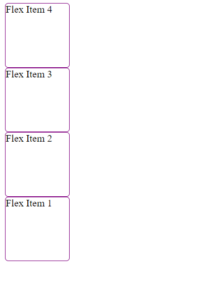
iii) flex-direction:row-reverse:

3 :flex-wrap
In order to wrap our flex-items onto multiple-lines and avoid the situation of over-flow of flex items we use the property flex-wrap with a value of wrap.Now if our item will be large , it should now wrap on to the next line.
i)flex-wrap:nowrap If the property is set to nowrap the flex-container will try to accomodate all the flex-items inside it give equal width or height accordingly,and flex items might get overflow . overflow: style:
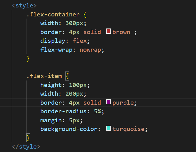
Hmtl:
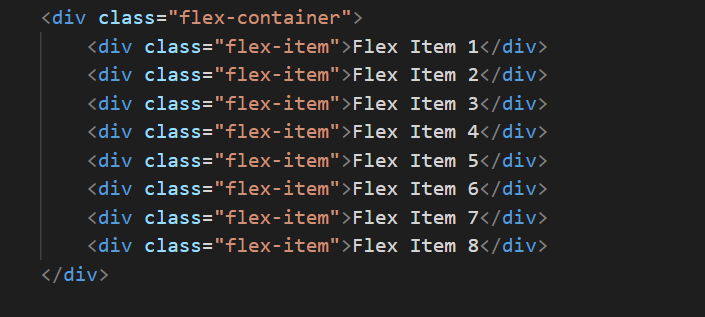
WebPage:
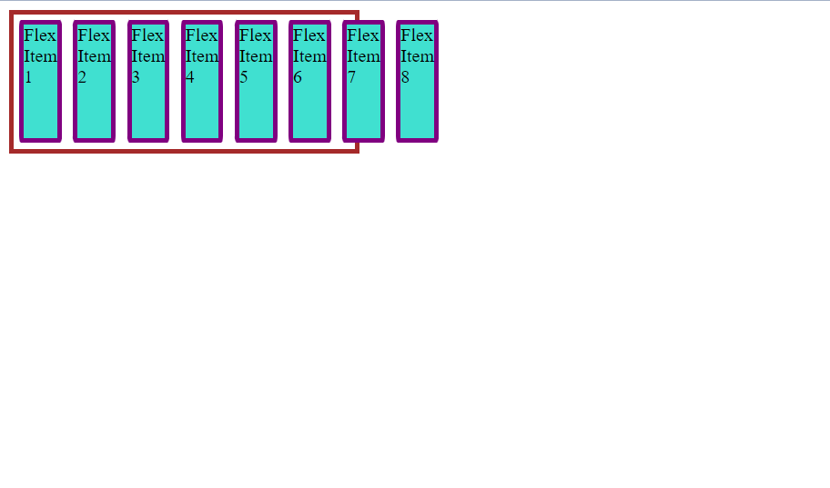
Flex box will accomodate all the boxes inside it if we change the width of the flex-container and width of the flex-items will vary with that increaing width. style:
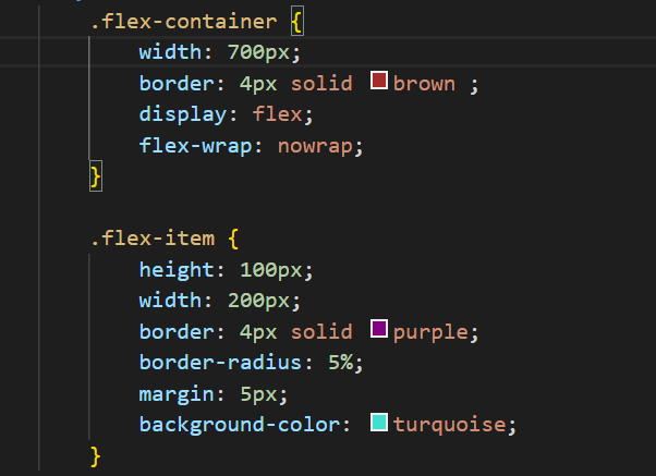
WebPage:
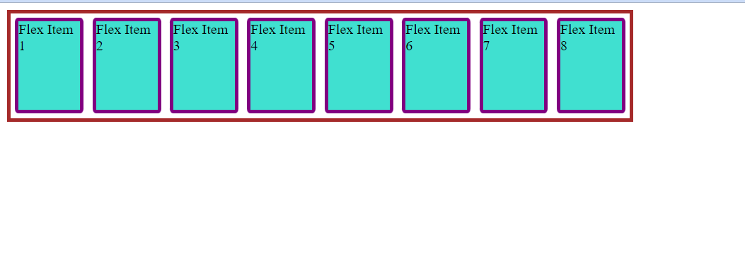
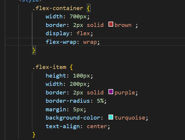
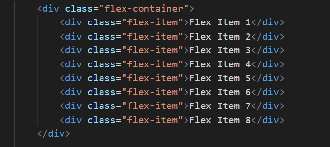
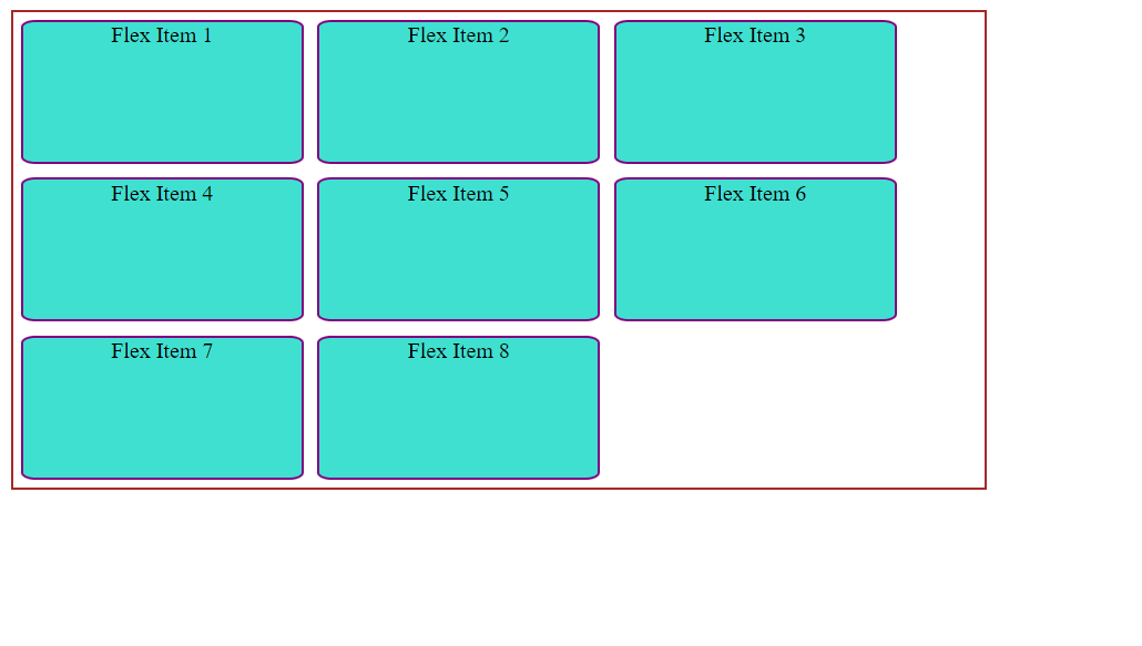
ii)flex-wrap:wrap If our flex-items are too large to fit into one-line , we can fit them onto multiple lines with flex-wrap:wrap. Style:
Html:
Webpage:
4: flex-flow
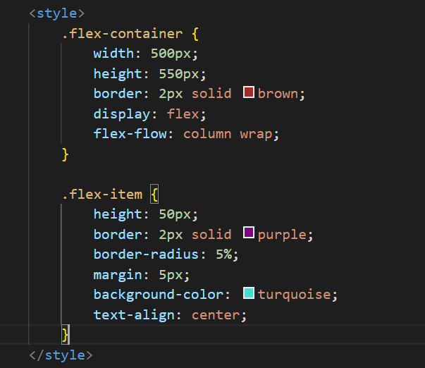
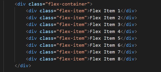
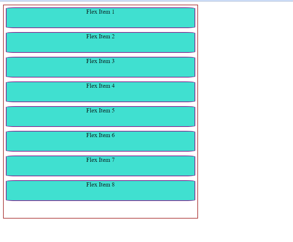
The flex-flow is a short hand for flex-wrap and flex direction ,combining both will decide our main axis and cross axis.
If no width is given the item items will get strech and wil occupy the free space and if no height is given the flex items will get streched again and will occupy the free space in flex-container(depends on the flex-direction).
Style:
 Html:
Html:
WebPage:
5: justify-content
The justify-content defines the alignment of flex-items along the main axis and gives us control in distributing the extra free space leftover. Here are some following values for the justify-content.
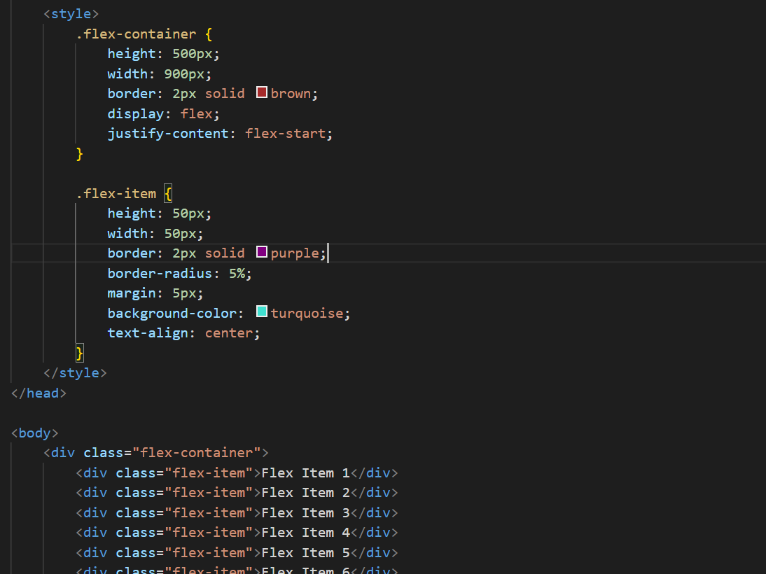
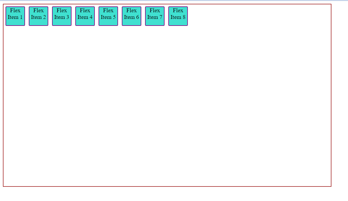
i ) justify-content:flex-start(by default). flex-items items are packed toward the start of the flex-direction.
Html and Style:
Webpage:
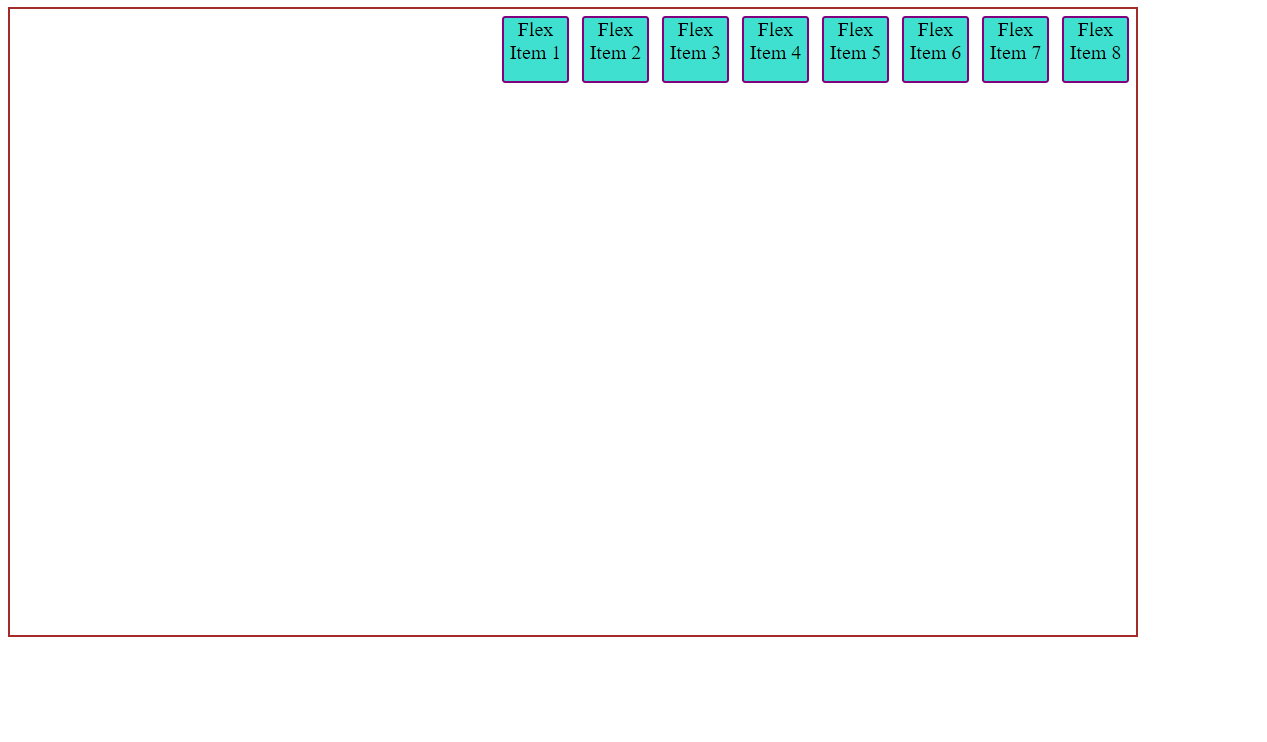
ii) justify-content:flex-end the flex items are packed towards the end of the flex-direction.
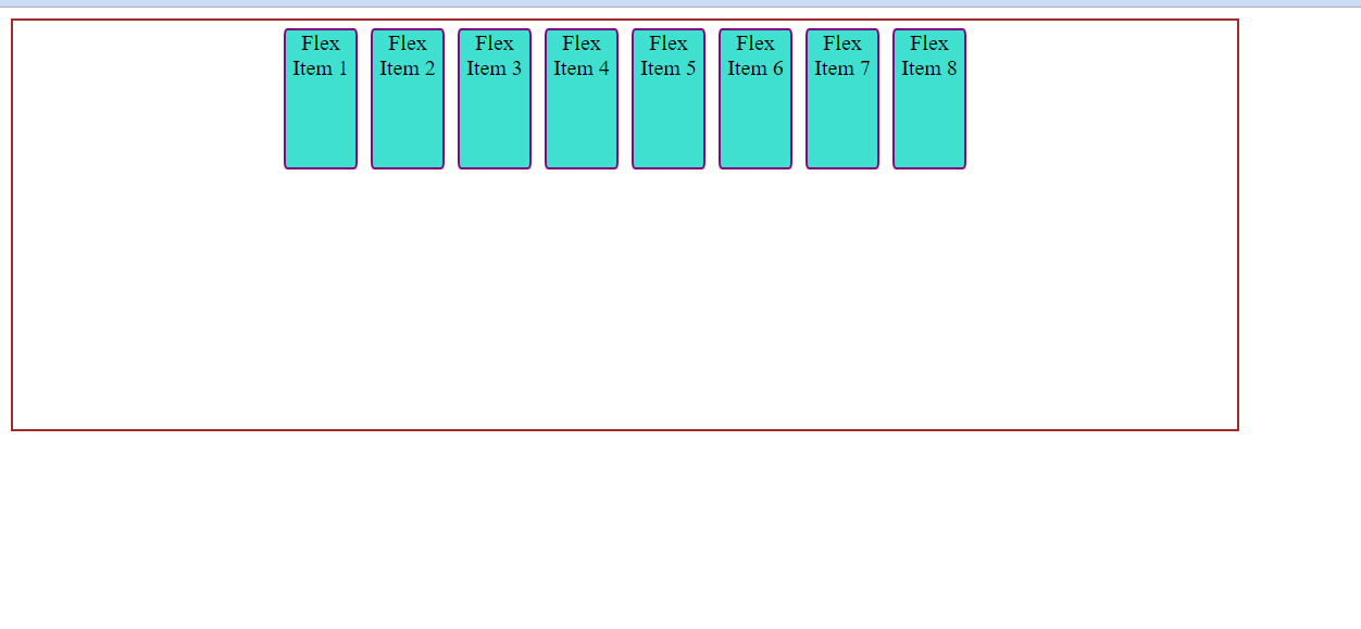
iii) justify-content:center The flex-items are centered along the line.
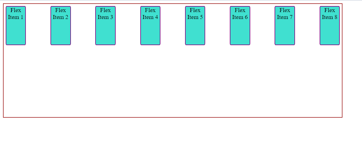
 iv) justify-content:space-between
The flex-items are evenly distributed along the line.First item is on the start line and last item is on the end line.
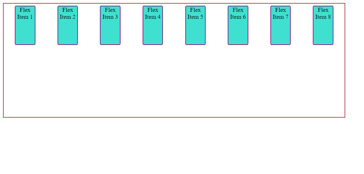
v) justify-content:space-around The flex items are given same or equal space around them .But the space doest appear to be equal. Since the space between the first item and the edge of the container is 1 Unit and 2 units of space to the next flex-item, since it has its own space also.
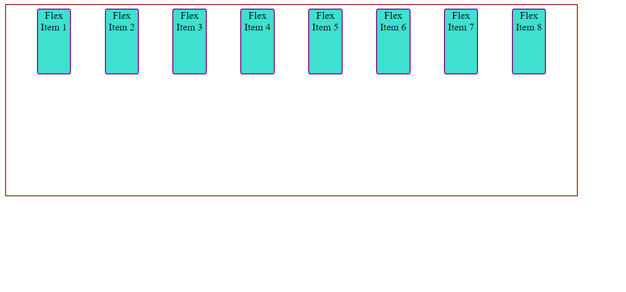
vi) justify-content:space-evenly The space between two flex items and space between first flex item(or last flex item) to the edge of the container is equal .Therefore the items are evenly distributed.
6:align-items
The align-items property allows us to control the behavior of the flex-items across cross-axis and helps in to lay flex-items accordingly.This property works similar to justify-content but for cross-axis.
Here are some values for the align-items property:
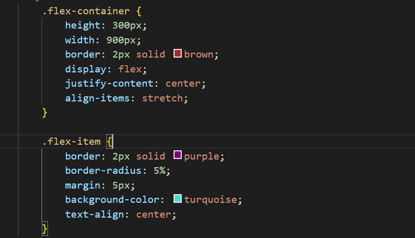
i)stretch
This value set is by defualt, it strech the flex-items to fill the container(respecting min-width / max-width) Style:
Html:

WebPage:
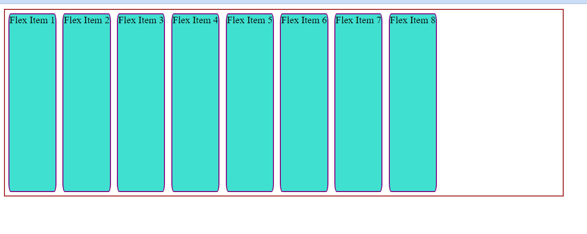
ii) flex-start,start , self-start Flex items are placed at the start of the cross-axis , depending on the flex-direction.
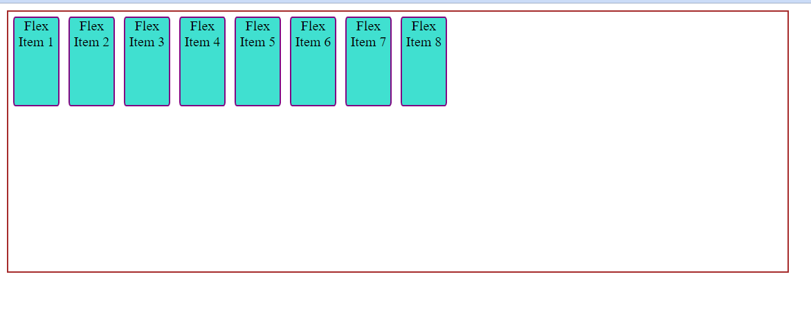
iii)flex-end / end / self-end Flex items are placed at the end of cross-axis with respect to the flex-direction.
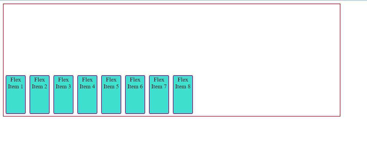
iv)center Flex items are aligned or placed at the centerd in cross-axis.
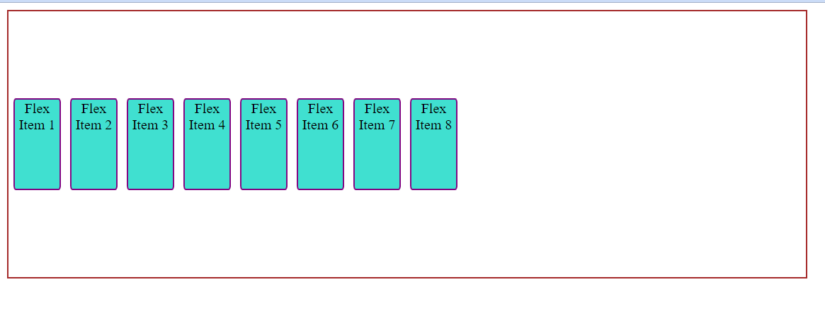
v)baseline items are aligned such as their baselines align even if they have different height, equillibrium among all is set with align-center:baseline.
7: align-content
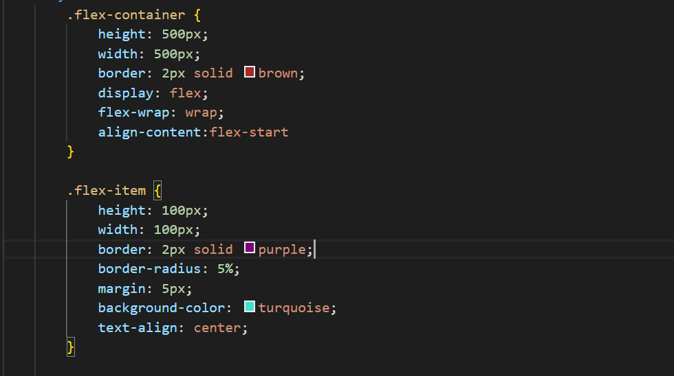
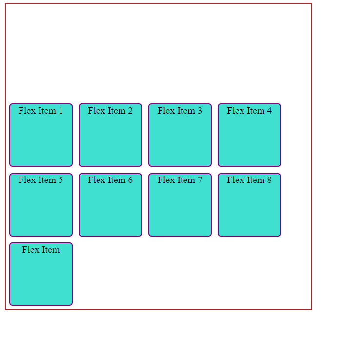
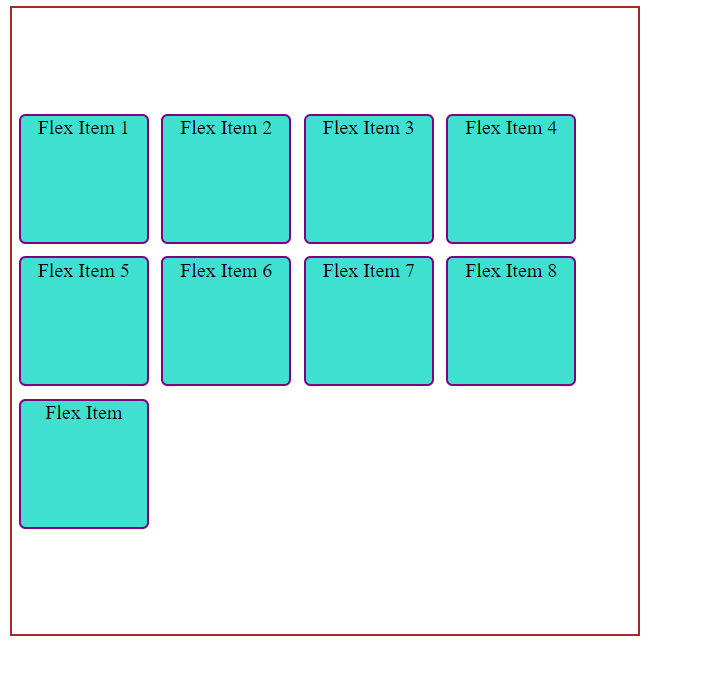
This property aligns the flex-container's lines across cross-axis when there is extra space,similar to justify-content aligns across main-axis. Here are some values for the align-content property:
i) flex-start:
Items are packed to the start of the container.
ii)flex-end Items are packed to the end of the container.
iii)center
Flex items are centered in the container.
iv)space-between items evenly distributed; the first line is at the start of the container while the last one is at the end.
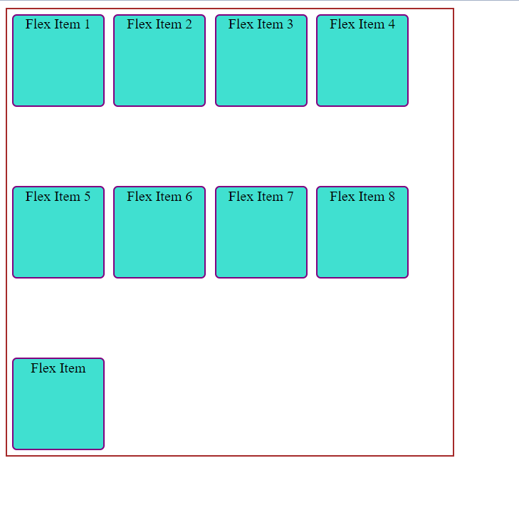
v)space-around
Items are distributed with equal space around eachline.
 vi)space-evenly
items are evenly distributed with equal space around them.
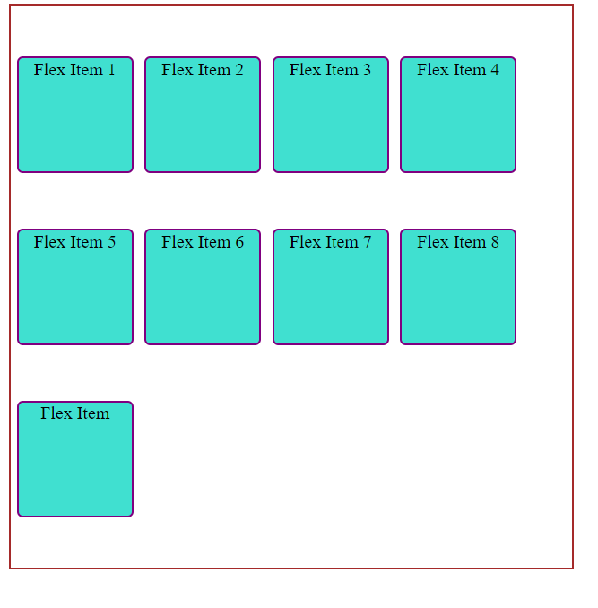
vii)stretch: lines stretch to take up the remaining space
8.gap, row-gap, column-gap
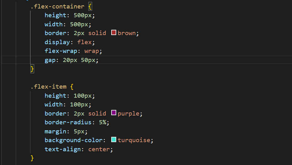
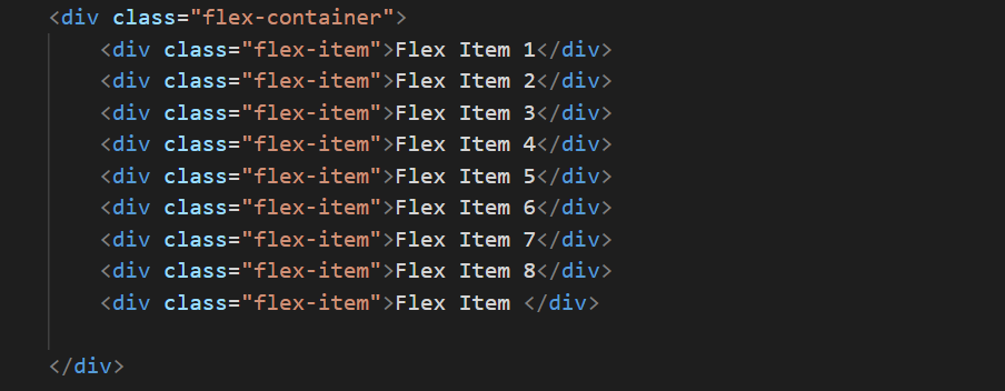
The gap property lets us control the spacing between flex items. It is applicable only to the spacing between flex items and not edges. Examples: gap:20px for both row and columns gap:20px 50x 20pxfor row and 50px column
Style:
Html:
Webpage:
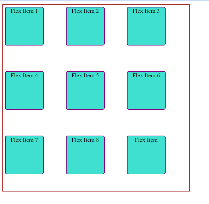
Properties for the Children(flex items)
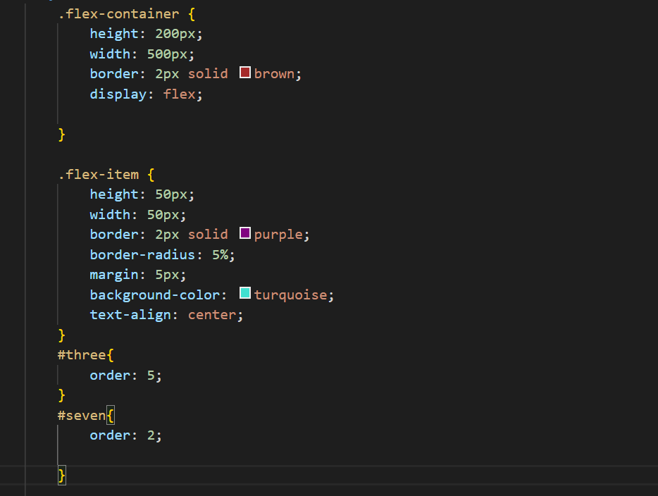
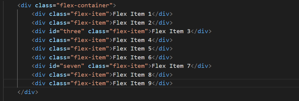
1. Order The order property of flex-items let us control in which order they will appear in flex-container.
Style:
Html:
Style:
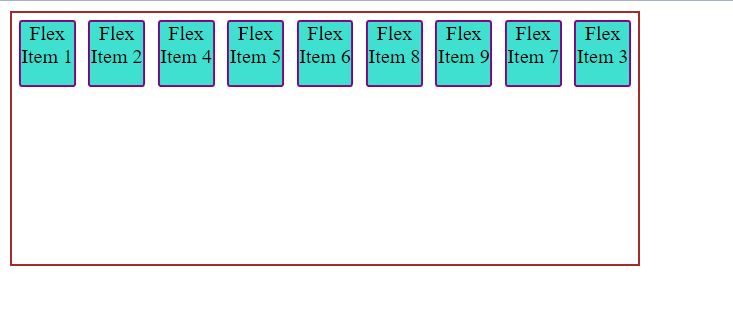
Items with the same order revert to source order.
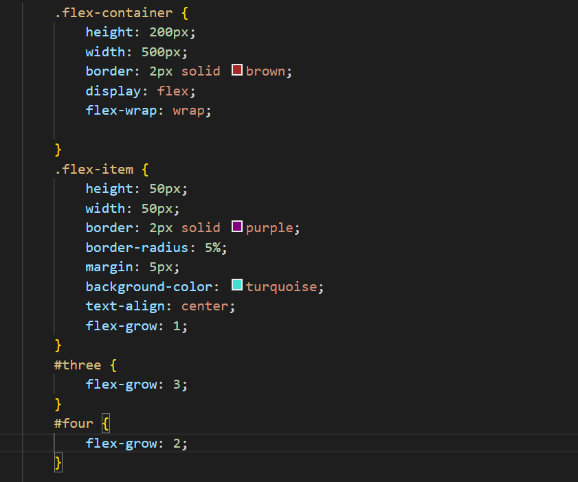
2.flex-grow:
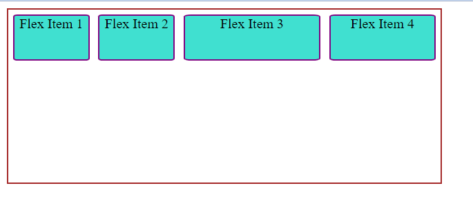
The flex-grow property gives us the power to increase or grow the size of the flex items. If the flex-items are set with flex-grow to 1,the space will be equally distributed among the flex-items.If any of the flex-items will have flex-grow value as one then it will take the space twice the size of any of the flex items.
Style:
Html:

Webpage:
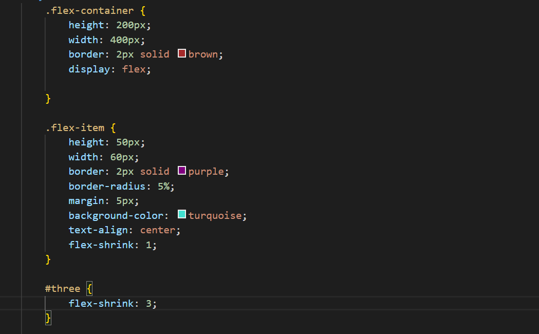
3.flex-shrink
This defines the ability of the flex-item to shrink if enough space is not available.
Style:
Hmtl:

Webpage:
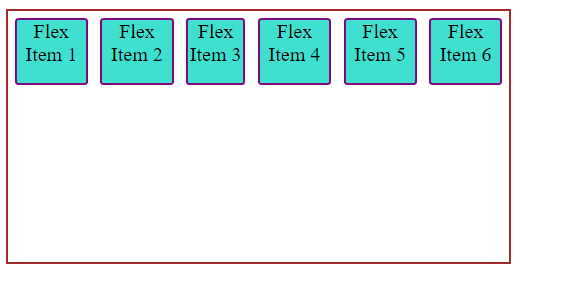 Item 3 got shrinked.
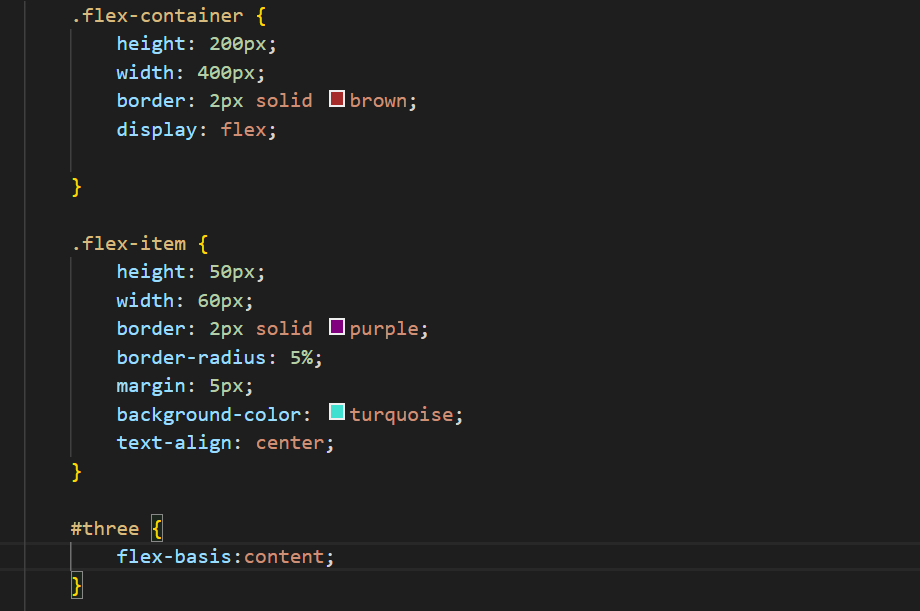
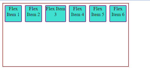
4:flex-basis:
it defines the deault size of the flex-item before the remaining space is distributed. The value auto means look at my height or width property and the value content means give size to the flex-item based on its content.
Style:
Html:

WebPage:
5. flex
This is the shorthand for flex-grow, flex-shrink and flex-basis combined. The second and third parameters (flex-shrink and flex-basis) are optional.It is recommended to use this shorthand value rathen than setting individual property.since it sets the other values intelligently syntax: .flex-item { flex: none | [ <'flex-grow'> <'flex-shrink'>? || <'flex-basis'> ] }
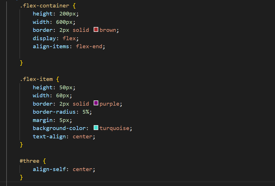
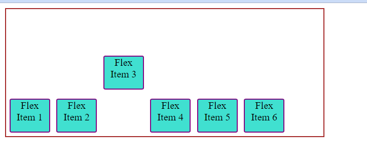
6.align-self
This allows the default alignment for a flex-item and overrides the align-items value for that particular item. Style:
Html:

Webpage:
Subscribe to my newsletter
Read articles from pankaj thakur directly inside your inbox. Subscribe to the newsletter, and don't miss out.
Written by