Flexbox made easy...
 saiprasad padhy
Flexbox is a great way to organize content on our web page as we need. Sometimes it works like a magic when we add display: flex to the parent but sometimes it won't work as expected and it will be very hard to debug and understand why it happens. In this blog, we will go through the very frequently used and most confusing properties of flexbox.
When we declare display: flex there will be 2 axis, one is Main axis and other one is Cross axis. by default Main axis is Horizontal (left --> right) and Cross axis is Vertical (top --> bottom).
In Flexbox child elements will get more control and parent will set some basic set of rules only
In this blog, We will understand the flexbox with a small example of stacking child elements next to each other inside a parent element.
<div class="parent">
   <div class="children"></div>
   <div class="children"></div>
   <div class="children"></div>
</div>
let's go to the first property.,
flex-shrink
Applicable to - Children
Default value - 1
This will shrink child elements when there is not enough space available. Will see an example of how this property works,
flex-shrink: 0

flex-shrink: 1

gap
Applicable to - Parent
This property is very useful when we need to add space between elements.
gap: 1rem

flex-grow
Applicable to - Children
Default value - 0
This will take the space left out in the parent and grow children's evenly.
flex-grow: 0

flex-grow: 1

flex-wrap
Applicable to - Parent
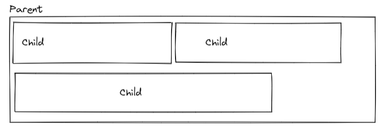
This will enable items to wrap inside the parent when there is not enough space available.
flex-wrap: nowrap

flex-wrap: wrap

Creating same-width columns

In the above example, flexbox won't create even width columns when there is more content in any one of the children. This is because flexbox will work with max-content so 3rd column will take more space as there is more content.
We can apply a small trick to achieve even columns.
.parent > * {
  flex: 1
}
flex: 1 is shorthand for 3 properties.
- flex-grow: 1
- flex-shrink: 1
- flex-basis: 0 (default is auto)
output:

flex-direction
Applicable to - Parent
Default value - row
This property describes in which direction child elements need to be stacked.
Also, the Main axis and Cross axis will depend on the flex-direction property.
flex-direction: row
If we define it as row, the parent will act like a row and all the children are the columns.
This means, Justify-content will work Horizontally and align-items will work Vertically.

flex-direction: column
If we define it as column, the parent will act like a column and all the children are the rows.
This means, Justify-content will work Vertically and align-items will work Horizontally.

justify-content
Applicable to - Parent
Default value - flex-start
This property always works with the Main axis.
- justify-content will only work if any space is left out in the parent.
- if the child has flex-grow: 1, means the child grows equally and there is no left out space in the parent. justify-content will not work in this case.
justify-content: center
it will take all the space and center the child items.

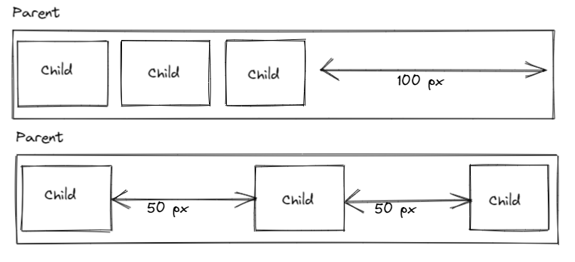
justify-content: space-between
it will equally distribute space between each flex item.

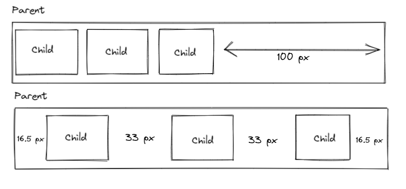
justify-content: space-around
it will distribute space around each flex item.

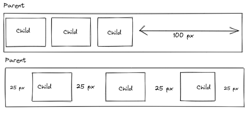
justify-content: space-evenly
it will distribute an equal amount of space around each flex item.

align-items
Applicable to - Parent
Default value - stretch
This property always works with the cross-axis.
align-items: center
it will center the flex items vertically.

align-self
Applicable to - Child
We can set individual item alignment by using this property.
align-self: flex-start
it aligns the specific flex item to start.

Thanks for reading this blog 🙏 🙏 🙏
Subscribe to my newsletter
Read articles from saiprasad padhy directly inside your inbox. Subscribe to the newsletter, and don't miss out.
Written by

saiprasad padhy
saiprasad padhy
When I first started out in my career, I was all about becoming a Data Scientist or ML Engineer. I was super good at Python and SQL, so that’s what I focused on. But then, I realized that I was actually more interested in being a Data Engineer. I love being highly analytical and process-oriented, and I’m really good at using the Microsoft Azure Data Engineering stack. I’m fluent in Python, SQL, and Databricks, and I’m especially good at Big Data tech like Hadoop and Spark (PySpark). I also know a lot about SQL databases (MS SQL, Postgres, Cosmos DB, and Mongo DB), data orchestration with Azure Data Factory, data governance with Microsoft Purview and Unity Catelog, and advanced tools like Azure Synapse Analytics, Delta Lake. I’m really passionate about finding the right solutions to complex challenges, and I’m not afraid to use any technology I need to get the job done. I’m also well-versed in AI technologies like Azure AI Services, Azure Open AI Studio, Scikit-Learn, and Spark ML. I’d love to chat with you and see how my skills can help you with your data engineering needs!