Ready-Made UI Components to Enhance Your Apps
 Shakuro
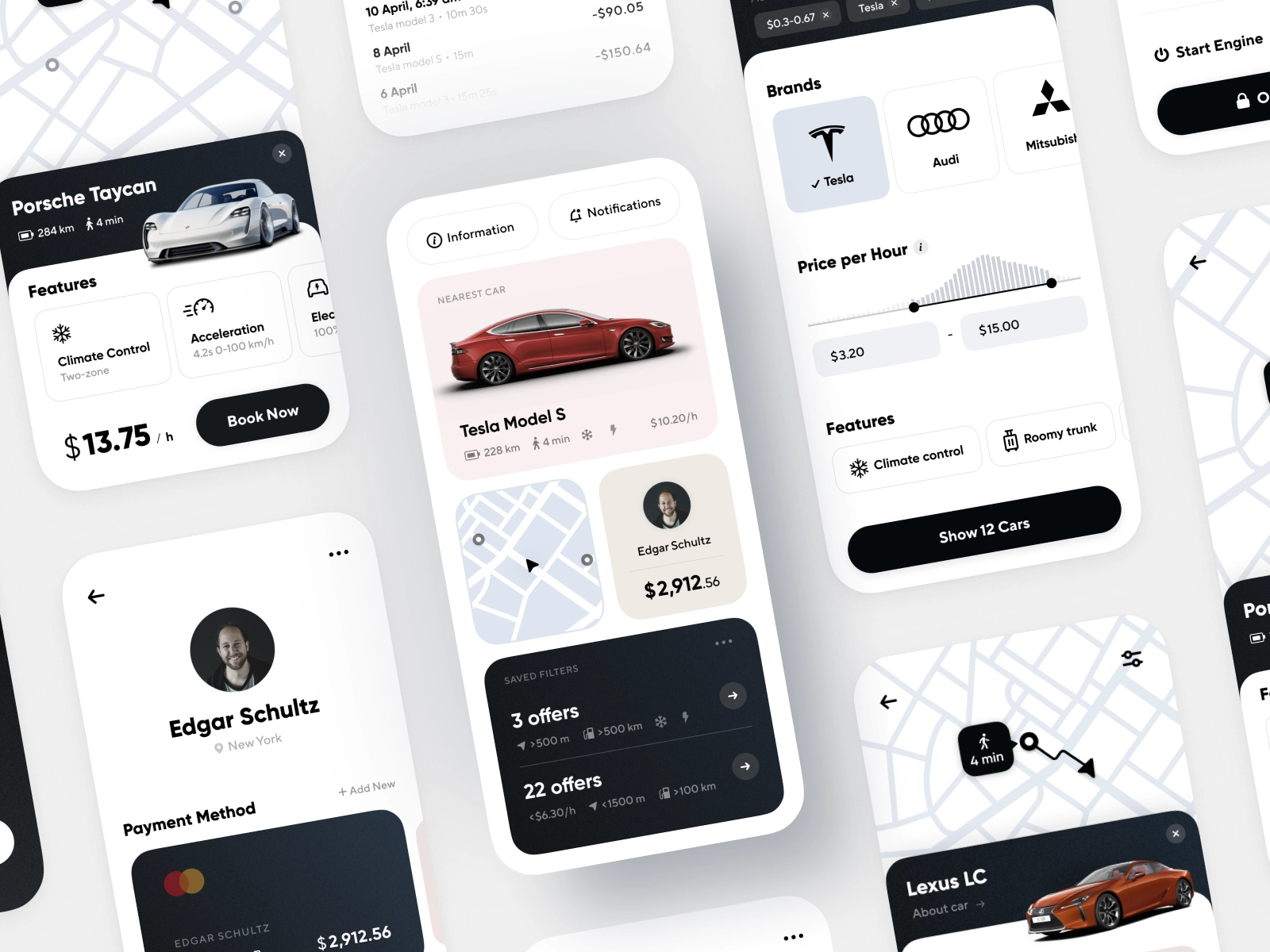
Do you plan to create a mobile app with a well-designed, custom interface? One of the challenges you can come across is building UI components. For small teams, they can become a real frustration, costing precious time and money. How to make a custom interface that works well and attracts people?
42% of people will uninstall an app because of the bad UI/UX. That’s why UI components are an essential part of your product to become successful on the market. There are different ways to optimize the working process, including hiring an outsourced development company. Nevertheless, the simplest one is to use ready-made chunks of code. With them, business owners can present the desired example to the team, while developers can dive into a custom interface, see how it’s implemented and apply the solution right away.
To save you time, we gathered seven animations ready for integration into your project. They are created for iOS apps running on the Swift programming language.
Switching animation for a fitness app
Wellness applications are in high demand now. They require an extensive toolkit with tracking features and geolocation. However, you also need smooth animations to enhance the user experience.
For instance, what about the interface for switching between current physical activities and their settings? It’s rather complex: you need to consider what info to show, make it glanceable, display the frame change correctly, etc. That’s a lot to think about.
With a Swift UI component like MiFit, you can save a huge amount of time. This component represents the movement we described above: when the user switches between the map for current activity progress and its settings. The map frame goes up smoothly and turns into a small rounded curtain that helps to save the action context. The white layer creates a transition to the activities. To provide feedback to the user and catch their attention, the Play button has advanced microinteractions, which are a hot UI/UX trend for the upcoming years.
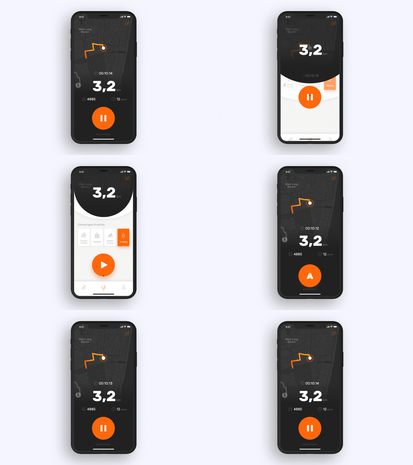
This type of interface also allows the user to check the distance, speed, time, etc. during the exercise, then return to the route and continue the movement. The MiFit animation shows all essential information about the route and activity. By implementing this component into your project, you can save lots of time and effort for the team.
Carousel animation for a movie app
A mobile application for a movie-watching platform should be convenient and pleasant to use. People spend some time browsing available films, their descriptions, and showtimes. This process must not be cumbersome. Together with working on the user experience, you can implement a few cool-looking animations. This strategy will boost the chances for your app to win the user’s hearts.
Using the MovieList component, you can build a carousel UI component library suitable for selecting a movie or an event with a mere swipe. In this interface, the user can look through available movies or events, where the movement highlights the selected film by enlarging the preview. Once the show is selected, the picture takes the whole screen, showing additional info about the movie. The user can scroll down and see all the essential details, like plot, cast, screenshots, and trailers, then see showtime dates.
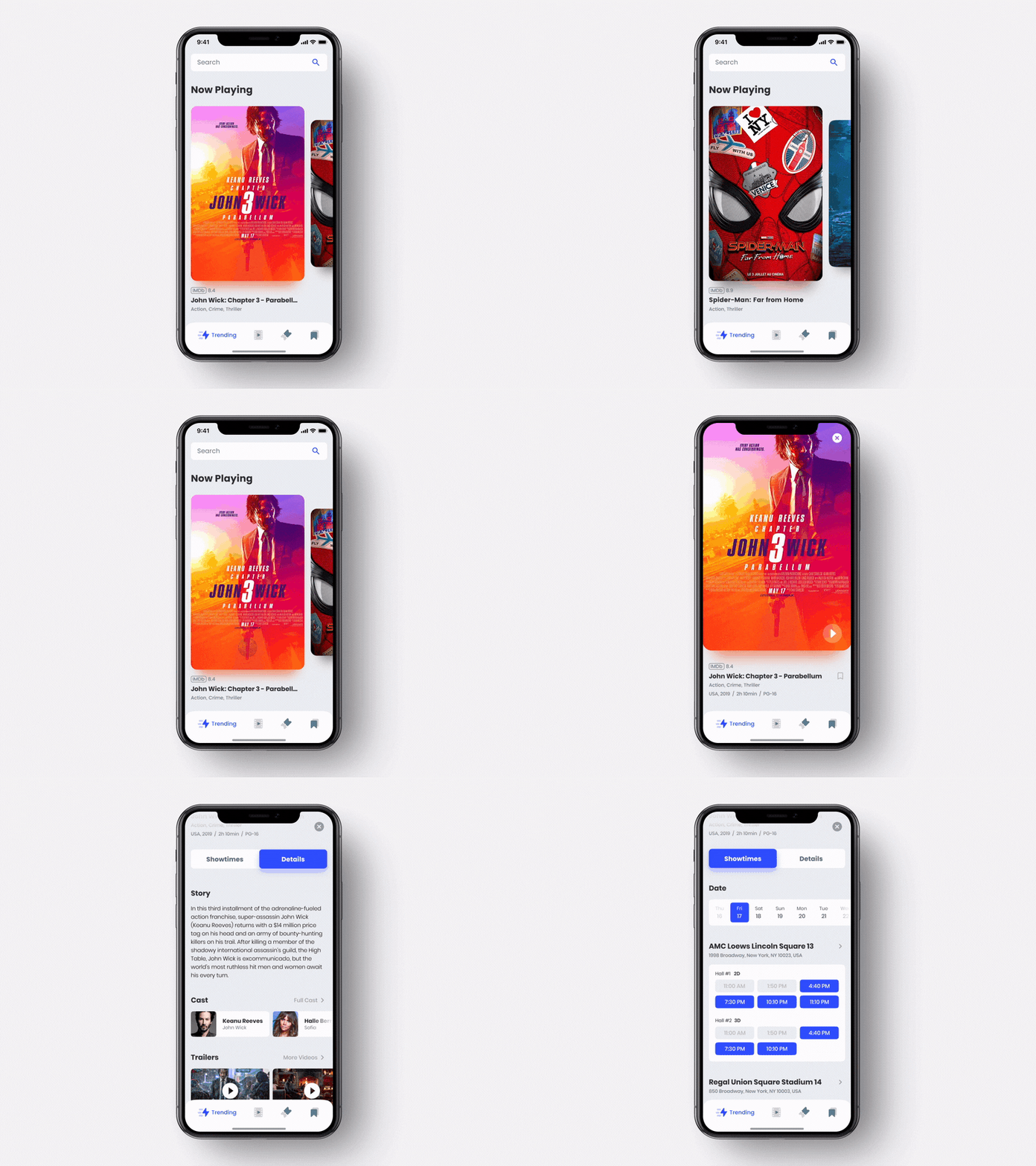
The zooming and switching animations make the flow very intuitive, so people will enjoy browsing movies to watch on the weekend.
Lighting animation for a smart home app
Are you making a mobile application for organizing a smart home? Around 57 million American households use smart home devices. People are obsessed with intelligent devices that make their lives easier. It’s so cool when one can control lights, warmth, vacuum cleaners, kettles, and other things remotely with a tap! However, the interface for such apps should be crystal clear and extremely convenient because the users will not waste time tinkering around with it.
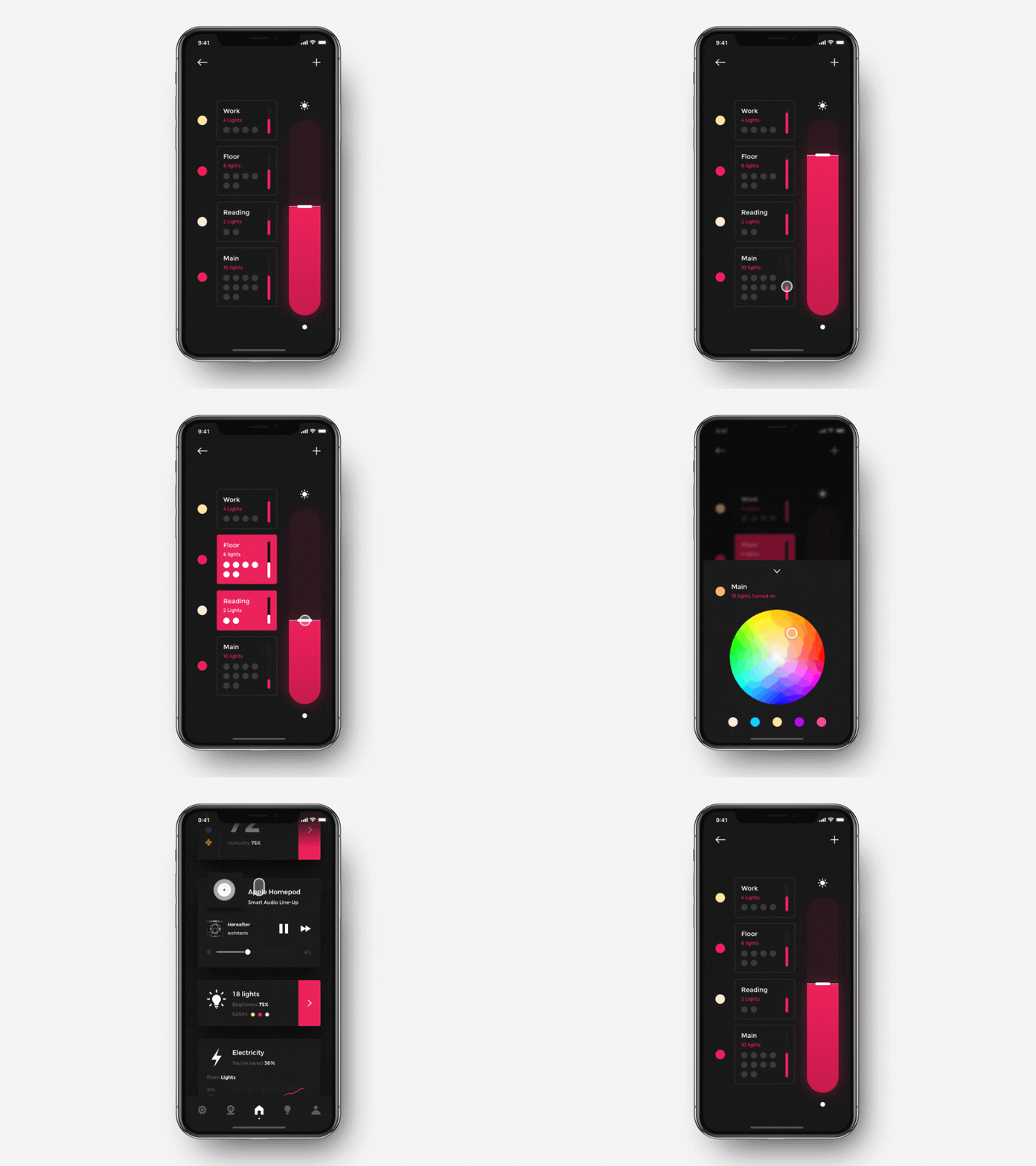
For creating a light-controlling animation, you can use the Lighting component. It is designed to adjust the intensity of several light sources. The UI consists of several sliders and buttons that are responsible for picking a room, switching on a light, and adjusting its intensity. Just by swiping the slider up or down, the user can control the light strength.
The movement is very smooth and responsive. Thanks to the layout, it’s possible to set brightness for all light sources or selected ones only. What’s more, this component is suitable for implementing the color choice logic with a convenient rounded palette. It is designed as a small curtain dragged from the bottom and doesn’t occupy the whole screen. There are a few recent color choices for a faster workflow.
Ticket booking animation for an event app
Creating an app for an event managing business is lucrative: it’s an easy way to attract potential users. If you go for this option, you can also apply ready-made UI components to speed up the software development process.
CinemaSeats component suits ticket booking apps for attending events, concerts, movies, etc. This interface represents choosing a seat and booking a ticket in several hall variants. It works as a layer hidden under the main frame that gently goes up. The animation clearly shows occupied and available seats for each hall. Below the user can see the price for selected tickets. Once they tap, the cost changes by flipping numbers for better clarity. If the person changes their mind and cancels the action, the main frame quickly drops on this layer and hides it to help the user return to film’s selection faster.
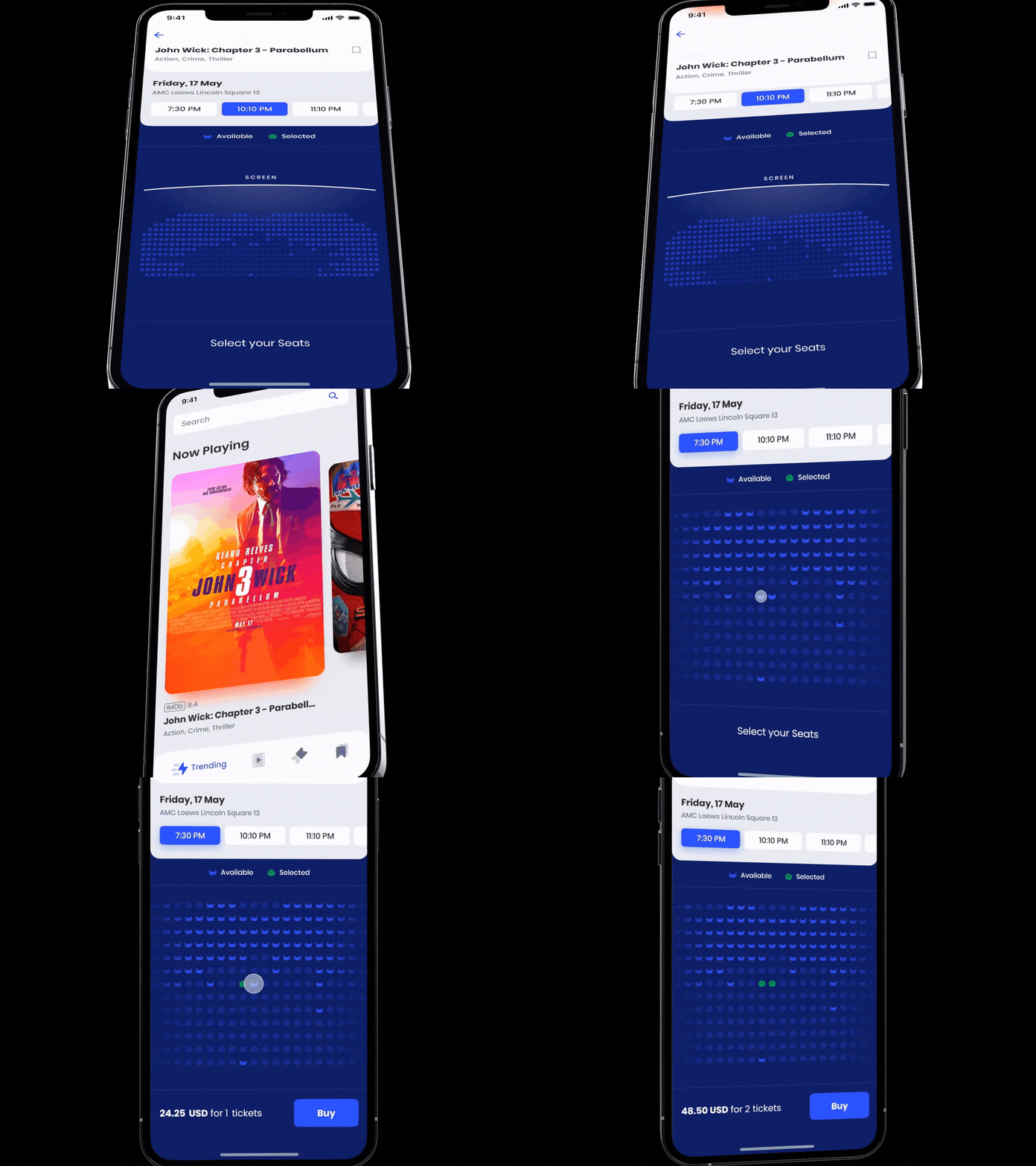
With CinemaSeats, you can implement standard logic. The user can pick several seats with a tap, select a certain period and book the tickets. The animation can be combined with the MovieList component to get a complete and well-designed user flow.
3D model rotation for a retail app
Today, mobile applications are a must-have for retail services. Around 2.14 billion people buy items online. To present your goods from the best angle, you need to implement certain animations. They will also allow the user to examine the product from all sides and get more satisfaction from the purchase.
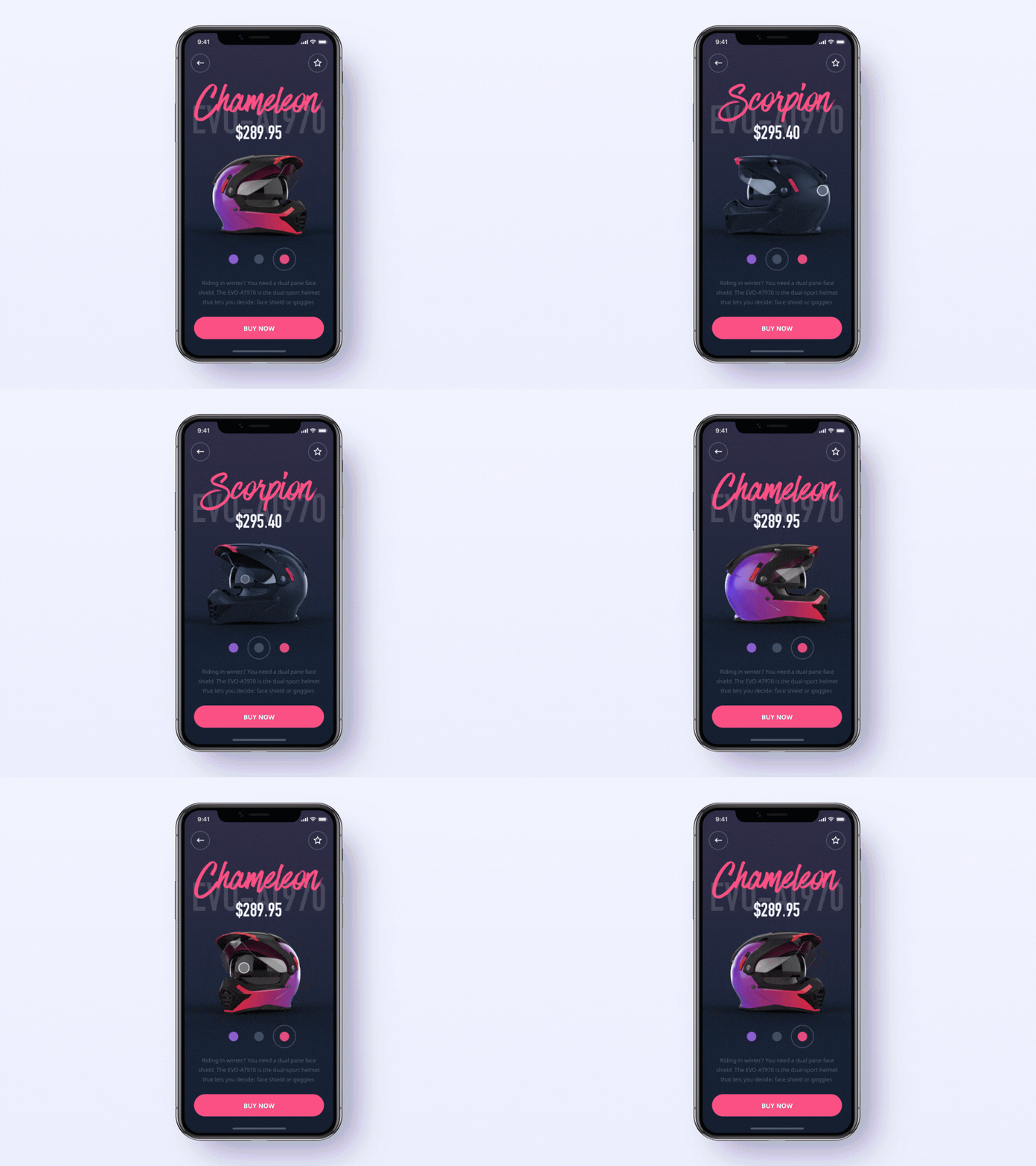
For example, you can use Helmet — a UI component for iOS apps featuring a 3D model that can be freely rotated with a swipe or drag. It is designed to showcase an item in an e-commerce store. The 3D model can be rotated 360° slowly by swiping or dragging to see every detail. When the user selects a different color or item, there is a blurring animation with a fast rotation. It creates a soft transition, providing additional interactivity and enhancing the user experience. As a result, this component is a ready-made solution for an online store app.
Temperature control for an IoT app
Apart from controlling lights, a smart device application can also provide temperature adjustments for air-conditioning systems.
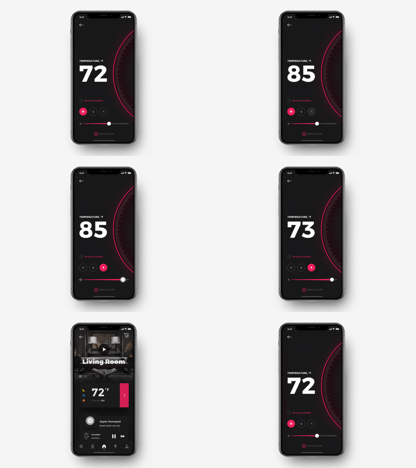
Simple sliders look too dull. With the Thermostat component, you can create the UI animation for setting the temperature by swiping a wheel. It allows the user to increase or decrease the numbers by moving the circle up or down at a different speed. The circle with a scale creates the impression of precision, and additional control, making a greater impact on the person. Moreover, you can bind logic for additional parameters like fan speed and air conditioner mode, turn it on or off, and set a timer.
Enhance your apps with ready-made UI components
To sum up, custom animations and cutting-edge design can greatly improve the user experience. Helpful applications with a convenient, user-friendly interface and pleasant visuals show higher user retention rates. By applying these UI components, you can attract more potential customers and get positive feedback.
Moreover, using a ready-made solution from an experienced team, you can get rid from a huge amount of work: concepts research, creating a UI from scratch, developing and implementing a great part of custom code. Our UI components are not just ready-to-use code, but serve as a source of inspiration in finding or developing your own project concept. We strive to make modern applications more functional, beautiful and give pleasant emotions to users.
If you want more useful solutions for your project, check out the Shakuro GitHub repository. There, you will find examples of various parts of apps, their processes, and their interface.
Subscribe to my newsletter
Read articles from Shakuro directly inside your inbox. Subscribe to the newsletter, and don't miss out.
Written by

Shakuro
Shakuro
We are an international digital design and development agency specializing in delivering end-to-end web and mobile application development. We’ll be writing about engineering, product management, design, technology, lifestyle and beyond…