Build a search bar with filter in React - Part 2
 Tawaliou ALAO
The final rendering can be tested on StackBlitz.
The context
We've built in this article a search bar with select and filter in React. Now here, we'll add three features to our component. We'll:
Allow renaming the "All" keyword
Allow uncategorised data (data that returns undefined or null after applying the
groupBycallback)Extract the component main logic and put it in a custom hook (refactoring): useSearchbarWithSelectAndFilter (awesome as name, isn't it ? I know, Thank you)
The solution
Allow user to rename the "All" keyword
To do it,
We add a property "allLabel" to the component props as an optional string with a default value of "All" or "Tout" (in french). So
types.ts
  // other types
  allLabel?: string;
SearchbarWithSelectAndFilter.tsx
  {
      // other props
      allLabel = "All",
  }
In the code section where we displayed by default "All", we replace it with this code
 <MenuItem value={DEFAULT_SELECT_VALUE}>
     {allLabel ?? "All"}
 </MenuItem>
Allow user to have uncategorised data (data which returns undefined or null after applying the groupBy callback)
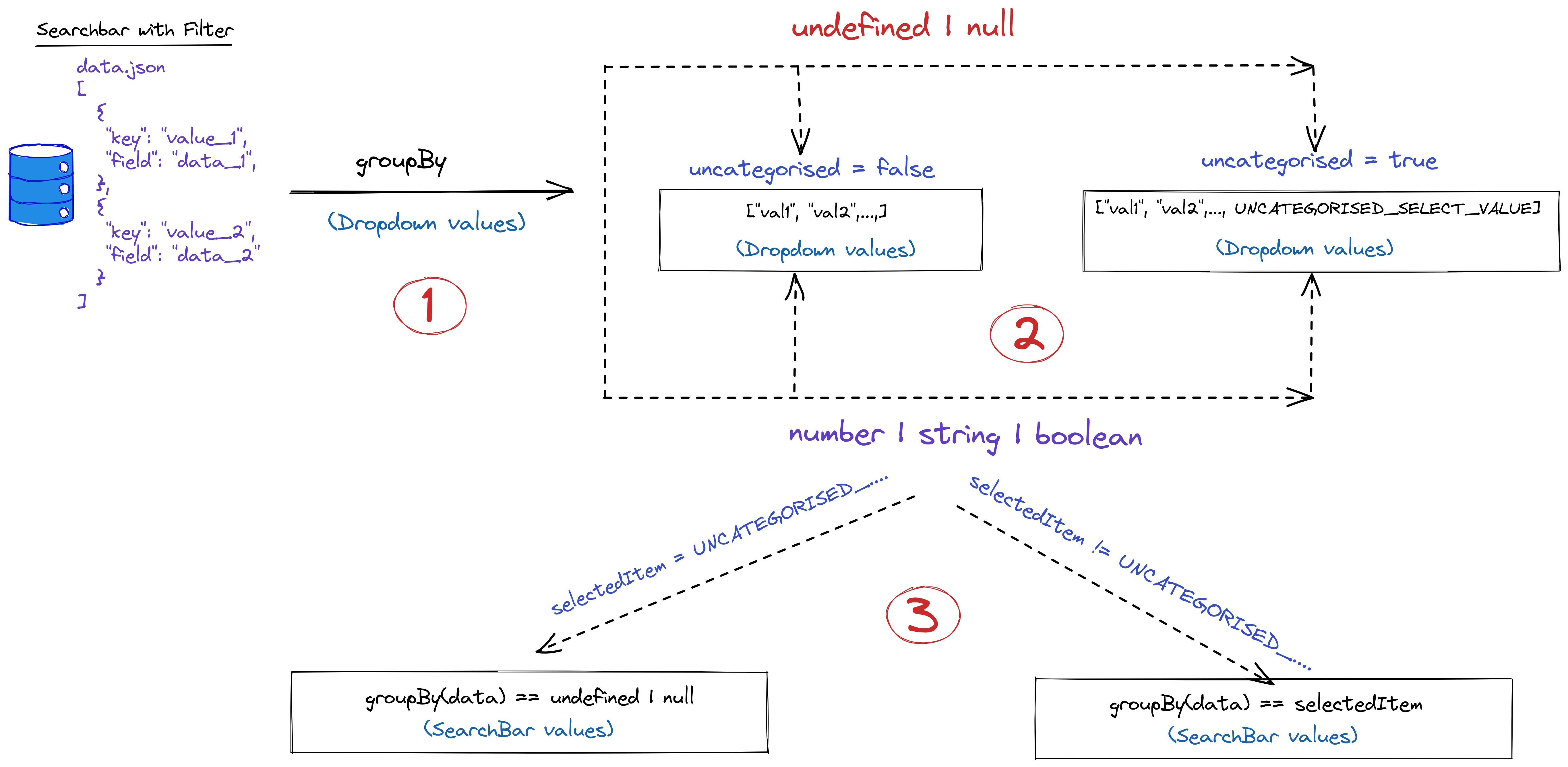
Currently, our filter list only data on which the callback groupBy returns either a number, string or boolean. But what happens if the callback returns undefined | null which means may be, the value at this time is unknown. So we'll configure our component to put this kind of data in the category Uncategorised. And to do it, let's follow the steps in the next image:

So, let's start
Add
uncategorised,uncategorisedLabelto the component props and extend the return type ofgroupBytoundefined | null.types.ts
  export interface SearchbarWithSelectAndFilterProps<T extends unknown> {
      // other types

      groupBy: (value: T) => string | number | boolean | null | undefined;

      /**
       * Refer to every data with "undefined" or "null" as value      after apply groupBy callback
       */
      uncategorised?: boolean;

      /**
       * Label displayed in dropdown to represent "unCategorised" value
       */
      uncategorisedLabel?: string;

      // other types
  }
SearchbarWithSelectAndFilter.tsx
  ({
      // other props

      uncategorised = true,
      uncategorisedLabel = "Uncategorised",

      // other props
  })
Add
UNCATEGORISED_SELECT_VALUEto the dropdown listWhen we retrieve the dropdown values, if the uncategorised prop is true, we'll check if the returned data after applying
groupByis undefined or null. In this case instead of adding undefined or null to the dropdown values we addUNCATEGORISED_SELECT_VALUE. So let's replace the old itemsGroup with this new code :// UNCATEGORISED_SELECT_VALUE = "ANY_KIND_OF_VALUE_YOU_WANT" // get the list of items for drowpdown let itemsGroup = useMemo(() => { let itemsAsSet = new Set(); searchData.forEach((data) => { let option = groupBy(data) ?? undefined; if (uncategorised) { option = option == undefined ? UNCATEGORISED_SELECT_VALUE : option; itemsAsSet.add(option); } else if (!uncategorised && option != undefined) { itemsAsSet.add(option); } }); return Array.from(itemsAsSet); }, [searchData, groupBy]);Update the list of data provided to the autocomplete
We bring a little bit of change to our useEffect.
     // update list of options provided to autocomplete
     useEffect(() => {
       const updateSearchList = new Map(searchList)
       if (!updateSearchList.has(selectedItem)) {
           if (selectedItem == DEFAULT_SELECT_VALUE) {
               updateSearchList.set(DEFAULT_SELECT_VALUE, searchData)
           } else {
               updateSearchList.set(
                   selectedItem,
                   searchData.filter((v) =>  {
                       const option = groupBy(v)
                       if (selectedItem == UNCATEGORISED_SELECT_VALUE) {
                           return option == undefined || option == null
                       } else return option == selectedItem
                   })
               )
           }
           setSearchList(updateSearchList)
       }
   }, [selectedItem, searchData])
Notice that we don't check if uncategorised is true or not because we assume that if
UNCATEGORISED_SELECT_VALUEis among dropdown values which means that uncategorised is true so undefined or null are allowed.
Refactoring the component logic by putting it into a custom hook
At the end of the first article of this series, I asked how we can extract the logic from the component so that it can be reused with MUI as well as other UI libraries like Mantine or Ant Design. To answer this question let's create a custom hook that'll contain all the (independent) code of the component:
state
useEffect, useMemo
functions utilities or event handler
Move component logic to the hook
A hook is like a usual javascript function that can hold another hook like default hooks from React (state, useEffect, ...). So let's create a new file called useSearchbarWithSelectAndFilter.ts in the same folder as our component. Here we'll create a hook like this:
```typescript export const useSearchbarWithSelectAndFilter = (/ parameters /) => { /**
* hooks
*/
  /**
   * functions
   */

  return {
    /* returned values */
  };
};

export default useSearchbarWithSelectAndFilter
```
Dropdown values and autocomplete list as states
We'll add the states that hold the dropdown values and the list for the autocomplete
```typescript export const useSearchbarWithSelectAndFilter = (/ parameters /) => { /**
* hooks
*/
const [selectedItem, setSelectedItem] = useState(DEFAULT_SELECT_VALUE); const [searchList, setSearchList] = useState(
new Map<ReturnType<typeof groupBy>, T[]>());
  /**
   * functions
   */
  // will set the selected dropdown's item
  const handleSelectedItemChange = (event: any) => {
    setSelectedItem(event.target.value);
  };

  return {
    /* returned values */
  };
};

export default useSearchbarWithSelectAndFilter
```

So here, our hook needs the `groupBy` callback and the type of each element in the list provided to the autocomplete. We'll add so a generic type to the hook and then pass the `searchData` and `groupBy` callback to the hook parameters.

```typescript
export const useSearchbarWithSelectAndFilter = <T>(
    searchData: SearchbarWithSelectAndFilterProps<T>["searchData"] = [],
    groupBy: SearchbarWithSelectAndFilterProps<T>["groupBy"]
) => {
  /**
   * hooks
   */
const [selectedItem, setSelectedItem] = useState(DEFAULT_SELECT_VALUE);
const [searchList, setSearchList] = useState(
    new Map<ReturnType<typeof groupBy>, T[]>()
);


  /**
   * functions
   */
  // will set the selected dropdown's item
  const handleSelectedItemChange = (event: any) => {
    setSelectedItem(event.target.value);
  };

  return {
    /* returned values */
  };
};

export default useSearchbarWithSelectAndFilter
```

`searchData` and `groupBy` are the same types as those used by our component so we use type indexing to retrieve these types from **SearchbarWithSelectAndFilterProps** (type of our component props)
Handling autocomplete list filtering and dropdown values enumeration
```typescript export const useSearchbarWithSelectAndFilter = (
 searchData: SearchbarWithSelectAndFilterProps<T>["searchData"] = [],
 groupBy: SearchbarWithSelectAndFilterProps<T>["groupBy"],
 options?: {
     uncategorised?: SearchbarWithSelectAndFilterProps<T>["uncategorised"]
 }
) => { /**
* hooks
*/
const [selectedItem, setSelectedItem] = useState(DEFAULT_SELECT_VALUE); const [searchList, setSearchList] = useState(
new Map<ReturnType<typeof groupBy>, T[]>());
/**
* functions
*/
// will set the selected dropdown's item const handleSelectedItemChange = (event: any) => {
setSelectedItem(event.target.value);};
// get the list of items for drowpdownlet itemsGroup = useMemo(() => {
 let itemsAsSet = new Set();
 searchData.forEach((data) => {
   let option = groupBy(data) ?? undefined;
   if (options?.uncategorised) {
     option = option == undefined ? UNCATEGORISED_SELECT_VALUE : option;
     itemsAsSet.add(option);
   } else if (!options?.uncategorised && option != undefined) {
     itemsAsSet.add(option);
   }
 });
 return Array.from(itemsAsSet);
}, [searchData, groupBy]);
    // update list of options provided to autocomplete
    useEffect(() => {
      const updateSearchList = new Map(searchList)
      if (!updateSearchList.has(selectedItem)) {
          if (selectedItem == DEFAULT_SELECT_VALUE) {
              updateSearchList.set(DEFAULT_SELECT_VALUE, searchData)
          } else {
              updateSearchList.set(
                  selectedItem,
                  searchData.filter((v) =>  {
                      const option = groupBy(v)
                      if (selectedItem == UNCATEGORISED_SELECT_VALUE) {
                          return option == undefined || option == null
                      } else return option == selectedItem
                  })
              )
          }
          setSearchList(updateSearchList)
      }
  }, [selectedItem, searchData])

  return {
    /* returned values */
  };
};

export default useSearchbarWithSelectAndFilter
```

So here we add optional props as an object with property uncategorised. (*I try to do it like what I see in packages: extra properties are optional and put in the options object*)
Last but not the least: the returned values
Our component needs the items and selected item for dropdown and the grouped lists for the autocomplete so let's return them in the hook:
 return {
     filter: { selectedItem, setSelectedItem, handleSelectedItemChange },
     autocomplete: {searchList, setSearchList},
     itemsGroup,
   };
 };
So yes we complete the three tasks with a reusable hook.
Conclusion
And again we are at the end of this article, we add some fancy features to our component and I hope that you enjoy this series. So let me know if you have any kind of suggestions
Subscribe to my newsletter
Read articles from Tawaliou ALAO directly inside your inbox. Subscribe to the newsletter, and don't miss out.
Written by

Tawaliou ALAO
Tawaliou ALAO
Software Developer | Love Low Level Eng. | Python, Javascript, C, Linux I'm learning backend development and system programming.
