Positioning in CSS
 Kelvin Ofili
Where to begin...
position: ;
Asides from box-sizing, positioning is the second most important concept in CSS. Hmm, that does not sound right. Let me rephrase, box-sizing is all about positioning, therefore, positioning is the most important concept in CSS. Yes, that's more like it.
It can be difficult, sometimes, to find the suitable method to position a portion or several portions of your code, and you are going to have to be familiar with all the techniques and combinations involved with positioning if you ever want to make appreciable progress in making the process easier.
What methods? What combinations? I'm lost. (<> _ <> )
That, dear programmer, is what you are here to find out. So buckle up, because I will try my absolute best to make sure you are conversant with them, relative to the global populace. The aim is to never be static when it comes to exploring possibilities. And if it ever gets sticky for you, you could always come back here to refresh your memories until it is fixed into your subconscious.
Did you see it? :)
The five different position values are:
Static
Relative
Absolute
Fixed
Sticky
We are going to take them apart one after the other, so stick with me ;). I should stop with the puns, now.
Static
The top on our list is the Static value, and there isn't much to say about it because this is the default position value for all HTML elements in CSS. Essentially, when static positioning is applied to an element, it tells that element to follow the other elements in the document flow. And as such, it is quite redundant to put it as the value in the first place if you do not want the flow any different from what it originally is.
<html>
    <head>
    </head>
    <body>
        <div class="first-class">first</div>
        <div class="second-class">second</div>
        <div class="third-class">third</div>
    </body>
</html>
div{
    height: 200px;
}
.first-class{
    background-color: green;
}
.second-class{
    background-color: blue;
}
.third-class{
    background-color: yellow;
}
With these code snippets above, this is the page displayed:

In the code snippet below, the 'div' with the class name of "second-class" is given the position value of "static",
div{
    height: 200px;
}
.first-class{
    background-color: green;
}
.second-class{
    background-color: blue;
}
.third-class{
    background-color: yellow;
}

/* focus on the part below this comment */
.second-class{
    position: static;
}
/* focus on the part above this comment */
and this is the resultant page displayed:
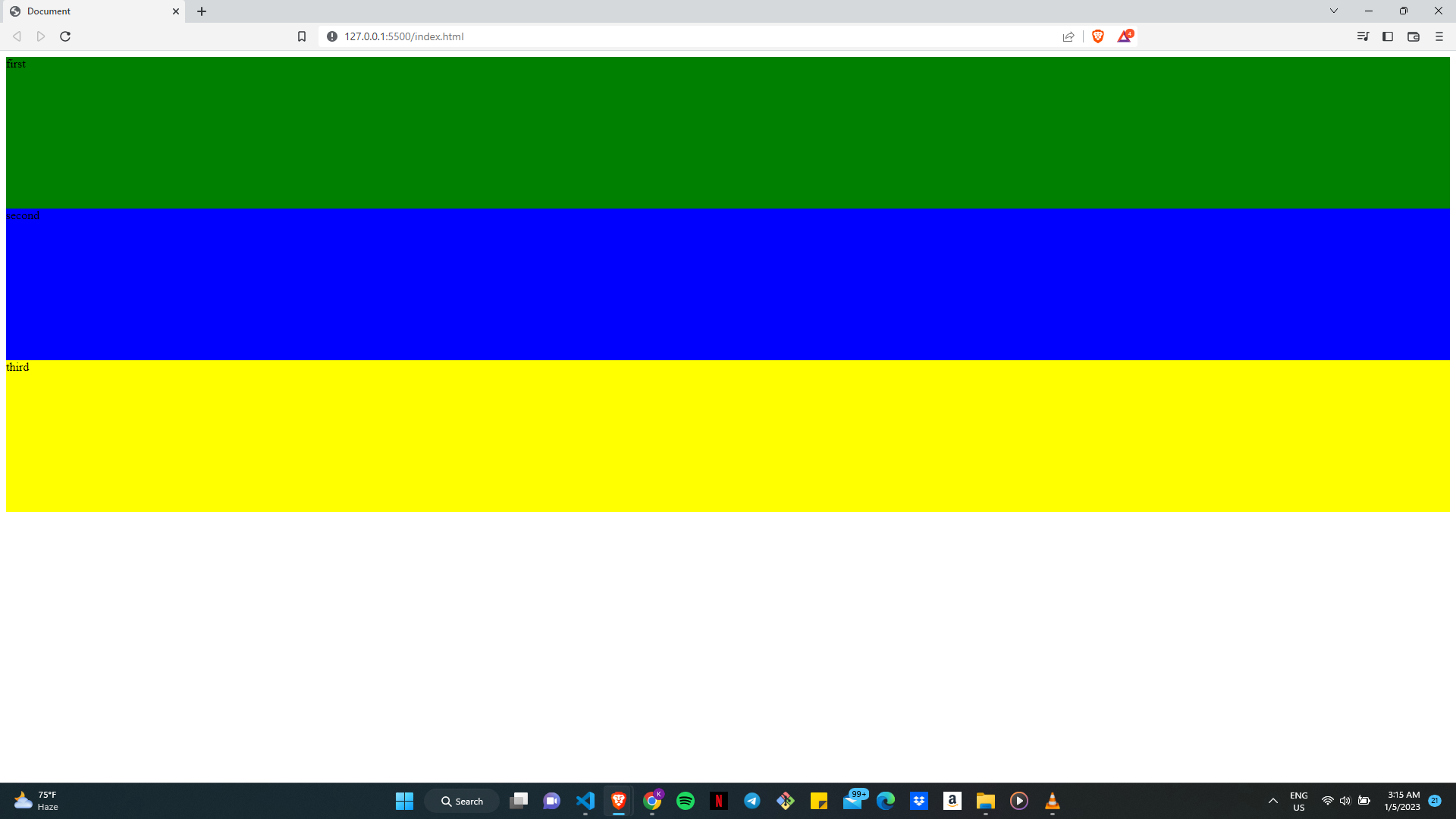
Notice any difference? Exactly. So for cases where the document flow doesn't have to change, it is conventionally acceptable to ignore adding the position value of "static".
Elements with a static position are not affected by the "top", "bottom", "left", and "right" properties. We'll get to that in a bit.
Relative
We also have the Relative value. The "relative" property value is used when we want the element to be positioned with respect to its normal position. That is where the "top", "bottom", "left", and "right" properties come into play. When one or more of these properties are put in place, the element will be shifted from its normal position in the direction specified by these properties. Pretty straightforward, no?
Let's consider the following HTML and CSS:
<html>
    <head>
    </head>
    <body>
        <span class="relative-container">
            Move me!
        </span>
    </body>
</html>
body{
    background-color: pink;
    color: white;
}
.relative-container{
    background-color: purple;
    position: relative;
    top: 320px;
    left: 200px;
}
This is the page gotten from these given blocks of code:
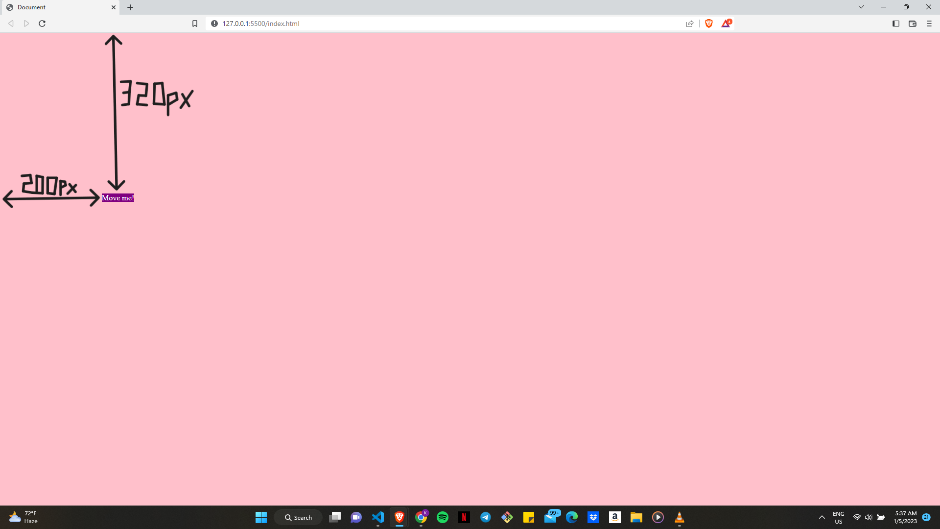
From the image and code blocks above, it can be deduced that the span element was shifted 320 pixels down and 200 pixels to the right of its normal position. The other elements on the page will act as if the element were still in its normal place, and it would still occupy the same amount of space as it would if it were in its normal position.
It is vital to keep in mind that when an element is positioned relatively, any elements that are inside it will be positioned relative to the element's new position, rather than its normal position.
Absolute
Next on our list is the position value Absolute. Basically, "absolute" tells the element to position itself relative to its nearest positioned ancestor, if any; otherwise, it is positioned relative to the initial containing block.
The initial containing block is the area in which the element is first rendered. It is the ancestor element that is responsible for the element's size and positioning. For most elements, the initial containing block is the initial viewport, which is the browser window.
"How is the element positioned?", you might ask; and the answer is "with the 'top', 'bottom', 'left' and 'right' properties". These properties specify the distance of the element from the respective edges of the containing block. Look at these code samples below for clarity:
<html>
    <head>
    </head>
    <body class="parent-container">
        <div class="child-box">What do we have here?</div>
    </body>
</html>
.parent-container{
    position: relative;
}
.child-box{
    position: absolute;
    top: 140px;
    right: 290px;
}
and this is the page below:
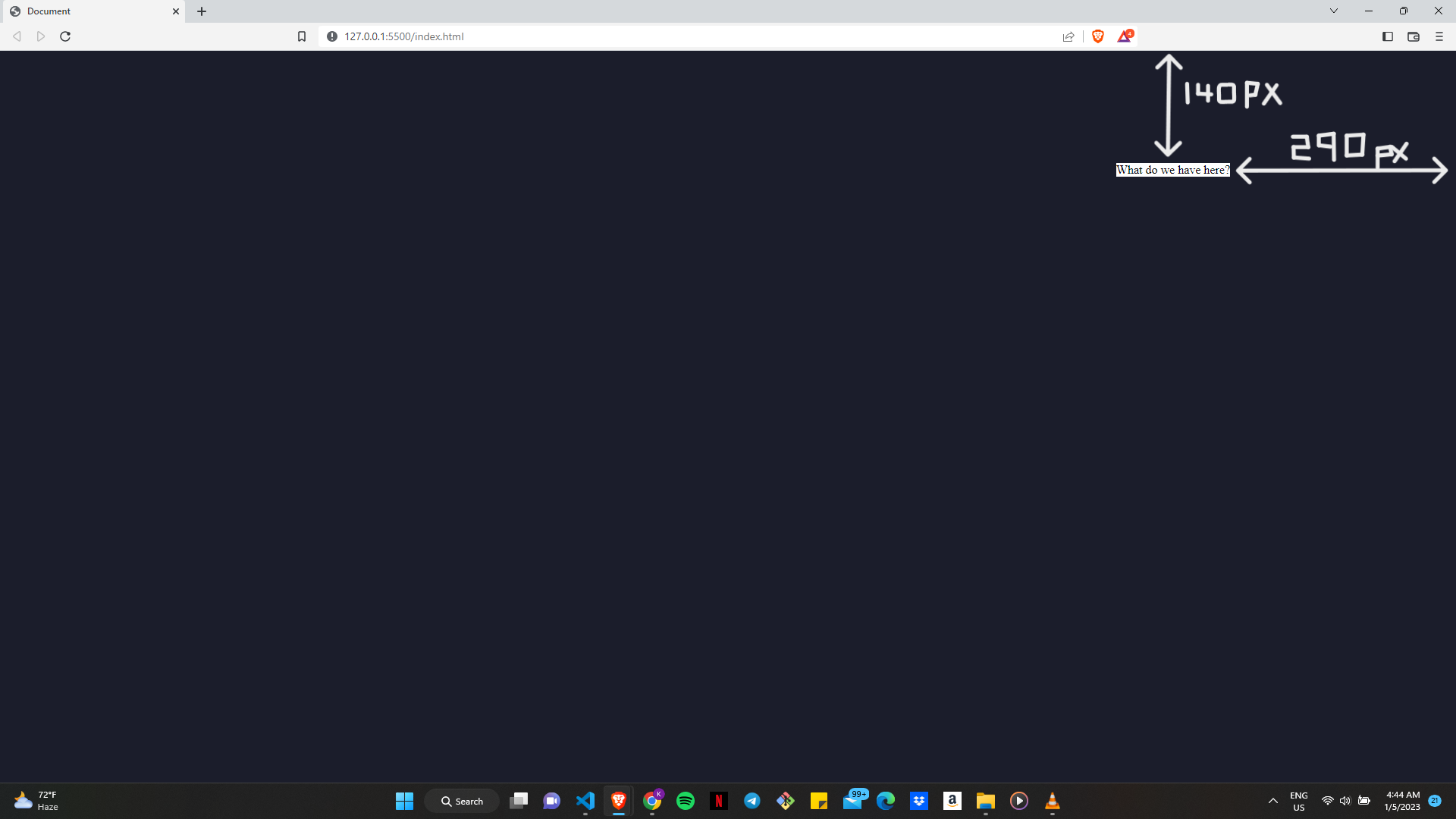
In this case, the ".child-box" element will be positioned 140 pixels down and 290 pixels to the left of its nearest ancestor element, which is the ".parent-container" element. If the ".parent-container" element were not positioned, the ".child-box" element would be positioned relative to its initial containing block instead.
An "absolutely" positioned element is not part of the usual flow of the page and does not occupy any space, which is a crucial distinction to make. This means that other elements on the page won't be impacted by the element's size or position and will behave as if it weren't there.
Fixed
As for Fixed, an element that has a position property value of "fixed" is positioned relative to the browser window, and it will stay there in the same place if the page is scrolled. What this means is that if you set one or more of the "top", "bottom", "left" and "right" properties, the element will be positioned at a specific location on the page and will remain there even if the user scrolls.
As usual, let us take a look at the following code snippets;
<html>
    <head>
    </head>
    <body>
        <h1 class="fixed-class">I am a fixed div</h1>
        <div class="empty-space"></div>
    </body>
</html>
body{
    background-color:pink;
}
.empty-space{
    height: 2000px;
}
.fixed-class{
    position: fixed;
    top: 200px;
}
From what I am sure you can observe, I created a 'div' with the class name "empty-space" in hopes of simulating the lack of effect scrolling has on an element whose position value is set to "fixed". The 'h1' tag with a class name "fixed-class" is 200 pixels below its original position and will remain there no matter how much scrolling is done. To check:
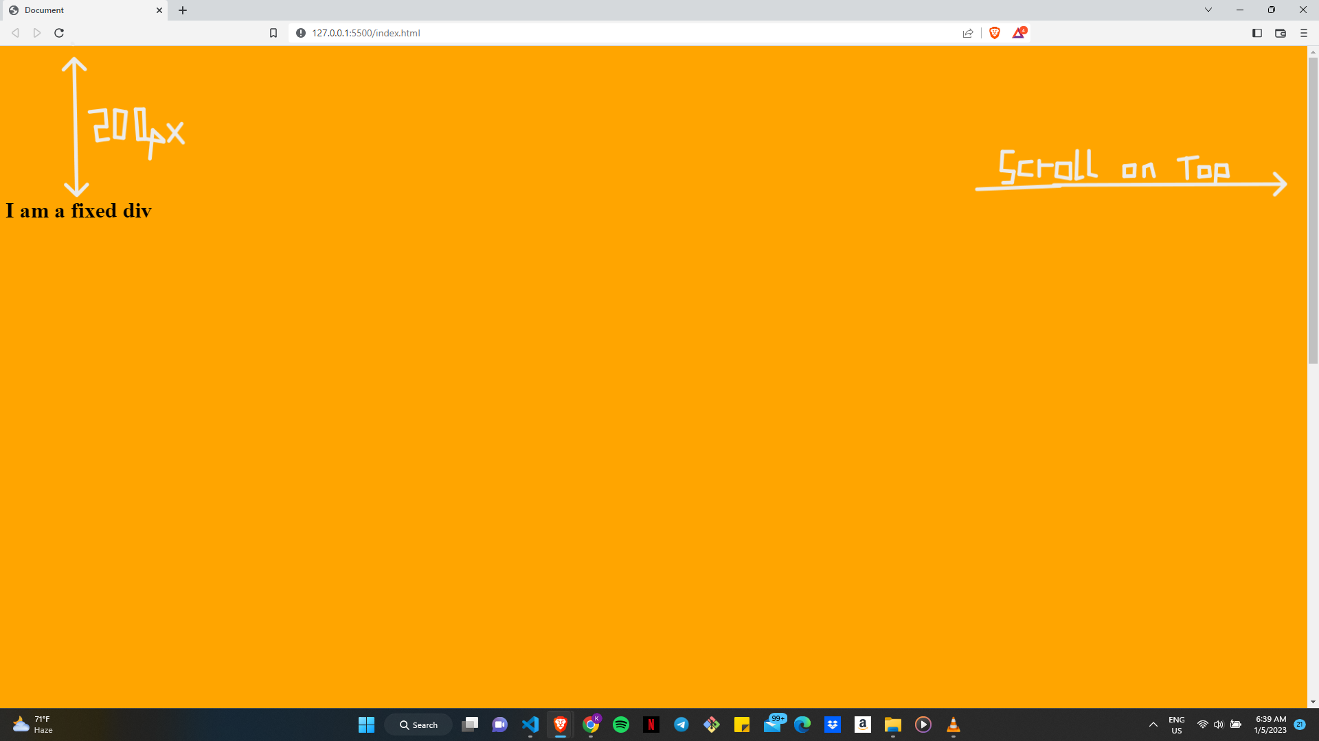
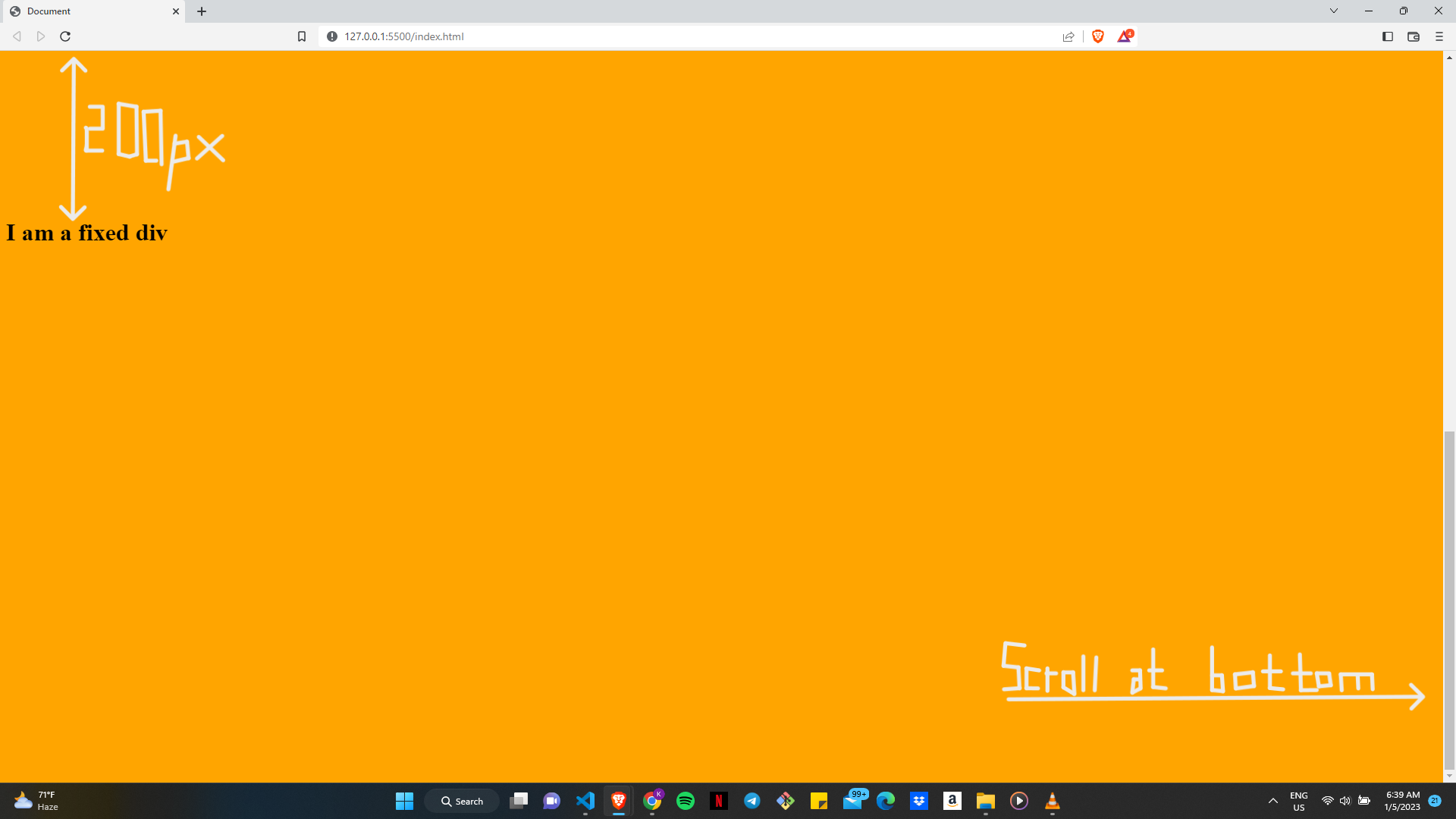
Regardless of where the scrollbar is, the position of the element with the position value set to "fixed" remains the same.
One important thing to note is that a fixed position element is removed from the document's normal flow and does not take up any space. This means that other elements on the page will behave as if the element were not there, and will not be affected by its size or position.
Sticky
Finally, we have Sticky. It works slightly similarly to both the "fixed" and the "relative" values, depending on how far down the web page you scroll. The "sticky" value positions an element as relative until it crosses a specified threshold, at which point it becomes fixed. This means that the element will behave like a "relative" position element until the user scrolls the page, at which point it will become fixed to a specific location on the page and stay there until the user scrolls back up past the threshold. You will understand this more once you've got through the following code blocks and web pages:
<html>
    <head>
    </head>
    <body>
        <h1>I am before the sticky div</h1>
        <h1 class="stick">I am a sticky div</h1>
        <h1>I am after the sticky div</h1>
        <div class="empty-space"></div>
    </body>
</html>
body{
    background-color: rgb(255, 0, 34);
}
h1{
    padding: 120px 30px;
    background-color: yellow;
    color: black;
}

.empty-space{
    height: 2000px;
}

.stick{
    background-color: rgb(75, 4, 48);
    color: white;
    /* Focus on code below this comment */

    position: sticky;
    top: 0px;

    /* Focus on code above this comment */
}
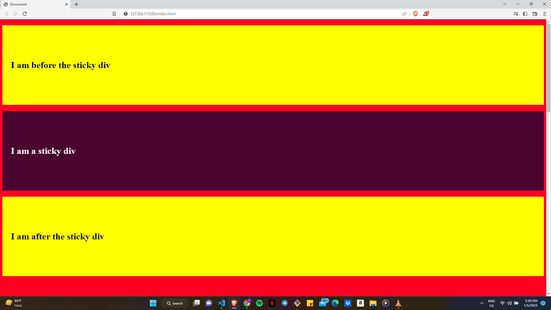
At the stage above, the "h1" element whose position property is set to "sticky" still behaves as though its position property were set to "relative".
But when you start scrolling, you begin to see some changes, the next image should help you understand better:
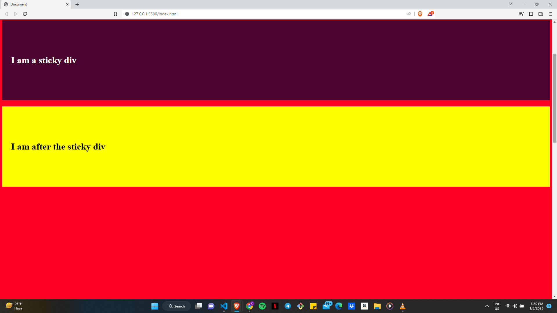
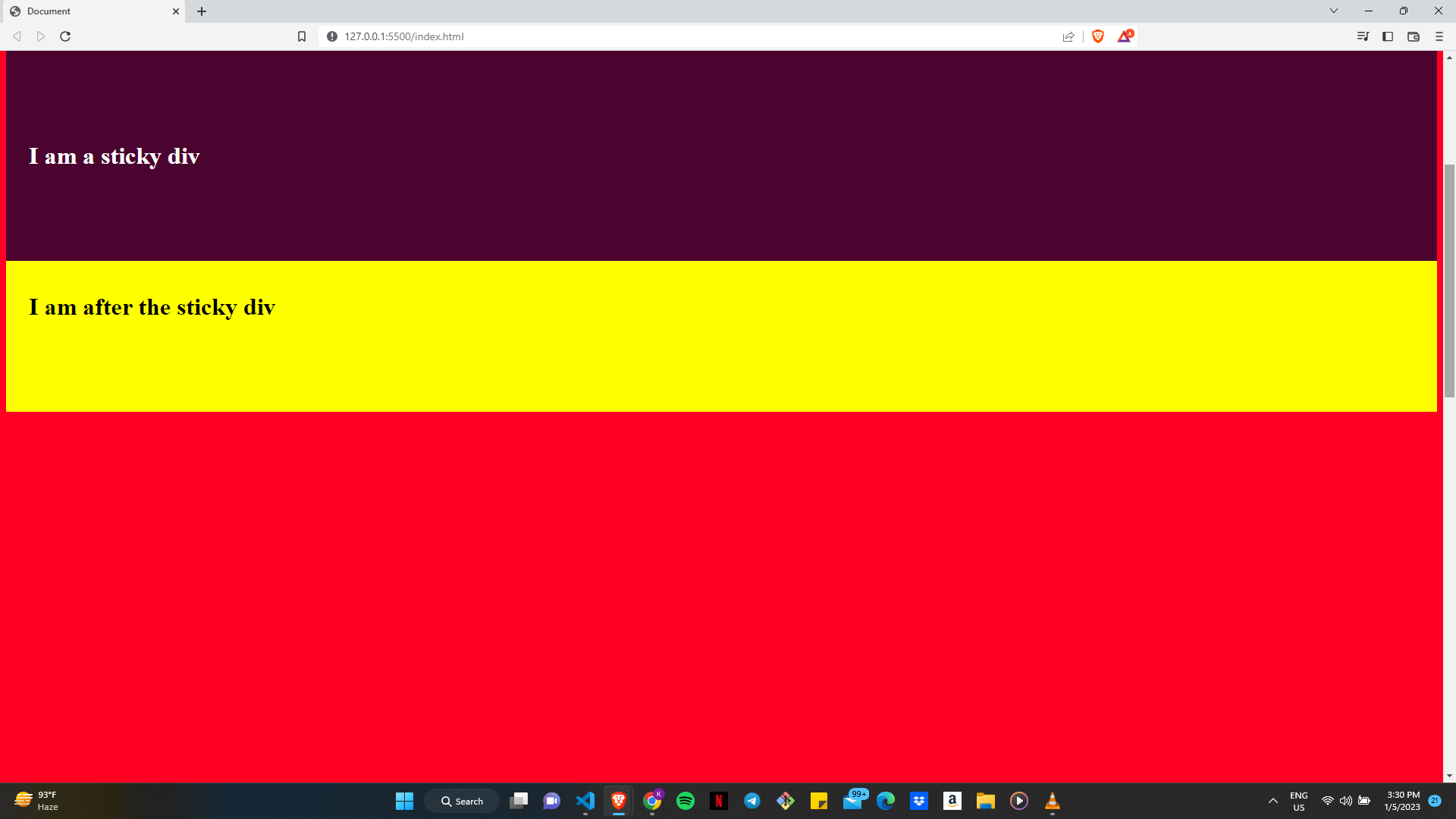
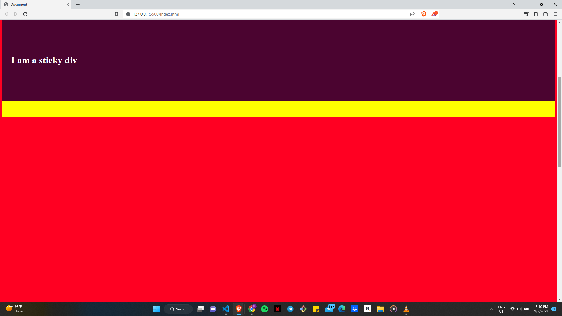
As you may have noticed, the "sticky h1" now becomes fixed as we have scrolled past a specific length, beyond which we would not be able to see the "h1" element again. It remains like this till we scroll back up, at which point, it returns to its original "relative" state. Any element after the "sticky" element will behave as though the "sticky" element were not there. The next images should make things clearer for you:
Now we have covered the main areas of the concept of positioning in CSS. I would like to mention one last thing before we say our goodbyes; the z-index.
The "z-index" property in CSS determines the stack order of positioned elements. An element with a higher "z-index" value will be placed in front of an element with a lower "z-index" value.
For example, consider the following HTML and CSS:
<html>
    <head>
        <meta charset="UTF-8" />
        <meta http-equiv="X-UA-Compatible" content="IE=edge" />
        <meta name="viewport" content="width=device-width, initial-scale=1.0" />
        <title>Document</title>
        <script src="test.js"></script>
        <link rel="stylesheet" href="blog.css" />
    </head>
    <body>
        <h1>I am before the sticky div</h1>
        <h1 class="stick">I am a sticky div</h1>
        <h1 class="z-index">I am after the sticky div and with a higher z-index</h1>
        <div class="empty-space"></div>
    </body>
</html>
body{
    background-color: rgb(255, 0, 34);
}
h1{
    padding: 120px 30px;
    background-color: yellow;
    color: black;
}

.empty-space{
    height: 2000px;
}

.stick{
    color: white;
    background-color: rgb(75, 4, 48);
    position: sticky;
    top: 0px;
}
/* Focus on code below this comment */

.z-index{
    position: relative;
    z-index: 1;
}

/* Focus on code above this comment */
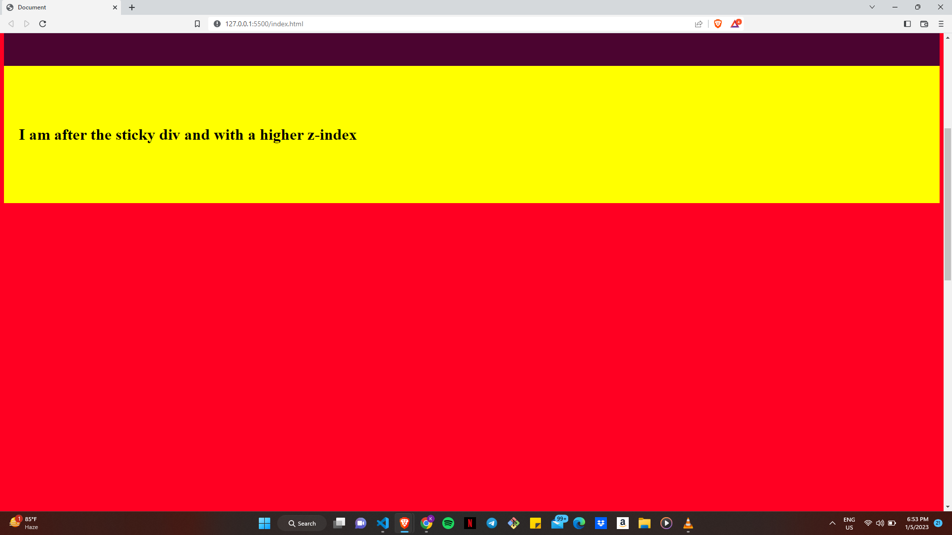
The blocks of code above are almost exact replicas of the blocks of code you were shown when we discussed what it means for an element to possess the position value of "sticky". The only difference is the addition of a ".z-index" class in the HTML (along with some texts) and its styling in the CSS using the "z-index" property.
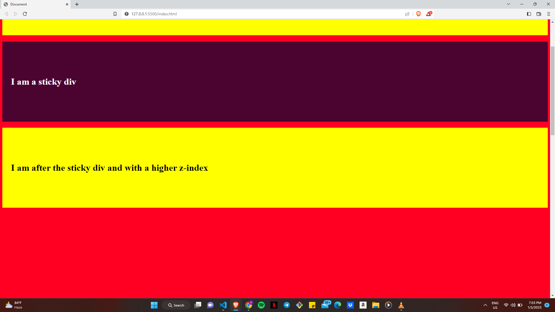
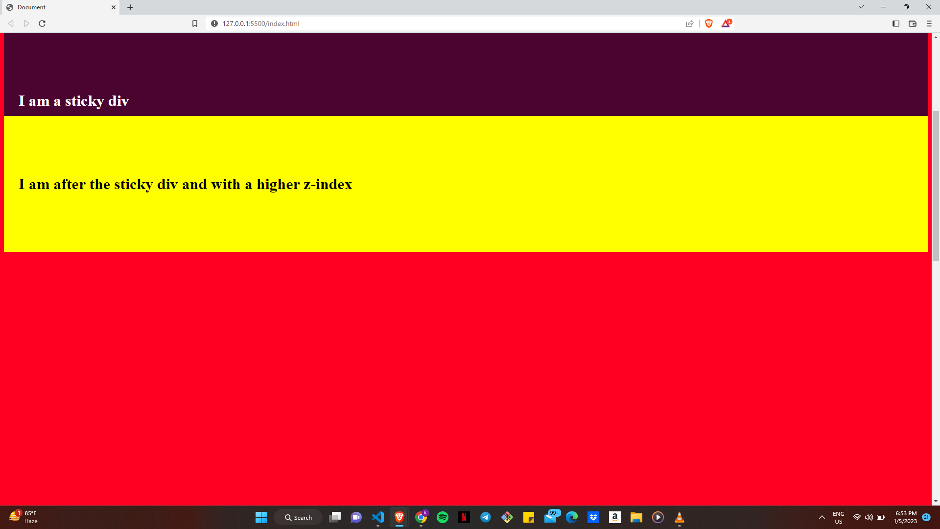
This is the result of the changes made:
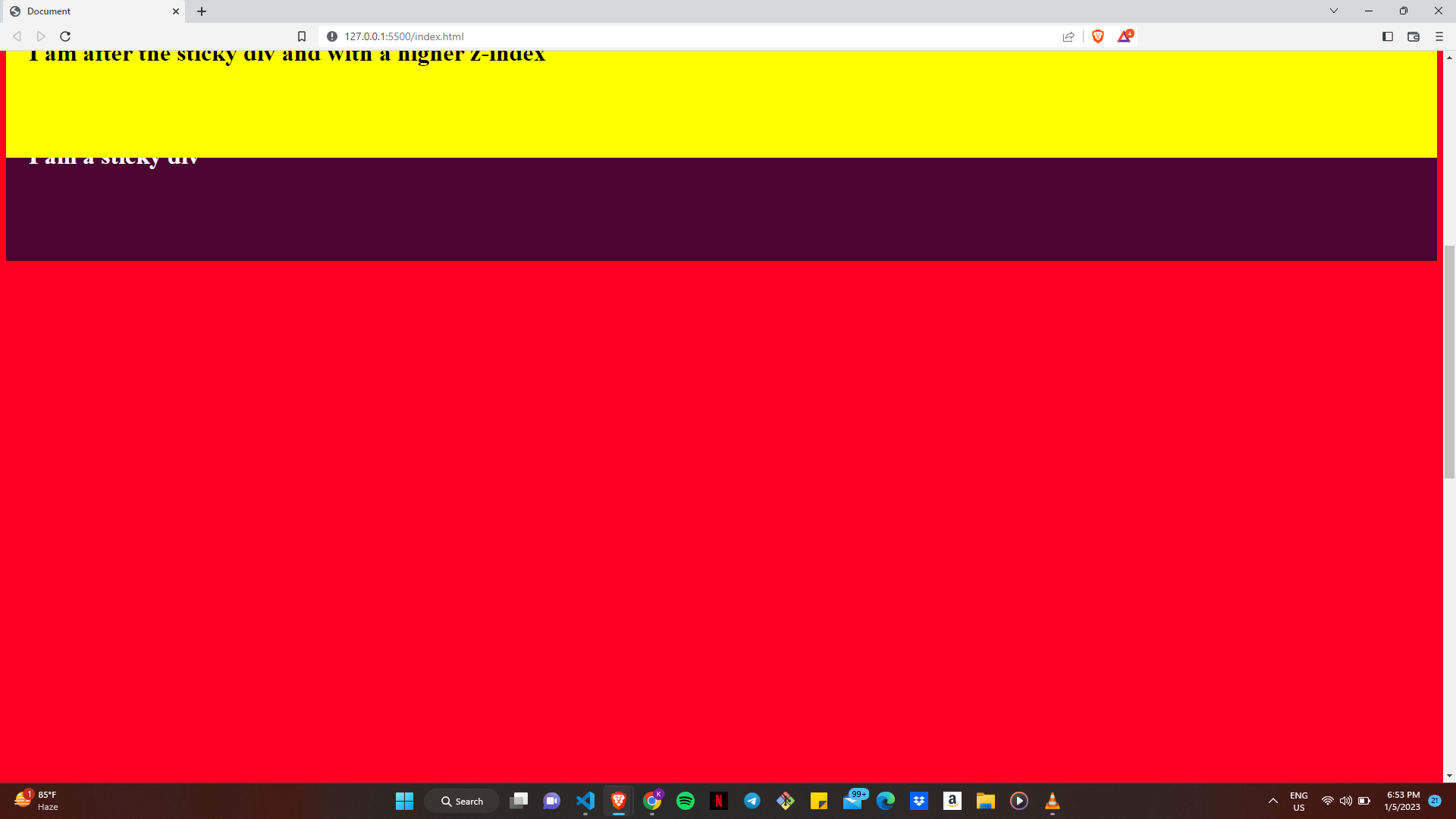
Note: Every element has a default "z-index" value of zero, so any element with a higher "z-index" takes precedence over elements without a set "z-index" value. At the same time, elements with a negative "z-index" value appear behind elements without a declared "z-index" value.
As you scroll up the page, you might observe that the element with the higher "z-index" retains priority and is displayed over the element with a lower "z-index".
In conclusion, positioning is essential when it comes to CSS; and once you have that covered, everything else comes relatively easier to you. As long as you keep practising, and maintain your desire to continue learning new concepts and providing more optimal solutions to problems, you shouldn't have any issues when it comes to positioning with CSS.
Thanks for your patience, and you can always check out my other writeups for all things tech. See you next time!
Subscribe to my newsletter
Read articles from Kelvin Ofili directly inside your inbox. Subscribe to the newsletter, and don't miss out.
Written by

Kelvin Ofili
Kelvin Ofili
I am a Software Developer, with my main focus on Frontend Web Development. I am very proficient with JavaScript and its surrounding frameworks and libraries like ReactJs, NodeJs, and TypeScript. My blog here is centred towards beginners. I am writing for people like me at the start of my tech growth. My articles are what would have worked perfectly for me. After much experience, I have decided to try to recreate what I would have loved to see when I was starting out. Hopefully, this works for someone out there.