CSS 3D: The Cube - part 1
 Maciek Fitzner
Table of contents
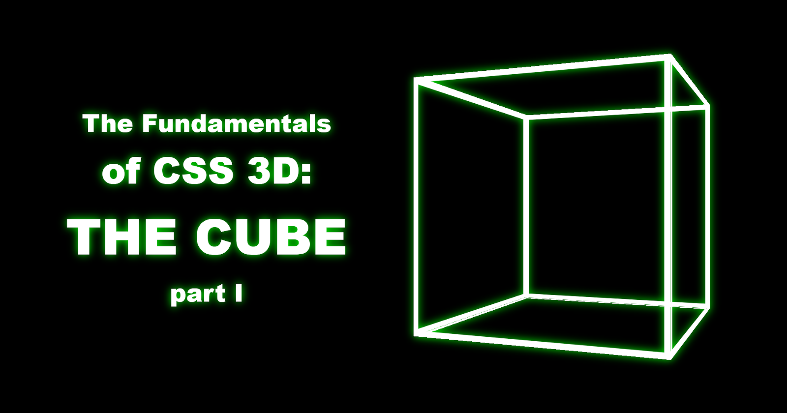
This is a cube created in CSS:
This is what CSS and HTML can do together - with no help from JavaScript. And that thing spins, too - if you haven't already, go ahead and click that triangle in the middle.
Now you're probably thinking one of these three things:
Holy ravioli, Batman! CSS can do 3D? Wowee!
1970's called. They want their technology back - because this ain't doing them justice.
This flies in the face of everything that the web is about these days. You either go for flat minimalism - or Three.js.
Yes. Yes, and yes.
3D shapes in CSS have been my obsession for the past three years - and it's crazy what it can do. But I am also painfully aware of what it can't do. For starters, the "polygon count" is limited - and usually, the CPU starts choking at around 500 objects (on my 4-year-old desktop, at least). So that's like mid-90's graphics, at best. Plus, you'll have to position every single one of those "polygons" yourself. Because Blender it is not. JavaScript offers web designers easier ways to create 3D solids, such as Three.js - and you should go with that if you're planning on doing it commercially. Me, I do this for fun - and the challenge. I'm a mad scientist - emphasis on mad, and with no actual academic education in the field. Just snippets of knowledge I dug up here and there while browsing the wrong end of the World Wide Woods, and fruits of my own unholy experimentations. So you might see me write some outright blasphemous, sacrilegious code that goes against the teachings of actual experts. I prefer flexbox over grid - and do not fancy myself an expert in either. I also have my own ideas on what looks fun in terms of shapes, colors, lettering, icons, etc. - which don't exactly align with the trends of today. Because, as I said before, it's just for fun - to see what's possible, what works, rather than what's right, elegant, modern, or commercially viable.
All right, then. You have been warned.
Anyone still with me?
The plan
The cube is merely the beginning. The entry point into a three-dimensional rabbit hole of endless fun. There be prisms and pyramids. Cylinders. Cones! Spheres, spheres and more spheres. Toruses. Polyhedra that philosophers never even dreamt of - and mathematic formulae you thought you left behind in high school. Oh, the horror! Oh, the joy!
(I suggest you pause this when you're done watching, it's a bit of a CPU hog)
But before we dash headfirst into the labyrinths of algebra, let's try something simple. Let's stick to the familiar corners. Track back to where we began.
The box
To begin with, let's do a quick recap of what we know about the box:
it has 6 faces (hence the other name it goes by: the hexahedron)
all its faces are squares: right angles and even sides all around
all faces are perfectly perpendicular to one another (i.e. at an angle of 90 degrees)
In our HMTL file, let's create 6 walls, grouped as a .cube, and set inside a .scene.
if your code editor has the Emmet extension, you can just type:
.scene>.cube>.wall*6
with no spaces - and then:
if you're on Codepen, press Tab
if you're using VSCode, press Enter
This should produce:
<div class="scene">
  <div class="cube">
    <div class="wall"></div>
    <div class="wall"></div>
    <div class="wall"></div>
    <div class="wall"></div>
    <div class="wall"></div>
    <div class="wall"></div>
  </div>
</div>
Alternatively, just type out or copy the code above.
Now, we'll need to manually add an extra class to each wall that refers to its placement:
front
back
left
right
top
bottom
Type them inside the quotation marks alongside the wall class - separated with just spaces.
Your file should look something like this.
<div class="scene">
  <div class="cube">
    <div class="wall front"></div>
    <div class="wall back"></div>
    <div class="wall left"></div>
    <div class="wall right"></div>
    <div class="wall top"></div>
    <div class="wall bottom"></div>
  </div>
</div>
Now it is ready for...
The construction
Head over to your CSS. First, the body. Even if you're using Codepen, which skips the boilerplate - and so the <body> tag isn't explicitly stated in your HTML, it's there, and we can style it:
body {
  margin: 0; /* don't want a margin on my background*/
  box-sizing: border-box; /* borders as a part of the object's dimensions*/
  background-color: black; /* hence the margin:0*/
  display: grid; /* mostly for the ease of centering content */
  place-items: center; /* centered horizontally AND vertically at once*/
  min-height: 100vh; /* so that there is enough room to center vertically */
  font-size: .5vh; /* a font-size that scales with the viewport */
  filter: drop-shadow(0 0 10px lime); /* adds a green glow to everything*/
}
Note that this demo is an isolated, self-contained site - and so, for simplicity, I used the body as the container/wrapper. If this were to be just a part of a larger website, the body only needs:
margin: 0; /* don't want a margin on my background*/
box-sizing: border-box; /* borders as a part of the object's dimensions*/
All the rest you can relegate to a .container/.wrapper.
Also, you might be wondering why I set a font-size so small. That's not going to be readable for anyone except maybe hawks. IF hawks could read. The thing is, though, it's not for text.
.scene {
  width: 100em; /* 100 units of the font size, mimiclomg percentages */
  aspect-ratio: 1; /* so the height matches the width, producing a square*/
  position: absolute; /* independent from any neighboring containers */
  perspective: 250em; /* sets the distance of the perspective */
}
See, that's what the font size was for. I could've used pixels - but then the cube wouldn't scale. Unless, of course, I went to town on media-queries. I could've used percentages, too - but see, percentages are confusing. Sometimes they refer to the size of the container's parent, and sometimes to the container itself. This snowballs into a bundle of issues. With 100em you get a consistent scale tailored to your main container - which in this case is indeed the .scene.
This also liberates me to give it a position: absolute. With percentages, I'd have to give it position: relative - so that it becomes the reference point for any of its children (meaning, if you set the width of the child to 100%, it'd be 100% of the .scene, not the body). And with position: absolute comes plenty of liberty. A container can be located anywhere in the body, not only next to or below its closest predecessor. It's free to occupy space already populated with countless other containers.
Case in point:
.scene * { /* meaning everything nested inside the .scene */
  position: absolute; /* everything can go everywhere */
  inset: 0; /* occupies full width & height of its parent container */
  transform-style: preserve-3d; /* makes sure that each container nested inside the .scene tag treats its nested content as a 3D object rather than a 2D projection */
}
This setup means that any container within the .scene - and any container within that container, any number of containers - can each take up 100% of the space available, with no margins.
Here is also that we encounter by far the most important property in the whole 3D kerfuffle:
transform-style: preserve-3d;
Perspective is actually optional. It helps present and emphasize the three-dimensionality - but is not the only way to achieve the illusion of 3D:
Preserve-3d, on the other hand. actually ensures that things are 3D. If it's not applied, the transform-style defaults to flat - and so every container treats its content not as elements suspended in 3D space, but merely a flat projection. Like a TV screen:
With the cube, the glitches aren't even particularly intriguing. So yeah, preserve 3D where necessary.
Now, how about we give the walls some style:
.wall {
  border: 3em solid white; /* a white border lining the edges */
}
I said some style, not some STYLE ;) Huge difference. You might've also noticed I omitted the .cube that groups all the walls. We'll get to it later.
Right now you should be seeing something like this:
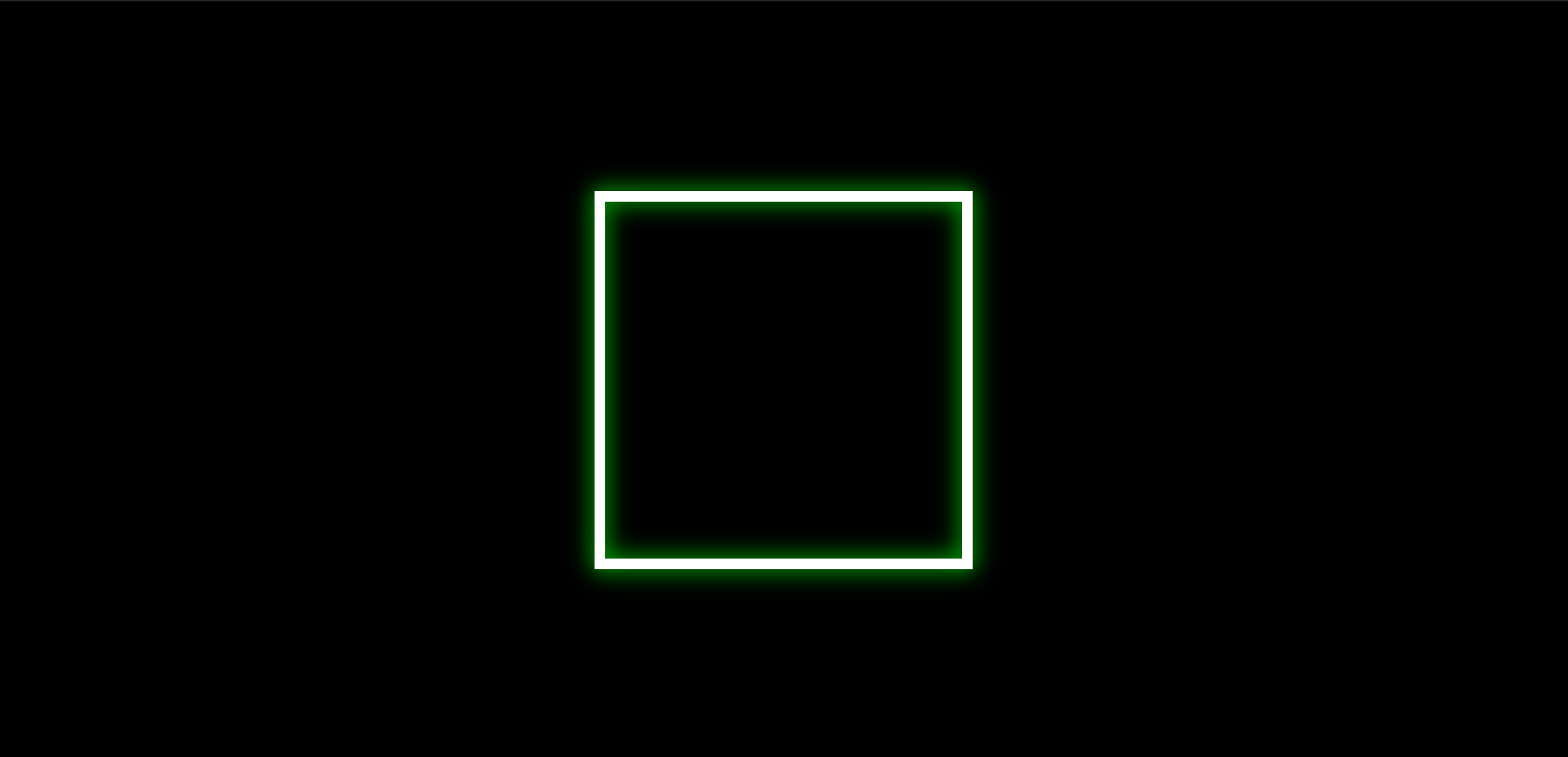
A square with a white border, glowing green, against a black backdrop. Or, rather, SIX flat squares on top of each other, trapped on a 2D plane.
There are two ways to free them - and combine their shapes to form a cube.
The transformations
The squares can change positions. They can move:
right and left
up and down
most notably, towards you and away from you
Or, to use the technical jargon: you can TRANSLATE them - along three axes:
The horizontal axis X
The vertical axis Y
The applicate axis Z
Here's what it looks like in practice:
Similarly, you can turn (a.k.a ROTATE) them along X, Y and Z axes:
You'll notice that rotating the wall in the Z axis makes it simply spin around. This is because the wall stretches along the X and Y axis, and doesn't extend into the third dimension. It is completely and absolutely flat, and you can't give it thickness via CSS.
What's even more important, the Cartesian coordinate system moves and turns along with the wall. There is no central, static set of X, Y and Z axes. The transforms are always viewed from the point of view of the object transformed.
OK, enough spinning, don't want to get dizzy, do we? Let's get moving, then - starting with the two walls that should be most interesting to us in the context of 3D: bring the front wall to the forefront, and push the back wall back.
.front {
  transform: translateZ(50em); /* pulls the wall closer to the viewer*/
}
Notice that we moved the wall by 50em - half of the parent container's size. This is for the sake of symmetry - since we'll be pushing the back wall in the opposite direction.
.back {
  transform: translateZ(-50em); /* pushes the wall away from the viewer*/
}
They are now 100em away from one another (and 50em from the center, where the parent container remains). The first two steps toward creating a cube of 100em by 100em by 100em.
Now, that is marvelous - but how do we get the right wall all the way to the right, and the left one to the left end of the cube? All transform: translateX does is make them strafe in that direction, and rotateX just makes them turn while standing in place (and face the wrong direction, while we're at it: up instead of right).
See, rotateX locks the wall in place like a set of two hinges on the door, attached at both ends - and since X is the horizontal axis, the only direction the wall can spin is up and down.
If you want to turn left, you lock the vertical axis: rotateY
Also, you can chain transforms: first, rotate - and then translate (separate them with spaces, not commas)
.left {
  transform: rotateY(90deg) translateZ(50em);
}

.right {
  transform: rotateY(-90deg) translateZ(50em);
}
...or translate first, then rotate. But that's a whole other story and its own can of worms. For now, let's analyze what happened here:
the .left wall turns to its left, then moves forward
similarly, the .right wall turns the wall its right, then pushes it forward
Note: as I mentioned before, transforms are always viewed from the object's perspective. Its left is your right - like a person standing in front of you - because it's facing you. And after it turns and moves forward, that means its forward - which to you will look like it's moving to the right.
The more you know...
Speaking of which: we already know translateX turns the wall up, so let's do that, and follow it with translation:
.top {
  transform: rotateX(90deg) translateZ(50em);
}

.bottom {
  transform: rotateX(-90deg) translateZ(50em);
}
Finally, here it is:
The Cube
in all its three-dimensional glory:
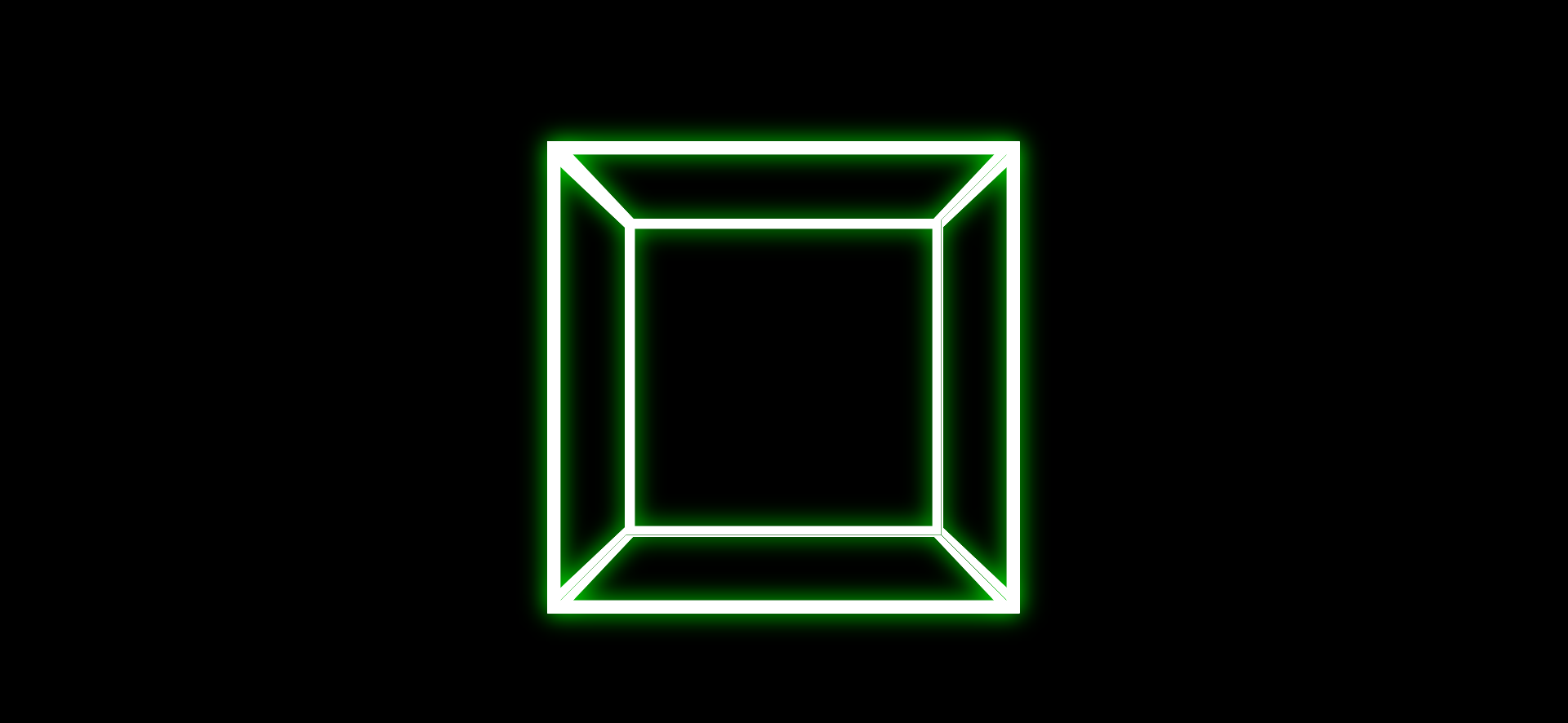
The mind boggles, doesn't it?
If your head is not spinning yet... How about we get that cube twirling, too?
.cube {
  animation: spin 6s linear infinite; /* adds a spinning animation */
}

@keyframes spin { /* the details of the animation: */
  100% { /* at the end point of the animation */
    transform: rotateY(360deg); /* ...the cube will have make a full 360 degree turn */
  }
}
Did it work? What do you see? Do you like what you see? Are you excited for more?
Because more is coming...
Subscribe to my newsletter
Read articles from Maciek Fitzner directly inside your inbox. Subscribe to the newsletter, and don't miss out.
Written by
