Hover Letter Wave Effect In CSS
 Karim Ould Mahieddine
What are we going to rebuild?
In this Blog Post from my UI / UX Bits series, we will rebuild a nice hover animation for buttons or links from https://touchycoffee.com/.
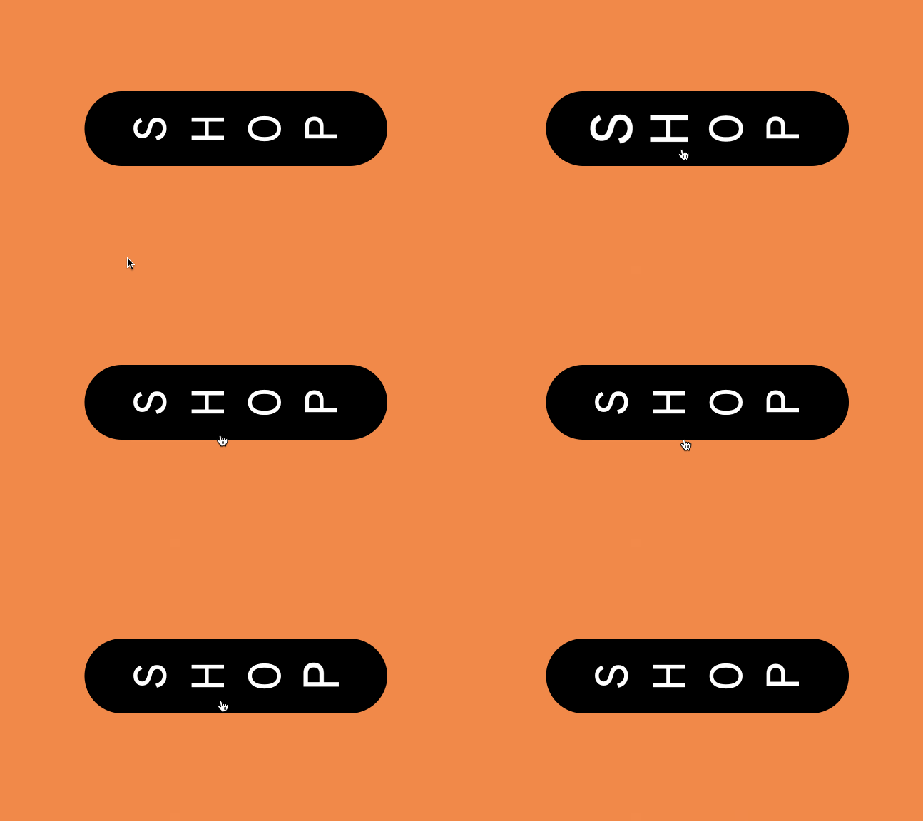
We going to rebuild this UI interaction:

What do we see?
We see a button element with rounded corners. The letters are rotated by 90 degrees. When we hover the element every single letter scales up and down a little bit, each shortly after the other. This gives us the wave animation.
If you want to go straight to the code, you can play with it here.
How can we recreate it?
We start with a basic and very small HTML structure.
<!DOCTYPE html>
<html lang="en">
  <head>
    <title>Hover Letter Wave Effect In CSS</title>
    <meta charset="UTF-8" />
    <meta name="viewport" content="width=device-width, initial-scale=1" />
    <link href="style.css" rel="stylesheet" />
  </head>
  <body>
    <a class="wave-hover">
      <span>s</span>
      <span>h</span>
      <span>o</span>
      <span>p</span>
    </a>
  </body>
</html>
The HTML code above creates an HTML element with the text "shop" with the class "wave-underline-hover".
Using the span tags in the anchor element allows us to style each letter within the anchor element individually.
We give our anchor tag the class wave-hover to style it.
Basic styling of the element
To get the desired look of the element we style it with some basic CSS.
.wave-hover {
  text-transform: uppercase;
  font-size: 1.5rem;
  padding: 1rem 2rem;
  background-color: black;
  color: white;
  border-radius: 100px;
  cursor: pointer;
  display: flex;
  gap: 1rem;
}
Most of the CSS is just for the appearance of our anchor tag and is not necessary for our animation.
The two last lines are important.
  display: flex;
  gap: 1rem;
The flex property allows us to transform our single letters and turn them 90 degrees. The gap property makes sure we have a little space of 1rem between the letters.
To rotate our letters we simply rotate every span in our anchor element with the transform property.
.wave-hover > span {
  transform: rotate(-90deg);
}
The anchor element now looks like the example, the hover effect is still missing.
The animation
To build the animation we use the @keyframe rule, you can read more about @keyframe here.
We use the @keyframes rule to define an animation that can be applied to an element using the animation property. The @keyframes rule is followed by the name of the animation, which in our case is "wave". Inside the @keyframes block, the keyframes of the animation are defined using percentages. These percentages represent the point in time at which the animation should be in a specific state.
If you don't need an animation that has different states in different animation frames you can simply use "from" and "to" instead of the percentage values.
@keyframes wave {
  0% {
    transform: scale(1) rotate(-90deg);
  }
  50% {
    transform: scale(1.3) rotate(-90deg);
  }
  100% {
    transform: scale(1) rotate(-90deg);
  }
The CSS code above defines our animation named "wave" which has three keyframes: 0%, 50%, and 100%.
At the 0% and 100% keyframes, our animation sets the transform property to scale(1) rotate(-90deg). This will scale the element to its normal size. At the 50% keyframe, the transform property is set to scale(1.3) rotate(-90deg), which scales the element up slightly and maintains the same rotation.
The wave effect
Now we need to apply our animation to our elements when a user hovers it.
To apply our animations to all our span elements within our element with the class .wave-hover we can simply do this:
.wave-hover:hover span {
  animation: wave 0.4s linear;
}
This adds our animation to all our span elements on hover, our animation is set to run for 0.4 seconds linearly.
Now we need to time the animation since we want to run it on every letter after another. To do this we make use of the nth-child pseudo-class, you can read more about it here.
With the nth-child pseudo-class, we can add different rules to all our children spans within our .wave-hover class element.
.wave-hover:hover span:nth-child(2) {
  animation-delay: 0.1s;
}

.wave-hover:hover span:nth-child(3) {
  animation-delay: 0.2s;
}

.wave-hover:hover span:nth-child(4) {
  animation-delay: 0.3s;
}
The animation-delay adds a delay to the element and when the animation should start.
The first span element has no delay, the second span element has a 0.1s delay, the third span element has a 0.2s delay and the fourth span element has a 0.3s delay. This creates the effect of the animation wave moving across the span elements.
The Problem with this solution is that for now, this will only work if the .wave-hover element has a maximum of 4 spans as direct children. If we have for example 5 spans the last span will not run the animation.
You have to add the fifth child to the CSS to make it work with 5 letters.
References
Subscribe to my newsletter
Read articles from Karim Ould Mahieddine directly inside your inbox. Subscribe to the newsletter, and don't miss out.
Written by
