Essential CSS Concept For Web Development
 Nkiruka Edith Onwugbufor
I can still recall enquiring about how long it would take me to become an excellent CSS user from my CSS-savvy coworker. She chuckled and added, "It might take years."
She was entirely true, as I now see after spending so much time learning CSS.
Sometimes you think you know everything there is to know about CSS, only to discover that you were wrong about a fundamental concept, or that your understanding of that concept differs from what the CSS spec says. Isn’t that why we often see memes saying,

In this article, I'll discuss a few CSS cautions, traps, and "wow" moments, along with demonstrations when appropriate. It will undoubtedly make you smile. So, let’s get started.
Pointer-event.
With the help of the pointer event property, you can decide whether or not an element will serve as the target for pointing device (such as a mouse or pen) events. There are more than 7 property values for the pointer-event property, but these are the most popular;
Values of Pointer-event
pointer-events: all: The element may be the target element for pointer events whenever the pointer is inside the CSS border edge of the element.pointer-events: auto: restores the default functionality, It indicates that an element must react to pointer events such as the click and**: hover**.pointer-events: fill: (For SVG only.) The element can only be the target of a pointer event when the pointer is over the interior (i.e., fill) of the element.pointer-events: none: This value indicates that an element doesn't react to pointer events. It avoids all state, clicks, and cursor options on the specified HTML element.
Background-clip
Thebackground-clip property defines how far the background (color or image) should extend within an element. It limits the area in which the background color or image should appear by applying a clipping box.
Values of Background-clip
border-box: is the default value. This allows the background to extend to the outside edge of the element’s border.padding-box: clips the background at the outside edge of the element’s padding and does not let it extend into the border.content-box: clips the background at the edge of the content box.inherit: applies thebackground-clipsetting of the parent to the selected element.
#border-box { background-clip: border-box; }

#padding-box { background-clip: padding-box; }

#content-box { background-clip: content-box; }
A practical example of how the CSS background-clip property works:
Text-overflow
To indicate that some text has overflowed and is hidden from view, CSS uses the text-overflow property.
Values of Text-overflow
text-overflow: clip;: content is clipped when it proceeds outside its box. This can be used "overflow-clip-margin" to set the clipped area.
div {
        width: 400px;
        font-size: 40px;
        white-space: nowrap;
        overflow: hidden;
        text-overflow: clip;
    }
text-overflow: ellipsis;: This value displays an ellipsis (?) or three dots to show the clipped text. It is displayed within the area, decreasing the amount of text.
div {
        width: 400px;
        font-size: 40px;
        white-space: nowrap;
        overflow: hidden;
        text-overflow: ellipsis;
    }
text-overflow: inherit;: It is used to inherit a property to an element from its parent element property value ie., the value will set the text-overflow property to the value of the parent element.
<html>
<head>
    <title> text-overflow Property </title>
    <style type="text/css">
    div {
        width: 400px;
        font-size: 40px;
        white-space: nowrap;
        overflow: hidden;
        text-overflow: ellipsis;
    }

    h3 {
        width: 400px;
        white-space: nowrap;
        overflow: hidden;
        text-overflow: inherit;
    }
    </style>
</head>
<body>
    <div> CSS: text-overflow property example
        <h3>
        inherited an overflow property from div.
        </h3>
    </div>
</body>
</html>
text-overflow: initial;: It sets the property to its default value.
div {
        width: 400px;
        font-size: 40px;
        white-space: nowrap;
        overflow: hidden;
        text-overflow: initial;
    }
Take a 5mins deep drive;
Word-break
The word-break property in CSS can change when line breaks ought to occur. In a text, line breaks typically only happen when there is a space or a hyphen.
Values of Word-break
word-break: break-all;: It is used to break the words at any character to prevent overflow.word-break: normal;: This property uses the default line break rules.word-break:keep-all;: Mostly used on Chinese, Japanese, and Korean text words which are not broken. Otherwise, this is the same asnormal.word-break: initial;: This property value sets the property to its default value.word-break: inherit;: It inherits the property from its parent element.
The word-break property values are demonstrated in action in the video down below.
Opacity
The CSS opacity property is used to specify the transparency of an element. If you want to put it simply, it specifies the image's clarity.
Opacity is the amount of light transmission through an object, according to technical definitions.
How to apply opacity setting in CSS.
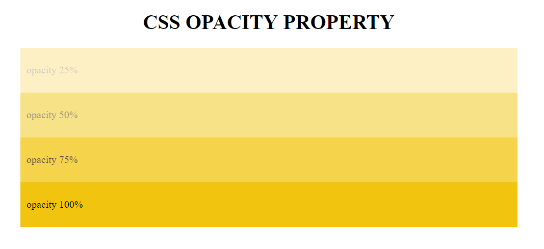
The entire object's opacity setting is applied uniformly, and the opacity value is defined as a digital value less than 1. Opacity is highly visible when the opacity value is lower.
Opacity is not inherited.

A practical example of how to play with CSS opacity:
Box-sizing
The box-sizing property enables you to include the padding and border when calculating the overall width and height of an element.
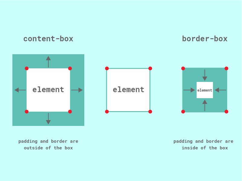
Setting box-sizing: border-box; on an element, padding and border are included in the width and height: Since the result of using this box-sizing: border-box; is so much better, many developers want all elements on their pages to work this way.
while box-sizing: content-box; gives you the default CSS box-sizing behavior. If you set an element's width to 70 pixels, then the element's content box will be 70 pixels wide, and the width of any border or padding will be added to the final rendered width, making the aspect wider than 70px.

No Box-sizing, what happens?
If you don’t use the box-sizing property, then the styling will be done by default. Accordingly, CSS by default increases an element's total height and width by the padding and border that the coder specifies for it. Here’s how it looks in a mathematical representation:
Height rendered = defined height + padding (if any) + border (if any)
Width rendered = defined width + padding (if any) + border (if any)
With Box-sizing, what happens?
CSS box-sizing enables you to specify how the total rendered height and width should be calculated: including border and padding or not.
With the CSS box-sizing property, you get to decide how the box model should calculate the height and width of an element. It is recommended to use border-box values when laying elements to make the calculations easier. However, if you are using the position property, using the content-box value is recommended to allow the size to be relative to the content.
Backdrop-filter
When using the property in CSS, filter effects can be applied to an element's background using values like ( blur , brightness , contrast etc.). The difference between backdrop-filter the filter property is that the filter effects are only applied to the background and not to the content of the element.
Values of Backdrop-filter
blur
The only argument that may be passed with this is a radius, which determines how much blur will be applied. It must be a length unit, like 10px. No percentages are permitted.
.element {
    filter: blur(0.3em);
}
brightness
The brightness function can be used to modify an element's brightness. The unmodified image is represented as 100% when expressing the brightness value as a percentage. Values between 0% and 100% reduce the brightness of the image because 0% turns the image black. To improve brightness, use values greater than 100%.
.my-element {
    filter: brightness(80%);
}
You can also use decimal values, instead of percentage values in filters like brightness. To set 80% brightness with a decimal, write 0.8.
contrast
Set a value between 0% and 100%, or 0 and 1 to decrease or increase the contrast, respectively.
.element {
    filter: contrast(120%);
}
grayscale
Grayscale() can take a value of 1 to apply a fully grayscale effect, or 0 to have an entirely saturated element. You can also apply a partial grayscale effect by using percentage or decimal values. If no arguments are supplied, the element will only have grayscale as an option. The value will be capped at 100% if you pass a value higher than that.
.element {
    filter: grayscale(80%);
}
invert
Like grayscale, the invert() method can be called with a 1 or 0 argument to toggle it on or off. The element's colors are entirely reversed when it is on. If you only want to apply a partial color inversion, you can do it by using percentage or decimal values. The invert() function will entirely invert the element if no parameters are provided.
.element {
    filter: invert(1);
}
opacity
The opacity() filter works just like the opacity property, where you can pass a number or percentage to increase or reduce the opacity. If you pass no arguments, the element is fully visible.
.my-element {
    filter: opacity(0.3);
}
saturate
The saturate filter is very similar to the brightness filter and accepts the same argument: number or percentage. Instead of increasing or decreasing the brightness effect, saturate increases or decrease the color saturation
.my-element {
   filter: saturate(155%);
}
This is a real-world example of a backdrop filter:
Conclusion
In conclusion, knowing these essential CSS concepts is crucial for any web developer. Understanding how and when to make use of them will greatly improve your experience.
Stick around; there is more to come.
Feel free to connect with me on LinkedIn | Github | Twitter.
Take care!!!
Subscribe to my newsletter
Read articles from Nkiruka Edith Onwugbufor directly inside your inbox. Subscribe to the newsletter, and don't miss out.
Written by

Nkiruka Edith Onwugbufor
Nkiruka Edith Onwugbufor
Hello, I'm Edith, a Frontend Developer who is passionate about creating engaging UI and interactive experiences. I am also a Technical Writer who writes on Frontend technologies to help other developers understand and also be creative with them.