Making my BETA website design
 Tiago Rangel de Sousa
Step 1. Font selection
To begin this project, I carefully selected two fonts: Playfair Display and Inter, which I felt captured the modern and beautiful aesthetic I desired for the beta redesign.
Step 2. Prototype in Figma
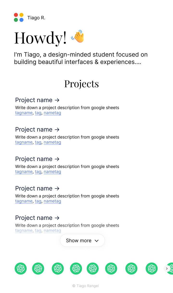
After that, I started making a prototype in Figma with a design that was clear, organized, and fast.
The results were satisfactory, and I liked the design. The prototype website featured my logo in a small font at the top, a header, a description, projects with a “Show More” button (a significant upgrade from the original website), and a slider with social links (another significant upgrade).

Wow, for me looks nice! Now, the most difficult part: make it work. As usual, I coded everything on Glitch.com: It's a nice interface, with autosave, and HTTPS domains, and works fast.
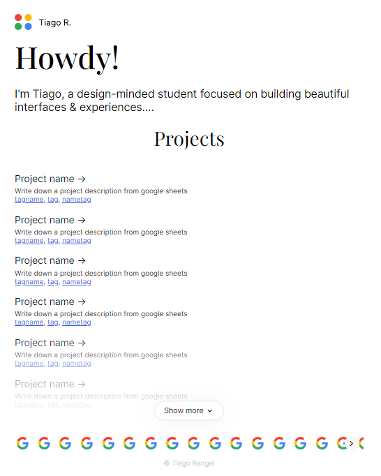
After working some time creating the initial preview with Glitch, I got an honestly nice result:

I was quite happy with the result. Splide worked well with the slider: some small customization and I was good to go.
Step 3. Make it work
I added multiple things to actually make the website work:
I added a title animation (the one saying "Howdy"). Moving letters provided some outstanding ones, and were easy to integrate. I decided to go with #7. I also added a waving hand APNG from emojipedia.
I also added a language picker
I connected my spreadsheet with data to the website (see this post)
I also added much more features and I am adding more features, so check out my website!
Subscribe to my newsletter
Read articles from Tiago Rangel de Sousa directly inside your inbox. Subscribe to the newsletter, and don't miss out.
Written by

Tiago Rangel de Sousa
Tiago Rangel de Sousa
Hi! I'm Tiago, a design-minded student focused on building beautiful interfaces & experiences