Position in CSS: Fixed, Relative, Absolute, Static, and Sticky (F.R.A.S.S)
 Eseose Cecilia-Roxanne Animhiaga
Hey there, developer and designer! Great to have you here. Today, we will discuss positioning elements on a web page using CSS and focus on the various position values - fixed, relative, absolute, static, and sticky.
In web design and development, positioning is one of the most crucial aspects of creating visually appealing and functional websites. And that is why this article will focus on the strengths, weaknesses, use cases, and examples of each position value (F.R.A.S.S).
Whether you're a beginner looking to learn the basics or an experienced developer looking to refresh your knowledge, this article will clearly explain how these position values work and when and how to use them. Now that we're all settled in let's get started!
The CSS position property
The CSS position property defines where an element is displayed on a web page. This property works simultaneously with the top, bottom, left, and right properties to determine the final position of the element on the page. However, these four(4) properties will not work unless the position property is set first. The code snippet below is an example of how a typical position property is represented:
.box1 {
  border: 1px solid;
  height: 200px;
  width: 300px;
  background-color: orchid;
  position: fixed;
  top: 50px;
  left: 50px;
}
Code result:

Overview of the five(5) position values
Now that we have been introduced to the position property, let us look at the five positioning values; Fixed, Relative, Absolute, Static, and Sticky. "Fixed" positions elements in a fixed location on the web page, while "Relative" positions elements relative to their normal position. "Absolute" positions elements in a specific location on the page, while "Static" positions elements in their default position. "Sticky" positions elements in a fixed location when scrolling to a certain point on the page. Let us take a more in-depth look at each position value in no particular order.
First, we create our HTML code and link a style sheet.
<!DOCTYPE html>
<html lang="en">
  <head>
    <meta charset="UTF-8" />
    <meta http-equiv="X-UA-Compatible" content="IE=edge" />
    <meta name="viewport" content="width=, initial-scale=1.0" />
    <link rel="stylesheet" href="styles.css" /> <!--CSS stylesheet-->
    <title>Position in css</title>
  </head>
  <body>
    <div class="static-box"></div>
    <div class="relative-box"></div>
    <div class="fixed-box"></div>
    <div class="absolute-box"></div>
    <div class="sticky-box"></div>

    <!--Optional dummy text-->
    <p>
      Lorem ipsum dolor sit amet consectetur adipisicing elit. Nulla a
      consequuntur recusandae, molestias molestiae vel delectus, at nihil est
      aspernatur aliquid expedita ipsa ut? Facilis delectus culpa tenetur ex
      ipsam?
    </p>... <!--Add more "lorem ipsum" text as necessary-->
 </body>
</html>
Static (position: static;)
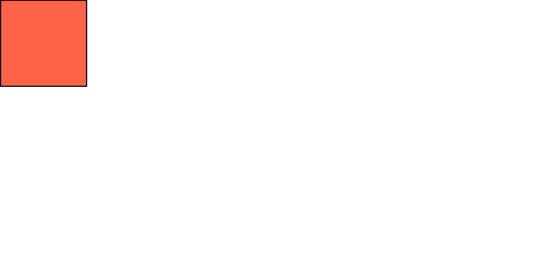
Static position in CSS refers to an element's normal, unaltered position within the flow of a web page. All elements, by default, are static until a different position value is implemented. Any element with the position: static; property is not affected in any way, as this is the default position of all elements on a web page. This type of positioning cannot be moved using top, bottom, left, or right attributes. Try out the code syntax below on your code editor. Comment out position: static; and see if any change is reflected. I bet the tomato box stayed the same ;)
Code example:
.static-box {
  border: 3px solid;
  height: 200px;
  width: 200px;
  background-color: tomato;
  position: static;
}
Code result:
Relative (position: relative;)
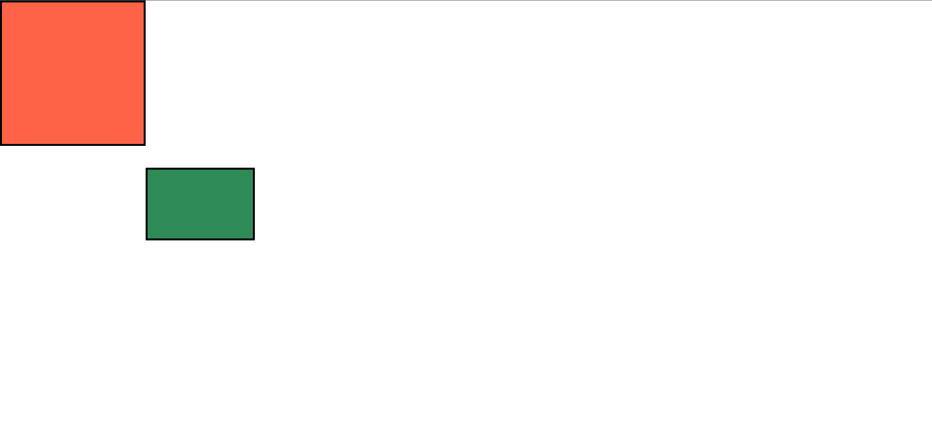
CSS relative positioning enables elements to be shifted from their standard position on the web page while preserving their normal location. This means that the element can be moved from its normal position using the top, bottom, left, and right attributes, but it will still occupy its original space in the flow of the web page.
The relative position is also often used as a base for absolute positioning, as elements with absolute positioning are positioned relative to the nearest positioned ancestor/parent element. The code example below shows the seagreen box moved 30px from the top and 200px from the left from its original position (top-left underneath the tomato box). Try out the code example below on your code editor. Take note of how the box moves relative to its origin point.
Code example:
.relative-box {
  border: 3px solid;
  height: 100px;
  width: 150px;
  background-color: seagreen;
  position: relative;
  top: 30px;
  left: 200px;
}
Code result:
Fixed (position: fixed;)
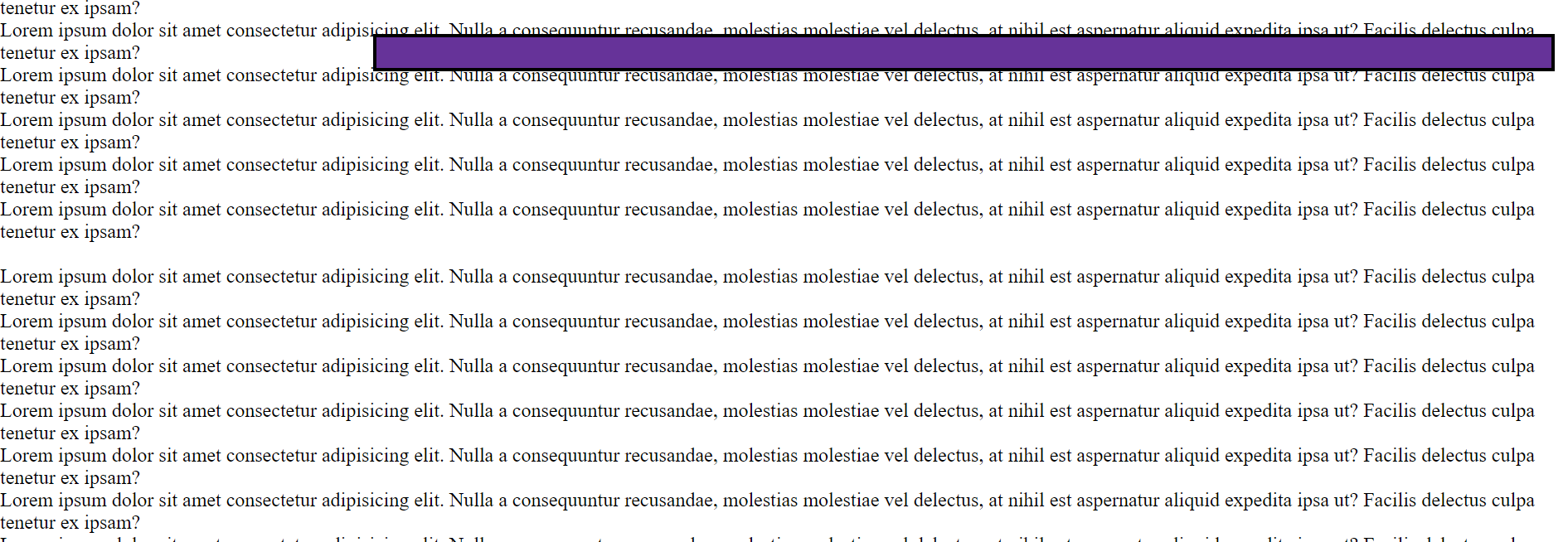
Fixed positioning in CSS allows elements to be positioned relative to the browser window rather than the web page. This means that the element will remain in a fixed location on the screen, even if the page is scrolled. The top, bottom, left, and right attributes can be used to specify the exact location of the element. It is important to note that fixed positioning can impact the web page's layout, as it will overlap other elements on the web page.
Fixed positioning is often used for navigation menus, pop-ups, and other elements that need to remain in a specific location on the screen, regardless of page scrolling. It is also useful for creating header or footer elements that stay visible while the page is scrolled. Additionally, fixed positioning may not be supported in older browsers, so it is important to consider compatibility when using this type of positioning. Try out the code example below:
Code example:
.fixed-box {
  border: 3px solid;
  height: 30px;
  width: 950px;
  background-color: rebeccapurple;
  position: fixed;
  top: 30px;
  left: 300px;
}
Code result A (before scrolling):
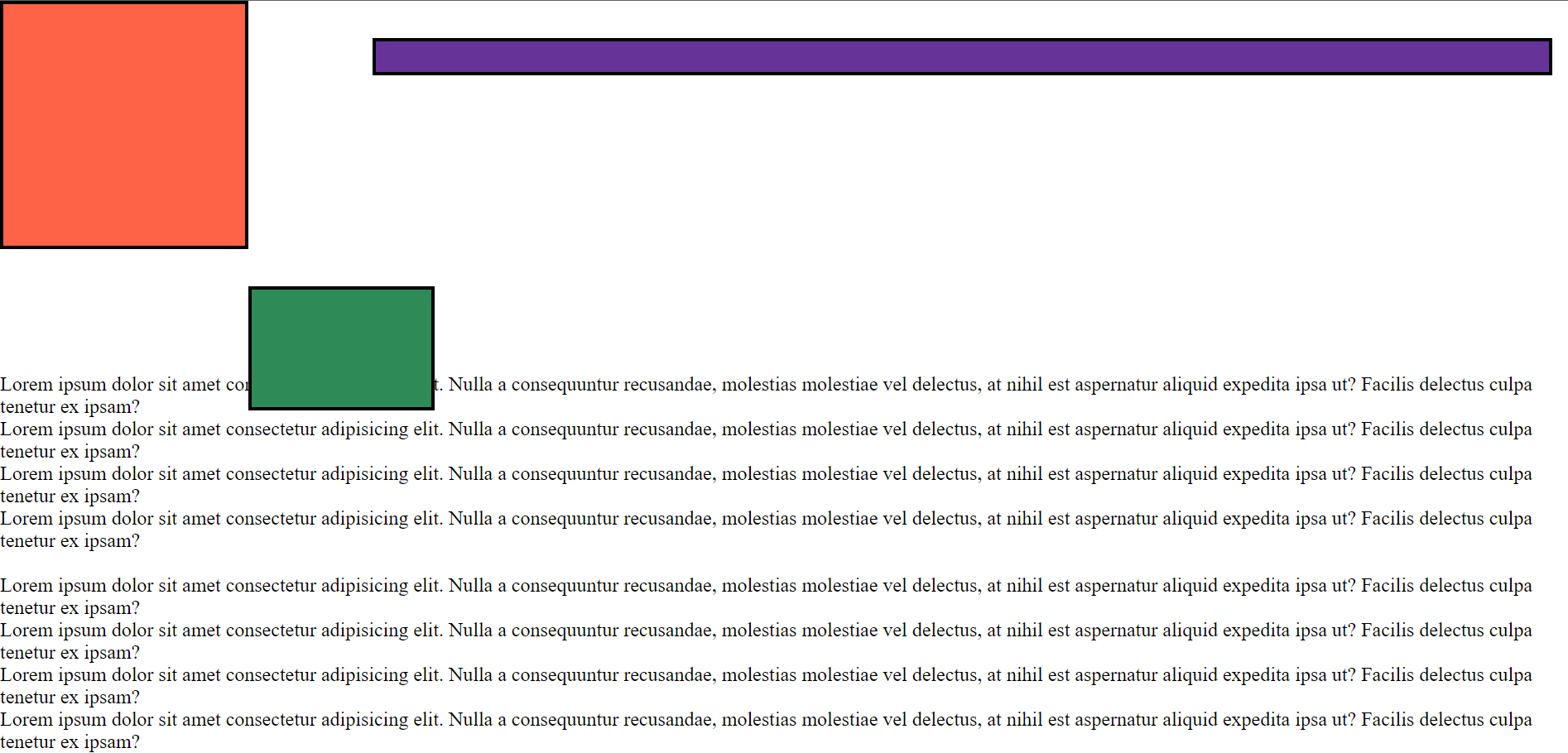
Code result B (after scrolling):
Absolute (position: absolute;)
Absolute position in CSS enables elements to be positioned relative to the nearest positioned ancestor/parent element (a positioned ancestor is any element with a position value other than the default; static). If no positioned ancestor exists, it will be positioned relative to the web page or browser window.
With the absolute position, an element is not part of the web page's normal flow, which can impact the page's layout as it will overlap other elements on the web page. The absolute position is often used to create elements that need to be positioned at a specific location on the web page, for example, pop-ups. In the code example below, the saddlebrown box is positioned relative to the web page at the top-left corner, with 0 top and left values. Try out the code yourself!
Code example:
.absolute-box {
  border: 3px solid;
  height: 60px;
  width: 55px;
  background-color: saddlebrown;
  position: absolute;
  top: 0;
  left: 0;
}
Code result:

Sticky (position: sticky;)
Elements with position: sticky; are positioned relative to the user's viewport or browser window, with the element remaining "stuck" to a specific location on the screen as the user scrolls. A sticky element behaves like a relative element (until the user scrolls to the specified position). Then it switches to a fixed element (when it "sticks" in place). The sticky position value allows elements to remain visible and accessible to users as they scroll through a web page.
It is commonly used to create header or footer elements that stay visible while the page is scrolled or elements that need to remain visible as the user scrolls through a long page. Fair warning! The sticky positioning may not be supported in older browsers; confirming compatibility and the website's possible audience is crucial before using this position type. In the code example below, the hotpink box maintains the web page's normal flow until the page is scrolled to the specified location where the element is 200px from the top but remains "stuck" in place.
Code example:
.sticky-box {
  border: 3px solid;
  height: 40px;
  width: 550px;
  background-color: hotpink;
  position: sticky;
  top: 200px;
  left: 400px;
}
Code result A (before scrolling):
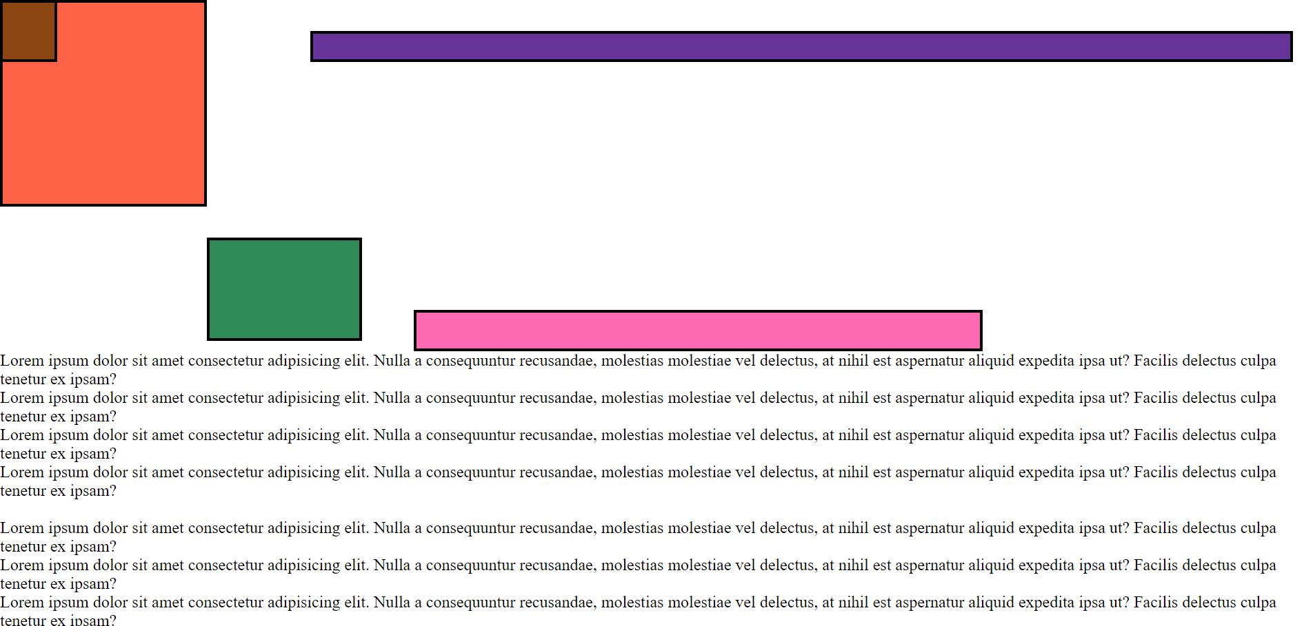
Code result B (after scrolling):

Five tips(5) for using position values
Compatibility: Not all positioning values are supported in all browsers, so it is important to consider compatibility when using them.
The flow of the page: Positioning values can significantly impact the page's layout, so it is vital to understand the flow of the page and how elements will interact with each other.
Avoid overlapping elements: Absolute and fixed positioning can result in overlapping elements, so be mindful of the placement of these elements on the page.
Consider the size and placement of elements when using relative positioning, as the element will still occupy its original space on the page.
Test and adjust: It is necessary to test positioning values on different devices and screen sizes and adjust as needed to ensure your desired effect is achieved across different devices and screen sizes.
Summary
In summary, the different position values in CSS - fixed, relative, absolute, static, and sticky - allow for precise control over the placement of elements on a web page. Your ability to understand the unique characteristics of each position value and how they interact with the layout of a web page is vital to making the most of them.
So whether you're a seasoned pro or just starting, take the time to experiment with these position values and find the best solution for your design needs. With consistent practice, you will soon get the hang of creating dynamic designs that are both user-friendly and visually appealing. Best of luck!
Subscribe to my newsletter
Read articles from Eseose Cecilia-Roxanne Animhiaga directly inside your inbox. Subscribe to the newsletter, and don't miss out.
Written by

Eseose Cecilia-Roxanne Animhiaga
Eseose Cecilia-Roxanne Animhiaga
Hi there 😊 👋🏿 I'm Eseose (Sose for short) I'm a software developer and technical writer currently learning and building in public. I also advocate for easy-to-understand and apply technical documentations. When I'm not people-watching I'm binging my favourite docuseries.