Box Model In CSS
 Mayank Sahu
Everything on a website is a box
Two Types of Box:-
Block => Every new block elements will start on a new line. We can apply height and width property. Example :- <div>, <p>, <h1>-<h6> etc.
Inline => New elements will not break into a new line. Height and width properties will not apply. The height of an inline element is the height of the content. The width of an inline element is the width of the content. Example :- <span>, <a>, <br> etc.
Note :- For code example we are taking box as class name
Parts of Box

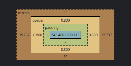
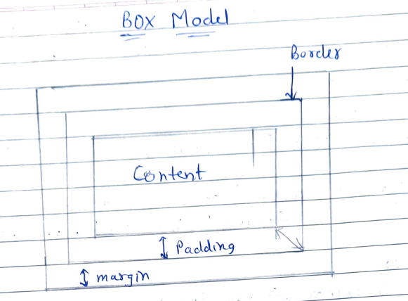
Content box :- The area where your content is displayed. Which can be sized using height and width.
 .box{
 height : 50%;  /* auto 500px 50em */
 width : 75%;   /* auto 500px 50em */
 }
Padding box :- Padding is the empty area between content edge and border. Covered with same color as of element background color.
 padding : 10 px; /* All sides: 10px padding */
 padding : 10px 20px; /* top and bottom: 10px padding , left and right: 20px padding */
 padding : 10px 20px 25px 50px;  /* top right bottom left */

 /* We can also specify any specific sides */
 padding-top: 10px;
 padding-left :50px; /* similarly padding-right padding-bottom */
Border : The border box wraps the content and any padding.
Note :- Border width also counted in the total dimension of the box.
border : 2px solid black; /* width style colour*/Margin : The margin is the outermost layer, wrapping the content, padding, and border as whitespace between this box and other elements.
Note :- Margin dimensions is not counted in the total dimension of box.
 margin : 10 px; /* All sides: 10px margin */
 margin : 10px 20px; /* top and bottom: 10px margin , left and right: 20px margin */
 margin: 10px 20px 25px 50px;  /* top right bottom left */

 /* We can also specify any specific sides */
 margin-top: 10px;
 margin-left :50px; /* similarly margin-right margin-bottom */
Alternate of CSS box Model
Padding and border can increase the dimensions of the box. In order to prevent it and merge the thickness of padding and border within the element's fixed dimensions we can use one single property know as box-sizing.
.box{
    box-sizing : border-box;
    width: 300px;
    padding 10px;
}

/* if box-sizing is not there than padding width i.e 10px + 10px (right+left) also added in box dimensions to become width of 320 px but now padding width is merge with box width and the box width will remain 300px only. */
/*same with border dimension */
It is consider best practice to use box-sizing for all your block element.
Important Points
When one value is specified, it applies the same padding / margin to all four sides.
When two values are specified, the first padding / margin applies to the top and bottom, the second to the left and right.
When three values are specified, the first padding / margin applies to the top, the second to the right and left, the third to the bottom.
When four values are specified, the paddings/ margins apply to the top, right, bottom, and left in that order (clockwise).
Margin Collapsing
The top and bottom margin of blocks are sometimes combined (collapsed) into a single margin whose site is the largest of the individual margins.
Rule of collapsing :-
Only vertical margins of block level elements are collapsed
The elements should be adjacent.
The element with bigger margins will be used.
The overflow property should be set to visible
Negative margin will add up.
No collapsing of margins between parents and child elements
collapsing only work in a flow layout.
Difference between outline and border.
An outline is a line that is drawn around the elements, outside the border.
Outline may overlap other content
Outline is not the part of element dimensions
Outline don't effect dimension.
Subscribe to my newsletter
Read articles from Mayank Sahu directly inside your inbox. Subscribe to the newsletter, and don't miss out.
Written by

Mayank Sahu
Mayank Sahu
Hello All, I am Mayank Sahu pursuing B.Tech in IT, highly passionate to be a Developer. I believe, development is not about writing code but more of craftsmanship.