Flex in CSS
 Goudham
What is Flex:
Flexbox layout aims to provide an efficient way to layout, align and distribute spaces among items in the container even when item size is unknown or dynamic
An important property to make a container or parent object into Flex is display: flex
flex-direction
in the flexbox layout, we have a main axis in which items fall in horizontally from left to right and a cross axis in which items fall in vertically from top to bottom
by default, flex-direction will be horizontal
for example, the direction can be changed vertically by setting the direction as a column like below
Justify-Content
Aligning content on the main axis using justify-content property
Flex-Start
items are aligned from starting of the flex
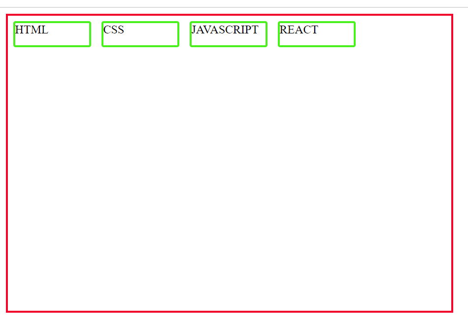
Flex-End
Items are placed at end of the flex

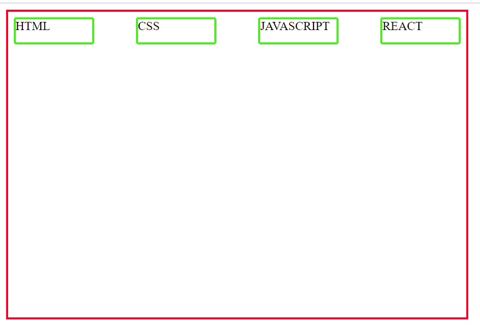
space-between
items are distributed equally where the first and last item will not have any spaces between the item and the border
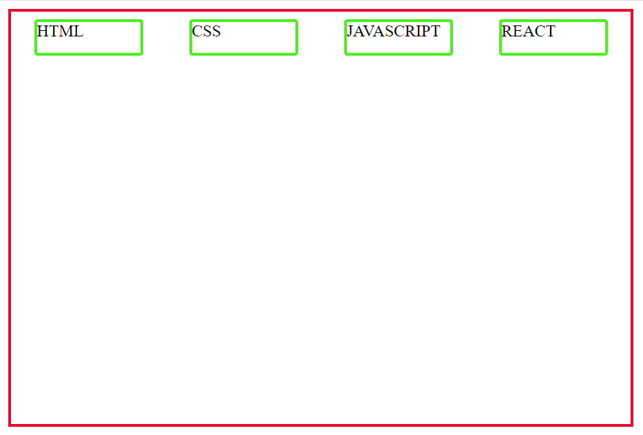
space-around
The first and last item has one unit of space from the border and in between items are equally distributed
space-evenly
items are placed evenly inside the parent container

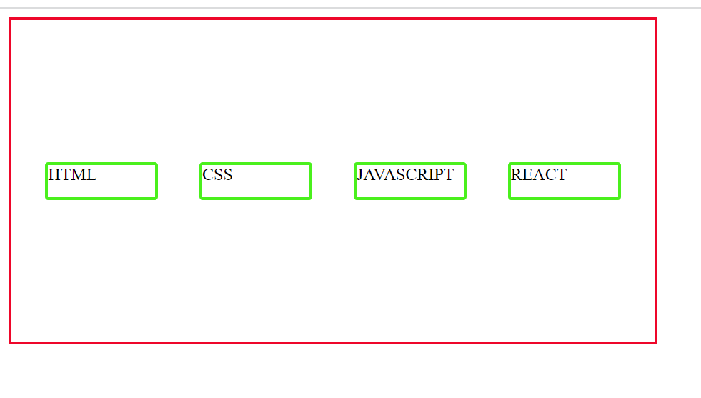
align-items
to align items on cross axis is using the align-items property
to place items in the center on the cross axis we can set align-items: center
Wrap
when the container has more items then placing will be a problem
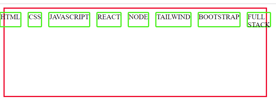
we can set flex-wrap to wrap for distributing items in a container, when items overflow automatically wrapped in the next line
.mycont{
    border: 3px solid rgb(238, 7, 42);
    height: 200px;
    width: 600px;
    display: flex;
    flex-direction: row;
    /* justify-content: space-evenly; */
    /* align-items: center; */
    flex-wrap: wrap;
}
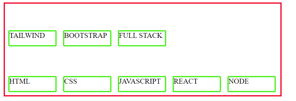
by default, flex-wrap is set to no-wrap and wrap-reverse is useful when items are to be seen as reversed
.mycont{
    border: 3px solid rgb(238, 7, 42);
    height: 200px;
    width: 600px;
    display: flex;
    flex-direction: row;
    /* justify-content: space-evenly; */
    /* align-items: center; */
    flex-wrap: wrap-reverse;
}
align-content
align-content property is enabled only when flex-wrap is set to wrap
.mycont{
    border: 3px solid rgb(238, 7, 42);
    height: 300px;
    width: 400px;
    display: flex;
    flex-direction: row;
    /* justify-content: space-evenly; */
    /* align-items: center; */
    flex-wrap: wrap;
    align-content: center;
}

Let's see how we can set properties for individual items in the flexbox layout
flex-grow
flex-grow is used to fill excess spaces in layout or to grow an item
align-self
align-self is to override the align-items property in the item level, For example, I have set align-item to flex-start which means items will be placed at the start of the layout in the cross axis
at the item level, if align-self is set to center, only a particular item will be placed in the layout center in the cross axis
Subscribe to my newsletter
Read articles from Goudham directly inside your inbox. Subscribe to the newsletter, and don't miss out.
Written by

Goudham
Goudham
I am a senior consultant