Understanding the BEM methodology
 Obafunsho
In coding, algorithms are hard, but naming variables is harder.
For example, to style your HTML elements, you give them classes or an id attribute. But what name should you give these attributes to make them easier to understand and style? And even after naming attributes properly, how do you avoid specificity problems in CSS?
Anyone who has done any serious CSS knows tracking specificity and cascade in CSS is difficult. Even when you understand these concepts, you will still make errors and some styles will still not reflect on the webpage.
Take for example:
input#search-input {
  color: green; /* 1-0-1 Specificity - WINS!! */
}
.bodyClass .sectionClass .parentClass .formClass input[id="search-input"] {
  color: yellow; /* 0-5-1 - LOSSES */
}
The style with 5 descendant selector combinators losses over the style with one selector, input#search-input. The cascading rule says the second (or last) styles applied to a selector should take precedence, but the specificity rule has more weight in this scenario.
There are only two hard problems in Computer Science: cache invalidation and naming things — Phil Karlton
Now imagine a CSS file with thousands of lines of code. It becomes nearly impossible to keep track of the styles, their cascades and their specificity.
One reason CSS can cause headaches is that the selectors and combinators are hard to follow, like in the above example. Enter the BEM methodology.
What is BEM?
BEM is an acronym for Block Element Modifier. It is a methodology that allows you to give your front-end code a component structure to make it reusable and sharable.
BEM makes it easy to avoid CSS specificity and cascading problems.
A Block is a standalone entity that is meaningful on its own. Examples are: card, menu, container, input, header.
An Element is part of a block that has no standalone meaning and is semantically tied to its block. Examples are: card title, menu item, header image.
A Modifier is a flag on a block or element. Use them to change appearance or behavior. Examples are: disabled, color red, color primary, size large.
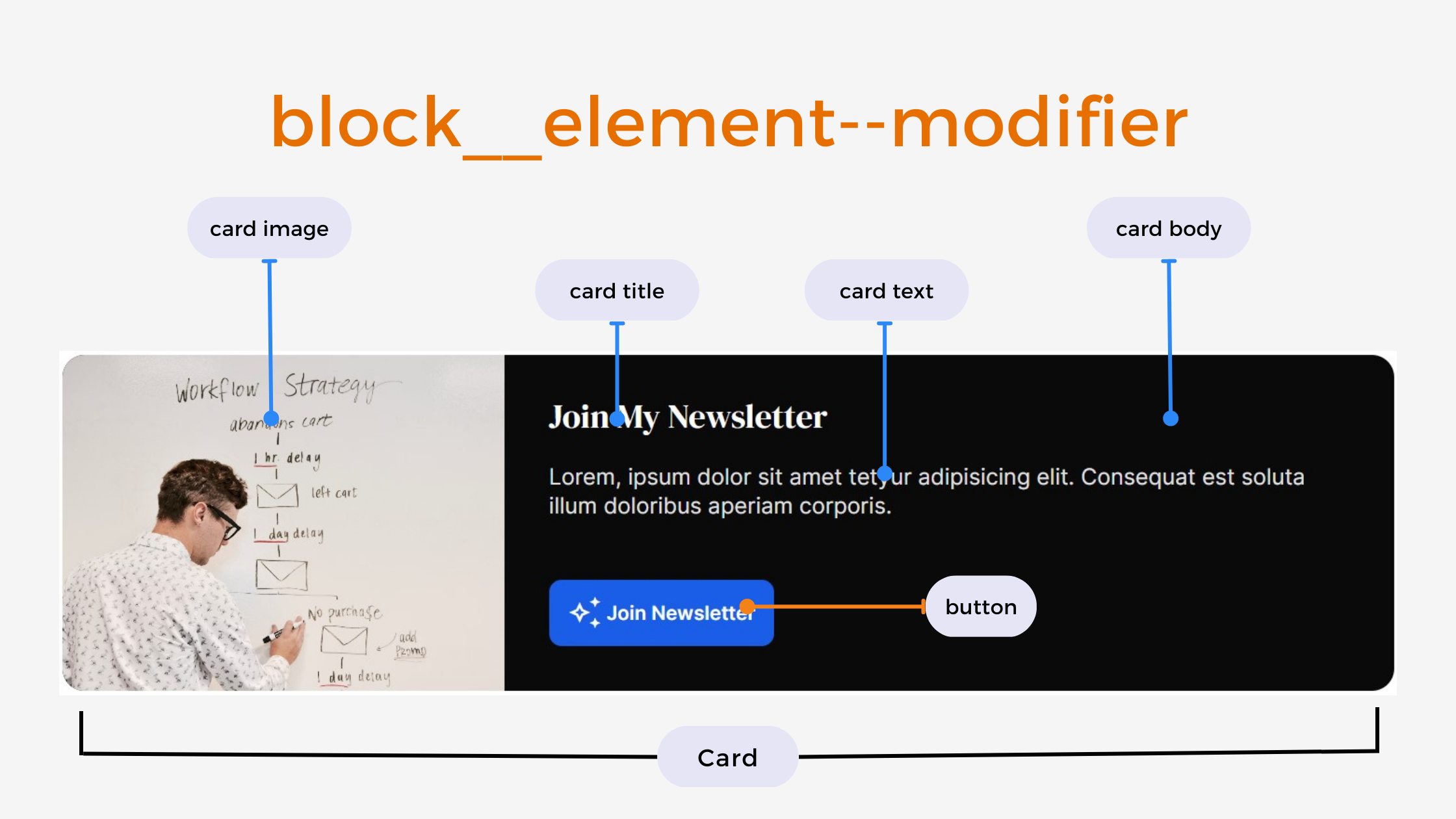
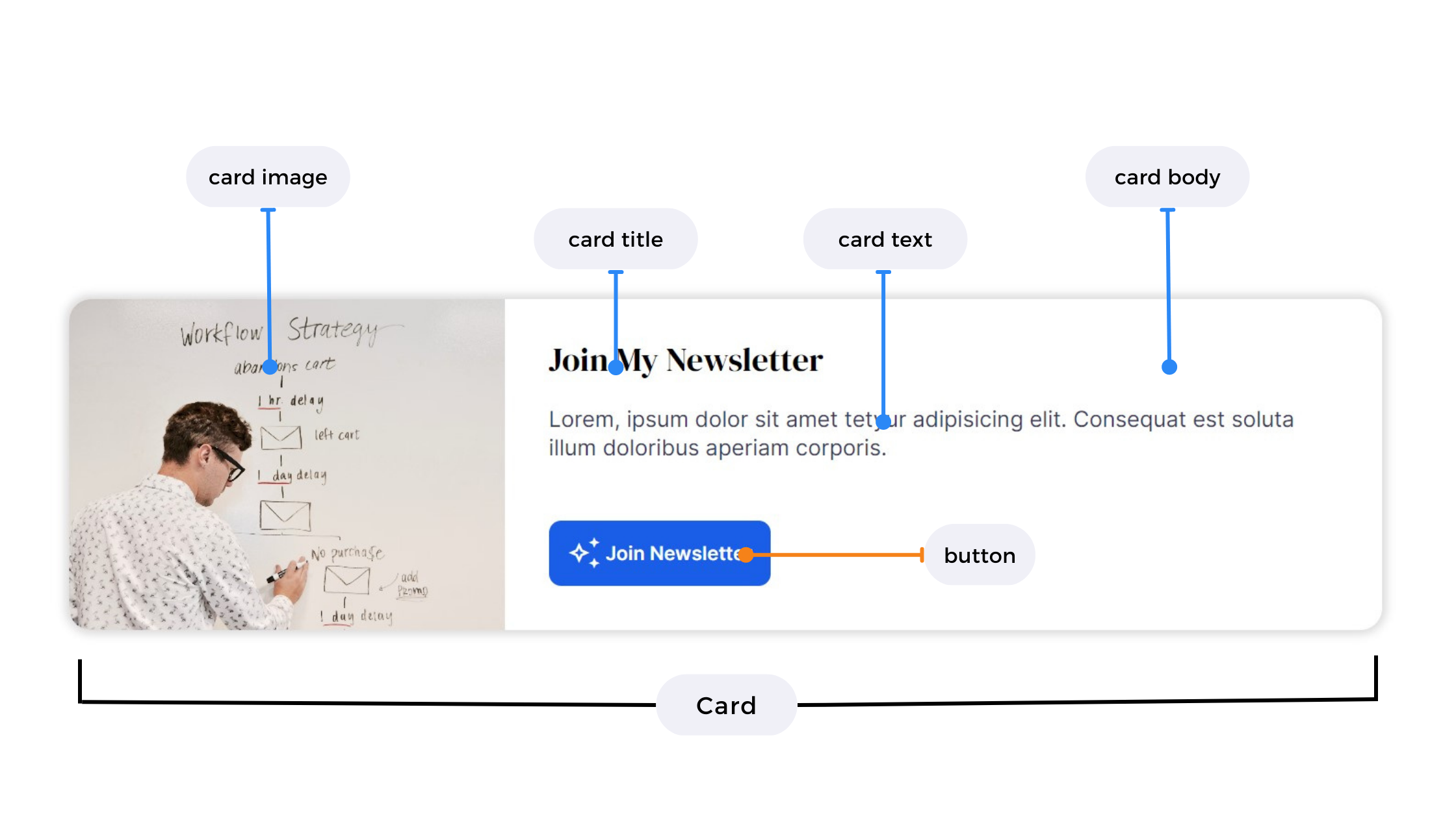
The syntax looks like this: block__element--modifier.
Using BEM

In the UI card component above, the block will be card, an element will be the card__title or card__image and a modifier will be button--blue.
The HTML code:
<div class="card">
    <div class="card__image">
        <img src="picture.jpg" />
    </div>

    <div class="card__body">
        <h2 class="card__title">Join My Newsletter</h2>
        <p class="card__text">
            Lorem, ipsum dolor sit amet tetyur adipisicing elit. illum.
        </p>
        <a class="btn btn--blue card__button" href="#">
            <!-- material icon -->
            <span class="material-symbols-outlined">auto_awesome</span>
            Join Newsletter
        </a>
    </div>
</div>
BEM Blocks
Add all the default card styles to the card block.
/* Card block */
.card { /* All cards will have this styles */
    display: flex;
    flex-wrap: wrap;
    background-color: white;
    border-radius: 1em;
    box-shadow: 0 0 10px 5px #00000022;
    max-width: 1000px;
    overflow: hidden;
}
BEM Elements
Add styling for elements in the card by suffixing the card block with __ and then the element.
/* Card elements*/
.card__image {
    height: 220px;
    flex: 1 0 180px;
}

.card__image img {
    object-fit: cover;
    width: 100%;
    height: 100%
}

.card__body {
    flex: 1 1 480px;
    display: grid;
    padding: 2em;
}

.card__title {
    font-size: 1.25rem;
    color: black;
}

.card__text {
    font-size: 1rem;
    color: black;
}

.card__button {
    align-self: end;
}
And the default button styles.
/* Button block */
.btn { /* Add these to any element to make it look like a button*/
    display: inline-flex;
    justify-content: center;
    align-items: center;
    background-color: white;
    color: hsl(220, 80%, 50%);
    padding: .75em 1em;
    text-decoration: none;
    width: fit-content;
}

.btn--blue { /* Button modifier */
    background-color: hsl(220, 80%, 50%);
    color: white;
}
BEM Modifiers
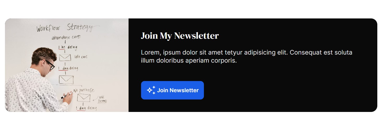
Now, say you want to change the card background to a dark color, to look like this:

Add a --dark modifier to the card block.
<div class="card card--dark">
...
</div>
Then use the .card--dark selector to change the background color to black and all the child text elements' color to white.
/* Card modifiers */
.card--dark {
    background-color: black;
}
.card--dark .card__title,
.card--dark .card__text {
    color: white;
}
BEM and SCSS Nesting
The BEM convention looks even better when using CSS extensions like SCSS or LESS where you can nest styles.
.card {
    display: flex;
    flex-wrap: wrap;
    background-color: white;
    border-radius: 1em;
    box-shadow: 0 0 10px 5px #00000022;
    max-width: 1000px;
    overflow: hidden;

    &__image {
        height: 220px;
        flex: 1 0 180px;
    }

    &__image img {
        object-fit: cover;
        width: 100%;
        height: 100%
    }

    &__body {
        flex: 1 1 480px;
        display: grid;
        padding: 2em;
    }

    &__title {
        font-size: 1.25rem;
        color: black;
    }

    &__text {
        font-size: 1rem;
        color: black;
    }

    &__button {
        align-self: end;
    }

}
Benefits of using BEM
Reusability. BEM reduces the amount of CSS code you have to write since you can just reuse the block and element styles. You can even copy the styles from a previous project to reuse in another project with similar UI components.
Modularity. By coding block, element and modifier styles independently of other elements on the page intelligently, cascading and specificity problems are gone.
Tips to master BEM
Decide on the blocks, elements and modifiers from the UI design.
For simplicity, style with classes only.
Add class attributes to any element you want to style to avoid using multiple CSS combinators.
Use double underscore
__to prefix an element in a block.Use double dash
--to prefix a modifier.
BEM methodology gives your CSS code a solid structure that remains simple and easy to understand.
Try BEM today!
Subscribe to my newsletter
Read articles from Obafunsho directly inside your inbox. Subscribe to the newsletter, and don't miss out.
Written by

Obafunsho
Obafunsho
iWrite. iDesign. iCode.