Draw Shapes using pure CSS
 Vashnavi chauhan
Table of contents
you have to follow only four steps:-

step 1: pen and paper📝
exactly! this easy is your first step is only to take pen and paper 🙂
step 2:Ready🚩
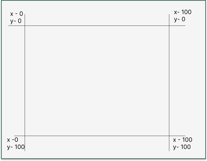
now it's the time to show your drawing skills! just kidding 😉... you have to draw only 4 lines two vertically and two horizontally. just same to same as it is shown below

yes this simple coordinate system you have to draw on your paper
step 3:- Action🎬
it's time to take action with your pen on paper, Now draw your favourite shape, letter any shape you want. I draw a V shape below... obviously, it's my favourite letter for sure 😁 . draw your shape inside the coordinate system

now point a dot in each joint in your shape, there are 6 joints
write it like this (1,2,3,4,5,6), for V coordinate points will be:-
(0 0,15% 0%,100% 75%,85% 0%,100% 0%,50% 100%)
you have to start with a point and draw another point to make a line
step 4:- Code👩🏻💻
hehe, I wish I write drama as a heading in step 4 😂... so now it's time to code, there is a CSS property clip-path
The clip-path CSS property creates a clipping region that sets what part of an element should be shown. Parts that are inside the region are shown, while those outside are hidden.
here we want to create a shape so we use the polygon() in clip-path
polygon() -Defines a polygon using an SVG filling rule and a set of vertices.
-webkit-clip-path: polygon(0 0,15% 0%,100% 75%,85% 0%,100% 0%,50% 100%);
  clip-path: polygon(0 0,15% 0%,50% 75%,85% 0%,100% 0%,50% 100%);
for more, you can refer to the MDN official documentation 😎
so that's all! love to connect 👩🏻💻 with you on Twitter and Linkedin 😁
Subscribe to my newsletter
Read articles from Vashnavi chauhan directly inside your inbox. Subscribe to the newsletter, and don't miss out.
Written by
