Creating a Custom Floating Search Bar for your Flutter Desktop App
 Siro Daves
One thing you will struggle with when you start to build flutter desktop apps is the lack of widgets that support various functions like a floating search bar. A search widget does exist in the flutter Sdk using the SearchDelegate<T> class which is a Delegate for showSearch to define the content of the search page. However, this will open a whole page or screen which only works well for mobile devices.

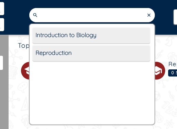
I encountered this challenge while implementing a design for a client app that needed a search button that when had a focus showed a floating list on the top of other widgets and I just didn't realize how hard that was till I started to work on it. I had already implemented an impressive header widget as you can see below but add the searching functionality was what was now going to be giving me a splitting headache. I had to think differently about the whole widget tree which all along had been put up together nicely using a stack widget.
Stack(
    children: <Widget>[
      HeaderWidget(
        showGoBackBtn: true,
        items: searchItems,
        onHelp: goToHelp,
        onSettings: goToSettings,
        onLogOut: goToStart,
      ).height(120).elevation(5),
      contentWidget.center().padding(top: 90),
    ],
),
Create a Stateful Search Widget
The first thing I did was to separate the search widget in my header to a
StatefulWidgetthat takes in three parameters: a list of search items, and two double values that represent the sizes of the left and right margins of the widget.
class SearchWidget extends StatefulWidget {
  final List<SearchItem> items;
  final double lMargin;
  final double rMargin;

  const SearchWidget(
      {super.key,
      required this.items,
      required this.lMargin,
      required this.rMargin});
  @override
  SearchWidgetState createState() => SearchWidgetState();
}
Define the FocusNode
In the
StudentSearchStateclass,TextEditingControlleris created to control the input field. AFocusNodeis also created to track the focus state of the search bar.The
initStatemethod sets the initial state of the filtered items to be the same as the input items. A listener is added to theFocusNodeto track changes to the focus state.The
disposemethod removes the listener from theFocusNodeand disposes of it.The
onFocusChangemethod sets the state of thehasFocusvariable to true or false depending on whether the search bar has focus.
class SearchWidgetState extends State<SearchWidget> {
  TextEditingController qryController = TextEditingController();
  final FocusNode focusNode = FocusNode();
  List<SearchItem> filtered = [];
  bool hasFocus = false;

  @override
  void initState() {
    super.initState();
    filtered = widget.items;
    focusNode.addListener(onFocusChange);
  }

  @override
  void dispose() {
    focusNode.removeListener(onFocusChange);
    focusNode.dispose();
    super.dispose();
  }

  void onFocusChange() {
    setState(() => hasFocus = focusNode.hasFocus);
  }
}
Implement Methods to handle Value changes or Selections
The
handleValueChangedmethod is called when the text in the search bar is changed. It filters the items in the input list to only those that contain the search query and updates the state of the filtered items.The
handleItemSelectedmethod is called when a user selects an item from the search results. It updates the text in the search bar to match the selected item.
  void handleValueChanged(String query) {
    if (query.isNotEmpty) {
      setState(() {
        filtered = widget.items
            .where((e) => e.title!.toLowerCase().contains(query.toLowerCase()))
            .toList();
      });
    }
  }

  void handleItemSelected(SearchItem item) {
    setState(() => qryController.text = item.title!);
  }
Customise your TextFormField Widget
A
searchContainervariable is created that contains aContainerwidget with aTextFormFieldthat represents the search bar. TheTextFormFieldhas aprefixIconof a search icon and asuffixIconof a clear icon. TheonChangedmethod of theTextFormFieldcalls thehandleValueChangedmethod.
var searchContainer = Container(
      decoration: const BoxDecoration(
        color: Colors.white,
        borderRadius: BorderRadius.all(Radius.circular(30)),
      ),
      child: TextFormField(
        autovalidateMode: AutovalidateMode.onUserInteraction,
        focusNode: focusNode,
        controller: qryController,
        decoration: InputDecoration(
          prefixIcon: const Icon(Icons.search),
          suffixIcon: InkWell(
            onTap: () => qryController.clear(),
            child: const Icon(Icons.clear, color: ThemeColors.primary),
          ),
          labelStyle: const TextStyle(fontSize: 18, color: ThemeColors.primary),
          isDense: true,
          enabledBorder: OutlineInputBorder(
            borderRadius: BorderRadius.circular(30),
            borderSide: const BorderSide(color: Colors.white),
          ),
          focusedBorder: OutlineInputBorder(
            borderRadius: BorderRadius.circular(30),
            borderSide: const BorderSide(color: Colors.white),
          ),
        ),
        style: const TextStyle(fontSize: 18, color: ThemeColors.primary),
        textInputAction: TextInputAction.done,
        onChanged: (String query) => handleValueChanged(query),
      ),
    );
Add a Container for the results
A
resultsContainervariable is created that contains aContainerwidget with aListView.builderwidget that displays the filtered items. TheonPressedmethod of eachRawMaterialButtonitem calls thehandleItemSelectedmethod.
var resultsContainer = Container(
      height: size.height / 2,
      margin: const EdgeInsets.only(top: 5),
      padding: const EdgeInsets.all(10),
      decoration: BoxDecoration(
        color: Colors.white,
        border: Border.all(color: Colors.grey),
        borderRadius: const BorderRadius.all(Radius.circular(Corners.s10)),
        boxShadow: const [
          BoxShadow(
            color: Colors.grey,
            spreadRadius: 1,
            blurRadius: 1,
            offset: Offset(0, 1),
          ),
        ],
      ),
      child: ListView.builder(
        itemExtent: 60,
        itemCount: filtered.length,
        itemBuilder: (ctx, index) {
          SearchItem item = filtered[index];
          return Padding(
            padding: const EdgeInsets.only(right: 5, bottom: 5),
            child: RawMaterialButton(
              fillColor: Colors.white.withOpacity(.75),
              focusElevation: 0,
              hoverColor: ThemeColors.accent,
              hoverElevation: 1,
              highlightElevation: 0,
              padding: const EdgeInsets.all(10),
              shape: const RoundedRectangleBorder(
                borderRadius: BorderRadius.all(Radius.circular(5)),
              ),
              onPressed: () => handleItemSelected(item),
              child: Align(
                alignment: Alignment.centerLeft,
                child: Text(
                  item.title!,
                  maxLines: 1,
                  style: TextStyles.Body1.size(20)
                      .bold
                      .textColor(ThemeColors.primary),
                ),
              ),
            ),
          );
        },
      ),
    );
Put it all together
In the
buildmethod, the size of the screen is obtained using theMediaQueryclass.The
buildmethod returns aSizedBoxwith aRowwidget that contains thesearchContainer,resultsContainer(ifhasFocusis true), and left and right margins.The
searchContainerandresultsContainerare contained in aColumnwidget, and theresultsContainerhas a fixed height of half the screen height.Finally, the
Columnwidget is expanded to fill the remaining space in theRowwidget.
return SizedBox(
      child: Row(
        children: [
          SizedBox(width: widget.lMargin),
          Column(
            children: [
              const SizedBox(height: 30),
              searchContainer,
              if (hasFocus) resultsContainer,
            ],
          ).expanded(),
          SizedBox(width: widget.rmargin),
        ],
      ),
    );
If we are to put the whole class together the code would be as below:
import 'package:flutter/material.dart';
import 'package:styled_widget/styled_widget.dart';

import '../../model/search_item.dart';
import '../../theme/theme_colors.dart';
import '../../theme/theme_styles.dart';

class SearchWidget extends StatefulWidget {
  final List<SearchItem> items;
  final double lMargin;
  final double rMargin;

  const SearchWidget(
      {super.key,
      required this.items,
      required this.lMargin,
      required this.rMargin});
  @override
  SearchWidgetState createState() => SearchWidgetState();
}

class SearchWidgetState extends State<SearchWidget> {
  TextEditingController qryController = TextEditingController();
  final FocusNode focusNode = FocusNode();
  List<SearchItem> filtered = [];
  bool hasFocus = false;

  @override
  void initState() {
    super.initState();
    filtered = widget.items;
    focusNode.addListener(onFocusChange);
  }

  @override
  void dispose() {
    focusNode.removeListener(onFocusChange);
    focusNode.dispose();
    super.dispose();
  }

  void onFocusChange() {
    setState(() => hasFocus = focusNode.hasFocus);
  }

  void handleValueChanged(String query) {
    if (query.isNotEmpty) {
      setState(() {
        filtered = widget.items
            .where((e) => e.title!.toLowerCase().contains(query.toLowerCase()))
            .toList();
      });
    }
  }

  void handleItemSelected(SearchItem item) {
    setState(() => qryController.text = item.title!);
  }

  @override
  Widget build(BuildContext context) {
    Size size = MediaQuery.of(context).size;
    var searchContainer = Container(
      decoration: const BoxDecoration(
        color: Colors.white,
        borderRadius: BorderRadius.all(Radius.circular(30)),
      ),
      child: TextFormField(
        autovalidateMode: AutovalidateMode.onUserInteraction,
        focusNode: focusNode,
        controller: qryController,
        decoration: InputDecoration(
          prefixIcon: const Icon(Icons.search),
          suffixIcon: InkWell(
            onTap: () => qryController.clear(),
            child: const Icon(Icons.clear, color: ThemeColors.primary),
          ),
          labelStyle: const TextStyle(fontSize: 18, color: ThemeColors.primary),
          isDense: true,
          enabledBorder: OutlineInputBorder(
            borderRadius: BorderRadius.circular(30),
            borderSide: const BorderSide(color: Colors.white),
          ),
          focusedBorder: OutlineInputBorder(
            borderRadius: BorderRadius.circular(30),
            borderSide: const BorderSide(color: Colors.white),
          ),
        ),
        style: const TextStyle(fontSize: 18, color: ThemeColors.primary),
        textInputAction: TextInputAction.done,
        onChanged: (String query) => handleValueChanged(query),
      ),
    );

    var resultsContainer = Container(
      height: size.height / 2,
      margin: const EdgeInsets.only(top: 5),
      padding: const EdgeInsets.all(10),
      decoration: BoxDecoration(
        color: Colors.white,
        border: Border.all(color: Colors.grey),
        borderRadius: const BorderRadius.all(Radius.circular(Corners.s10)),
        boxShadow: const [
          BoxShadow(
            color: Colors.grey,
            spreadRadius: 1,
            blurRadius: 1,
            offset: Offset(0, 1),
          ),
        ],
      ),
      child: ListView.builder(
        itemExtent: 60,
        itemCount: filtered.length,
        itemBuilder: (ctx, index) {
          SearchItem item = filtered[index];
          return Padding(
            padding: const EdgeInsets.only(right: 5, bottom: 5),
            child: RawMaterialButton(
              fillColor: Colors.white.withOpacity(.75),
              focusElevation: 0,
              hoverColor: ThemeColors.accent,
              hoverElevation: 1,
              highlightElevation: 0,
              padding: const EdgeInsets.all(10),
              shape: const RoundedRectangleBorder(
                borderRadius: BorderRadius.all(Radius.circular(5)),
              ),
              onPressed: () => handleItemSelected(item),
              child: Align(
                alignment: Alignment.centerLeft,
                child: Text(
                  item.title!,
                  maxLines: 1,
                  style: TextStyles.Body1.size(20)
                      .bold
                      .textColor(ThemeColors.primary),
                ),
              ),
            ),
          );
        },
      ),
    );
    return SizedBox(
      child: Row(
        children: [
          SizedBox(width: widget.lMargin),
          Column(
            children: [
              const SizedBox(height: 30),
              searchContainer,
              if (hasFocus) resultsContainer,
            ],
          ).expanded(),
          SizedBox(width: widget.rMargin),
        ],
      ),
    );
  }
}
- Implementing Your Widget
Back to the other class where you were implementing it, you will need to add it as the top widget in your stack and it will take the full space so that it can float over other widgets as desired in the design.
Stack(
    children: <Widget>[
      HeaderWidget(
        showGoBackBtn: true,
        items: searchItems,
        onHelp: goToHelp,
        onSettings: goToSettings,
        onLogOut: goToStart,
      ).height(120).elevation(5),
      contentWidget.center().padding(top: 90),
      StudentSearch(
         items: searchItems,
         lMargin: 400,
         rMargin: 500,
      ),
    ],
),
Conclusion
In conclusion, the SearchWidget demonstrates how to create a search bar that displays a filtered list of items when it has focus. It makes use of various Flutter widgets such as TextFormField, ListView.builder, and RawMaterialButton, as well as stateful widgets such as StatefulWidget and State. The SearchWidget's state maintains a list of filtered items based on the user's input in the search bar. The focusNode and onFocusChange methods are used to detect whether the search bar has focus or not. When the search bar has focus, the filtered list is displayed in a resultsContainer widget. Overall, the widget provides a helpful example for implementing a search bar with filtered results in a Flutter app.
That is it for this one see you in the next one
Don't fail to Follow me here on Hashnode and On
Twitter @ JacksiroKe | Linked In Jack Siro | Github @ JacksiroKe
Subscribe to my newsletter
Read articles from Siro Daves directly inside your inbox. Subscribe to the newsletter, and don't miss out.
Written by

Siro Daves
Siro Daves
Software engineer and a Technical Writer, Best at Flutter mobile app development, full stack development with Mern. Other areas are like Android, Kotlin, .Net and Qt