Flexbox in CSS
 Abhishek Sahu
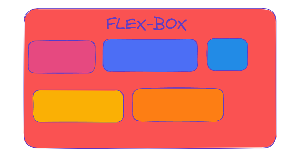
This article gives a detailed insight into the use and effect of flexbox property in CSS. In CSS, while using flexbox, the parent element (the flex container) and the child elements (the flex items) are both taken into consideration and both of them respond to different possible properties.
Background
The flex layout is to give the container the ability to alter its items’ width/height (and order) to best fill the available space (mostly to accommodate all kinds of display devices and screen sizes).
A flex container expands items to fill available free space or shrinks them to prevent overflow.
The flexbox layout is direction-agnostic which means this has no constraints in terms of direction.
The flexbox offers space distribution between items in an interface and powerful alignment capabilities.
Terminologies

Points:
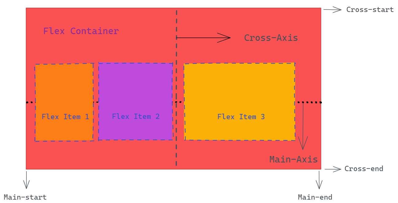
The main-axis is not always horizontal. It depends upon
flex-direction.The cross-axis is not always vertical. Again, it depends upon
flex-direction.The cross-axis is always perpendicular to the main-axis.
If the main-axis is vertical then the cross-axis will be horizontal.
Properties
Flexbox properties for the parent
display
Syntex: display: flex
When this is applied to the parent container, it enables a flex context for all its direct children.
flex-direction
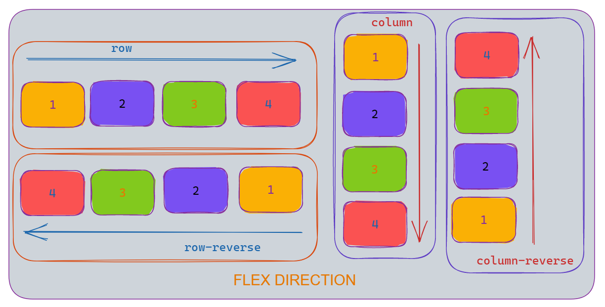
Syntex: flex-direction: row | row-reverse | column | column-reverse
The main-axis is defined by this flex-direction. Whichever will be the main-axis, the cross-axis would be perpendicular to this and hence it establishes the direction of the flex.
row: If the flex-direction is not mentioned after display: flex, then the flex-direction is set to default to row. The direction of the flex would be from left to right of the flex container. The main-axis would be horizontal (left to right) while the cross-axis will be vertical (top to bottom).
row-reverse: When set to this value, the direction changes from right to left in the horizontal main-axis.
column: Same as row, but from top to bottom. main-axis becomes vertical while cross-axis becomes horizontal.
column-reverse: Same as row-reverse, but from bottom to top.

flex-wrap
Syntax: flex-wrap: nowrap | wrap | wrap-reverse
The default behavior is that the flex items will try to remain in one line. This behavior can be changed as per need with the flex-wrap property.
nowrap(default): all flex items will be on one line.wrap: flex items will wrap onto multiple lines, from top to bottom.wrap-reverse: flex items will wrap onto multiple lines from bottom to top.
flex-flow
Syntax: flex-flow: flex-direction flex-wrap
It is a shorthand method for the flex-direction and flex-wrap properties.
The default value is row and nowrap.
justify-content
Syntax: justify-content: flex-start | flex-end | center | space-between | space-around | space-evenly | start | end | left | right
This defines the alignment along the main axis.
flex-start(default): items are kept toward the start of the flex-direction.flex-end: items are kept toward the end of the flex-direction.start: items are kept toward the start of thewriting-modedirection.end: items are kept toward the end of thewriting-modedirection.center: items are centered along the line.space-between: items are evenly distributed in the line; the first item is on the start line, and the last item is on the end linespace-around: items are evenly distributed in the line with equal space around them.space-evenly: items are distributed so that the spacing between any two items (and the space to the edges) is equal.
align-items
Syntax: align-items: stretch | flex-start | flex-end | center | baseline | first baseline | last baseline | start | end | self-start | self-end
This defines alignment along the cross-axis.
stretch(default): stretch to fill the container (still respect min-width/max-width)flex-start/start/self-start: items are placed at the start of the cross-axis. The difference between these is subtle and is about respecting theflex-directionrules or thewriting-moderules.flex-end/end/self-end: items are placed at the end of the cross-axis. The difference again is subtle and is about respectingflex-directionrules vs.writing-moderules.center: items are centered on the cross-axis.baseline: items are aligned such as their baselines align.
align-content
Syntax: align-content: flex-start | flex-end | center | space-between | space-around | space-evenly | stretch | start | end | baseline
It sets the distribution of space between and around content items along the cross-axis of the flexbox.
gap, row-gap, column-gap
Syntax: gap: 10px ; row-gap: 10px; column-gap: 10px
The gap property controls the space between flex-items, but not on the outer edges.
Flexbox properties for the children
order
Syntax: order: 3
The default order of the flex-items is according to the source order.
The order property controls the order of the items in which they will be shown.
flex-grow
Syntax: flex-grow: 3
Under the necessary condition, it enables the flex-items to grow. The default is flex-grow: 1. This property specifies how much of the remaining space in the flex container should be assigned to the item.
flex-shrink
Syntax: flex-shrink: 2
It sets the flex shrink factor of a flex item. When the size of all flex-items is larger than the flex container, items shrink to fit according to value of flex-shrink.
flex-basis
Syntax: flex-basis: 100px
It sets the initial main size of a flex item before the remaining space is distributed. The default value is auto.
flex
Syntax: flex: none | [ <'flex-grow'> <'flex-shrink'>? || <'flex-basis'> ]
This is the shorthand for flex-grow, flex-shrink and flex-basis combined. The default is flex: 0 1 auto.
align-self
Syntax: align-self: auto | flex-start | flex-end | center | baseline | stretch
This allows the default alignment (or the one specified by align-items) to be overridden for individual flex items.
Code
Thank you for reading.
Subscribe to my newsletter
Read articles from Abhishek Sahu directly inside your inbox. Subscribe to the newsletter, and don't miss out.
Written by
