Elevation and Shadow in React Native
 Shrutika Dorugade
Hey friends, I hope you have built an awesome portfolio of yours, in case if you haven't then check out my previous article to get it created. So today we will understand elevation and shadow using which we can give a nice look to our card.
Friends, we will work on our previous PortfolioCard.tsx file where I am going to create a style object cardElevation and will apply that to our main card.
Let's first add elevation because this is the first step required to use the shadow.
elevation: 10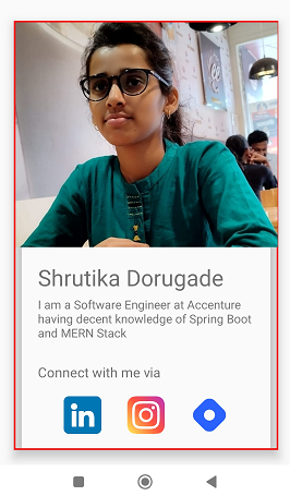
You can see some kind of shadow-like structure but it's not looking too good because it has decreased our content view size but the image size is the same. And that's why there is some gap between the two. So let's give the white background color so that the gap won't be highlighted.
backgroundColor: 'white'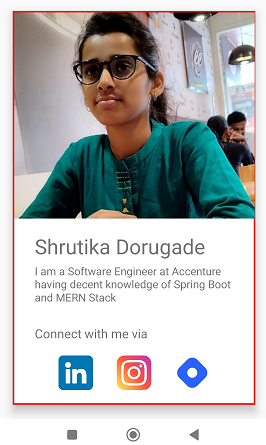
Now let's add shadow offset. So basically shadow offset helps us to specify the width and height of the shadow.
shadowOffset: { width: 4, height: 4 }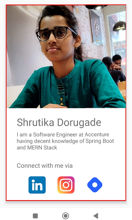
I have also reduced the elevation to 6 to make it a little narrower. The changes are so minimalistic that you won't observe them in the first go. Try different values to find the one which you like.Now let's give color to our shadow to make it more visible. It's not mandatory. I am just showing you different properties which you can use to enhance the look of your card.
shadowColor: '#FF6263'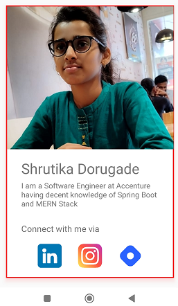
You can see the shadow color has changed slightly. It is reddish. Between you can use any color.
Hey, guys I have made some changes like reducing the border size and increasing the image size to see the shadow effect clearly.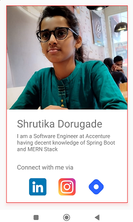
We can even specify shadow opacity using which we can control the darkness of the shadow. Its value varies between 0 to 1. Suppose if I give a value of 0.2 then the shadow will be lighter and as soon as I increase the value let's say to 0.9 or 1 then the shadow will be darker.
shadowOpacity: 0.7We have a shadow radius property using which we can control corner curves.
shadowRadius: 1
I am not pasting here all the code as you can get that from my previous articles. I am just highlighting here the View to which elevation style is applied.

I encourage you to apply the above styles and see the result on your card. I will catch you up in our next article. Till that time keep learning and building awesome stuff.
Special thanks to Hitesh Choudhary !!!
Subscribe to my newsletter
Read articles from Shrutika Dorugade directly inside your inbox. Subscribe to the newsletter, and don't miss out.
Written by

Shrutika Dorugade
Shrutika Dorugade
I am a software engineer at Accenture and an Tech enthusiast who have decent knowledge in Spring Boot and MERN stack