Insta-Next: More UI with Mantine
 Hoh Shen Yien

In this part, we will try to complete the remaining profile page and the stories. There are quite a lot of modals and carousel here.
As most of the concepts are the same as the last part, feel free to skip to the next part after skimming through them, but the components here are more complex if you're interested. (unless you wanna try some challenges from this part)
If you decided to skip to this part, fret not, I got you covered. You can download the complete codes from the last part here.
Sneak Peek:
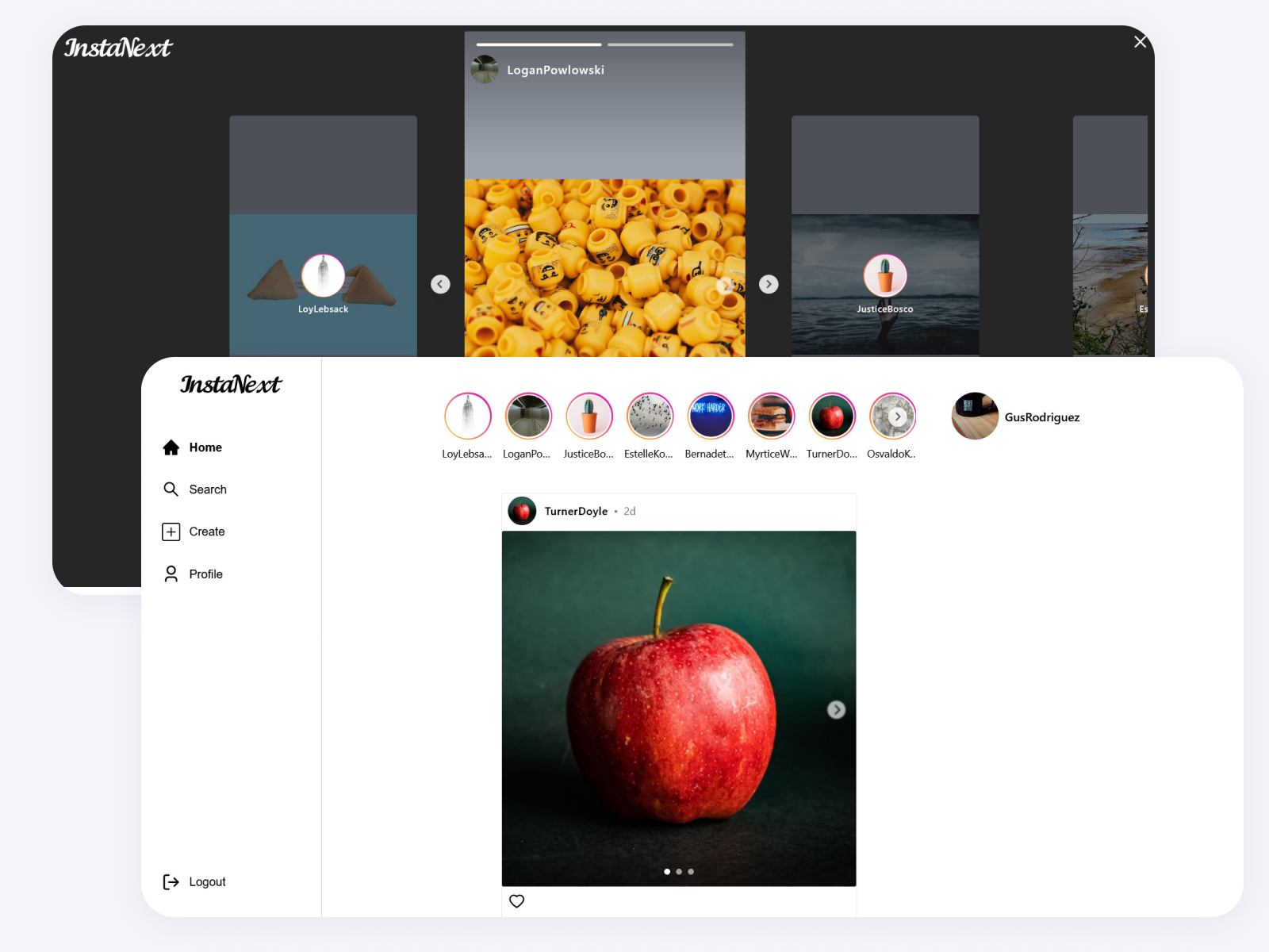
Profile Page
Now that we got the index page done, it's time to finish up the user profile page. We will use the route /users/[username] for this profile page. Do you still remember how to create a dynamic route and get the route parameter from it?
PS: I just noticed that I used the path /user instead of /users for user page, could you do me a favor by replacing all /user/ to /users/
// src/pages/users/[username].tsx
import { useRouter } from "next/router";

const ProfilePage = () => {
  const router = useRouter();
  const { username } = router.query;
  return <div>{username}</div>;
};

export default ProfilePage;
And now, we can just head back to the index page and click on any user, you should be able to see the username displayed in the center.
APIs
We haven't built any API that allows us to read a user's info and the user's posts. Before building it, let's see what are the APIs needed,
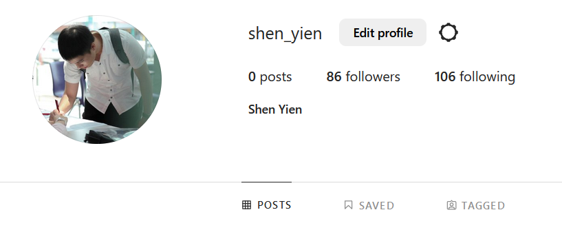
For user info, aside from the basic info, we will also need the count for the number of posts, followers and followings.
Meanwhile, for each post, we will also need to get the first image as well as the number of likes it received.
Since these are technically two different information, we will build two separate APIs for each of them
User Info
We will just need to include the 3 additional _count, and search the user based on their username
// src/features/users/findUserInfo.ts
import prisma from "@/utils/prisma";
import attachImage from "../images/attach-image";

const findUserInfo = async (username: string) => {
  const user = await prisma.user.findFirstOrThrow({
    where: {
      username,
    },
    include: {
      _count: {
        select: {
          followers: true,
          followings: true,
          posts: true,
        },
      },
    },
  });

  return await attachImage(user, "user");
};

export default findUserInfo;
Now using it in our API route, note that I have used Prisma's _GetPayload type which converts the arguments into a type, can be a good choice to quickly create type out from complex Prisma types
// src/features/users/findUserInfo.ts
import type { NextApiRequest, NextApiResponse } from "next";
import { AttachImage } from "@/features/images/attach-image";
import { Prisma, User } from "@prisma/client";
import findUserInfo from "@/features/users/findUserInfo";

export type UserInfoData = {
  user: AttachImage<
    Prisma.UserGetPayload<{
      include: {
        _count: {
          select: {
            followers: true;
            followings: true;
            posts: true;
          };
        };
      };
    }>,
    "user"
  >;
};

export default async function handler(
  req: NextApiRequest,
  res: NextApiResponse<UserInfoData>
) {
  const { username } = req.query as { username: string };

  try {
    const user = await findUserInfo(username);
    res.status(200).json({ user });
  } catch (exception) {
    res.status(404).end();
  }
}
User Posts
User posts is slightly easier, we just need to query for all posts of the user, and include the count for liked_bys
import prisma from "@/utils/prisma";
import attachImage from "../images/attach-image";

const findUserPosts = async (username: string) => {
  const { posts } = await prisma.user.findFirstOrThrow({
    where: {
      username,
    },
    include: {
      posts: {
        include: {
          _count: {
            select: {
              liked_bys: true,
            },
          },
        },
      },
    },
  });

  // This is certainly bad in performance since we only need 1
  // and we are fetching everything
  return await Promise.all(
    posts.map(async (post) => await attachImage(post, "post"))
  );
};

export default findUserPosts;
I will leave the API part to you, here's the solution if you wish to have a look at it.
Frontend
As usual, before we can query the API, let's add them to our /src/api folder
// src/api/users.ts
export const getUserInfo = async (username: string): Promise<UserInfoData> => {
  const data = await axios.get(`/api/users/${username}`);
  return data.data;
};

// src/api/posts.ts
export const getUserPosts = async (username: string): Promise<UserPostData> => {
  const data = await axios.get(`/api/users/${username}/posts`);
  return data.data;
};
Since we have two separate queries here, we should probably divide the page into two components too: UserInfo and UserPosts.
UserInfo
This part is quite similar to the src/components/users/LikedUser/LikedUser.tsx that we created last part, and it's rather trivial, so I'll leave it to you as a challenge. Here's a starter component for you
import { getUserInfo } from "@/api/users";
import { useQuery } from "@tanstack/react-query";
import { useRouter } from "next/router";

const UserInfo = () => {
  const { username } = useRouter().query as { username: string };
  const { data: userInfo, isSuccess } = useQuery({
    queryFn: () => getUserInfo(username),
    queryKey: ["user-info"],
  });

  return <div>{isSuccess && userInfo.user.username}</div>;
};

export default UserInfo;
You should try to create something like this, here are the completed codes on GitHub.

UserPosts
At a glance, UserPosts probably is as simple as UserInfo. However, it requires additional components, that is, another modal. We will work on that later, for now, let's create a UserPost and UserPosts component.
UserPost component itself is rather simple, but do remember that we need to show an overlay when hovering
// src/components/posts/UserPost/UserPost.tsx
import { UserPostData } from "@/pages/api/users/[username]/posts";
import { Unpacked } from "@/utils/types";
import { Image } from "@mantine/core";
import { IoCopy } from "react-icons/io5";
import { FaHeart } from "react-icons/fa";

interface UserPostProps {
  post: Unpacked<UserPostData["posts"]>;
}

const UserPost = ({ post }: UserPostProps) => {
  return (
    <div className="relative">
      <Image
        src={post.images[0].url}
        alt={post.images[0].url}
        classNames={{ image: "aspect-square" }}
        width="100%"
      />
      {post.images.length > 1 && (
        <div className="absolute top-2 right-2">
          <IoCopy className="text-white" size="20px" />
        </div>
      )}
      <div className="absolute top-0 left-0 h-full w-full bg-black/40 flex justify-center items-center opacity-0 hover:opacity-100 transition-all">
        <div className="text-white flex items-center">
          <FaHeart className="mr-2" /> {post._count.liked_bys}
        </div>
      </div>
    </div>
  );
};

export default UserPost;
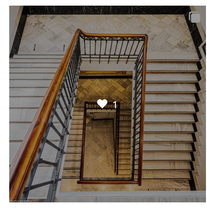
It looks pretty good now, let's build the entire UserPosts
// src/components/posts/UserPost/UserPosts.tsx
import { getUserPosts } from "@/api/posts";
import { useQuery } from "@tanstack/react-query";
import { useRouter } from "next/router";
import UserPost from "./UserPost";

const UserPosts = () => {
  const { username } = useRouter().query as { username: string };
  const { data, isSuccess } = useQuery({
    queryFn: () => getUserPosts(username),
    queryKey: ["user-posts"],
    enabled: !!username,
  });

  return (
    <div className="grid grid-cols-3 gap-2">
      {isSuccess &&
        data.posts.map((post, index) => <UserPost key={index} post={post} />)}
    </div>
  );
};

export default UserPosts;
Doesn't it look just like Instagram but toned down now?
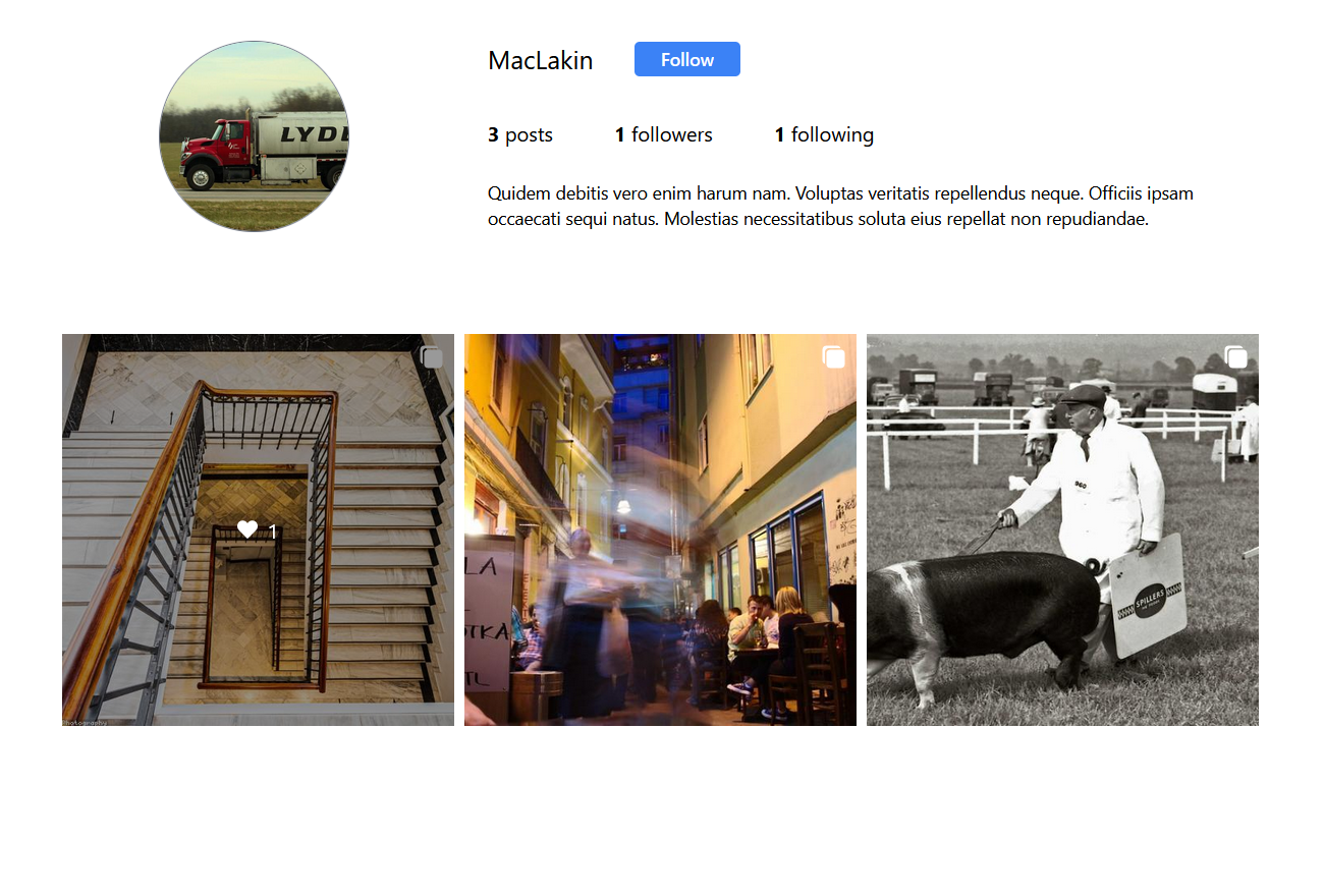
Here's the final version of our ProfilePage
// src/pages/users/[username].tsx
import UserPosts from "@/components/posts/UserPost/UserPosts";
import UserInfo from "@/components/users/UserInfo";
import { useRouter } from "next/router";

const ProfilePage = () => {
  return (
    <div className="max-w-[940px] space-y-20">
      <UserInfo />
      <UserPosts />
    </div>
  );
};

export default ProfilePage;
PostModal
Just like Instagram, we gotta allow the users to click on the posts to show the post modal. This isn't quite hard, we will reuse the image carousel we created in the last part
However, for future reusability & since we don't have information about the author in UserPost component, we'll need an API for it. This time, we will include post and author as two separate return types since they're used differently
// src/pages/api/posts/[post_id]/index.ts
import type { NextApiRequest, NextApiResponse } from "next";
import { AttachImage } from "@/features/images/attach-image";
import { Post, Prisma, User } from "@prisma/client";
import findSinglePost from "@/features/posts/findSinglePost";

export type PostData = {
  author: AttachImage<User, "user">;
  post: AttachImage<
    Prisma.PostGetPayload<{
      include: {
        _count: {
          select: {
            liked_bys: true;
          };
        };
      };
    }>,
    "post"
  >;
};

export default async function handler(
  req: NextApiRequest,
  res: NextApiResponse<PostData>
) {
  const { post_id } = req.query as { post_id: string };

  try {
    const data = await findSinglePost(+post_id);
    res.status(200).json(data);
  } catch (exception) {
    res.status(404).end();
  }
}
If you notice, there's a findSinglePost defined elsewhere, you can try building it yourself or check out how I implemented it here.
Using the API, we can now start building the modal, let's just add in the types first
// src/utils/modals/types.ts
...
& {
  [key in typeof postModal]: {
    post: AttachImage<
      Prisma.PostGetPayload<{
        include: {
          _count: {
            select: {
              liked_bys: true;
            };
          };
        };
      }>,
      "post"
    >;
    author: AttachImage<User, "user">;
  };
Then, we can build the modal out, using all these data. However, our current modal is insufficient, notice the title, and paddings? We gotta make the component more robust and better suited to more scenarios.
I'm gonna give you a few hints here
Maybe make the top part shows only if the title exists?
Make padding part of the props
Let's also make an object in
openModalwhich maps the modal name to properties like modal size? This makes each modal have their specific properties, I've decided to pull in Mantine's Parameter for that purpose```typescript const modalProperties: Record< ModalType, Omit[0], "modal" | "innerProps">
= {
size: "sm", },
size: "1200px", withCloseButton: false, radius: "md", }, }
4. Our carousel currently have a fixed size of 480px, can we make it variable? *(*[*Here*](https://github.com/HohShenYien/insta-next/blob/part5-post-story-modal/src/components/carousel/ImageCarousel.tsx)*'s how I did it)*
While I'd like to show the solution, but this whole blog might get a bit too lengthy, so check out the [GitHub](https://github.com/HohShenYien/insta-next/blob/part5-post-story-modal/src/components/modals/PostModal.tsx) for solution

It might not look as good as Instagram's, but it shows what's needed!
*PS: I noticed that the like button is similar to* `Post.tsx`, *so I also extracted it out and called it* `PostLiked`.
*While I was extracting the file, I encountered a* ***circular dependency*** *error, looking back, it goes* `PostLiked->openModal->PostModal->modals->createPostModal->PostLiked`*, so I moved* `modals` *out to a separate file in* `modals.ts` *to break the chain*.
```typescript
// src/utils/modals/modals.ts
import PostLikedModal from "@/components/modals/PostLikedModal";
import PostModal from "@/components/modals/PostModal";
import { postLikesModal, postModal } from "./constants";
export const modals = {
[postLikesModal]: PostLikedModal,
[postModal]: PostModal,
};
Stories

API
We'll come back to the index page and try to get the stories out. As usual, let's create an API for it first.
One challenge here is that, instead of getting all stories, we'll get the stories for each user and attach the images one-by-one
// src/features/stories/findManyStories.ts
import attachImage from "../images/attach-image";
import prisma from "@/utils/prisma";

const findManyStories = async () => {
  const users = await prisma.user.findMany({
    include: {
      stories: true,
    },
  });

  // Bad performance here, better to use SQL instead
  return await Promise.all(
    users.map(async ({ stories, ...user }) => {
      const userWithImage = await attachImage(user, "user");
      const storiesWithImage = await Promise.all(
        stories.map(async (story) => attachImage(story, "story"))
      );
      return { user: userWithImage, stories: storiesWithImage };
    })
  );
};

export default findManyStories;
And let's update the API endpoint
// src/pages/api/stories/index.ts
import { Story, User } from "@prisma/client";
import type { NextApiRequest, NextApiResponse } from "next";
import { AttachImage } from "@/features/images/attach-image";
import findManyStories from "@/features/stories/findManyStories";

export type AllStoriesData = {
  stories: {
    user: AttachImage<User, "user">;
    stories: AttachImage<Story, "story">[];
  }[];
};

export default async function handler(
  req: NextApiRequest,
  res: NextApiResponse<AllStoriesData>
) {
  const stories = await findManyStories();
  res.status(200).json({ stories });
}
Don't you just think that writing API endpoints using Next.js is so effortless?
UI
There are two core parts to the UI, the carousel and the modal. While the carousel is probably quite simple, the modal may take a bit more effort as it needs to have the ability to navigate.
Carousel
Let's create a story carousel, to start off, we can first copy over the ImageCarousel and edit from there. Since the story carousel only appears at home, we will make the carousel query for the stories right away.
A few things that we need to modify are the sizes, number of slides to scroll will be 4, make the carousel wider, and remove the indicator.
// src/components/carousels/StoryCarousel.tsx
import { Carousel, Embla, useAnimationOffsetEffect } from "@mantine/carousel";
import { Image } from "@mantine/core";
import { IoChevronBackCircle, IoChevronForwardCircle } from "react-icons/io5";
import { useQuery } from "@tanstack/react-query";
import { getAllStories } from "@/api/stories";

const StoryCarousel = () => {
  const { isSuccess, data: stories } = useQuery({
    queryFn: getAllStories,
    queryKey: ["all-stories"],
  });
  return (
    <Carousel
      height={120}
      maw={630}
      classNames={{
        control:
          "p-0 border-0 text-white/80 blur-[0.5px] backdrop-blur-sm data-[inactive=true]:invisible data-[inactive=true]:cursor-default",
        viewport: "rounded-sm",
      }}
      // changed to match Instagram style
      previousControlIcon={<IoChevronBackCircle size={30} />}
      nextControlIcon={<IoChevronForwardCircle size={30} />}
      slideSize={66}
      slidesToScroll={4}
      draggable={false}
      align={"start"}
      w="630"
    >
      {isSuccess &&
        stories.stories.map((story, index) => {
          return (
            <Carousel.Slide key={index}>
              <Image
                src={story.user.profile_pic?.url}
                alt={story.user.username}
                height={56}
                width={56}
                fit="cover"
              />
            </Carousel.Slide>
          );
        })}
    </Carousel>
  );
};

export default StoryCarousel;
It should look something like this now
I ran yarn seed a few more times to get the data

Not really nice yet, the arrow icons are still off, the images are not rounded, the Instagram gradient and the username are missing. We can easily modify most of those by using classNames
import { Carousel, Embla } from "@mantine/carousel";
import { Image, Text } from "@mantine/core";
import { BiChevronLeft, BiChevronRight } from "react-icons/bi";
import { useQuery } from "@tanstack/react-query";
// don't forget to create the API call
import { getAllStories } from "@/api/stories";

const StoryCarousel = () => {
  const { isSuccess, data: stories } = useQuery({
    queryFn: getAllStories,
    queryKey: ["all-stories"],
  });

  return (
    <Carousel
      height={120}
      maw={630}
      classNames={{
        control:
          "p-0 border-0 text-gray-600 data-[inactive=true]:invisible data-[inactive=true]:cursor-default bg-white",
        controls: "top-[20px]",
        viewport: "rounded-sm",
      }}
      previousControlIcon={<BiChevronLeft size={24} />}
      nextControlIcon={<BiChevronRight size={24} />}
      slideSize={70}
      slidesToScroll={4}
      draggable={false}
      align={"start"}
      w="630"
      slideGap={"sm"}
      // this is to prevent over-scrolling, which is default behaviour
      containScroll="trimSnaps"
    >
      {isSuccess &&
        stories.stories.map((story, index) => {
          return (
            <Carousel.Slide key={index}>
              <div className="flex flex-col items-center space-y-2">
                {/* This part is for the Instagram gradient ring */}
                <div className="bg-gradient-to-bl from-[#D300C5] to-[#FFCE29] rounded-full p-0.5">
                  <Image
                    src={story.user.profile_pic?.url}
                    alt={story.user.username}
                    height={56}
                    width={56}
                    fit="cover"
                    className="rounded-full"
                    classNames={{
                      root: "bg-white p-0.5 !w-[unset]",
                      image: "rounded-full",
                    }}
                  />
                </div>
                <Text className="text-sm truncate w-[70px] text-center">
                  {story.user.username}
                </Text>
              </div>
            </Carousel.Slide>
          );
        })}
    </Carousel>
  );
};

export default StoryCarousel;
Don't forget to modify and include the carousel in our index.tsx page
// src/pages/index.tsx
...
      <div className="space-y-4 flex flex-col items-center">
        <StoryCarousel />
        {posts.isSuccess &&
          posts.data.posts.map((post, index) => (
            <Post post={post} key={index} />
          ))}
      </div>
...
And here we go

Looks pretty neat!
Notice that I've used another icon for the arrow to better match the Instagram theme (which is again a bad example, all icons should be consistent in style)
Modal
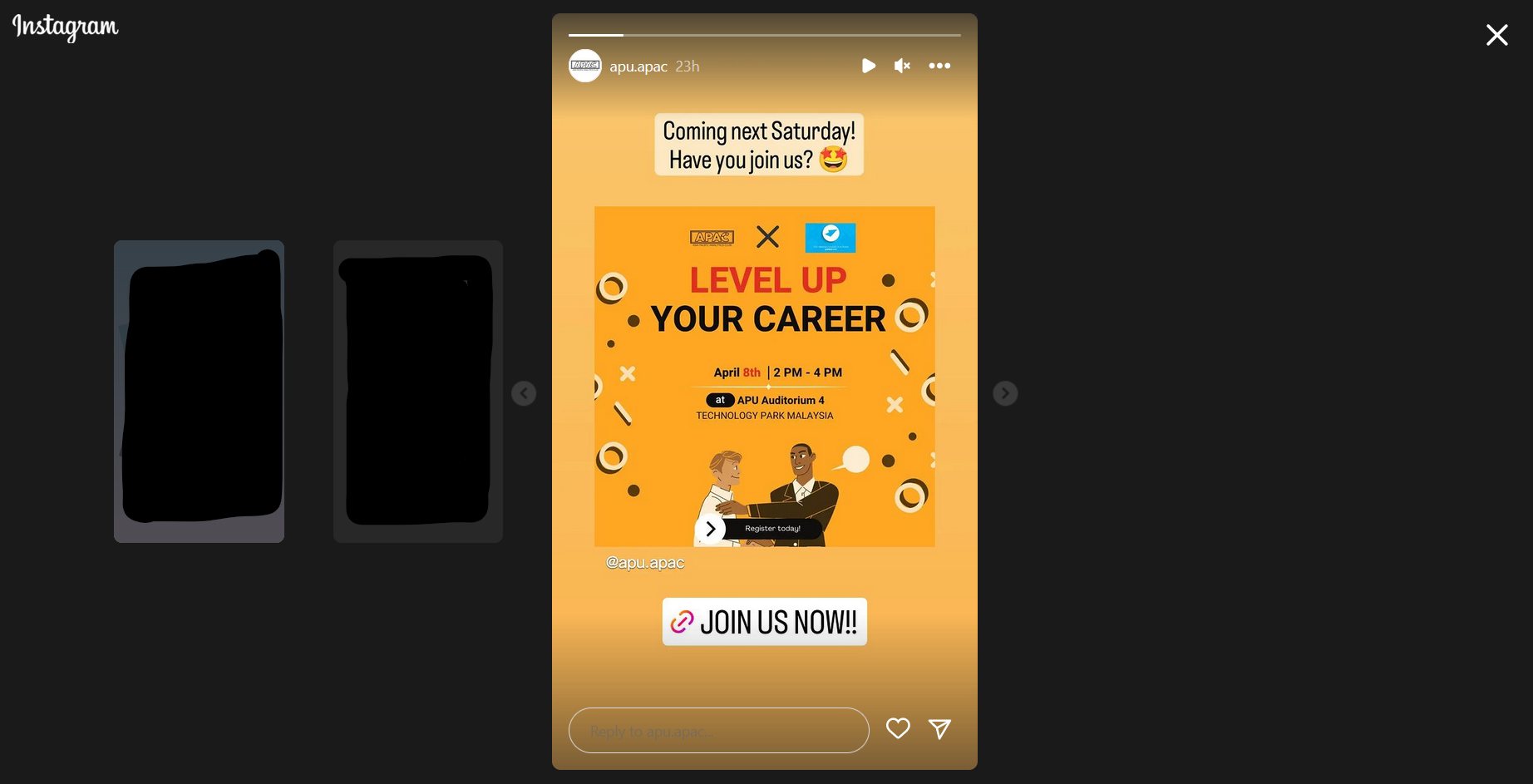
Here comes the modal again. The challenging part for the modal is about navigating back and forth, so here's the plan
The modal will refer to the query using
useQuery's cacheThe current story's index will be passed to the
openModalI will use a Carousel (again) to build it
Ready? Let's go
// src/utils/modals/constants.ts
export const postLikesModal = "PostLikes";
export const postModal = "Post";
export const createPostModal = "CreatePost";
export const storyModal = "Story";

export type ModalType =
  | typeof postLikesModal
  | typeof createPostModal
  | typeof postModal
  | typeof storyModal;

// src/utils/modals/types.ts
...
} & {
  [key in typeof storyModal]: {
    index: number;
  };
};
There will be two carousels here, the inner carousel, which is where the story is, and the outer carousel, which lets you navigate through the stories from different users
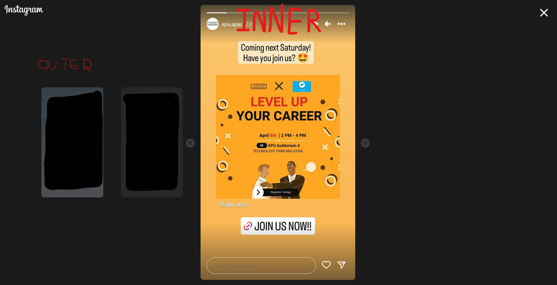
The inner one is relatively easier, let's get it out first. Notice that it's basically ImageCarousel with caption, top indicator & some author infos?
Again, we will start off copying the ImageCarousel, and do some minor styling here and there first. Then, we will add the user info along, and that's basically it
// src/components/stories/InnerStoryCarousel.tsx
import { AttachImage } from "@/features/images/attach-image";
import { Embla, useAnimationOffsetEffect, Carousel } from "@mantine/carousel";
import { Avatar, Image, Text } from "@mantine/core";
import { Story, User } from "@prisma/client";
import Link from "next/link";
import { useState } from "react";
import { IoChevronBackCircle, IoChevronForwardCircle } from "react-icons/io5";
import styles from "./StoryStyle.module.css";

interface InnerStoryCarouselProps {
  author: AttachImage<User, "user">;
  stories: AttachImage<Story, "story">[];
}

const InnerStoryCarousel = ({ author, stories }: InnerStoryCarouselProps) => {
  const TRANSITION_DURATION = 200;
  const [embla, setEmbla] = useState<Embla | null>(null);

  // This is needed to solve misaligning slides from Mantine
  // https://mantine.dev/others/carousel/#carousel-container-animation-offset
  useAnimationOffsetEffect(embla, TRANSITION_DURATION);

  return (
    <div className="relative">
      <Carousel
        withIndicators
        height={"90vh"}
        maw={"50vh"}
        classNames={{
          control:
            "p-0 border-0 text-white/80 blur-[0.5px] backdrop-blur-sm data-[inactive=true]:invisible data-[inactive=true]:cursor-default",
          indicator: "bg-white h-1",
          indicators: "top-4 bottom-[unset] px-4 gap-x-2",
          viewport: "rounded-lg overflow-x-hidden",
        }}
        styles={{
          indicator: {
            width: `calc(${100 / stories.length}%)`,
          },
        }}
        // changed to match Instagram style
        previousControlIcon={<IoChevronBackCircle size={30} />}
        nextControlIcon={<IoChevronForwardCircle size={30} />}
        slideSize={"50vh"}
        slidesToScroll={1}
        draggable={false}
        getEmblaApi={setEmbla}
      >
        {stories.map((story, index) => {
          return (
            <Carousel.Slide key={index}>
              <div className="bg-gray-400 relative">
                <Image
                  src={story.image.url}
                  alt={story.image.url}
                  height={"90vh"}
                  width={"50vh"}
                  fit="contain"
                />
                <div
                  className={`absolute top-0 bottom-0 w-full ${styles.blackOverlay}`}
                ></div>
                <div className="absolute bottom-4 absolute-x-center bg-white text-sm w-[90%]">
                  {story.caption}
                </div>
              </div>
            </Carousel.Slide>
          );
        })}
      </Carousel>
      <div className="absolute top-8">
        <div className="flex items-center px-2">
          <Link href={`/users/${author.username}`}>
            <Avatar
              src={author.profile_pic?.url}
              alt={author.username}
              radius="xl"
              size="md"
              className="mr-3 hover:brightness-125"
            />
          </Link>
          <div className="flex space-x-2 items-center text-white">
            <Link href={`/users/${author.username}`}>
              <Text className="font-semibold tracking-wider">
                {author.username}
              </Text>
            </Link>
          </div>
        </div>
      </div>
    </div>
  );
};

export default InnerStoryCarousel;
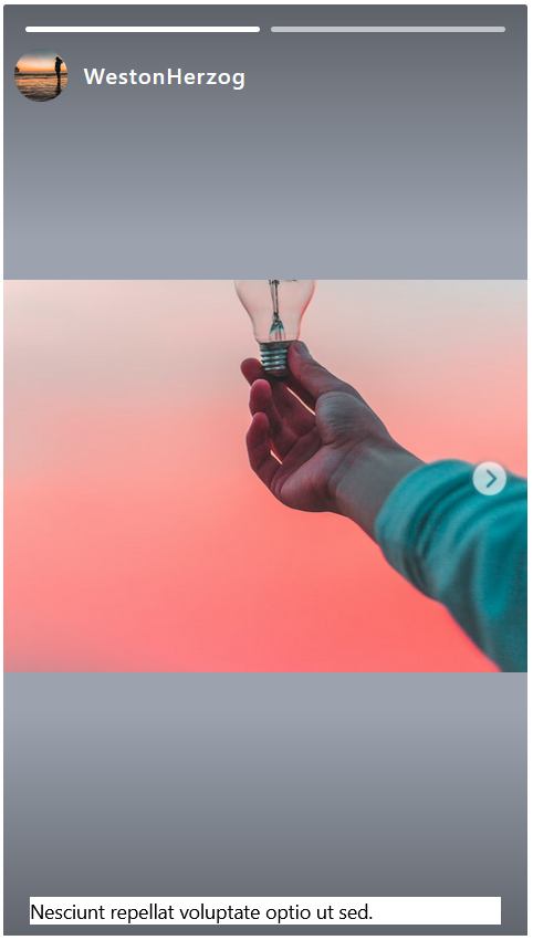
It's quite something, but maybe we can make the text looks better? I decided to round it a little, with some extra padding
...
                <div className="absolute bottom-4 absolute-x-center bg-white text-sm w-[90%] p-2 rounded-md">
                  {story.caption}
                </div>
...
Somewhat better

Next, it's time to build the outer carousel!
Honestly, I had a lot of difficulties in achieving that, but somehow I came across this and I was like maybe it can work? And voila, it did work despite having some lags. Here's what you can try
Referring to the Embia example, we can include it in our codes to scale when scrolling across (I copied the carousel from
InnerStoryCarouselto start with)... const [emblaApi, setEmblaApi] = useState<Embla | null>(null); const [tweenValues, setTweenValues] = useState<number[]>([]); useAnimationOffsetEffect(emblaApi, 400); const onScroll = useCallback(() => { if (!emblaApi) return; const engine = emblaApi.internalEngine(); const scrollProgress = emblaApi.scrollProgress(); const styles = emblaApi.scrollSnapList().map((scrollSnap, index) => { if (!emblaApi.slidesInView().includes(index)) return 0.667; let diffToTarget = scrollSnap - scrollProgress; if (engine.options.loop) { // It basically calculates the percentage of the slide that is in the view engine.slideLooper.loopPoints.forEach((loopItem) => { const target = loopItem.target().get(); if (index === loopItem.index && target !== 0) { const sign = Math.sign(target); if (sign === -1) diffToTarget = scrollSnap - (1 + scrollProgress); if (sign === 1) diffToTarget = scrollSnap + (1 - scrollProgress); } }); } // just a random scaling speed that I feel smooth const tweenValue = 1 - Math.abs(diffToTarget * 2.3); return numberWithinRange(tweenValue, 0, 1); }); setTweenValues(styles); }, [emblaApi, setTweenValues]); useEffect(() => { if (!emblaApi) return; onScroll(); emblaApi.on("scroll", () => { flushSync(() => onScroll()); }); emblaApi.on("reInit", onScroll); }, [emblaApi, onScroll]); ... <Carousel.Slide key={index} className="origin-center rounded-md"> <div style={{ ...(tweenValues.length && { transform: `scale(${tweenValues[index]})`, }), }} > ...Then, we make the carousel's overflow to be visible, most carousels out there work by maintaining a long horizontal flex, and moving the flex left & right to show only the parts intended.
Originally,

After making the overflow visible
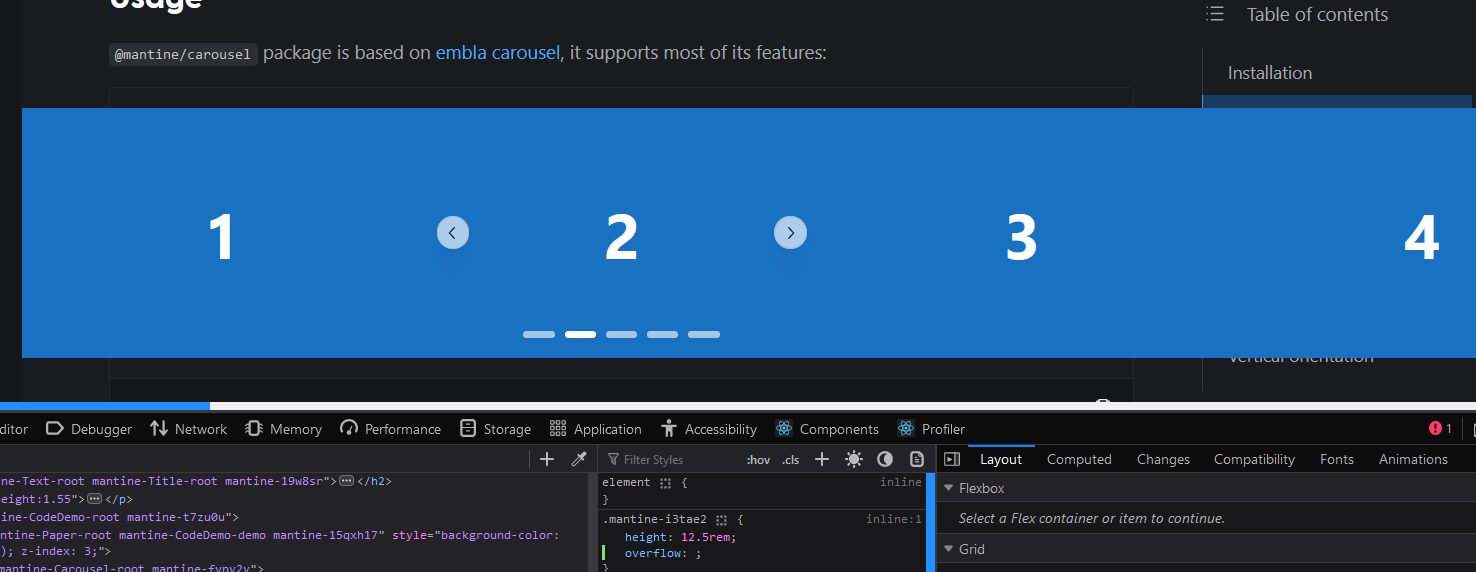
From the tween values, we can notice that it is 0.667 for slides out of view and for the slide in view, 1. By relying on this information, we can display differently based on the tween values.
When the tween value is >= 0.99 (to make transition smoother) you can swap to
InnerStoryCarousel, otherwise, it'll be the default slide... {/* tweenValues will be [NaN] if there's only one value */} {tweenValues.length == 1 || tweenValues[index] > 0.99 ? ( <InnerStoryCarousel author={story.user} stories={story.stories} /> ) : ( <div className="bg-gray-400 relative rounded-lg overflow-hidden cursor-pointer" onClick={() => emblaApi?.scrollTo(index)} > <Image src={story.stories[0].image.url} alt={story.stories[0].image.url} height={"90vh"} width={"50vh"} fit="contain" /> <div className="absolute top-0 left-0 h-full w-full bg-black/50 flex justify-center items-center"> <div className="flex flex-col items-center"> <GradientBorderAvatar src={story.user.profile_pic?.url ?? ""} alt={story.user.username} // since the slide is scaled down to 0.667, I want to get // size 54, so 1/0.667 * 54 = 81 size={81} /> <Text className="font-semibold text-lg tracking-wider text-white mt-2"> {story.user.username} </Text> </div> </div> </div> )} ...
You can try to code the remaining parts for the OuterStoryCarousel.tsx, or refer to the full implementation here.
You will also need to style the StoryModal a little, but since it's quite trivial, you can refer to it here. Finally, to get the modal showing up properly, you have to update the openModal to style the background, and include the sizes
import { modals } from "@mantine/modals";
import {
  ModalType,
  postLikesModal,
  postModal,
  createPostModal,
  storyModal,
} from "./constants";
import { ModalInnerProps } from "./types";
import { Box, clsx } from "@mantine/core";

interface OpenModalProps<T extends ModalType> {
  type: T;
  innerProps: ModalInnerProps[T];
}

// Here is the mapping of modal name to their specific properties
// I'm taking the properties from the function itself, excluding
// two kkeys that will be passed for sure
const modalProperties: Record<
  ModalType,
  Omit<Parameters<typeof modals.openContextModal>[0], "modal" | "innerProps">
> = {
  [createPostModal]: {},
  [postLikesModal]: {
    size: "sm",
  },
  [postModal]: {
    size: "1200px",
    withCloseButton: false,
    radius: "md",
  },
  [storyModal]: {
    fullScreen: true,
    classNames: {
      content: clsx("!overflow-hidden", "bg-neutral-800"),
      close: "!bg-transparent text-white hover:text-gray-400",
    },
  },
};

function openModal<T extends ModalType>({
  type,
  innerProps,
}: OpenModalProps<T>) {
  modals.openContextModal({
    padding: 0,
    modal: type,
    innerProps,
    closeButtonProps: { size: 28 },
    radius: "lg",
    centered: true,
    scrollAreaComponent: Box as any,
    ...modalProperties[type],
    classNames: {
      header: "absolute bg-transparent top-2 right-2",
      close: "!bg-transparent text-black hover:text-gray-800",
      inner: "overflow-hidden",
      content: "!overflow-hidden",
      ...modalProperties[type].classNames,
    },
  });
}

export default openModal;
While doing, I noticed that I'll need the gradient border avatar again, so I moved it to another component
// src/components/avatars/GradientBorderAvatar.tsx
import { Image } from "@mantine/core";

interface GradientBorderAvatarProps {
  src: string;
  alt: string;
  size: number;
}

const GradientBorderAvatar = ({
  src,
  alt,
  size,
}: GradientBorderAvatarProps) => {
  return (
    <div className="bg-gradient-to-bl from-[#D300C5] to-[#FFCE29] rounded-full p-0.5">
      <Image
        src={src}
        alt={alt}
        height={size}
        width={size}
        fit="cover"
        className="rounded-full"
        classNames={{
          root: "bg-white p-0.5 !w-[unset]",
          image: "rounded-full",
        }}
      />
    </div>
  );
};

export default GradientBorderAvatar;
and refactored the StoryCarousel.tsx
...
              <div
                className="flex flex-col items-center space-y-2 cursor-pointer"
                onClick={() =>
                  openModal({ type: storyModal, innerProps: { index } })
                }
              >
                <GradientBorderAvatar
                  src={story.user.profile_pic?.url ?? ""}
                  alt={story.user.username}
                  size={56}
                />
                <Text className="text-sm truncate w-[70px] text-center">
                  {story.user.username}
                </Text>
              </div>
...
And... we're done! Here's how it looks now
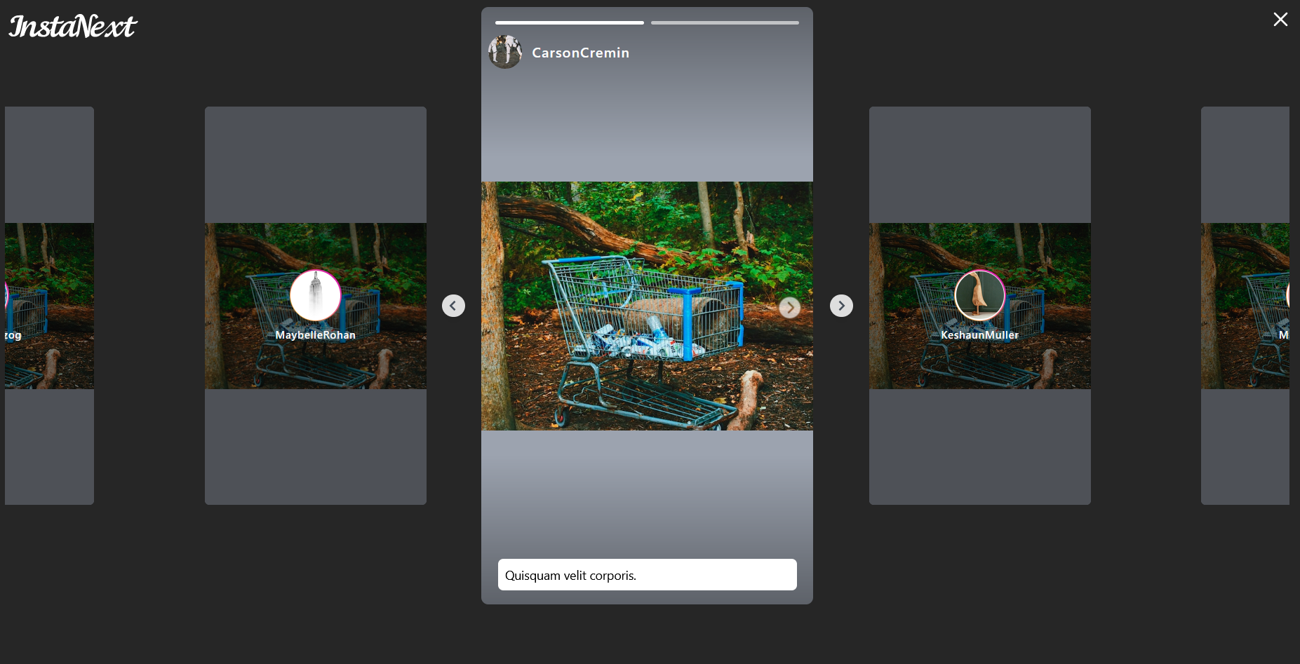
Doesn't it look amazing?
Summary
In this part, you implemented the missing profile page and story modal. While most of the things here overlapped with the content from the last part, this part focused a lot on carousel.
I hope you did learn something useful here! As usual, here's the completed implementation for this part: GitHub
Subscribe to my newsletter
Read articles from Hoh Shen Yien directly inside your inbox. Subscribe to the newsletter, and don't miss out.
Written by

Hoh Shen Yien
Hoh Shen Yien
My name is Hoh Shen Yien, I'm a Malaysian fullstack developer who likes to read and write sometimes 🤩