Creating a Navigation Bar with MUI AppBar Component in Next.js
 Arshad Ali Soomro
The App Bar displays information and actions relating to the current screen. The top App bar provides content and actions related to the current screen. It's used for branding, screen titles, navigation, and actions.
It can transform into a contextual action bar or be used as a navbar.
In this blog post, we will be creating a Navigation Bar for with MUI AppBar Component.
Create a PrimarySearchAppBar.tsx File
MUI provides a wide range of UI components to make web development faster and more efficient. Among these components is the MUI PrimarySearchAppBar, which is a customizable and easy-to-use component that can be integrated into any React application.
Create a components folder inside src folder, then create a file named PrimarySearchAppBar.tsx
import * as React from 'react';
import AppBar from '@mui/material/AppBar';
import Box from '@mui/material/Box';
import Toolbar from '@mui/material/Toolbar';

export default function PrimarySearchAppBar() {

    return (
        <Box sx={{ flexGrow: 1 }}>
            <AppBar position="fixed">
                <Toolbar></Toolbar>
            </AppBar>
        </Box>
    );
}
This is a functional component that defines a PrimarySearchAppBar.
It uses Material UI's Box, AppBar, Container, and Toolbar components to create a fixed-position app bar with a container.
The sx prop on the Box component allows for inline styling using Material UI's theme. In this case, the flexGrow: 1 property ensures that the app bar will take up all available space in its container.
The position="fixed" prop on the AppBar component makes the app bar stay fixed at the top of the screen even if the user scrolls down the page.
The maxWidth="xl" prop on the Container component sets the maximum width of the container to xl, which is one of the predefined values in Material UI. This means that the container will be as wide as the screen, up to a maximum width of xl.
The disableGutters prop on the Toolbar component removes the default left and right padding of the toolbar, allowing you to have full control over the content inside.
This code does not have any content in Toolbar yet, but you can add buttons, icons, or other custom components to the Toolbar component as children.
The export default statement at the end of the component means that this component can be imported into other files in your project. It can be imported into index.tsx like this:
import Head from 'next/head'
import Box from '@mui/material/Box'
import PrimarySearchAppBar from '@/components/PrimarySearchAppBar'

export default function Home() {
  return (
    <>
      <Head>
        <title>Employee Leave Manager App</title>
        <meta name="description" content="Generated by create next app" />
        <meta name="viewport" content="width=device-width, initial-scale=1" />
        <link rel="icon" href="/favicon.ico" />
      </Head>
      <Box>
        <PrimarySearchAppBar />
      </Box>
    </>
  )
}
output:

Add a brand name to Toolbar
The Typography component will be used to create a text element with the following properties:
variant="h6": sets the text to use the "h6" heading variantnoWrap: prevents the text from wrapping onto a new line if it exceeds the element's widthcomponent="a": sets the HTML tag of the rendered element to anaanchor taghref="/": sets the URL that the anchor tag should link to as the root directory of the websitesx: an object containing custom styling properties for the element using the Material-UI styling system
Within the sx object, the following styles would be applied:
mr: 2: adds a margin of 2 units (specified elsewhere) to the left and right of the elementdisplay: { md: 'flex' }: sets the element to use flexbox display when the viewport width is at least medium-sizedfontFamily: 'monospace': sets the font family of the text to a monospace fontfontWeight: 700: sets the font weight to a bold value of 700letterSpacing: '.3rem': sets the amount of space between each character to be a fixed value of 0.3 remcolor: 'inherit': sets the color of the text to inherit its parent's color propertytextDecoration: 'none': removes any underlining or other decorations on the anchor text.
<Typography
    variant="h6"
    noWrap
    component="a"
    href="/"
    sx={{
        mx: 2,
        display: { md: 'flex' },
        fontFamily: 'monospace',
        fontWeight: 700,
        letterSpacing: '.3rem',
        color: 'inherit',
        textDecoration: 'none',
    }}
>
    ELM
</Typography>
Overall, this code creates a stylized link or button that reads "ELM" and links to the root directory of the website. It uses a monospace font, bold text, and capital letters with letter-spacing for emphasis. The element is also set to use a flexbox display on medium-sized screens.
output:

Adding Email and Notifications IconButtons to Toolbar
We will render two icon buttons on a Toolbar. The first button displays an email icon and the second button displays a notifications icon.
<Box sx={{ ml: 2>
    <IconButton size="large" aria-label="mails" color="inherit">
        <Badge badgeContent={4} color="error">
            <MailIcon />
        </Badge>
    </IconButton>
    <IconButton
        size="large"
        aria-label="notifications"
        color="inherit">
        <Badge badgeContent={17} color="error">
            <NotificationsIcon />
        </Badge>
    </IconButton>
</Box>
The Box component is used to wrap the two IconButton components and applies some styling using the sx prop. In this case, it sets the left margin to 2.
The IconButton component creates a clickable icon button that can be used as a part of a user interface. The size prop sets the size of the button to "large", aria-label prop sets an accessible label for the button, and the color prop sets the color of the icon to "inherit" which allows the button to inherit its parent's color.
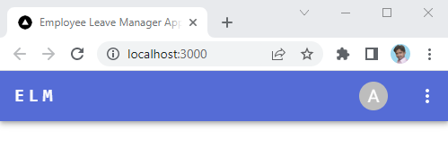
output:

Adding Avatar IconButton to Toolbar
Avatars are found throughout material design with uses in everything from tables to dialog menus and AppBars. We will add Avatar to AppBar as:
<IconButton
    size="large"
    edge="end"
    aria-label="account of current user"
    aria-haspopup="true"
    color="inherit"
    sx={{ mr: 2 }}>
    <Avatar sx={{ width: 32, height: 32 }}>A</Avatar>
</IconButton>
This code creates an IconButton component with props that specify its size, edge, color, and accessibility properties. The IconButton component is used to render an interactive button element that displays an Avatar component inside it.
The Avatar component is used to render a circular icon or image representing the current user's account. It has props that specify its size and styling. In this case, the Avatar is styled with a width and height of 32 pixels and displays the letter "A".
The sx prop is used to apply custom styles to the IconButton and Avatar components using the Material UI styling system. The mr property sets a margin-right of 2 in the IconButton component, pushing any elements to the right of it away from it.
output:

Adding Dropdown Menu to Avatar
A menu displays a list of choices on a temporary surface. It appears when the user interacts with a button or other control.
In over case we are going to add Menu to Avatar IconButton as:
const [anchorEl, setAnchorEl] = React.useState<null | HTMLElement>(null);
const isMenuOpen = Boolean(anchorEl);

const handleProfileMenuOpen = (event: React.MouseEvent<HTMLElement>) => {
    setAnchorEl(event.currentTarget);
};

const handleMenuClose = () => {
    setAnchorEl(null);
};

const menuId = 'account-menu';
const renderMenu = (
    <Menu
        anchorEl={anchorEl}
        anchorOrigin={{
            vertical: 'top',
            horizontal: 'right',
        }}
        id={menuId}
        keepMounted
        transformOrigin={{
            vertical: 'top',
            horizontal: 'right',
        }}
        open={isMenuOpen}
        onClose={handleMenuClose}>
        <MenuItem onClick={handleMenuClose}>
            <ListItemIcon>
                <AccountCircle fontSize="small" />
            </ListItemIcon>
            Profile
        </MenuItem>
        <Divider />
        <MenuItem onClick={handleMenuClose}>
            <ListItemIcon>
                <Settings fontSize="small" />
            </ListItemIcon>
            Settings
        </MenuItem>
        <MenuItem onClick={handleMenuClose}>
            <ListItemIcon>
                <Logout fontSize="small" />
            </ListItemIcon>
            Logout
        </MenuItem>
    </Menu>
);
The code generates a menu with three options: Profile, Settings, and Logout. The menu is triggered by clicking on Avatar IconButton on the AppBar and it opens anchored to the element.
The component has four states defined using the useState hook: anchorEl, isMenuOpen, handleProfileMenuOpen, and handleMenuClose. anchorEl is the element on the page that the menu is anchored to, isMenuOpen is a boolean value that tracks whether the menu is open or not, handleProfileMenuOpen is a function that sets the anchorEl state to the current target element when the menu is opened, and handleMenuClose is a function that sets the anchorEl state to null when the menu is closed.
The menuId variable is used to set the ID of the menu element, and renderMenu is a JSX expression that renders a Menu component with the following props:
anchorEl: The element on the page that the menu is anchored to.anchorOrigin: The position on the page where the menu is anchored. In this case, it is anchored to the top-right corner of the element.id: The ID of the menu element.keepMounted: A boolean value that keeps the menu mounted even when it is hidden. This can improve performance in some cases.transformOrigin: The position on the menu where it is anchored. In this case, it is anchored to the top-right corner of the menu.open: A boolean value that determines whether the menu is open or not. It is set to the value ofisMenuOpen.onClose: A function that is called when the menu is closed. It calls thehandleMenuClosefunction.
The renderMenu variable is returned by the component, so when it is rendered on the page below the AppBar component
<AppBar position="fixed">
    ...
</AppBar>
{ renderMenu }
It generates a menu element that can be opened and closed by clicking on the triggering element the Avatar IconButton. We have to add
aria-controls={menuId}onClick={handleProfileMenuOpen}
to Avatar IconButton.
When an option in the menu is clicked, the handleMenuClose function is called to close the menu.
<IconButton
    size="large"
    edge="end"
    aria-label="account of current user"
    aria-controls={menuId}
    aria-haspopup="true"
    onClick={handleProfileMenuOpen}
    color="inherit"
    sx={{ mr: 2 }}>
    <Avatar sx={{ width: 32, height: 32 }}>A</Avatar>
</IconButton>
output:

Making AppBar menus responsive
To make AppBar Menus render well on a variety of devices and window or screen sizes from minimum to maximum display size, we will make it responsive to ensure usability and satisfaction. To do so add the following code:
const [mobileMoreAnchorEl, setMobileMoreAnchorEl] =
    React.useState<null | HTMLElement>(null);
const isMobileMenuOpen = Boolean(mobileMoreAnchorEl);

const handleMobileMenuClose = () => {
    setMobileMoreAnchorEl(null);
};

const handleMobileMenuOpen = (event: React.MouseEvent<HTMLElement>) => {
    setMobileMoreAnchorEl(event.currentTarget);
};

const mobileMenuId = 'account-menu-mobile';
const renderMobileMenu = (
    <Menu
        anchorEl={mobileMoreAnchorEl}
        anchorOrigin={{
            vertical: 'top',
            horizontal: 'right',
        }}
        id={mobileMenuId}
        keepMounted
        transformOrigin={{
            vertical: 'top',
            horizontal: 'right',
        }}
        open={isMobileMenuOpen}
        onClose={handleMobileMenuClose}>
        <MenuItem>
            <IconButton size="large" aria-label="new mails" color="inherit">
                <MailIcon />
            </IconButton>
            <p>Messages</p>
        </MenuItem>
        <MenuItem>
            <IconButton
                size="large"
                aria-label="new notifications"
                color="inherit">
                <NotificationsIcon />
            </IconButton>
            <p>Notifications</p>
        </MenuItem>
    </Menu>
);
Next, make changes to handleMenuClose:
const handleMenuClose = () => {
    setAnchorEl(null);
    handleMobileMenuClose();
};
Next, add one more IconButton to AppBar and add renderMobileMenu as shown:
<AppBar position="fixed">
    <Toolbar disableGutters>
        ...
        <Box sx={{ display: { xs: 'flex', md: 'none' } }}>
            <IconButton
                size="large"
                aria-label="show more"
                aria-controls={mobileMenuId}
                aria-haspopup="true"
                onClick={handleMobileMenuOpen}
                color="inherit"
            >
                <MoreIcon />
            </IconButton>
        </Box>
    </Toolbar>
</AppBar>
{ renderMenu }
{ renderMobileMenu }
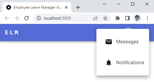
The Box component is used to wrap the IconButton component and it applies custom styles to the component using the Material-UI styling system. The sx prop is used to specify the styles. The display property of sx specifies that on screens with a width of xs (extra small), the box should be displayed as a flex container, and on screens with a width of md (medium) or larger, the box should be hidden (none).
output:

And

Creating SearchInput.tsx
The SearchInput component can be used as a reusable UI element in any React application that requires a search input field with a search icon. It provides a well-styled and functional search input field that can be easily integrated into AppBar.
The SearchInput component to allows users to search for Employees based on their names.
import InputBase from '@mui/material/InputBase';
import { alpha, styled } from '@mui/material/styles';
import React, { } from 'react';
import SearchIcon from '@mui/icons-material/Search';

const Search = styled('div')(({ theme }) => ({
    position: 'relative',
    borderRadius: theme.shape.borderRadius,
    backgroundColor: alpha(theme.palette.common.white, 0.15),
    '&:hover': {
        backgroundColor: alpha(theme.palette.common.white, 0.25),
    },
    marginRight: theme.spacing(2),
    marginLeft: 4,
}));

const SearchIconWrapper = styled('div')(({ theme }) => ({
    padding: theme.spacing(0, 2),
    height: '100%',
    position: 'absolute',
    pointerEvents: 'none',
    display: 'flex',
    alignItems: 'center',
    justifyContent: 'center',
}));

const StyledInputBase = styled(InputBase)(({ theme }) => ({
    color: 'inherit',
    '& .MuiInputBase-input': {
        padding: theme.spacing(1, 1, 1, 0),
        // vertical padding + font size from searchIcon
        paddingLeft: `calc(1em + ${theme.spacing(4)})`,
        transition: theme.transitions.create('width'),
    },
}));

const SearchInput = () => {

    return (
        <Search>
            <SearchIconWrapper>
                <SearchIcon />
            </SearchIconWrapper>
            <StyledInputBase
                placeholder="Search…"
                inputProps={{ 'aria-label': 'search' }} />
        </Search>
    );
}

export default SearchInput;
This is a React component that renders a search input field with a search icon beside it. The styles for this component are defined using the styled-components library.
The component is divided into three styled-components:
Search: This is adivelement that represents the search bar container. It has a white background with 15% opacity, rounded borders and a darker background (25% opacity) on hover.SearchIconWrapper: This is adivelement that contains the search icon (<SearchIcon />). It is positioned absolutely within the search container and centered using flexbox.StyledInputBase: This is anInputBasecomponent from the Material UI library that represents the search input field. It inherits its color from the parent element, and has some padding and transition effects to provide a smooth experience for the user.
Finally, the SearchInput component is defined by rendering these three styled components inside the Search container. The search input field has a placeholder text of "Search..." .
Adding SearchInput to Toolbar in AppBar
To show SearchInput in Toolbar we only have to add it as:
<AppBar position="fixed">
    <Toolbar disableGutters>
        ...
        <Box sx={{ flexGrow: 1 }} />
        <SearchInput />
        ...
    </Toolbar>
</AppBar>
output:

Here's a required implementation of PrimarySearchAppBar.tsx:
import * as React from 'react';
import AppBar from '@mui/material/AppBar';
import Box from '@mui/material/Box';
import Toolbar from '@mui/material/Toolbar';
import Typography from '@mui/material/Typography';
import IconButton from '@mui/material/IconButton';
import MailIcon from '@mui/icons-material/Mail';
import NotificationsIcon from '@mui/icons-material/Notifications';
import Avatar from '@mui/material/Avatar';
import Menu from '@mui/material/Menu';
import MenuItem from '@mui/material/MenuItem';
import ListItemIcon from '@mui/material/ListItemIcon';
import Divider from '@mui/material/Divider';
import AccountCircle from '@mui/icons-material/AccountCircle';
import Settings from '@mui/icons-material/Settings';
import Logout from '@mui/icons-material/Logout';
import MoreIcon from '@mui/icons-material/MoreVert';
import SearchInput from './SearchInput';


export default function PrimarySearchAppBar() {
    const [anchorEl, setAnchorEl] = React.useState<null | HTMLElement>(null);
    const isMenuOpen = Boolean(anchorEl);

    const [mobileMoreAnchorEl, setMobileMoreAnchorEl] =
        React.useState<null | HTMLElement>(null);
    const isMobileMenuOpen = Boolean(mobileMoreAnchorEl);

    const handleProfileMenuOpen = (event: React.MouseEvent<HTMLElement>) => {
        setAnchorEl(event.currentTarget);
    };

    const handleMobileMenuClose = () => {
        setMobileMoreAnchorEl(null);
    };

    const handleMenuClose = () => {
        setAnchorEl(null);
        handleMobileMenuClose();
    };

    const handleMobileMenuOpen = (event: React.MouseEvent<HTMLElement>) => {
        setMobileMoreAnchorEl(event.currentTarget);
    };

    const menuId = 'account-menu';
    const renderMenu = (
        <Menu
            anchorEl={anchorEl}
            anchorOrigin={{
                vertical: 'top',
                horizontal: 'right',
            }}
            id={menuId}
            keepMounted
            transformOrigin={{
                vertical: 'top',
                horizontal: 'right',
            }}
            open={isMenuOpen}
            onClose={handleMenuClose}>
            <MenuItem onClick={handleMenuClose}>
                <ListItemIcon>
                    <AccountCircle fontSize="small" />
                </ListItemIcon>
                Profile
            </MenuItem>
            <Divider />
            <MenuItem onClick={handleMenuClose}>
                <ListItemIcon>
                    <Settings fontSize="small" />
                </ListItemIcon>
                Settings
            </MenuItem>
            <MenuItem onClick={handleMenuClose}>
                <ListItemIcon>
                    <Logout fontSize="small" />
                </ListItemIcon>
                Logout
            </MenuItem>
        </Menu>
    );

    const mobileMenuId = 'account-menu-mobile';
    const renderMobileMenu = (
        <Menu
            anchorEl={mobileMoreAnchorEl}
            anchorOrigin={{
                vertical: 'top',
                horizontal: 'right',
            }}
            id={mobileMenuId}
            keepMounted
            transformOrigin={{
                vertical: 'top',
                horizontal: 'right',
            }}
            open={isMobileMenuOpen}
            onClose={handleMobileMenuClose}>
            <MenuItem>
                <IconButton size="large" aria-label="new mails" color="inherit">
                    <MailIcon />
                </IconButton>
                <p>Messages</p>
            </MenuItem>
            <MenuItem>
                <IconButton
                    size="large"
                    aria-label="new notifications"
                    color="inherit">
                    <NotificationsIcon />
                </IconButton>
                <p>Notifications</p>
            </MenuItem>
        </Menu>
    );

    return (
        <Box sx={{ flexGrow: 1 }}>
            <AppBar position="fixed">
                <Toolbar disableGutters>
                    <Typography
                        variant="h6"
                        noWrap
                        component="a"
                        href="/"
                        sx={{
                            mx: 2,
                            display: { md: 'flex' },
                            fontFamily: 'monospace',
                            fontWeight: 700,
                            letterSpacing: '.3rem',
                            color: 'inherit',
                            textDecoration: 'none',
                        }}
                    >
                        ELM
                    </Typography>
                    <Box sx={{ flexGrow: 1 }} />
                    <SearchInput />
                    <Box sx={{ ml: 2, display: { xs: 'none', md: 'flex' } }}>
                        <IconButton size="large" aria-label="mails" color="inherit">
                            <MailIcon />
                        </IconButton>
                        <IconButton
                            size="large"
                            aria-label="notifications"
                            color="inherit"
                        >
                            <NotificationsIcon />
                        </IconButton>
                    </Box>
                    <IconButton
                        size="large"
                        edge="end"
                        aria-label="account of current user"
                        aria-controls={menuId}
                        aria-haspopup="true"
                        onClick={handleProfileMenuOpen}
                        color="inherit"
                        sx={{ mr: 1 }}>
                        <Avatar sx={{ width: 32, height: 32 }}>A</Avatar>
                    </IconButton>
                    <Box sx={{ display: { xs: 'flex', md: 'none' } }}>
                        <IconButton
                            size="large"
                            aria-label="show more"
                            aria-controls={mobileMenuId}
                            aria-haspopup="true"
                            onClick={handleMobileMenuOpen}
                            color="inherit"
                        >
                            <MoreIcon />
                        </IconButton>
                    </Box>
                </Toolbar>
            </AppBar>
            {renderMenu}
            {renderMobileMenu}
        </Box>
    );
}
Conclusion
This blog post demonstrates how to create a responsive AppBar that includes a Notification icon, Email icon, and Avatar icon. Additionally, we added a SearchInput to the AppBar to enable users to search for content within the application. The PrimarySearchInput component is optimized for responsiveness across all devices.
Subscribe to my newsletter
Read articles from Arshad Ali Soomro directly inside your inbox. Subscribe to the newsletter, and don't miss out.
Written by

Arshad Ali Soomro
Arshad Ali Soomro
Hi there, I'm a tech enthusiast with a passion for programming and a keen eye for developing high-quality software solutions. With my skills in Java, Spring Boot RESTful API development, and Android app development, I've gained a wealth of experience in building robust and scalable applications that meet the needs of businesses and end-users alike. Recently, I've ventured into the world of Next.js, and I'm excited to expand my knowledge and skills in this area. As an enthusiastic learner and problem-solver, I thrive in challenging environments and am constantly pushing myself to grow and evolve. When I'm not coding, you can find me exploring new technologies, tinkering with new gadgets, or playing video games. I'm also passionate about giving back to the tech community, and I regularly contribute to open-source projects and share my knowledge and experiences with others. If you're interested in collaborating on a project or just want to connect, feel free to drop me a message!