Cumulocity Data-Grid Tutorial Series - Part 1
 TECHcommunity_SAG
Introduction and local data example
Welcome to chapter 1 of the c8y-data-grid tutorial series. In this chapter, you will get a general introduction to the features of the grid and its properties and you will get to see a first code example of how to use it.
This training is targeted at an audience that has experience with Angular and the creation and implementation of Cumulocity WebSDK-based apps (using c8ycli, how to use hooks, etc). If this sounds new to you, please check out the basic Web Development Tutorial out first.
All of the code examples shown in this tutorial series are part of a GitHub project called cumulocity-data-grid-samples. This project contains various examples how to configure and use the c8y-data-grid component
Don’t reinvent the wheel
The c8y-data-grid is a powerful, generic, and highly configurable table component. It is part of ngx-components since WebSDK version 1007. ngx-components is an Angular-based library, that, among other things, contains a large collection of components that e.g. the Cumulocity core-project uses.
Features

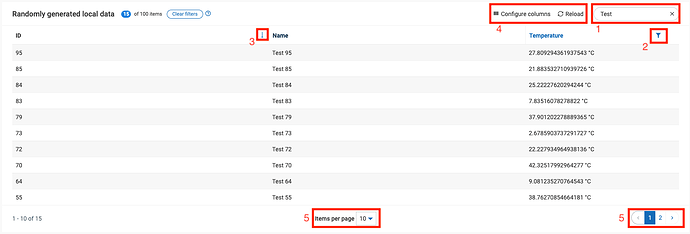
The c8y-data-grid ships with a number of powerful features right out of the box: Searchability (1), filterability (2) and sortability (3) of data, Reload button, column configuration (4), Resizable columns, (Bulk-) Actions, Pagination (5), Responsive layout and Configurability and Customizability.
[ ](https://global.discourse-cdn.com/techcommunity/original/3X/c/b/cb1b340889ac47c3be74bfd3b7c0c9209a9f3774.png "Bildschirmfoto 2023-02-15 um 17.06.28")
Example of c8y-data-grid
When to use
You should make use of the c8y-data-grid component whenever you want to display a list of one of the Cumulocity domain model entities. The reason is that usually, the data amount to be displayed can become very large so you’ll want to use pagination and filters to enable the user to just visualize the relevant parts of the data.
Alternatives
If you know that you just want to show a small dataset with limited filter functionality, you can also use the table as shown in the styleguide.
[ ](https://global.discourse-cdn.com/techcommunity/original/3X/8/d/8d67aa560190bed989c96c4d687a7df53a99a393.png "Bildschirmfoto 2023-02-15 um 16.57.21")
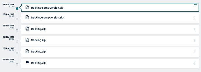
Example of grid using the table tag and css (taken from the styleguide)
Or, if you want to show e.g. events in a timeline, you can use the c8y-li or c8y-li-timeline component. You can find examples of how to use these in the tutorial-app. You can create and run the tutorial-app by using the c8ycli.
[ ](https://global.discourse-cdn.com/techcommunity/original/3X/7/0/70c36bbb821077c93dd54819e0407b4c5b121efa.png "Bildschirmfoto 2023-02-15 um 16.55.09")
Example of a timeline list
Local data example
Without further ado, let’s go ahead and create our first super minimal c8y-data-grid. Create a new component and use the following in your .ts file.

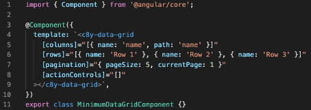
Sample code of the most minimal example (can be downloaded here)
The most minimal c8y-data-grid example requires to:
- bind data via rows
- bind column configuration via columns
- setup a pagination
- assign (in this case empty actions via) actionControls
This will result in the following output:

As no header is specified for the column, it falls back to the value of the name attribute. The path was set to extract the value from the name attribute of each item of the dataset. As nothing else is configured on the column side, the column can be sorted by default. The search bar shows up automatically as the data got bound locally using the rows attribute. Clicking the reload button wouldn’t really have any effect.
There are some things that magically work out of the box - the user can configure whether or not he wants to see columns and in which order to display columns, by using the Configure columns button. Sortation is enabled by default, the content is then sorted by string comparison. Additional to the sortation also filtration of the grid’s content is possible.
The user can either filter the content per column (if filterable: true is configured for a column), or per row by using the search input on the top right, where a row remains if any of its columns match. In both cases, a case-insensitive includes-search is applied, meaning it doesn’t matter where in the text your search string is located, or if uppercase or lowercase is used either in the search or the content.
Congratulations! You have successfully setup your first c8y-data-grid component! In the next chapter we will dive into the column configuration and attribute setup of the c8y-data-grid to further customize it.
Subscribe to my newsletter
Read articles from TECHcommunity_SAG directly inside your inbox. Subscribe to the newsletter, and don't miss out.
Written by

TECHcommunity_SAG
TECHcommunity_SAG
Discover, Share, and Collaborate with the Software AG Tech Community The Software AG Tech Community is your single best source for expert insights, getting the latest product updates, demos, trial downloads, documentation, code samples, videos and topical articles. But even more important, this community is tailored to meet your needs to improve productivity, accelerate development, solve problems, and achieve your goals. Join our dynamic group of users who rely on Software AG solutions every day, follow the link or you can even sign up and get access to Software AG's Developer Community. Thanks for stopping by, we hope to meet you soon.