Building Responsive Websites with Media Queries: The Ultimate Guide
 Pooja Patil
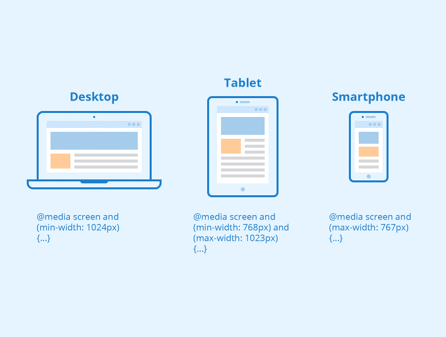
Media queries are a powerful tool for building responsive websites that adapt to different screen sizes and devices. They allow web developers to define different styles and layouts for different devices, making it possible to create a seamless user experience across all devices. In this article, we will explore the basics of media queries and how to use them effectively to build responsive websites.
What are Media Queries?
Media queries are a CSS feature that allows web developers to apply different styles and layouts to a web page based on the characteristics of the device it is being viewed on. This includes the device's screen size, orientation, resolution, and more.
How to use Media Queries
Using media queries involves defining different styles and layouts for different screen sizes and devices. Here are the basic steps for using media queries to create a responsive website:
Define breakpoints: Define the different screen sizes and devices that you want to target with media queries, and set breakpoints accordingly.
Write media queries: Use the
@mediarule in CSS to define different styles and layouts for different screen sizes and devices.Test and adjust: Test your website on different devices and screen sizes, and adjust your media queries as needed to ensure a seamless user experience.
Benefits of using Media Queries
Media queries offer a wide range of benefits for building responsive websites, including:
Improved user experience on all devices
Greater flexibility and control over layout and design
Ability to target specific devices and screen sizes
Reduced need for separate mobile and desktop versions of a website
Improved SEO and search engine rankings
In conclusion, media queries are a powerful tool for building responsive websites that adapt to different screen sizes and devices. By understanding the basics of media queries and how to use them effectively, you can create a seamless user experience across all devices, making your website more user-friendly and engaging.
Subscribe to my newsletter
Read articles from Pooja Patil directly inside your inbox. Subscribe to the newsletter, and don't miss out.
Written by
