Make webpage in grid formation
 Janvi Limbasiya
As I wrote in a previous article on flex, when there is a need to arrange elements in single dimensional such as rows or columns, we use flex.
But when there is a need to arrange HTML items in form of greed, that time grid is used.
Grid:
As the name suggests, the grid is used to arrange elements in the formation of the grid. It is applied to the parent element and can be written as,
display:grid;
Difference between grid and flex:
To understand the difference between flex and grid, there is a very basic example described below.
Flex Example:
The coach of the train is an example of a flex arrangement. It is arranged in one direction.
Grid example:
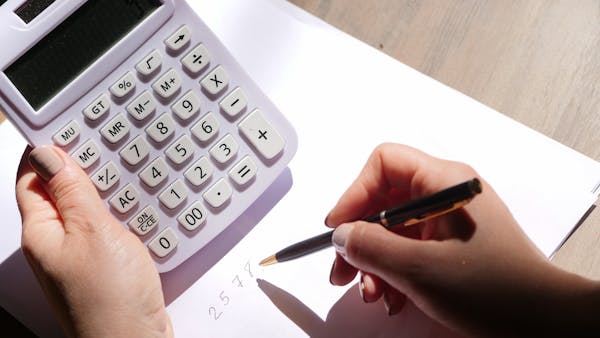
Switches of the calculator are arranged in multidimensional, which has more than one row and column.

Important words to understand grid:

Container: A container is an element, in which all the items are stored. As shown in the figure, the object highlighted with green color is a container.
Grid lines: grid lines are lines, by which rows and columns can be separated. The red lines shown in the figure are grid lines. Line 1 to line 4 in rows and columns are also shown in the figure.
Grid cells: Grid cells are boxes are small boxes. The example is shown in the figure.
Grid track: A grid track is a space between two adjacent lines. Here, it covered cells 4,5 and 6.
Grid items: Grid items are the direct children of the grid container. Here, all 9 boxes are grid items.
Z-index: Z-index is used to overlap items or to stack the order of grid items.
Properties of grid layout:
grid-template-columns: This property sets the size of columns in a grid layout. It can be written in multiple units such as pixels, percentages and a fraction of free space(fr).
Fr means utilizing the space of the parent container.
Ex.grid-template-columns: 1fr 1fr 1fr; It divides the parent container's space into three parts. Here, one column takes one-third space of the parent container.
It can be written in multiple ways too. The example is shown below.
grid-template-columns: 10px 10px 10px; /*generate 3 columns of size 10pixels*/
grid-template-columns: repeat (3,1fr); /*generate 3 columns of size 1 fraction*/
grid-template-columns: 50px 40% 1fr auto/*multiple unit also works to generate one column*/
grid-template-rows: This property sets the size of rows in a grid layout. It can be written in multiple units such as pixels, percentages and a fraction of free space(fr). It can be written in multiple ways too. The example is shown below.
grid-template-rows: 10px 10px 10px; /*generate 3 rows of size 10pixels*/
grid-template-rows: repeat (3,1fr); /*generate 3 rows of size 1 fraction*/
grid-template-rows: 50px 40% 1fr auto/*multiple unit also works to generate one row*/
row-gap: As the name suggests, the row-gap property applies the gap between rows. It can be written in multiple units such as pixels, percentages and a fraction of free space(fr). The example is shown below.
row-gap:12px;
column-gap: As the name suggests, the column-gap property applies the gap between columns. It can be written in multiple units such as pixels, percentages and a fraction of free space(fr). The example is shown below.
column-gap:12px;
All the properties explained above are included in this example.
fraction: A fraction is a unit, used to give the measurement to rows and columns of the grid. To understand it clearly, the example is given below.
In the above-shown example, if the height and width of the child's items are removed and these two properties are applied,
grid-template-columns:1fr 1fr 1fr
grid-template-rows:1fr 1fr 1fr
child items use the height and width of the parent container. The example is shown below. Here, the fraction is applied as a unit, so it divides space into three equal parts for rows and columns.
The size of any grid item also can be defined by grid lines. For this, the properties which are used are defined below.
grid-column-start: To define the size of a grid item vertically using a grid line, this property is used.
grid-column-end: To define the end point of a grid item vertically using a grid line, this property is used.
The same property is also applied to rows.
grid-row-start: To define the start point of a grid item horizontally using a grid line, this property is used.
grid-column-end: To define the end point of a grid item horizontally using a grid line, this property is used.
An example of all four properties is below.
As shown in the example, in 'item-one' style is applied in form of a column, starting from line 1 to line 3.
In 'item-four' style is applied in form of a row, starting from line 2 to line 4.
grid-column: Grid-column is a shorthand property of grid-column-start and grid-column-end.
Syntax:
grid-column:grid-column-start/grid-column-end;
grid-row: Grid-row is a shorthand property of grid-row-start and grid-row-end.
Syntax:
grid-row:grid-row-start/grid-row-end;
span: In place of using a line number, one way is to use a span.
here, grid-row:1/3; is the same as grid-row:1/span 2; This way, a span unit can be used.
grid-area: A grid-area is a shorthand property of grid-row-start, grid-column-start, grid-row-end and grid-column-end.
Syntax:
grid-area: grid-row-start/grid-column-start/grid-row-end/grid-column-end;
justify-items: Justify-items property is used to select the place of the item in the cell such as start, end, center etc. The example given below sets all the items in the center. Justify items applied in the parent container. It adds styles to all grid items.
Different values for the same property are given below.
justify-items:left;/*place items towards the left side of the cell*/
justify-items:right;/*place items towards the right side of the cell*/
justify-items:stretch;/*takes whole width of the parent container*/
justify-items:start;/*place items towards the start edge of the cell*/
justify-items:end;/*place items towards the end edge of the cell*/
justify-self: When there is a need to add a position to a particular item, at that time justify-self is used. It uses the values same as justify-items. Like, start, end, stretch, left, right etc.
As shown in the above example, in 'element-one' justify-self is applied as the center. So, it displays in the center of the cell. This way, it is used to style one particular item of the grid.
Subscribe to my newsletter
Read articles from Janvi Limbasiya directly inside your inbox. Subscribe to the newsletter, and don't miss out.
Written by

