The geodesic sphere
 Maciek Fitzner
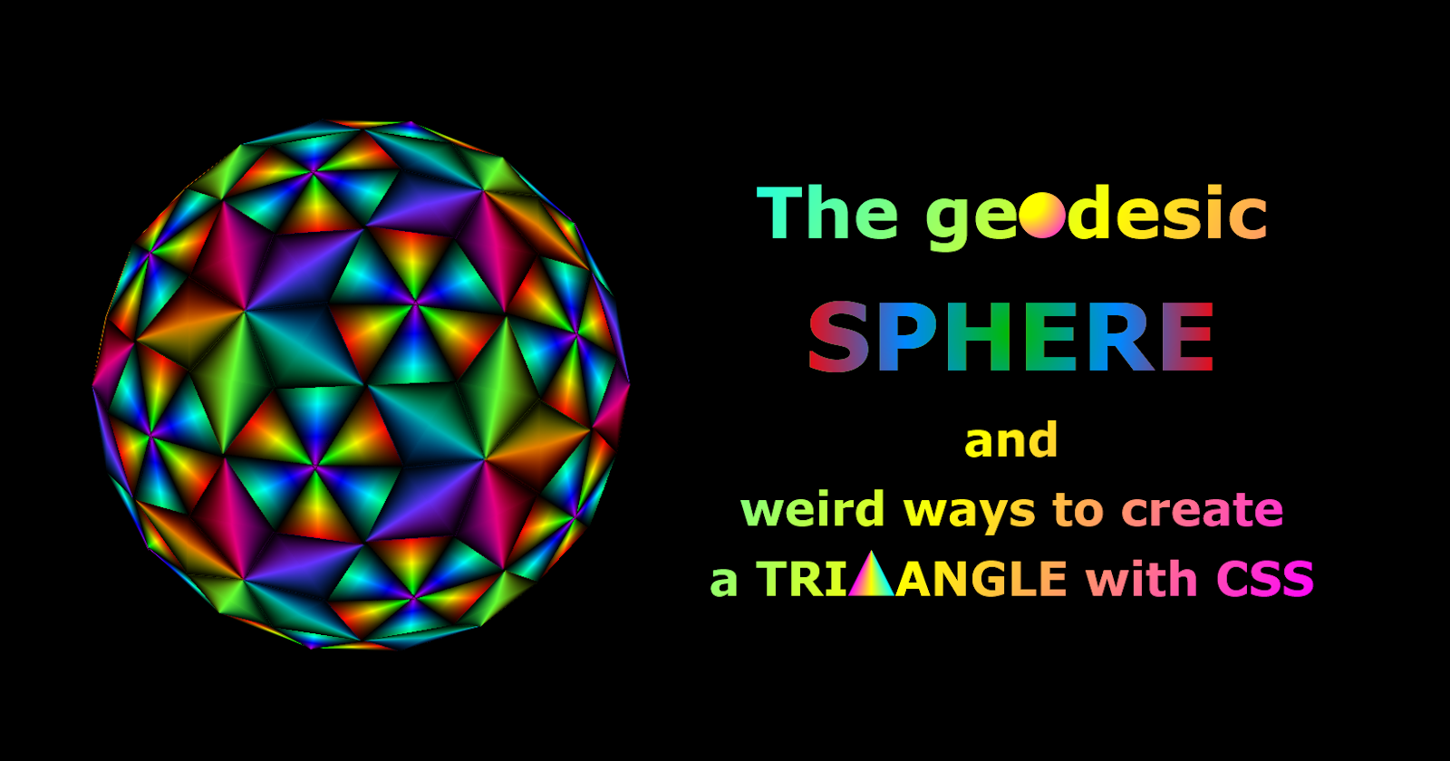
In my never-ending quest to code crazy 3D geometries I've long been fantasizing and theorizing about geodesic spheres - approximations of an orb made exclusively out of triangles connecting at weird, incomprehensible angles.
Now the nightmare finally came into being:
Careful touching it, it's a real CPU hog - and some browsers might choke on it, taking a good few seconds to load and for the Play button to notice it's been pressed. In my experience, on Firefox it runs fine, but Chrome and Edge are struggling, at least in the beginning. My guess is it's the CSS trigonometry. Chrome was usually the faster one when I did my trigs with PHP or SCSS and the browser got the pre-baked values.
For this reason, I probably better not bother talking about the calculations going on here. They fried my brain to a crisp - and I'm used to this stuff. You don't need to go down this rabbit hole - unless you really, really want to.
But there's a simpler, more bite-sized lesson here:
Weird ways to create triangles with CSS
If you'd like your standard rectangular container to be a different polygon, these days your first choice would be the clip-path:
div {
    clip-path: polygon(0 100%, 50% 0, 100% 100%);
}
which will produce a triangle by slicing the square, starting from bottom left, to top center, then bottom right:
It's a quick, elegant solution that was designed for this specific purpose - unlike the old workaround involving tinkering with borders:
.triangle {
  width: 0;
  aspect-ratio: 1;
  border: 50em solid; /* percentages won't work, you need concrete units: px, em, ch, etc. */
  border-color: red yellow blue green;
}
which creates a triangle by setting really thick borders on your container, then the colors on three of them to transparent:
But these aren't my today's subject. I needed to mention them to give you some historical background - and I will talk about them in the context of other methods - but If you'd like to read more on them, here's a comprehensive article from our fellow blogger Alvaro Montoro.
What I *would* like to talk about today is how CSS gives you many, many ways to create non-standard shapes. These methods will be closer in nature to the border-based method - i.e. not designed specifically to cut out shapes, just exhibiting certain properties that can be used to form them.
For instance, take a look at the cube:
It's a set of six square walls, each perpendicular to its direct neighbors - but perspective distorts those angles. The farther something is from the viewer, the smaller it appears. The walls on the left, right, top and bottom appear to be trapezoids - because one edge is closer to us than the other.
If the walls were taller and extended further into the distance away from us - at some point, their farther edge would shrink so much it'd almost look like a single point:
The same would happen if, instead, you shortened the perspective:
In both cases, however, it'd have to go to extreme lengths for the lines to converge. In the case of stretching the walls, even if they went past the specified distance of the perspective, they still have a long way to go.
Similarly, shortening the perspective would bring you ever closer to the point of convergence, but never quite.
Unless, maybe, you pulled it all the way down to zero...? This could never work, right?
And yet, it does - and perspective: 0 is something very different from perspective: none:
In terms of the visual result, they are the opposite. With perspective: none the top, bottom, left and right walls are invisible to us, because they are perpendicular to the front face. With perspective: zero the vanishing point acts like a black hole: it sucks everything in with incredible force that defies all logic. The height of the wall and the angles no longer matter, everything is stretched to its limits and physics seem to no longer apply.
So, whether you want to or not, you get four beautiful, perfectly spiky triangles - or at least approximating perfection very, very closely in the case of very slight inclinations (why you would even use them will be discussed below).
But by far the most awesome and useful property of perspective-based triangles is the gradients.

<div class="cube">
  <div class="wall"></div>
  <div class="wall"></div>
  <div class="wall"></div>
  <div class="wall"></div>
</div>
.cube {
  position: relative;
  width: 100em;
  aspect-ratio: 1;
  perspective: 0;
}

.wall {
  position: absolute;
  left: 50em;
  height: 100em;
  aspect-ratio: 1;
  transform-origin: 0 50%;
  transform: rotate(calc(90deg*(var(--nth)))) translateX(50em) rotateY(90deg);
  background-image: linear-gradient(hsl(calc(var(--nth)*90deg) 100% 50%), hsl(calc((var(--nth) + 1)*90deg) 100% 50%));
  transition: all .3s ease-in-out;
}

.wall:nth-child(1) {
  --nth: 1;
}

.wall:nth-child(2) {
  --nth: 2;
}

.wall:nth-child(3) {
  --nth: 3;
}

.wall:nth-child(4) {
  --nth: 4;
}
What you get looks just like a regular conic-gradient - and in fact it is what I'd use before we had that (the time when we didn't isn't that ancient - and we STILL don't have conics in SVG). But is there a reason to still use perspective-based gradients today? They look the same - even when the conic is spinning and the linear only pretending to, and in fact just sliding its gradient along a line.
/* replacing the background-image definition */

.wall {
    background-size: 100% 400%;
    background-position-y: calc(var(--nth)*-100%);
    animation: slide 18s linear infinite;
}

@keyframes slide {
  100% {
    background-position-y: calc(var(--nth)*-100% - 400%);
  }
}
But there are things conic gradients can't do - and that is animation. If you try to apply animation to them, they'll skip between the keyframes in single steps - whether it's about color transitions or change of angles. Meanwhile, linear-gradients - while still constrained as far as colors are concerned - do offer some freedom in defining background-size and background-position, with smooth transitions between keyframes:
You can also stretch and bend the triangles easily - by changing the perspective-origin (you might need to double-click)
Why, then, if perspective-based triangles are so great, have I only used them on only three vertices in the pen with the geodesic sphere - which has hundreds of them? Didn't use them in the sphere, itself, either - just the play button.
Performance.
Your browser and your CPU/GPU don't like hundreds of objects flying around. I've known that for years - and forced my way, anyway. Still, perspective requires two containers: the one that sets the perspective, and another than is subjected to it. That doubles the polygon count - and I haven't even begun! They generally don't like too many gradients, either. Animations, transforms, filters and blend modes - all of which I love to pieces - are hard on them, too. On top of that, now we have trigonometry in CSS, which forces browsers to crunch the numbers in real time. If you're reading this on Chrome, chances are you had to wait 10 seconds for the geodesic sphere to even load.
Because of that - and also little glitches and idiosyncracies - I needed to curb my ambitions. I can't have everything animating - and since I can't, there was no point using the more resource-heavy solution. It's still my favorite, but needs to be used sparingly. It's like VHS vs Betamax - or DVD vs Blu-Ray. The superior technology loses because it's more expensive - here in terms of processing power.
There is also one area where gradients outshine both clip-path and perspective - and that is in nesting.
Clip-path will cut off anything non within its bounds - and that includes any nested content. It also flattens perspective/overrides 3D transforms.
Perspective distorts nested content - whether you want it or not.
There are ways to work around this, but it'd require extra containers - and I usually don't want that.
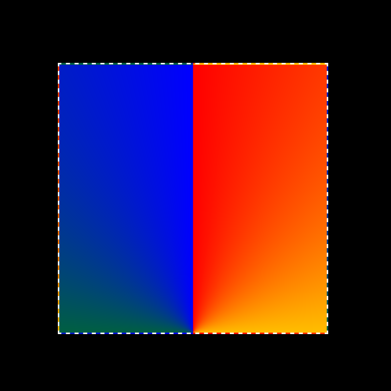
So, how does one make a triangle analogous to what we did above with just conic-gradients? Let's take the most basic container with an aspect-ratio of 1 (that is, the height is equal to the width):
<div class="triangle"></div>
body {
    background: #000;
}

.triangle {
    width: 40%; /* roughtly half of the viewport's width - using this insead of my usual em for simplicity */
    aspect-ratio: 1;
    border: 3px #fff dashed;
    margin: 5em;
    background-image: conic-gradient(red,blue);
}

Since the gradient starts and ends in the upper half, for simplicity let's place its origin at 50% 100% (center, bottom).
.triangle {
    background-image: conic-gradient(at 50% 100%, red, yellow, green, blue);
}

Now, we need the gradient to start at the top left corner with the color red, and progress through yellow, green and blue, finishing at the right corner. You could do this manually, through trial and error getting the angles just right. Luckily, you don't have to! Trigonometry can do that for you. All you need is to serve it two pieces of information:
The height of your container - equal to the width, ergo: 40% (disregard the unit, we just need a number).
Half of the width: 40/2 = 20.
With that we can now calculate the angle of the line that goes from our gradient's origin (50% 100%) to either of the container's corners.
.triangle {
    --angle: atan(calc(20/40));
}
What that does is first calculate the ratio of half of the width to the height of the container. That's 0.5. Then it finds what angle's tangent that would be. Since it won't tell it to you after it's done, let me: it's 2 degrees.
Now we need to use that data. I split the whole property into separate lines so I can comment on each piece of information served.
Let's check if that's correct by tilting the start point by 26.5650512 degrees towards the left corner:
.triangle {
    --angle: atan(calc(20/40));
    background-image: conic-gradient(
        from calc(-1*var(--angle)) /* the starting angle: -26.5650512deg */
        at 50% 100%, /* gradient's center=point: bottom center */
        red, yellow, green, blue);
}

There is a reason why it needed to be rotated by negative 26.5650512 degrees. As far as I know, the conic-gradient's direction can't be changed; it progresses clockwise only.
Which lets us know what to do next: make the gradient extend only to the top right corner instead of doing the whole 360. That corner is at 26.5650512degrees - which means it's twice that from where we currently are: at -26.5650512deg.
.triangle {
    --angle: atan(calc(20/40));
    background-image: conic-gradient(
        from calc(-1*var(--angle)) /* the starting angle: -26.5650512deg */
        at 50% 100%, /* gradient's center=point: bottom center */
        red, yellow, green, blue calc(var(--angle)*2)); /* the gradient goes from red to blue over the span of 53.1301024 degrees only */
}

The only problem is we didn't tell our gradient to shut off after 53.1301024 degrees. It still wants to do a full circle, spreading the last color declared. That means that if we want no color after the 53.1301024deg mark, we need to declare it:
.triangle {
    --angle: atan(calc(20/40));
    background-image: conic-gradient(
        from calc(-1*var(--angle)) /* the starting angle: -26.5650512deg */
        at 50% 100%, /* gradient's center=point: bottom center */
        red, yellow, green, blue calc(var(--angle)*2),
        transparent 0 ); /* the gradient goes from red to blue over the span of 53.1301024 degrees only */
}
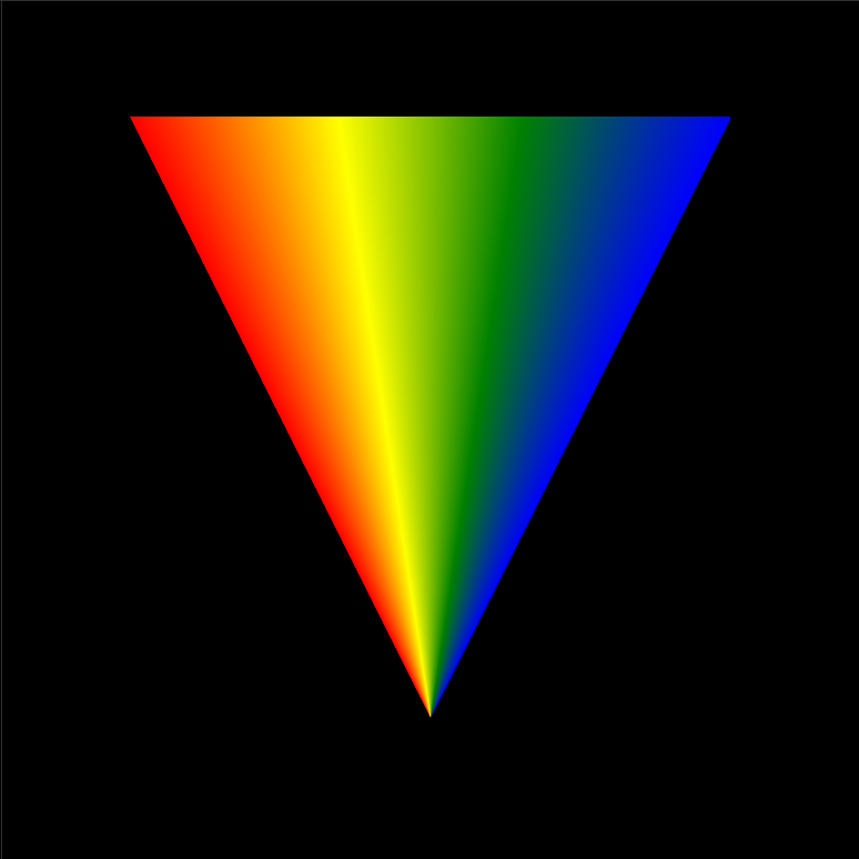
Transparency does the trick - no color after 53.1301024 degrees:

But the real trick is the zero following the color specification. If we were to be super strict with our syntax, we'd do it like this:
.triangle {
    --angle: atan(calc(20/40));
    background-image: conic-gradient(
        from calc(-1*var(--angle))
        at 50% 100%,
        red, yellow, green, blue calc(var(--angle)*2),
        transparent calc(var(--angle)*2) ); /* instead of transparent 0 */
so that the transparency starts at the same point the blue ends (we have to do that, by the way, because if we don't specify the endpoint, CSS will assume the transparency starts at 100% - and you can probably guess what happens). But it can be 0, too - since the gradient progresses clockwise only, it cannot turn back, so if the onset of transparency is a smaller value than the end of blue, the smaller one will be ignored, and the blue's end will act as the onset of transparency.
Here's the whole code for creating a triangle using conic-gradient, with comments:
.triangle {
    width: 40%; /* roughtly half of the viewport's width - using this insead of my usual em for simplicity */
    aspect-ratio: 1;
    margin: 5em;
    --angle: atan(calc(20/40)); /* calculating the angle between either of the top corners and the center of the bottom by calculating the reverse tangent the base and the height */
    background-image: conic-gradient(
      from calc(-1*var(--angle)) /* the angle needs to be negative since the vertical line is the angle of 0, and here we're going counter-clockwise*/
      at 50% 100%, /* center, bottom*/
      red, yellow, green,blue calc(var(--angle)*2), /* the gradient ends with blue after making an arc of 53.1301024 (from 26.5650512 to get to the vertical line, and then, mirroring that, another 26.5650512 to reach the top right angle*/
      transparent 0); /* the transparency needs to start right where the blue ends, so you could also serve it the same calc - but if you're lazy, you can give it any number that is smaller than the calculated value, because it can't go back to it, and will continue onwards from where it ended */
}
There's, of course, way more you can do going off from this basic setup - like having your triangle's tip point in different directions: up, down, left or right:
and many more tweaks and more subtle and precise calibrations.
But that's a story for another time.
Subscribe to my newsletter
Read articles from Maciek Fitzner directly inside your inbox. Subscribe to the newsletter, and don't miss out.
Written by
