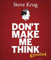
Review: Don't Make Me Think By Steve Krug
 Afeez Lasisi
This morning I finished Don’t Make Me Think — A Common Sense Approach to Web Usability by Steve Krug. Steve is an American writer and ‘expert’ on Usability and User Experience (UX). The book was published in 2000.
The book is concise, witty and easy to read with diagrams to make it explanatory. It is basic but thorough introduction to web and mobile design. Krug said how we design the web is diametrically opposed to how users use the web.
He argued that users do not really read most of the texts in a web page. They scan the page not read the texts, expecting to quickly find what they want. So, when you are designing a web, remember that, users are in hurry, they scan your page not ‘read’ the text. His first law of usability is the title of the book: Don’t Make Me Think.
Krug uses example of a physical store where the layout is easy to explore by customers. He said the bricks and mortals store’s layout is designed that if you can’t find your way, you can easily ask someone who will guide you.
Steve Krug’s Laws of Usability:
First Law: Don’t make me think
Here, Krug said you should make your website obvious, self-explanatory and and self-evident at a glance that even the average user will know how to get what they want and how to use it without having to think about it and easy to navigate to accomplish their goals. The size, color and layout should aid in making it obvious. The success of your site depends on how obvious and accessible your site is. So obvious that a new visitor to your site should be. It will create cognitive workload and mental chatter making the users or visitors to be asking himself questions like ‘where am I’, ‘where should I begin’, ‘where do they put…’ which eventually lead to errors from the users or visitors.
Second law : It doesn’t matter how many times I have to click, as long as each click is a mindless, unambiguous choice.
Steve said here that some people believe that the number of times a user clicks get what they want without being frustrated but Steve disagreed. He said that “the number of clicks it takes me to get to what I want (although there are limits), but rather how hard each click is — the amount of thought required and the amount of uncertainty about whether I’m making the right choice.” Steve said that users — in most cases — don’t care about the number of times they click as long as the clicking is painless and they quite aware that they are on the right track.
Third Law: Get rid of half the words on each page, then get rid of half of what’s left.
Krug said we sometimes words to make our page clumsy when in reality users do not really read most of these texts in a web page. They scan the page not read the text, expecting to quickly find what they want. So, when you are designing a web, remember that, users are in hurry, they scan your page not ‘read’. More words in your page make it noisy there making it less obvious.
Usability testing:
Chapter 9 of the book is dedicated to Usability testing. A comprehensive explanation of usability test. Krug, an ‘expert’ on the field of usability test believed that with little resources you can conduct usability test and stress the importance usability test with 3 or 4 users. Tools needed and how to conduct it are explained.
There are other valuable concepts well-explained in the book including breadcrumbs and accessibility. However, the book needs to be revised. It has been decades it as written and since then there has been radical changes in how web is designed and being used. With more people spending considerable time on social media, it worth exploring.
Subscribe to my newsletter
Read articles from Afeez Lasisi directly inside your inbox. Subscribe to the newsletter, and don't miss out.
Written by
